RV life is an app that helps users find RV-friendly parks and other pit stops along the path of their route. It allows you to be part of a community where people read and leave reviews about the places they visit and mention the amenities available that might be essential for travel. This critique analyses the design aspects of RV Life based on the usability concepts mentioned in The Design of Everyday Things – by Don Norman.
Tasks performed:
Task 1. Create an account

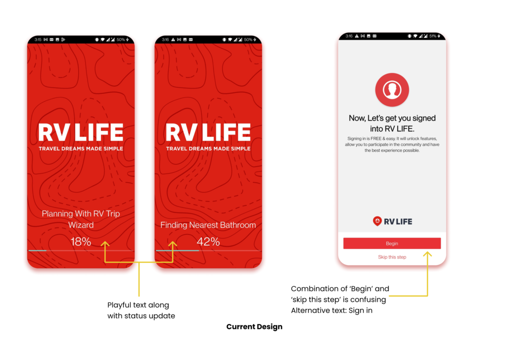
While starting the user experience, the app displays a loading screen with friendly phrases related to RV life, playing to the user’s visceral level, keeping them from getting frustrated with the loading time. Moving ahead, the Sign-in Page says ‘Begin’ which is not a term that the user is used to seeing, and pairing it with ‘Skip this step’ can be confusing. An alternative is to label the button as ‘Sign in’.

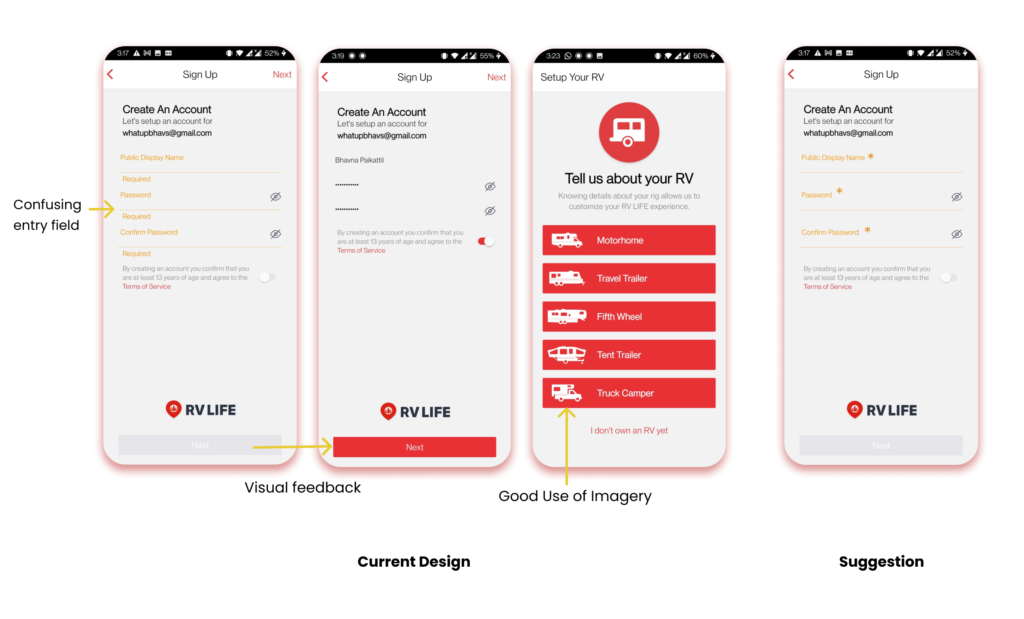
While logging in the user’s credentials, it is confusing to understand where to type as the general mapping or natural reaction would be to click near the line, as one would relate it to ruled books where they write on the line. Interestingly, the text is entered where the signifier label was and hence did not match the conceptual model of the product. After filling in the details, the disabled grey button turns red, providing immediate feedback that the user can proceed. One suggestion for this screen is to keep an asterisk(*) near the form label to indicate that it is a required field.
Continuing to set up the user’s profile, it takes information about the user’s RV. Here, it offers 5 distinct options for RV. These buttons have text accompanied by illustrations to visually describe the type of RV. This is useful a feature as helps the users not rely on their ‘knowledge in the head’.
Task 2. Find a park to visit

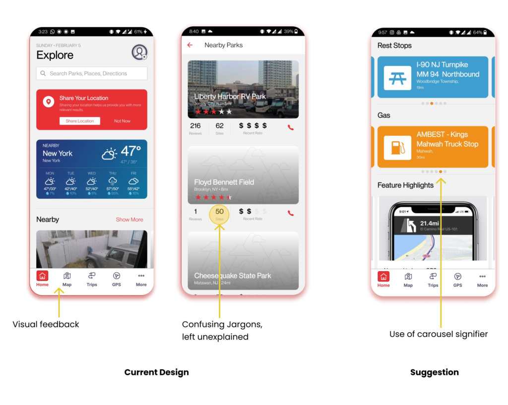
The nav bar has color feedback to show which page the user is on. On the home page, the categories are clearly defined and there is a good use of signifiers for carousels whose affordance is to be swiped by showing a preview of the next item. An additional feature to have would be signifiers at the bottom indicating how many items are in the carousel and the current position.
While browsing through the results, there is a data point referred to as ‘sites’ but it is not explained what it means, this fails Nielson Normans’ Heuristic #2: Match between the system and the real world as they are using internal jargon that the user may not be aware of.

While trying to favorite a park to visit, it does not give immediate feedback. Additionally, on the screen where the user is supposed to select which list to add the item, it does not signify the affordance of choosing the list and still allows the user to add favorites without selection and gives feedback similar to having completed the action successfully. During the gulf of evaluation phase, the user is left to identify where they went wrong. One suggestion is to have a disabled icon near the selection which would change color when clicked or a prompt telling the user to select a list. Additionally, adding constraints of not being able to save unless a list is chosen would help reduce the number of errors or mistakes.
Among the filters is the option to choose how much to spend. The symbols are similar to what the user would see on google reviews ($-$$$$). A helpful feature here is the immediate feedback when selecting the ‘$’ sign, it reflects the price it is referring to. This is useful since money and affordability are subjective, it allows the user to make any changes if not fit. A suggestion for this screen would be to remove the cross buttons for filtering items since unwanted filters could be left empty instead of giving the user more tasks.
Task 3. Delete Profile
The position of this function matched the user’s mapping of where they would find it- My Profile section. While executing this function, the user faces what Don Norman refers to as a Lock-in, as they are not able to find the button to confirm the choice of deleting the account. They are in turn led to the support page, where they are then guided to write an email to the support team to delete the account.
Conclusion
RV Life app has a lot to offer, especially in its paid features. There is a lot of thought put into the nice user group and what they require. However, it has room for improvement on the usability front in a few areas.
