
The Pattern, an astrology mobile application available to both IOS and Android users. Generates personalized profile of users, offering insights to various personality traits and notable timing; aimed at helping users understand themselves and others. You may add friends to learn more about their personalities, their timing, and relationship dynamics.
1. Create an account
While creating a new account, I realized a new dating feature in the application called Connect. It is introduced to the user as the third step of the process as shown above. This process makes use of Norman’s concept of knowledge of the world, where users are comfortable with the layout and process of making a new account across all applications today. The contrast of the layout, specifically the buttons, playing as signifiers, makes the discoverability of the application effortless. After successfully setting up the name/username and birthday. The next step is setting up the time of the day the user was born, the Skip for now button is noticeably hard to discern as a button. My suggestion for this is to have a border and drop down shadow so users can still quickly move forward with the process.
2. Dashboard
On October 2020, the Pattern released a new feature that allowed users to see their astrological planets that resonated with their personality traits by clicking on the right hand corner of the card. The video above illustrates the animation that occurs when the user slides the cards to the right for further discoverability. While there is feedback when the user is sliding through the cards. There isn’t an idea of how many personality traits are assigned and what the progress status is. My suggestion would be to have a hierarchy of main categories, such as growth and instinct. At this point, when a user clicks on either of these choices, a modal appears to extend more information about the personality characteristics, for example, self-possessed and deep, and, confidence and comfort for growth.
3. Dating App
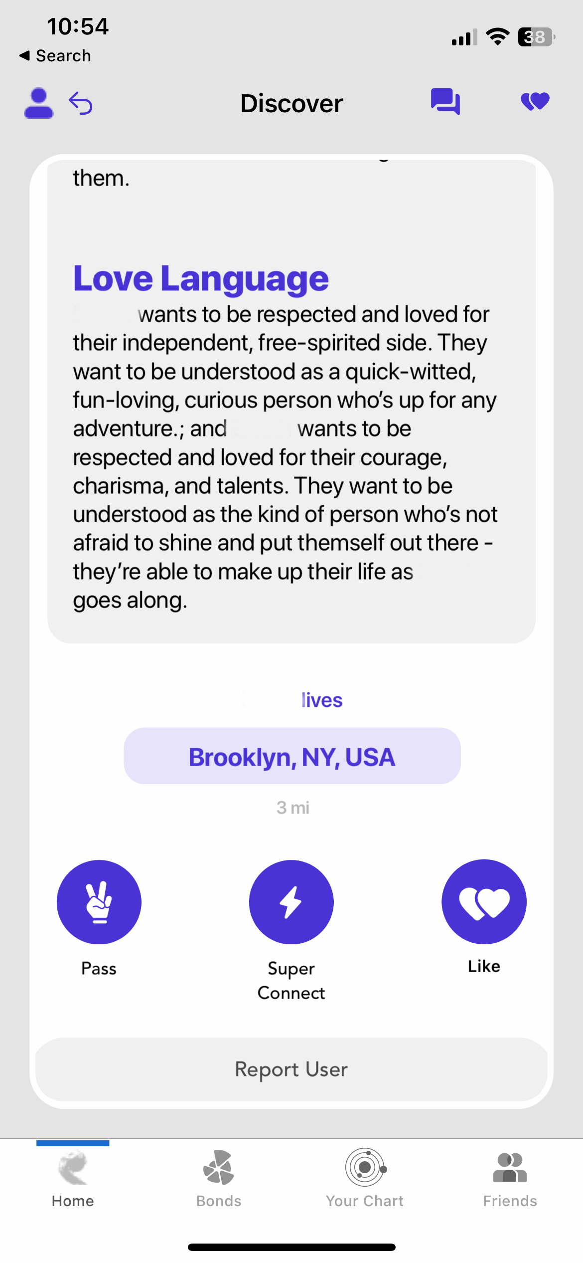
The dating feature design inside the application is similar to other dating applications, such as tinder. In this instance, you can’t swipe left or right immediately but are forced to scroll down for each profile, which at first was confusing, given that other apps introduce a profile and then you must tap the person’s profile if interested in order to extend more information about that person. In the first image of the user, there is a diagram and spectrum compatibility, in this instance it is Extraordinary. It is not as obvious that it is a button, but when clicked, a series of carousel cards displays, giving more information on compatibility. Once you scrolled to the bottom, you must click on either of these options to continue. My suggestion for this is to make the buttons display for easier discoverability and mapping of the feature.