Too Good To Go is the world’s first app against food waste, helping merchants reduce daily food waste and engaging more people at a low cost. This critique review follows a Too Good To Go user looking for and collecting surprise bags on an iPhone 13.
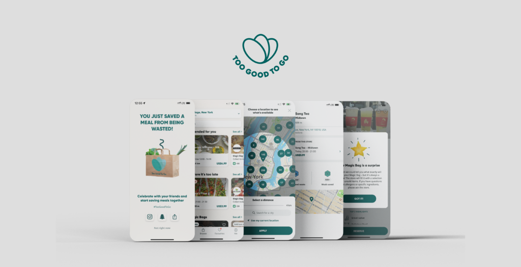
Don Norman’s seven stages of action are followed while using the app. Let’s take the example of collecting a surprise bag. (Figure 1)

Setting the pickup zone
Once the app is opened, it’s the discover page (Figure 2) where many actions are afforded such as searching, browsing more merchants, and viewing the details of magic bags. The placeholder for search, consistent card layout, blurred and gentle shadows, and pointing arrows are signifiers making it easy for users to access these affordances.
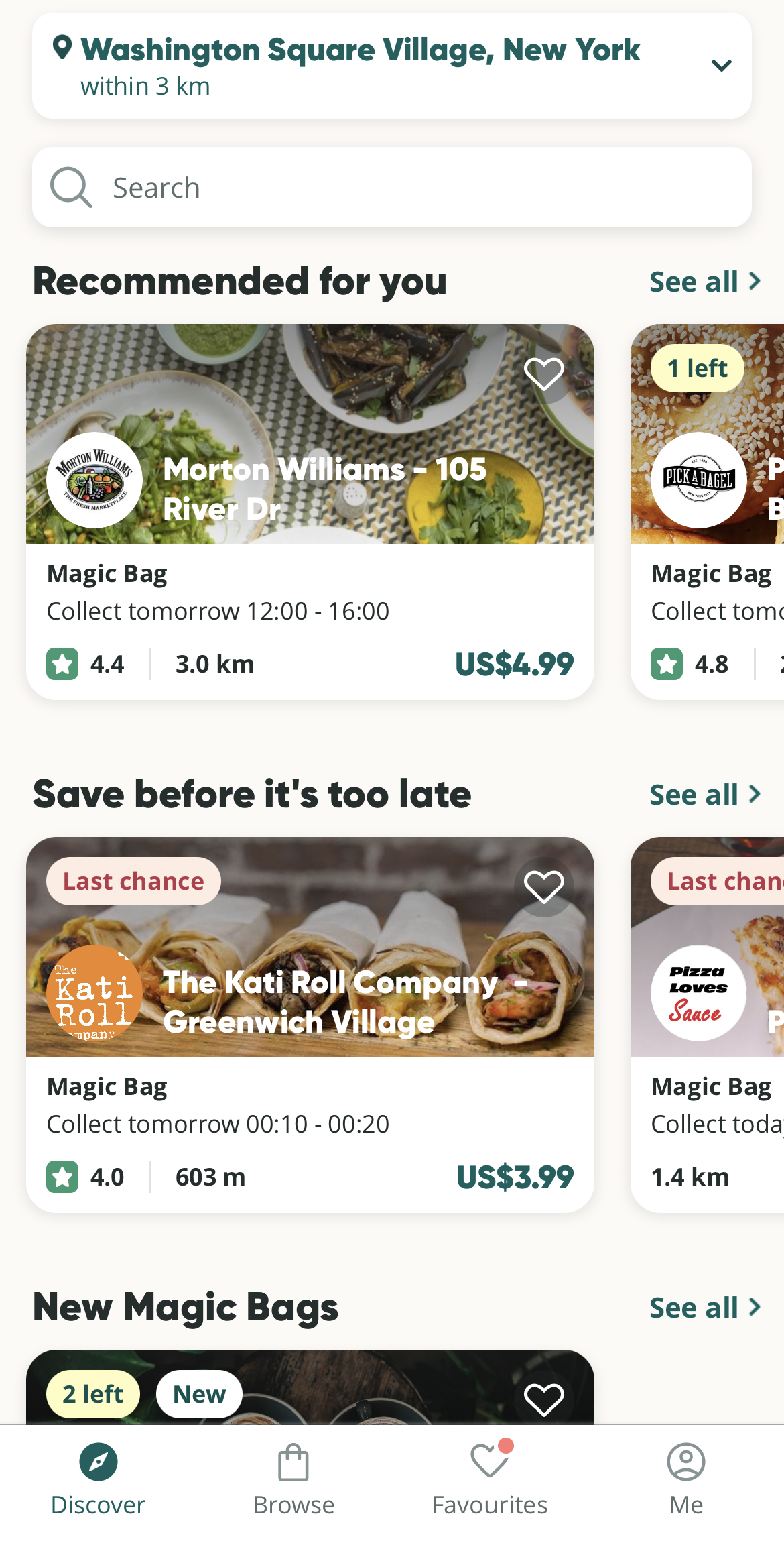
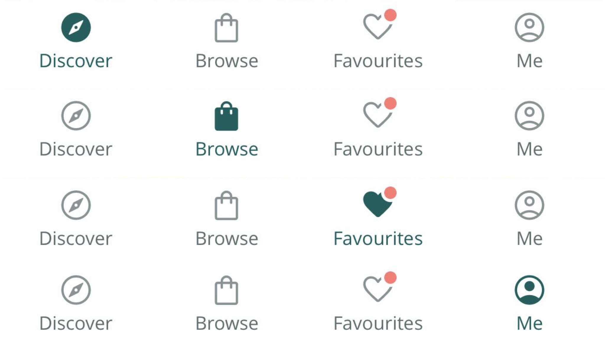
In addition, both the location at the top of the page and the navigation bar at the bottom, combined with icons corresponding to the conceptual model, map the user actions and the results intuitively. The effect shift of color and fill gives feedback to the user for switching the page interaction. (Figure 3)
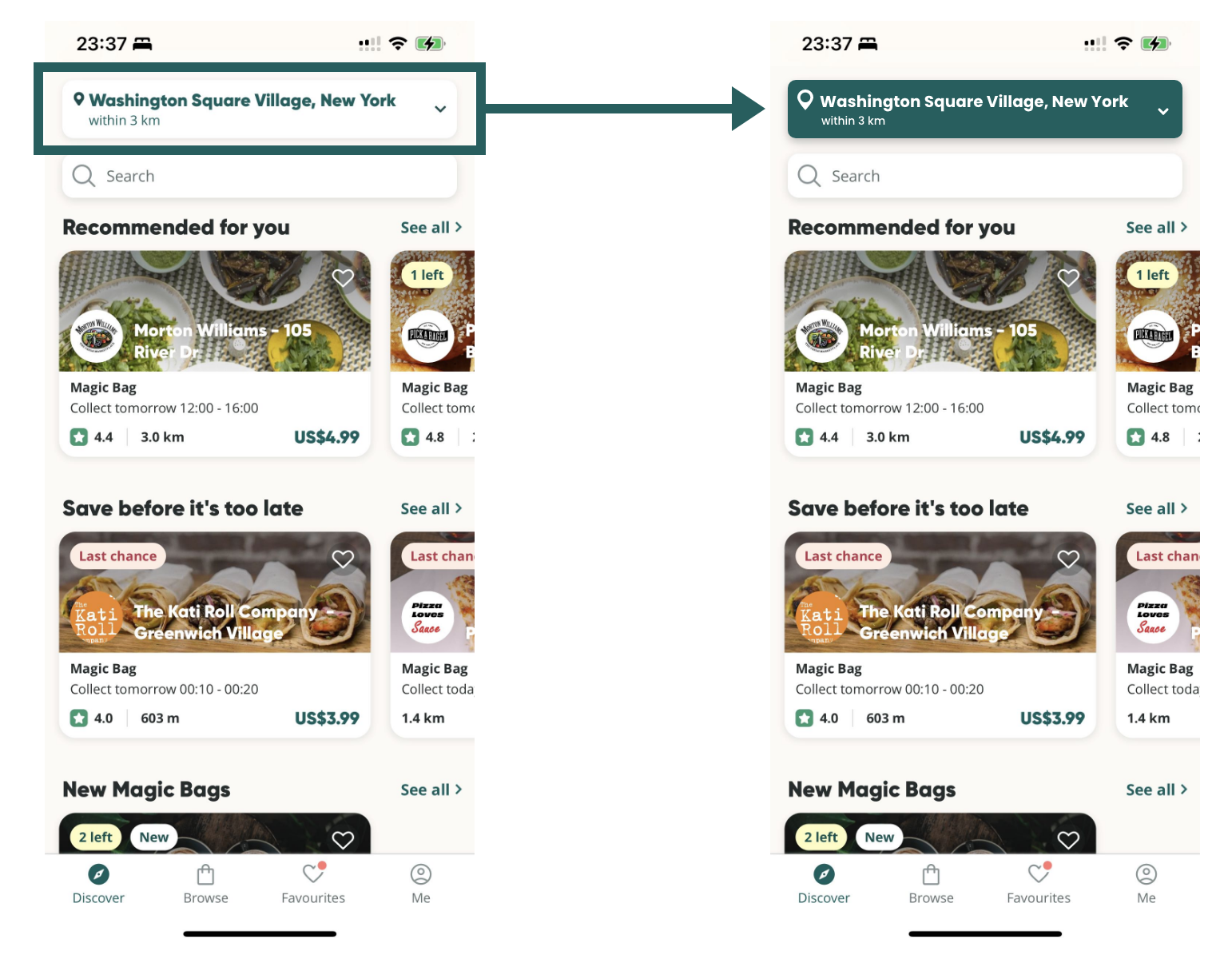
However, the entire visual center of the page is drawn to the Magic Bags’ images, the location selection is not highlighted, even though it is placed at the top of the page. (This problem is also present on the browse page.) To upgrade the discoverability of the location bar, since determining where to pick up is the first step, along with maintaining a consistent design, the location bar can be highlighted by deepening the color. (Figure 4)
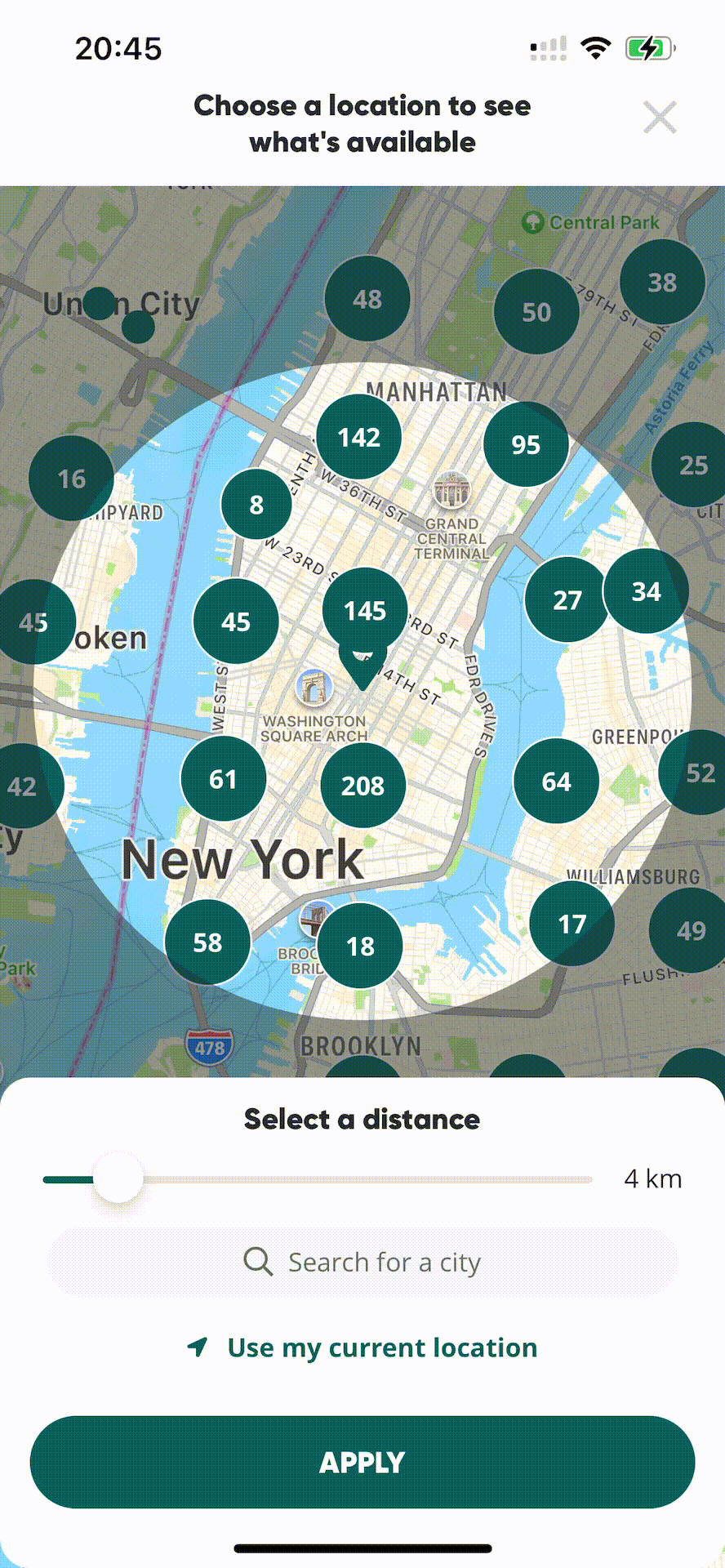
The page of the location selection screen is map-based with knowledge in the world. Radius can be adjusted by swiping the control stick and zooming in and out of the map to find the location and area of the desired surprise bag. Here, logical constraints on the radius (1km~30km) are applied to limit the area. (Figure 5)
Exploring the details of the surprise bag
The surprise bag details page affords streamlined functions in a content-rich context. However, on the discover or browse page, the tag for the meal is “magic bag”, while on the detail page, it is called “surprise bag”. By unifying these two contents in a consistent manner(for example, unified as “surprise bag”), the user can have a more precise understanding of the information.
In addition, since the signifier arrows in the ingredients and allergens section imply clickability, users have an expectation of the feedback content after clicking, based on the knowledge in the head, for example, common allergen descriptions, meal recipes, etc. Yet the lack of further instructions actually complicates the structure of the collecting surprise bags task. To simplify the structure of the task, the description of the surprise bag ingredients and allergens can be presented directly. (Figure 6)
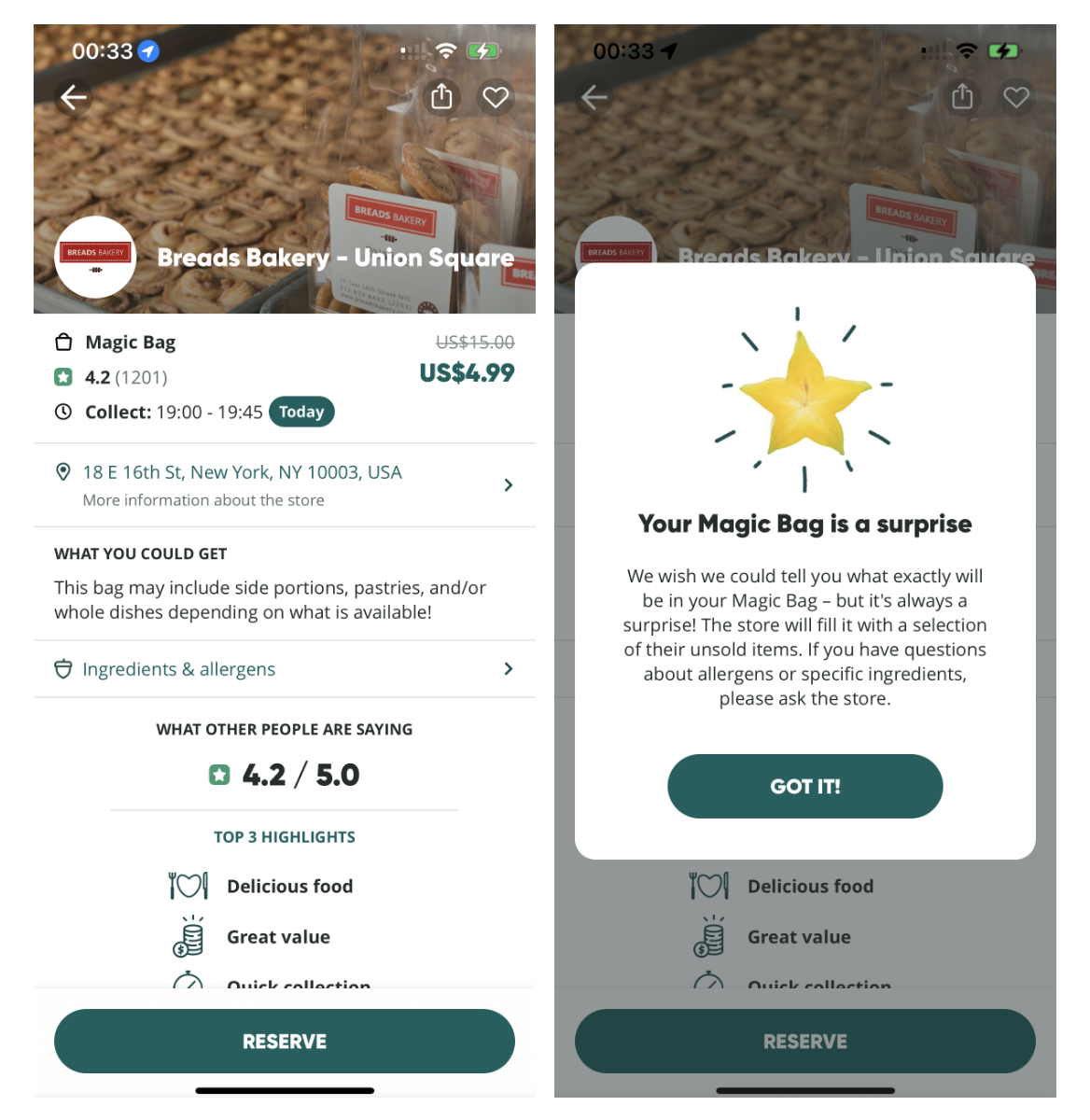
Meanwhile, the date “Today” is designed in the same style as the reserve button, but “Today” is indeed a non-clickable tag, where the description-similarity slip occurred. In order to avoid confusion among users clicking on the “Today” tag, a stronger visual distinction needs to be designed, such as replacing the tag style with a stroke instead of a fill.
Reserving a surprise bag
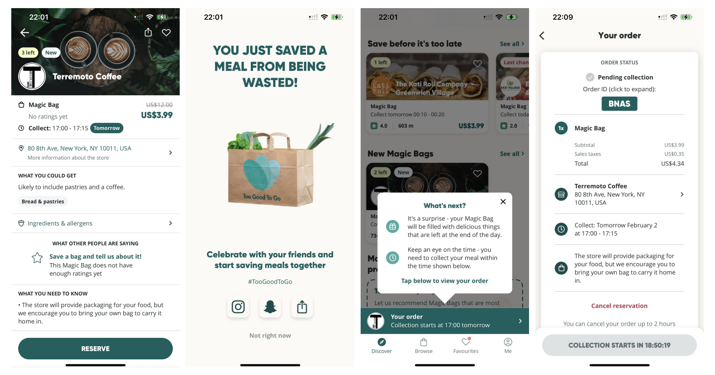
When the user clicks the reserve button, a payment pop-up appears. Following the confirmation of payment, a promotional poster is displayed, where consistency is also emphasized, as the social sharing icon is placed on a card with a light gray shade. This clickability and consistency in design allow users to reduce the amount of learning and change.
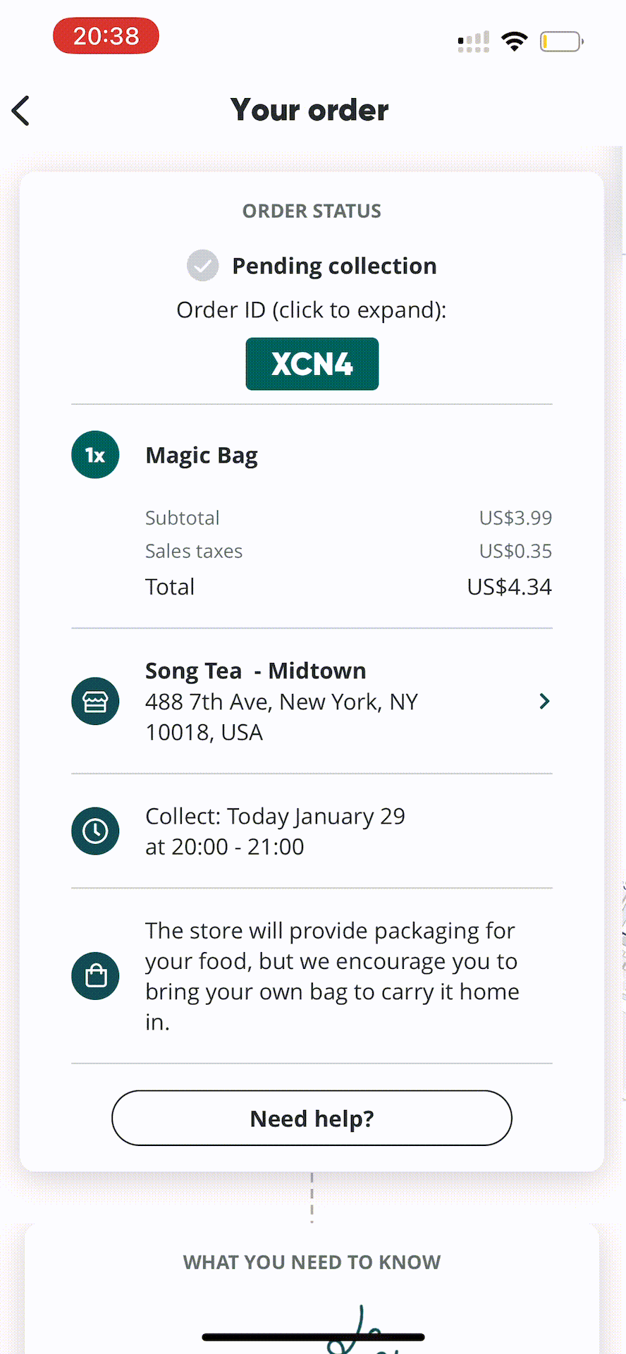
If you have reserved a surprise bag in advance (meaning it is not yet time for the collection to begin), you will find a gray countdown bar replacing the original reserve button when you open your order. It is this active forcing function that constrains the users to pick up the meals within the specified time and at the same time serves as feedback to remind the users of the appropriate pick-up time dynamically. (Figure 7)
When the time to collect is up, the “tap to collect” button at the bottom will appear, and a confirmation pop-up will continue to display, asking the user to swipe to confirm the collection. (Figure 8)
Conclusion
Too Good To Go is being used and promoted by more and more people. Although there are still some details to be improved, the consistent design makes it easy for users to understand and enjoy its functions.