Introduction:
The Smithsonian American Art Museum at Renwick is the nation’s flagship museum for American art and craft. Our usability team was asked to test a search engine they are designing to help educators find and access educational resources like lesson plans, videos, and hands-on activities. SAAM desired to have us test their metadata and tagging as well as the overall implementation of their search engine. In order to test this feature we were given access to SAAM’s planned metadata tags and a beta version of their educational search feature. With such a broad scope for us to cover, we devised a two step testing process that involved using Optimalsort’s card sorting test as well as search test using the filters present on the search engine prototype. My team for this project was Ziqi Wang, Mehika Singhal, Cici Lin, and Angela Li.
After the first client meeting we were given a link to SAAM’s Figma mockup of the search interface they were building and a promise of a working prototype to be provided later. We struggled initially to come up with a user test we could perform with just this to go on. We were feeling behind in the timeline, so we began meeting ahead of class to discuss our project and plan our next moves. Thinking about SAAM’s goals for our research we decided to send an email asking for access to SAAM’s full planned metadata document and things began to come together coherently not long after we received it.
Our Development Process:
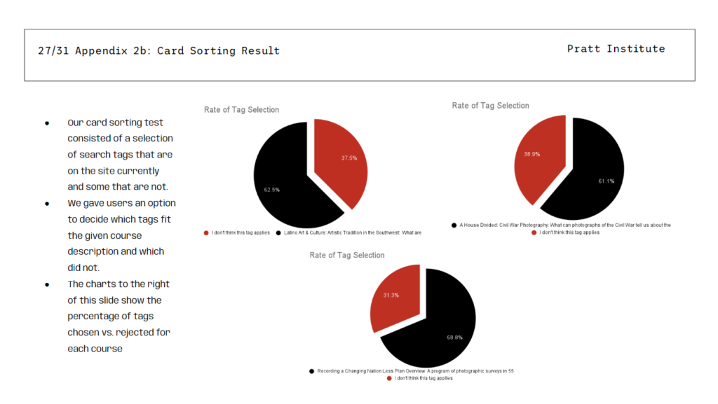
Having decided to implement the card sorting exercise in our test, we divided the work amongst ourselves; Ziqi and Mehika developed the script we would use for our search test, while Cici and I developed the card sorting exercise. During this time Angela was sick with covid so we wanted her to rest. Once we had access to the prototype search engine and metadata we wanted to find a way to use the full metadata in our test. What we decided to do was pick three tags that were not present in the current prototype and include them in our card sorting exercise, this way we could get a read on what tags users would associate with different course descriptions.
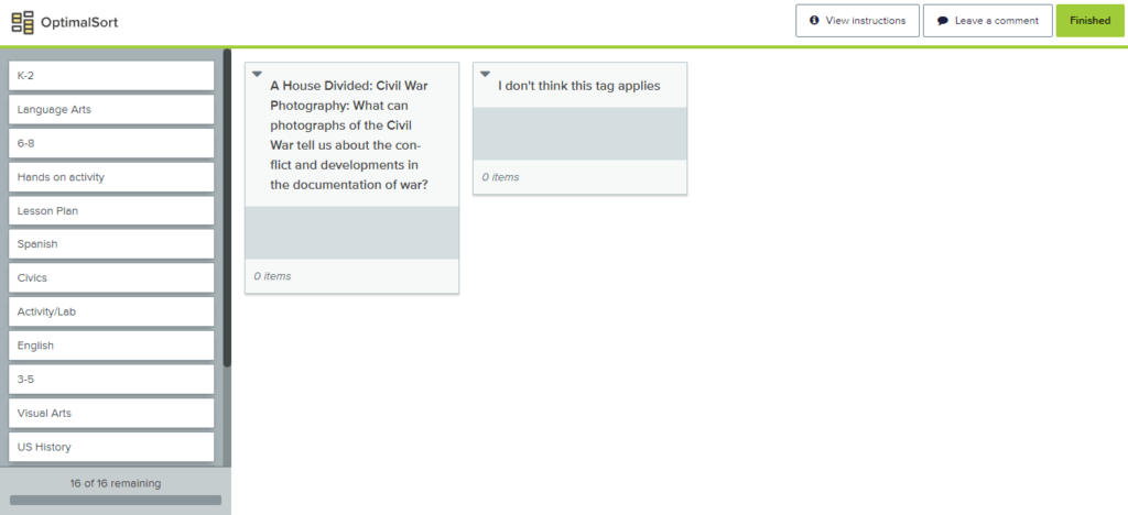
Our completed card sort consists of an array of tags pulled from the metadata and from the prototype website with two boxes provided, one for tags they think fit the provided course description and one for tags they think don’t fit the provided course description. We found some of the course descriptions to be long and unwieldy, so we attempted to shorten them where possible. If users asked however, we had the full descriptions on hand to read to them just in case. We decided on three different course descriptions for the exercise and let each moderator pick from them at random.
In the completed script, the card sorting makes up tasks 1 & 2 with the option for users to only do one card sort and move on to the search exercise depending on how much time they had available to commit to our test. Our search exercise asked users to find course content we described to them on the search engine prototype using only the filter options below the search bar.
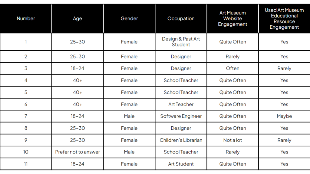
With the test compiled, we sent our screening questionnaire out and got about 15 responses back. Mehika compiled a very helpful spreadsheet for us to schedule interviews and Angela took charge of most of the client communications. In total, our team conducted 11 interviews, 4 of which were educators, SAAM’s primary audience for this test. I was able to schedule one in-person interview and one over Zoom.
Results:
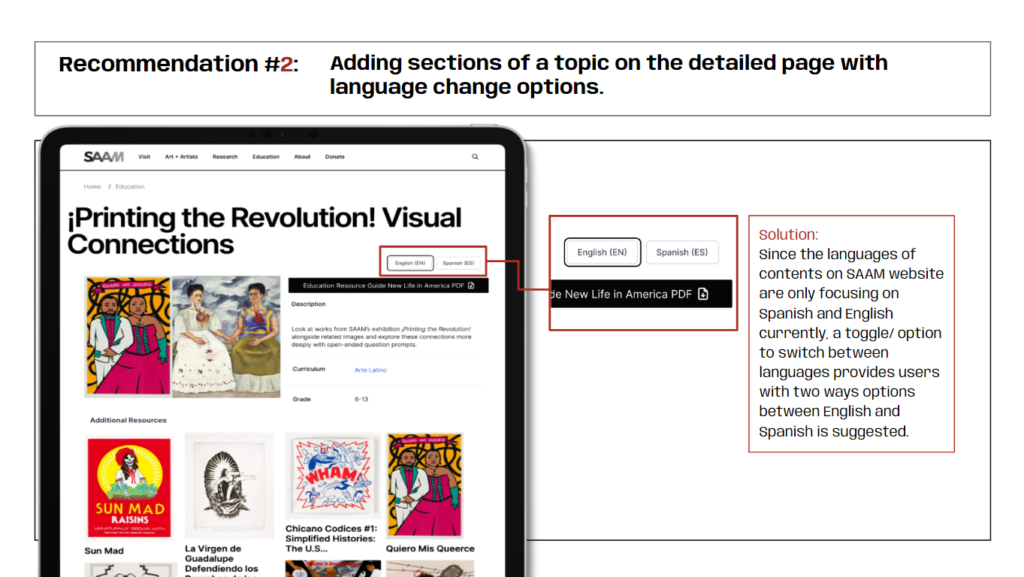
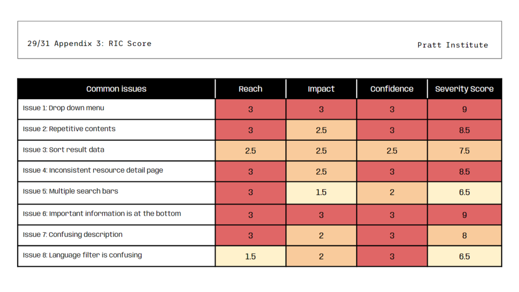
After conducting our interviews we compiled our results into a spreadsheet and discussed them together over Zoom. We were able to compile all of our testing results into 8 recommendations that you can see in our presentation here.
I believe our strongest recommendations were Issues 2 and 4 as most of our group members encountered these problems in their tests.
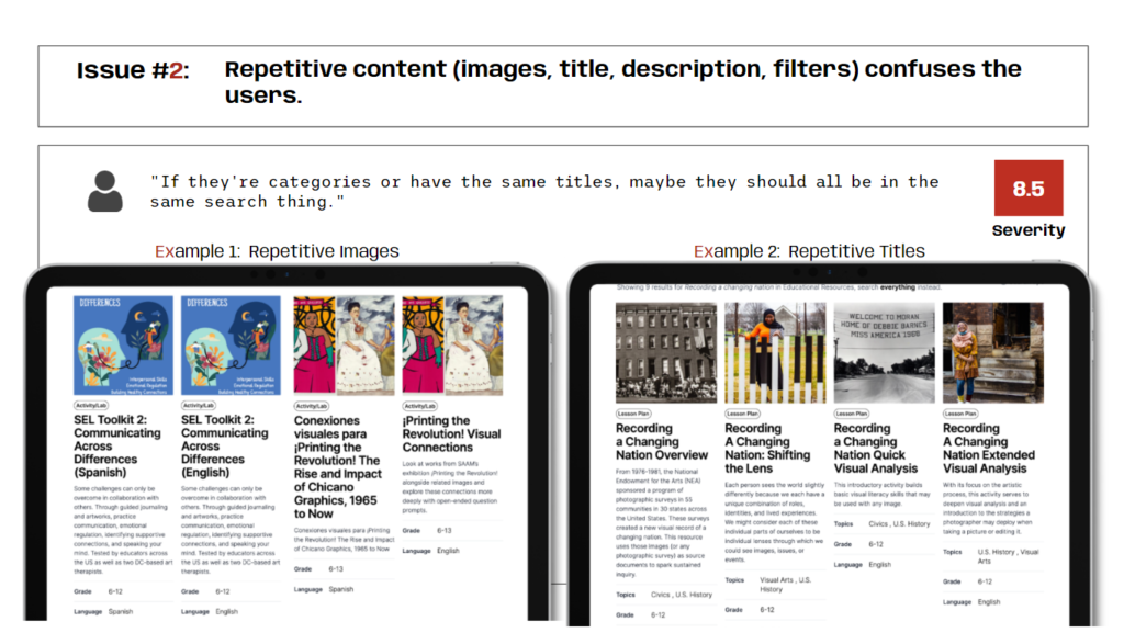
Issue 2 was a problem for users because they would have to read the same course title several times for each individual section of a single educational resource. In my interviews I asked my users to find Recording a Changing Nation: Overview, but neither of them were able to find the exact section due to the overwhelming number of instances of that title in the results.
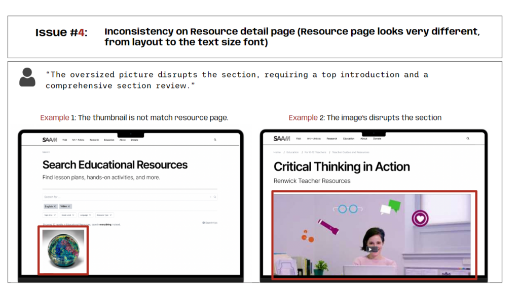
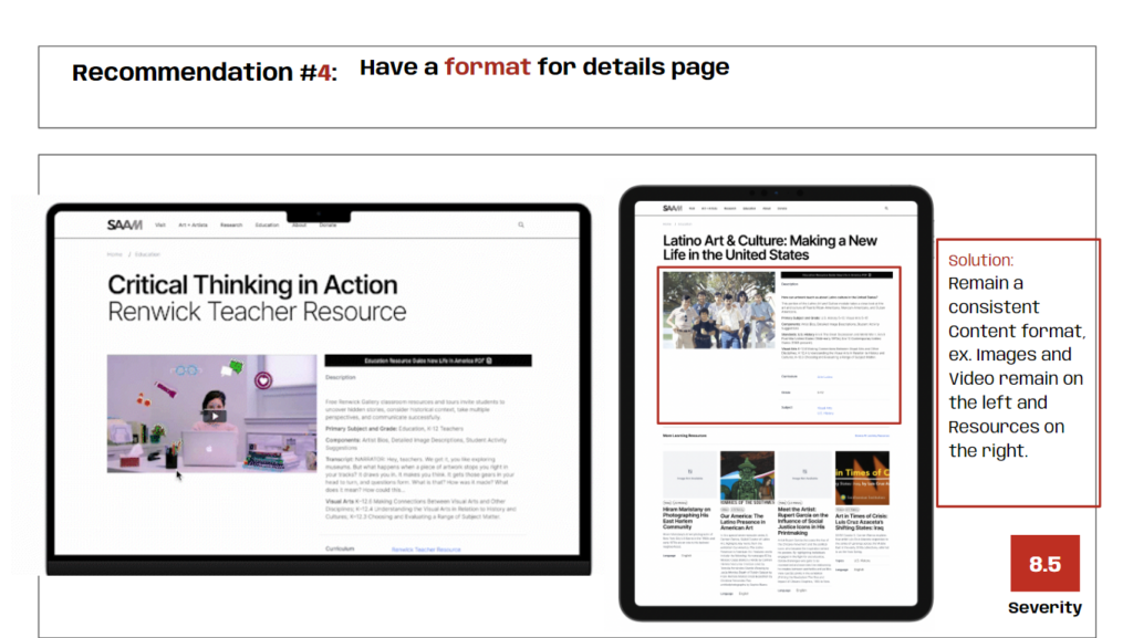
Issue 4 was a problem for users because they expected to find the same organizational structure within all the educational materials. Homogenizing the contents of the course page alleviates the chance for confusion when browsing multiple items as well as places the important information up front for easy access without scrolling.
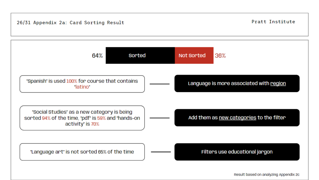
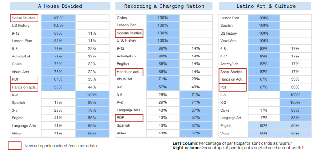
My focus for work on the presentation was the appendix where we got the chance to talk about our process and the data we collected. Ziqi and I collected the data from all three card sorts into a single spreadsheet from which we made visualizations to show the rate of tag selection among our users. Optimalsort also has a ‘Popular Placements Matrix’ which allowed us to easily see which specific tags were getting the most use. In the presentation we highlighted those tags with red boxes. In the appendix we also talked about our RIC scoring chart and the process we used to synthesize our recommendations.
Presentation Delivery and Conclusion:
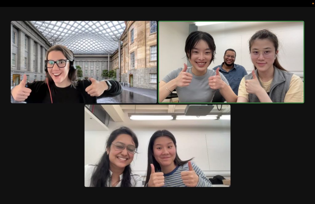
After the work of figuring out and designing the user tests, delivering them, and examining the results, delivering the presentation felt like an exhale. I think this is in large part thanks to the easygoing attitude and demeanor of Alex, our client for this project. She was easy to talk to and seemed at least as proud of our work as we were, if not more. This made it easy on us to deliver our recommendations and to talk more in-depth about them in the conversation following the formal presentation. In terms of feedback, what we got from Alex was mostly granular details about the presentation itself and less about the recommendations themselves. She expressed that many of our recommendations were in line with ideas she had wanted to implement but had trouble convincing others within the development team, and was excited to have a concrete product and user testing to bolster her arguments.
If we were to continue working on this project, I would like to interview more educators. The main reason we got so few was due to the time constraints of the semester; by the time we got in contact with a source connected to the education community, we were running out of time and decided to push forward with the users who had already responded to our query. It would also be nice to further distribute the card sorting exercises, with or without moderation, as it could only make our claims based on that data more reliable.
I think the biggest lesson I learned from this project was that it’s so much easier to work when you can make it fun. I’ve noticed in hindsight that the times when it was the hardest to fill a page or come up with an idea were the times where I was really stressed about the quality of my contributions or our recommendations. Alex and the rest of my team really helped shake me out of the rigid, formal style I learned to get through work in the air force and I think I am truly better for it.