Introduction
The Smithsonian American Art Museum (SAAM) is a renowned museum that boasts an extensive collection of American art, spanning from the colonial period to contemporary times. As part of its mission to educate, inspire, and engage its audience, the museum constantly strives to improve not only its visitor experience but also users of their online resources, specifically target to art educator in our project. To this end, SAAM has tasked our Pratt student team with conducting a usability evaluation of its website, with the goal of identifying areas where the website can be improved to better meet the needs of its users. The evaluation will focus on various aspects of the website, including, layout, content, and information architecture, etc. By conducting this evaluation, our team aims to provide SAAM with actionable insights and recommendations that can be used to enhance the overall usability and user experience of its website, and ultimately, help the museum achieve its mission of providing a better accessibility of resources for art educators.
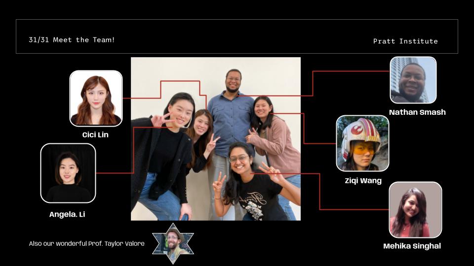
Our Team
Part. I: Client Prep
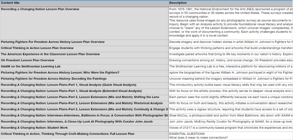
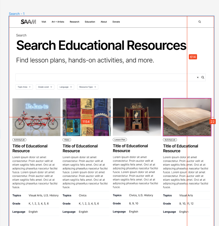
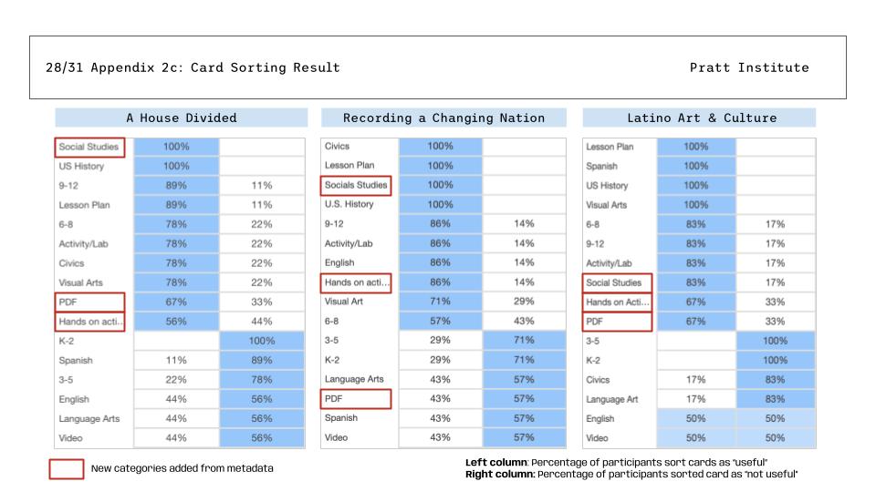
After the first kick-off meeting and follow-up communications we received several resources from our client, including, labels database in a excel spreadsheet and two types of prototypes(website/Figma) they were used as a basis for our evaluation. We conducted our study using a variety of methods, including survey, card sorting test, moderated users interview, and RICE(the “E”, estimate, wasn’t included in this study) scoring to gather data and insights on various aspects of the website’s usability and user experience.
Part. II: User Targeting
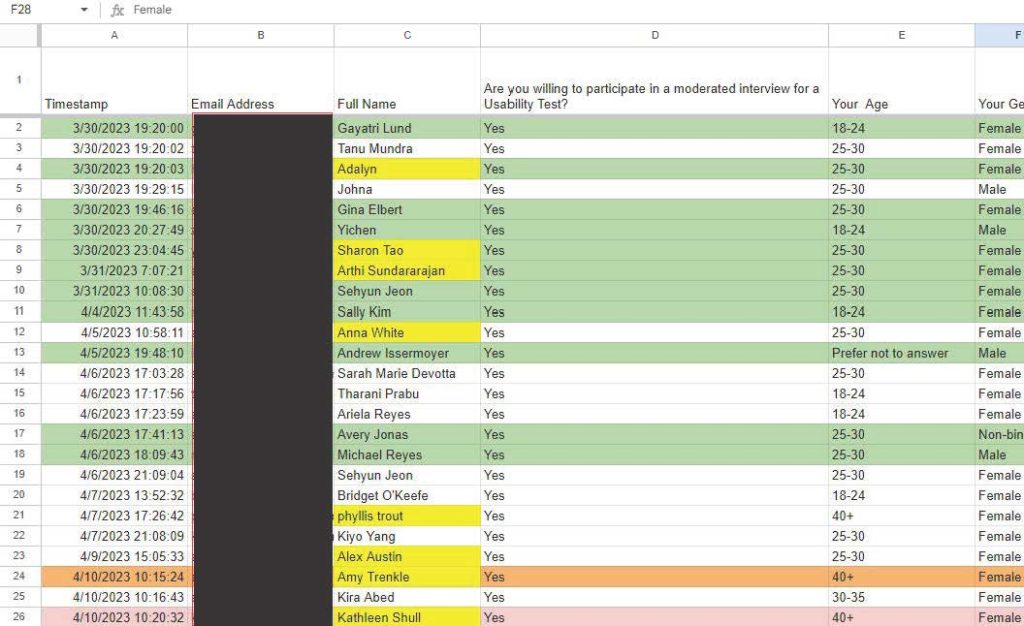
To ensure that our study is effective, our team went through a comprehensive process of user targeting. This involved identifying the different types of users, which include, educators, workers and students in the art sector, and also people who are out side of the industry as well. We created a series of screening survey to helps us to recruit participants for our usability testing sessions, ensuring that we had a diverse and representative sample of users who would be able to provide valuable feedback on the website’s usability and user experience.
Part. III: User Tasks
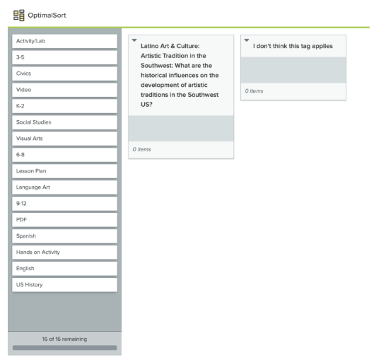
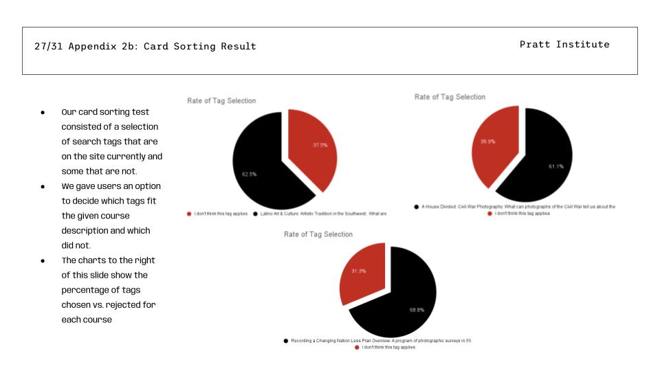
To meet our client’s needs we conducted both moderated card sorting test, supported by Optimal Workshop and moderated users interviews, each of our teammates conducted 2-3 interviews in a total of 11 moderated tests. During the interview there are a total of four tasks and interviewees are first asked to completed the two of the three card sorting test and following with a series of designated tasks related to different topics(randomly selected by interviewer) on SAAM Educational Resource Search Page by only using their filter function. For more info please check out our user interview script.
Part. IV: User Evaluation Analysis
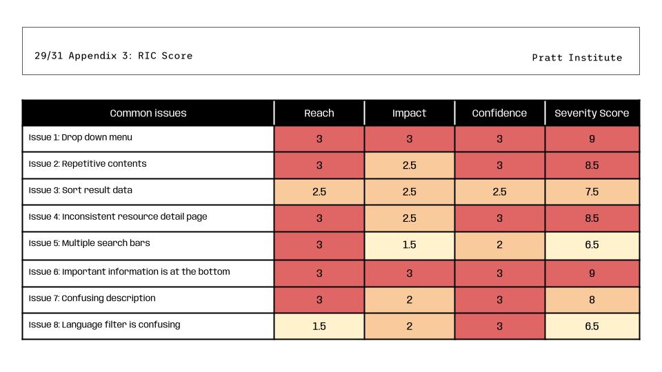
Interviews were conducted separately by each teammates and recorded in the interview notes and conclusion spreadsheets individually . Later on, with group discussions to indicate the issues and their severity levels by using the rice score.
Part. V: Highlighted Issues & Recommendations
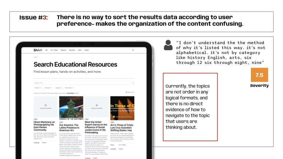
Issue#3: There is no way to sort the results data according to users preference makes the organization of the content confusing, is giving users a hard time to navigate to the designated topics is the non-ordering lists of topics in the educational search page, and during the interview users suggested us to add a sorting drop down selection, so they can navigate to the designated topic in a more logical and instinct way.
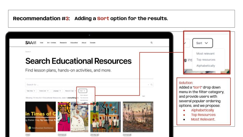
Recommendation#3: To solve the issue we added a sort drop down menu beside the current filter drop downs with several sorting options to remain the freedom of users to select their own way of navigation.
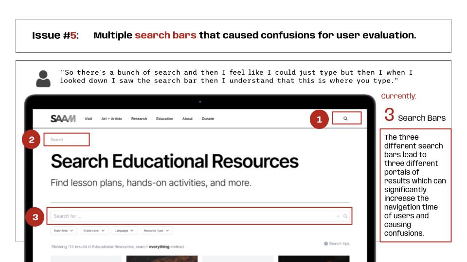
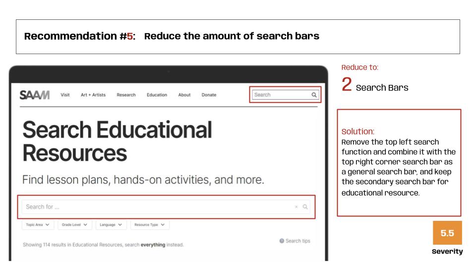
Issue#5: Multiple search bars that caused confusions for user evaluation. There are currently three place to search and even though we did not ask users to use any of the search bars, but they still spotted the issue and confused by what each search bar will lead them to, and on of my user even bought up that she though the “Search Educational Resources” heading is also a search bar because the whole heading was underlined with a line and her first instinct was that it is same design as other existing search bar where she saw from other website.
Recommendation#5: To fix this issue we simply reduce the number of search bars and take out the underline from the heading.
Part. VI: Add-ons Issues
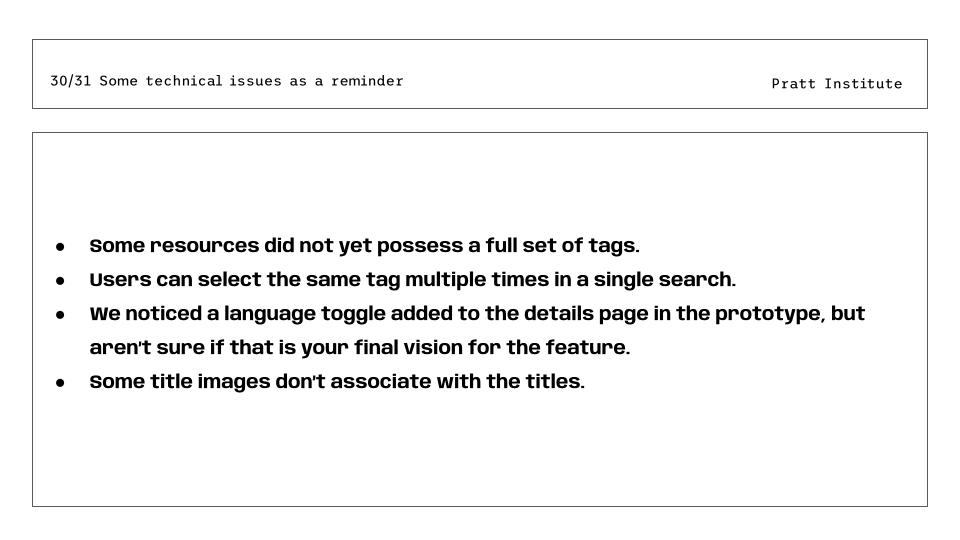
There are some other issues that we also spotted by we believe is some technical issues that SAAM might have realized already, and we should be proposing them as issues in our usability recommendations.
Part. VII: Final Presentation with Our Client
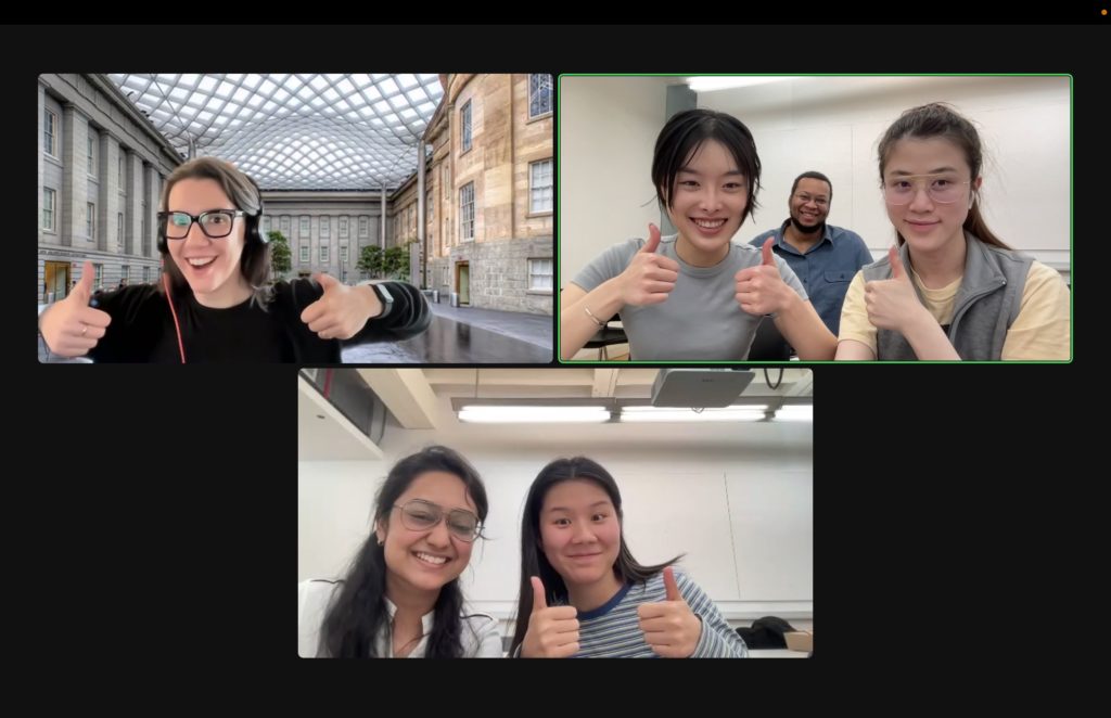
We proposed our final project to our client on May, 3rd, 2023, 4pm through zoom, and according to Alex’s feedback we have successfully reach the expectation of SAAM, and she loves the overall results and flow of our presentation, which has demonstrates the findings logically and easy to understandable. After our presentation we also have a discussion toward some of the recommendations, where some of the them had already spotted out by SAAM team, and she is glad that we have the similar vision toward the development of their website, and they really appreciated the efforts we have put in the project. Moreover, Alex has also indicate a few of the small issues and gives us suggestions of where we can do better, for instance, some grammar and formats problems. Overall, it was a great experience working with SAAM and Alex, which has motivated me to learn more and produce a better team works with my group, and special thanks to my professor, Taylor, who has answered soo many questions and support us through out the project.