Overview
We were approached by the Smithsonian Institution Traveling Exhibition Service (SITES) to conduct a usability evaluation of their site with a goal of generating more leads for their organization. We conducted a series of moderated usability tests with ten participants we recruited through Pratt’s listserv as well as outreach to former clients of SITES. In total, we did ten interviews (nine virtually), wrote up user problems, and identified critical site issues according to the RIC(E) framework.

Through our research we identified three key areas for improvement with the site and made recommendations based on usability best practices:
- Remove the login gate from the site and provide the information to the user up front. Additionally, move the request for user information to the Schedule Call button via a Calendly integration.
- Simplify the exhibition discovery process by making the search filter more user-friendly and moving the tour schedule from an isolated, separate page to the main exhibit page.
- Reduce the overall number of CTAs on the exhibit page and eliminate insider jargon that may not be clear to all users.
Research Process
The key goal for SITES’ website was to generate more leads for their traveling exhibitions program. With that in mind, we requested Google Analytics data from them to ensure some of our basic assumptions were correct (e.g., are most SITES users on a desktop vs mobile?), and ran a competitive analysis to see how some of their peers were handling similar problems.

We designed the study to target users with experience working in museums or similar arts organizations, working with the client to make sure we had a reasonable number of people who booked traveling exhibitions to make the sample representative.
We designed our scenario and tasks to fit the lead generation user journey, asking participants to imagine that they were trying to find an exhibit they may want to bring to their museum.
Scenario: “You’re at the very beginning stage of your research, so you’re looking for something that would interest your patrons while keeping the practical aspects of your space and budget in mind. You aren’t set on a date yet either.”
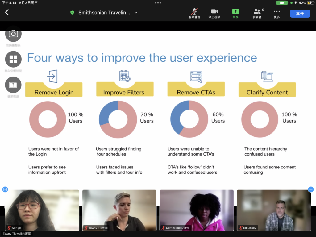
Through these user interviews, we learned about three significant issues users faced in attempting to find and book an exhibit with SITES:

These issues were identified by giving all user problems a RIC score, and aggregating the severe results.
Recommendations
After identifying the main issues with the exhibition booking journey, we developed recommendations to bring the site into better alignment with user expectations.
Recommendation #1: Remove the login and add a Calendly integration for call scheduling
SITES requires users to create a login in order to access much of the relevant information on their website. The process can take 1-2 days, as it requires a manual confirmation. By removing the login, the organization can eliminate the single biggest hurdle users have in accessing the information they want to see. Users will be able to explore exhibits and come to a full understanding of what is available in their price range for their exhibition room size without friction.
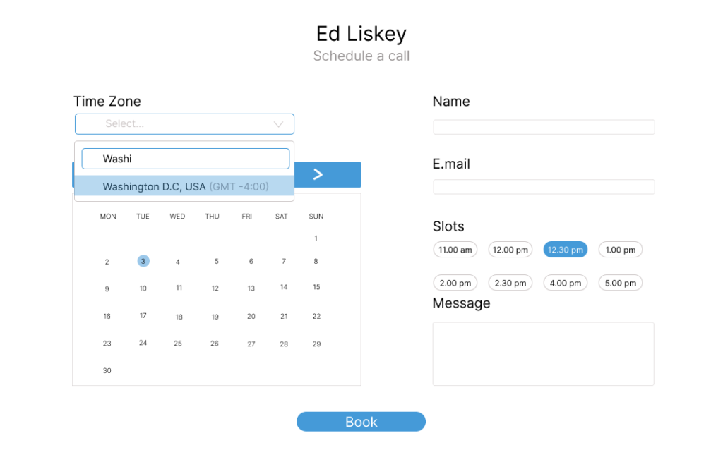
Once the user has settled on an exhibit, they can reach out to someone at SITES via their Calendly scheduler. The scheduler captures name and email, which allows the SITES team to accomplish their lead generation goal via a call to action that is a much less arduous ask of the user:

Recommendation #2: Improve the site navigation by making the filter function more useful

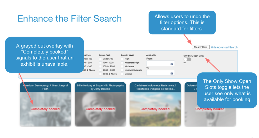
By making the exhibition search filter more useful, navigation of the site is greatly enhanced. Our recommendations for improvement include clearly marking sold out exhibits as completely booked by graying out and labeling their tiles, adding a toggle so that users can view only exhibits that are available, and adding a clear filters button.
Recommendation #3: Make the exhibit page easier to digest and a one-stop shop for the user
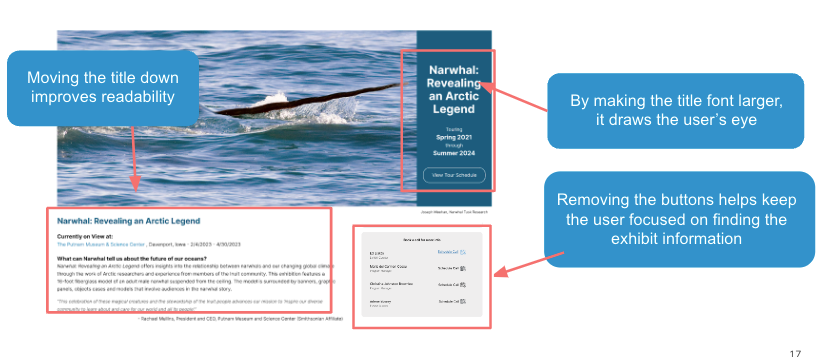
Enhancing the content hierarchy with better font choices and fewer unnecessary CTAs helps keep the user focused on the exhibition content. Moving the tour schedule to the exhibition page also reduces back and forth clicking or the chance they get lost and abandon the exploration. Moving the exhibition title down improves readability and helps ground the user in the content.

Concluding the Project

We presented our findings to the SITES team in a video call. They were effusive about the quality of the findings, and excited to try to implement some of them. Two different members of their team said these findings confirmed some feelings they had about the site, and that they hoped to use our deck to help convince leadership of needed changes.
They also gave us some helpful feedback about not using terminology like “CTAs” with lay audiences, which I’ll be incorporating in future projects with Pratt.