Method: Moderated User Testing
Team Members: Alicia Ritchie, Karan Vora, Keyi Zhang, Yiying Zhou
Client: The Norman Sicily Project
Introduction
The Norman Sicily Project, founded by the client, contained history about the Norman Rulers and its lineage in Sicily. The client experienced extensive usability issues on the web interface that participants gave feedback on during the User Moderated Testing. Conducting this test helped the client gain feedback on the usability issues and how to improve the overall interface for better results. My role within the team was to demonstrate user moderated testing with two participants interested in Sicilian history. Each participant weregiven tasks to complete to test the usability issues on the website by thinking out loud. This feedback was used to analyze the data amongst the other participants my team members Karan Vora, Keyi Zhang, Yiying Zhou had conducted to determine the specific problems. Additionally, I wrote the problem and recommendations for the “people” page on the website. Overall, improving the search specificity for users.
- User Moderated Testing on The Norman Sicily Project.
- Stated usability problems and feedback on the people page.
- Conducted User Moderated Testing with two participants that were assigned three tasks about The Norman Sicily Project.
Client (The Norman Sicily Project)
Founders of The Norman Sicily Project, Dawn Marie Hayes, and Joseph Hayes created a prototype of the web interface that promotes historical and cultural heritage knowledge of Sicily during the Norman period. Scholars, educators, and the general public are audiences for this platform. The interface focuses on Sicily; it provides a model for scholars working on other chronological eras and locations and those that are unable to access resources for significant cultural conversations. It provides new interpretations of the complex society and understandings digitally. During the kick-off meeting the client mentioned their interests, which were making the website user-friendly and the reorganization of the website. The client stated it should be more concise for multiple audiences. These were the immediate concerns and priorities for the project.
Participants
The User Moderated Testing consisted of two participants for each team member. Participant A was a student based in the Netherlands studying history. Participant B was a researcher based in the United States. Both of the participants had a strong interest in The Norman Sicily Project and provided accurate feedback for the client while completing the tasks. Participant A was very thorough while completing tasks, which helped gather lots of information. The participant mentioned issues beyond the scope of the usability task, which I still took into consideration for my own research and overall issues of the website. However, Participant B had networking issues throughout the session, which caused inconsistencies for the tasks and results. It was not as precise as Participant A. I learned throughout the testing to be prepared for unexpected networking issues, because it can overall impact the feedback. Due to this, I did my due diligence of asking a series of questions of what could have been improved and what were the problem areas the participant noticed for more data and feedback. Though the feedback was not like Participant A, the client had mentioned in the kick-off meeting about the loading issues, which Participant B experienced during the session. I had informed both participants their feedback would be taken into consideration for the study. Additionally, both participants stated positive feedback stating what they liked, as well as the information provided on the website and layout were good. However, users would find it difficult to navigate the site overall if they weren’t familiar with it.
The Process
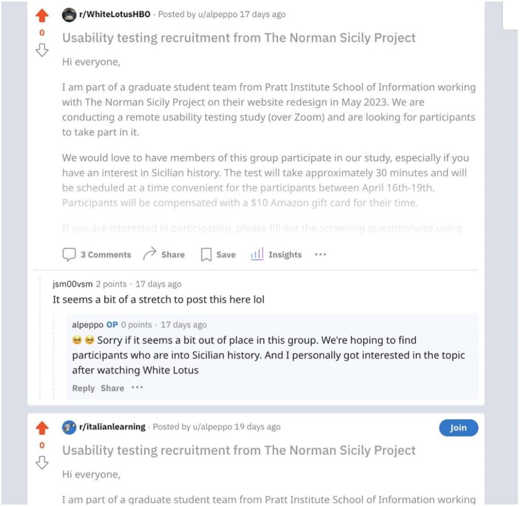
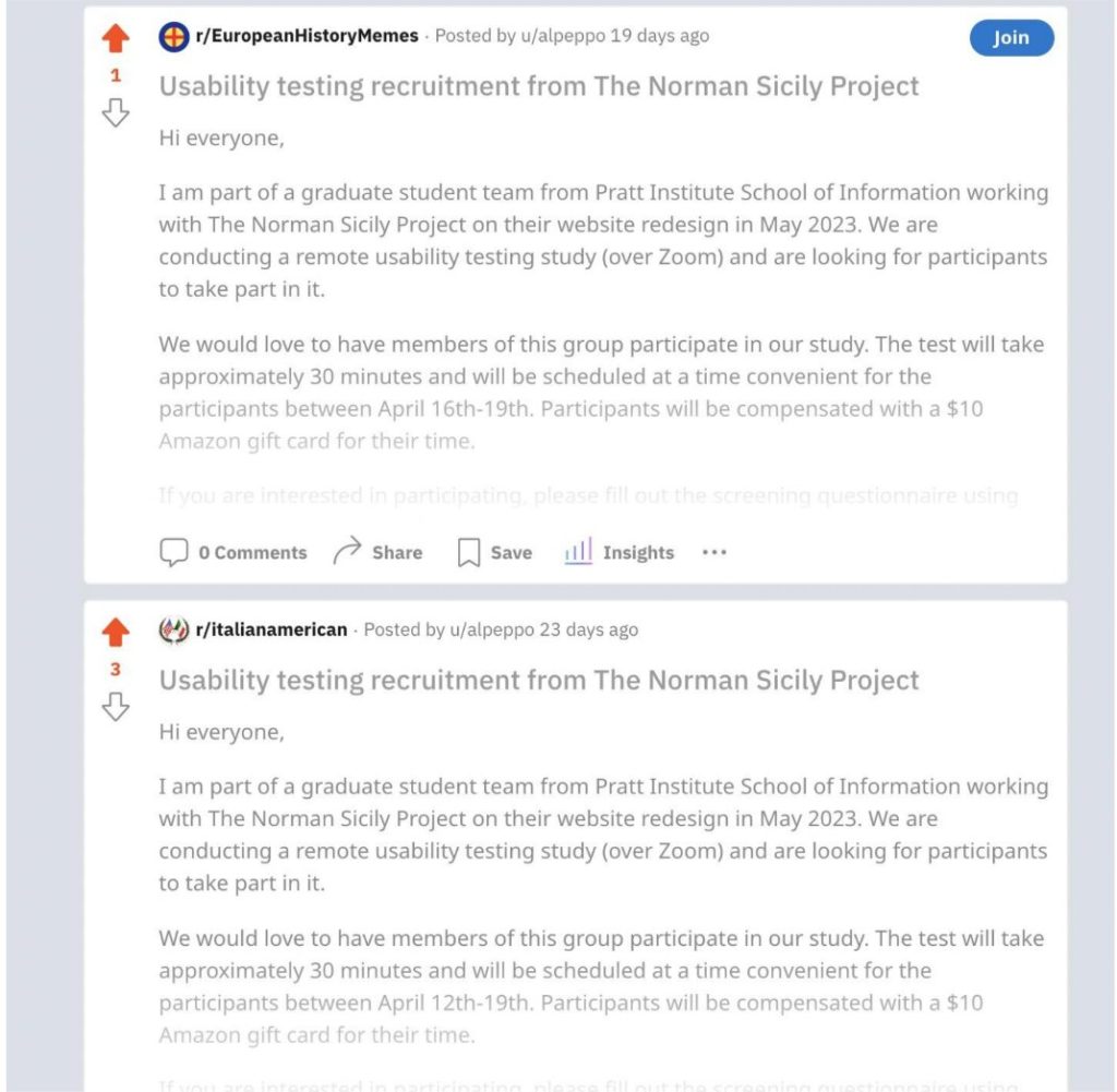
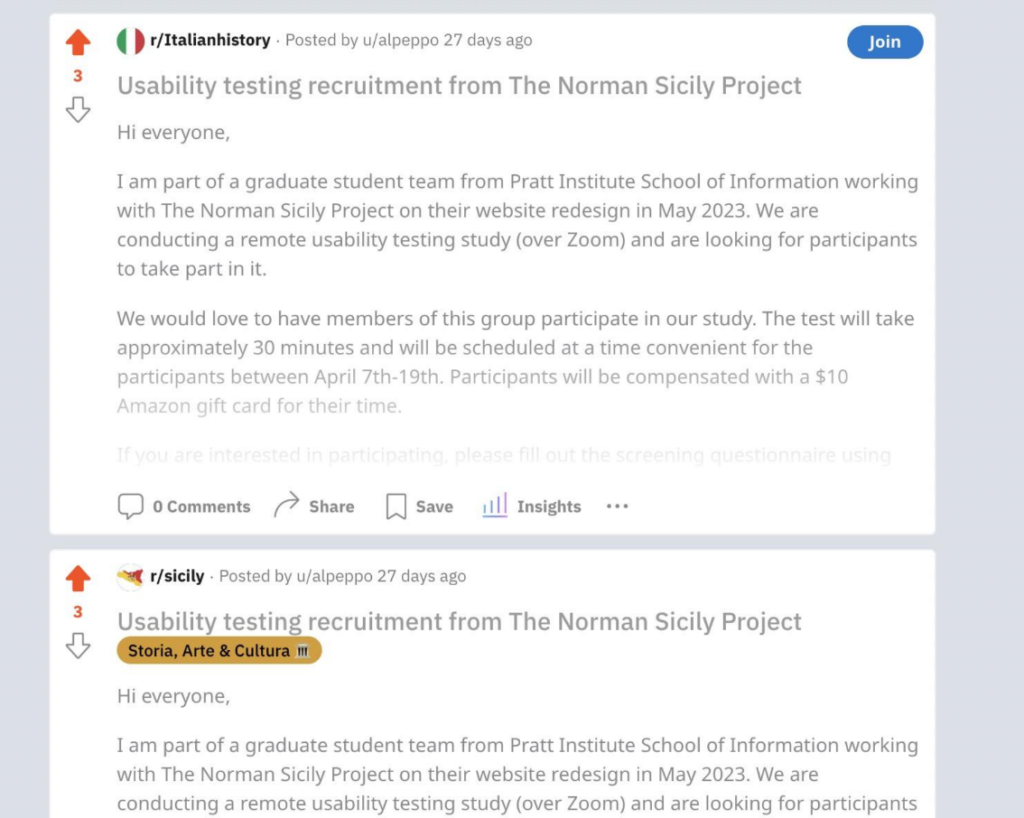
After the kick-off meeting with the client the recruitment was done for participants that would be representative of The Norman Sicily Project. The goal was to keep the participants as close as the current audience, such as scholars, students, researchers and the general public. There were eight participants that participated in the user testing. The recruitment process was conducted on Reddit. After the team gathered the participants, we were able to send each participant a screening questionnaire to their provided emails. We gathered specific data before moving to the next step. The participants were divided amongst the team. I chose two participants I wanted to conduct the user testing with and scheduled a Calendly invite for each participant to participate in the User Moderated Testing. After each participant had accepted, I sent out consent forms that provided information about the user testing and description of the study. The user testing was conducted for 30 minutes for each participant that was recorded for data analysis on Zoom. The team created polls that popped up on the participants screen after each task, which was the post-task questionnaire. The participants were able to rank their task experience. After the post-task questionnaire was done I followed up with additional questions about the tasks and what was difficult or not. I read from a moderator’s script that included the scenario and tasks throughout the session. The goal was to ensure each participant talked out loud. After the session had ended each participant received an Amazon Gift Card link thanking them for their participation.
Reddit Recruitment
Post-Task Questionnaire
How easy was it to complete the task?
- Very Difficult
- Difficult
- Neither Easy nor Difficult
- Easy
- Very Easy
Were you able to find the necessary information to complete the task?
- No, I couldn’t find it
- Yes, but it took a lot of time and effort
- Yes, it was easy to find
Were the steps to complete the task clear and easy to understand?
- No, they were confusing
- Somewhat, but I had to figure some things out on my own
- Yes, they were clear and easy to understand
How satisfied are you with your overall experience completing this task?
- Very Unsatisfied
- Unsatisfied
- Neutral
- Satisfied
- Very Satisfied
Scenario
Imagine you are writing a research paper about Norman Sicily. You want to gain a deeper understanding of the Monasteries of Norman Sicily and their Greater Network, as well as the Norman Rulers of Sicily and their Family Networks from the website http://normansicily.org/en/home/.
Tasks
Task 1: You wish to know the name of the Mother and the Children of King Roger I of Hauteville.
Task 2: You are searching for Saint Mary of Novara, a medieval church that was acquired by the Benedictine community. Your goal is to obtain the precise latitude and longitude coordinates of the church’s location.
Task 3: Go back to the homepage. Imagine you are interested in pictures of Churches around Sicily and want to download a photo of a specific one called “Chiesa Bizantina” for your research. Please show me how you would go about this.
Results
For the people page the problems identified by the participants were:
- Excessive clutter and large amounts of text and information on the graph.
- Locations of the functions and the interactions on the graph.
People Page Problem
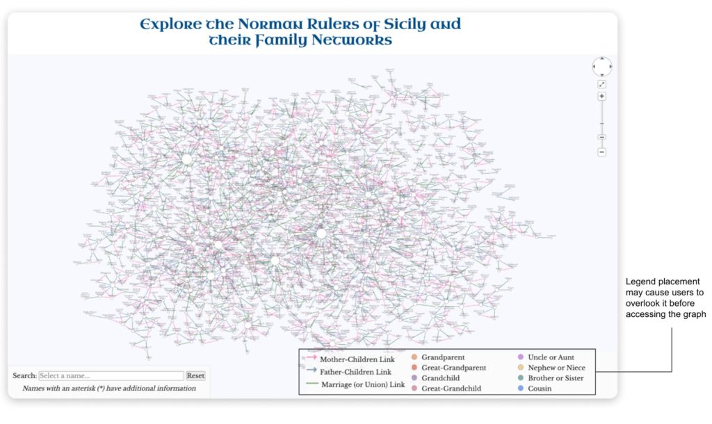
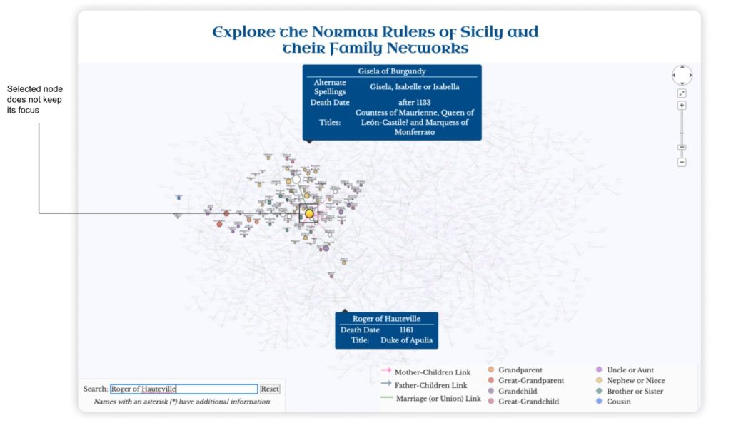
The graph was difficult to navigate due to the clutter of nodes and information. The legend was not noticed by the participants. Participants went to the search bar to begin the search without understanding the correlation. After noticing the legend the participants expected it to be interactive, due to the information on the graph. Additionally, the location of the search bar was not in a great place on the graph. The participants felt it wasn’t visible at the bottom corner of the graph. As well as the active nodes losing focus when the cursor was moved onto another area of the graph. Overall, the participants felt it was complicated getting back to their designated search. In terms of product performance Participant A wasn’t able to complete the task though the participant knew what to do, but the excessive information prevented it being a success. Participant B was unable to complete the task due to loading issues.
People Page Recommendations
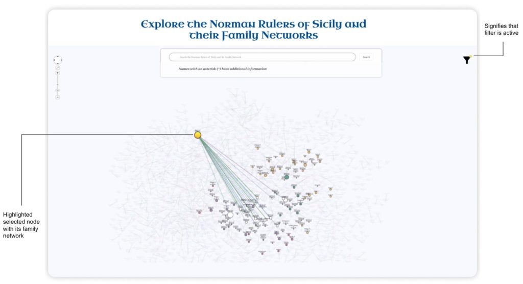
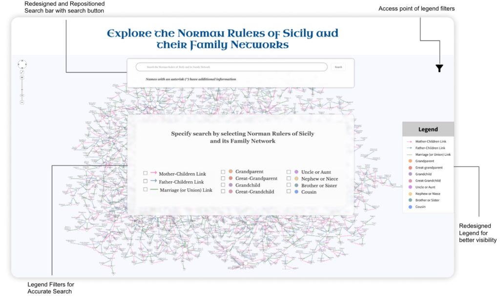
The first recommendation was to redesign the location of the search bar to increase the visibility. I decided to make the search bar much bigger, therefore users are able to accurately search. The search bar would be at the top of the page instead of integrating it with the legend. The second recommendation was to remove the legend from the bottom and integrate it into a filter icon to reduce the clutter on the page. For better visibility the legend would be interactive and will be featured as a pop up display, which will include filters to enhance specificity about the Norman Rulers and its families. The side of the page will feature the legend, increasing more visibility for the user. Thirdly, to fix the active node issue, when a user selects a particular node on the graph it will remain active even if the cursor is moved. The selection of the node will gray out all other nodes that are not associated with the search. Lastly, when the nodes are dragged, the graph will actively connect to the Norman Rulers and its families network. Users will be notified when certain nodes are selected by a circle icon appearing by the filer icon.
The Norman Sicily Report
https://drive.google.com/file/d/10AekhQtrfh4FKAhmTzb7W0KgH8v6MTYN/view
The Norman Sicily Presentation
Conclusion
The overall final results presented to the client went really well. I gave positive feedback before stating the problems and recommendations. The client was in agreement with the problems the participants mentioned during the User Moderated Testing. The client acknowledged they were prepared for the problems because they knew where the website wasn’t performing the best. One of their recommendations during the kick-off meeting was to focus on the people page. There were no push backs for the recommendations. However, one feedback the client mentioned was the differentiation of UX designers and developers and how they differ. UX designers focus on the look and feel of the interface, while the developers make the design actually work. The client stated for the recommendations they would need strong developing assistance to bring the recommendations to life. Nevertheless, the client looks forward to implementing the recommendations in the near future to improve the usability and hopefully work with the team again. Overall, they appreciated the thoroughness of the testing.
Continuing the project, I would recommend fixing the overall layout. Though the participants commented on the layout it was referred to the homepage only. However, I think consolidating the information would make a difference. If I were to continue to work on the people page, I would make it more engaging for new users. Coming onto a new page can be daunting if the user is unfamiliar with how it functions. I would make everything very clear. Therefore there is no confusion.
The major lessons and takeaways of the project was communication. Communication with the client to ensure everyone is on the same page. The miscommunication caused a minor hurdle throughout the process. However, the team acted quickly to resolve the issue allowing me and my team members to feel great about the final product.
