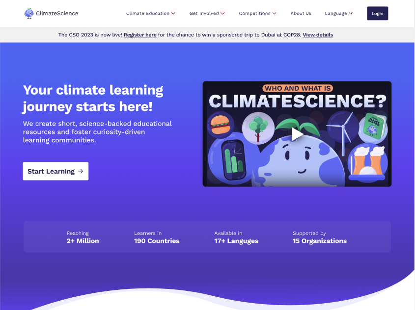
Project Overview
This website redesign effort for ClimateScience.org was the final project for the “Projects in IXD” course at Pratt Institute’s School of Information. The team members were Yang Cheng (’23), Samika Rastogi (’23), and Derek Frisicchio (’23). The redesign effort was advised by Professor Hasan Hachem. The team at ClimateScience.org was observed having issues with user retention through the online courses they offered on climate change and its effects on the planet. They also wanted their users to engage in mitigating the effects of climate change in an offline environment – which meant that a possible new product could be created.
The team worked with the client, ClimateScience.org, in an effort to create a coherent narrative for their users by connecting their three different products – Courses, Community, and Olympiad (an online challenge). At the end of 4 months, the design team created a new website design that genuinely connected the products together based on well-known methods for motivation.
Prototype Details
The full Figma prototype can be viewed here.
The full design can be viewed together here.
About ClimateScience.org
ClimateScience.org is a non-profit organization that hosts learning content and other miscellaneous resources related to climate change on an online website. The organization officially pitches itself as an educational tool that “drives the transition to a sustainable world.” The organization has three separate products that are hosted on their website – Courses (online, peer-reviewed learning courses and curriculums on climate change), Community (a discord channel hosted by internal team members), and Olympiad (a challenge that could qualify you to present at an international conference).
Our Process

Project Goals
The team at ClimateScience.org explained that they struggle with retaining users, especially in their Courses product. Most users were observed starting a course or chapter but never finishing it. They also realized that there were no cross-product users which led them to believe the website held no coherent narrative to connect their three products together. This knowledge influenced the design team to learn about natural motivation techniques to understand how to create a desirable, natural narrative that genuinely connects user needs to the right products at the right moment.
User Research
For the first 8 weeks of this project, the design team conducted several rounds of research in order to 1) develop a thorough understanding of human motivations in a learning environment, 2) learn how other UX systems connect different features, and 3) generate ideas on how to create a learning experience that would bring people back.
- In our literature review, we learned that humans are motivated to perform an action either through an outward influence or an internal desire. Motivation is also influenced when the individual is able to fulfill the primary psychological needs for autonomy, competency, and relatedness (Self-Determination Theory). In an educational setting, humans are driven and motivated to learn when the learning outcomes are perceived as valuable, attainable, and supportive.
- We conducted a technical analysis of the ClimateScience.org website along with a competitive analysis of other digital education systems like Duolingo and Coursera. The team was able to recognize that most of these educational systems have a rewards strategy that encourages their users to keep going in their learning habits. These systems also let the user personalize their learning experience based on each individual’s learning needs. The ClimateScience.org website did not contain a rewards strategy or a UX that affords students to find courses or chapters that are right for them.
- The design team reviewed data gathered from user interviews and usability testing that detailed how people may take action towards climate change and what usability issues could be found on the website. The user interviews showed us that although people can all agree on the same issue, climate change, each one mitigates it differently depending on how much time they can allocate. Our usability testing showed that the course content could not appeal to all individuals based on their learning expectations and preferred content to consume. It also seemed difficult for the participants to find other products from their origin point on the website due to the chosen nomenclature and lack of content placement.
- When generating an ecosystem map that was meant to visualize ClimateScience’s information system, the design team could also see that there were no connections between the products but there was obvious potential. So, we outlined where those potential connections should be based on the knowledge we’ve learned about human motivation.
Through these research efforts, the design team aligned on the following insights after an effort to triangulate all of the collected observations.
- People are motivated to pursue goals & outcomes that they believe they can successfully achieve.
- There’s no clear order on the ClimateScience website in which products an individual should engage with first or reasons why they should engage at first.
- People can be motivated to obtain their learning objectives by receiving rewards that intrinsically drive their learning behaviors and visualize their learning progressions.
- People are motivated to take action toward climate change, but their commitment to that action is influenced by their daily schedules and responsibilities.
Design Principles
After the design team generated the insights from the observations, it became clear to us how to redesign the ClimateScience website in a way that would meet business objectives and genuine user needs.
- ClimateScience needs an intrinsic rewards system to help students track and drive their learning progression.
- Make ClimateScience online courses the space for people to connect.
- Develop a hub where people can use the knowledge they learned to take action on climate change.
- Inform the individuals about the learning outcomes of each course prior to their course registration.
- Develop a UX that aligns with an individual’s commitment to learning.
The following section is meant to detail the specific choices of the redesign, key flows, information architecture, and content.
Genuinely, Flexible Key Flows
Those who experience the current ClimateScience website will be met with deadends after engaging with a certain product offering. There is no natural connection to other products that would encourage individuals to stay longer. The key flows need to mold to the individual’s learning goals at the start of their journey and throughout it. They need to be flexible.
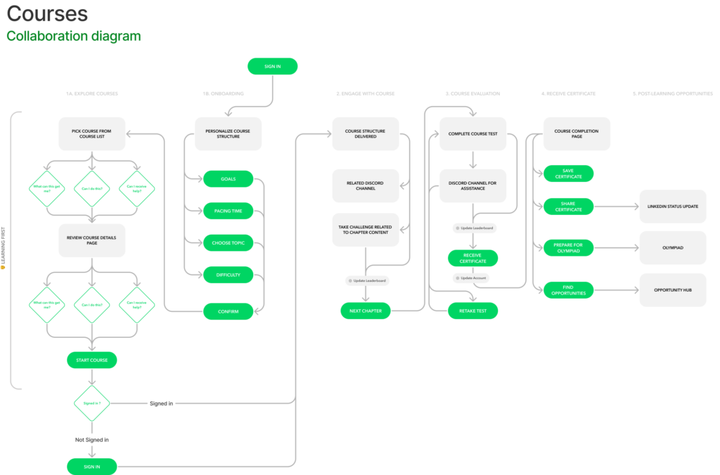
In this flow, we assume an individual’s main goal is to learn about climate change through the Courses product. During their course decisions, the new UX should present what kinds of value each course can offer. If the individual is too indecisive, they can provide details on their learning capacities to ClimateScience so the website can suggest course content easier. Throughout the course, the UX should present touch-points to the Community product which will afford an individual to feel supported in their learning journey. At the end of their course, the UX will present them with an award along with a list of suggestions on what to do next based on the learning outcomes they’ve achieved. It’s at this endpoint where we believe introducing Olympiad and an Action Hub (offline climate change engagement opportunities) will create this coherent narrative to connect products and retain individuals.
A Warm Welcome Just For You: Courses Homepage
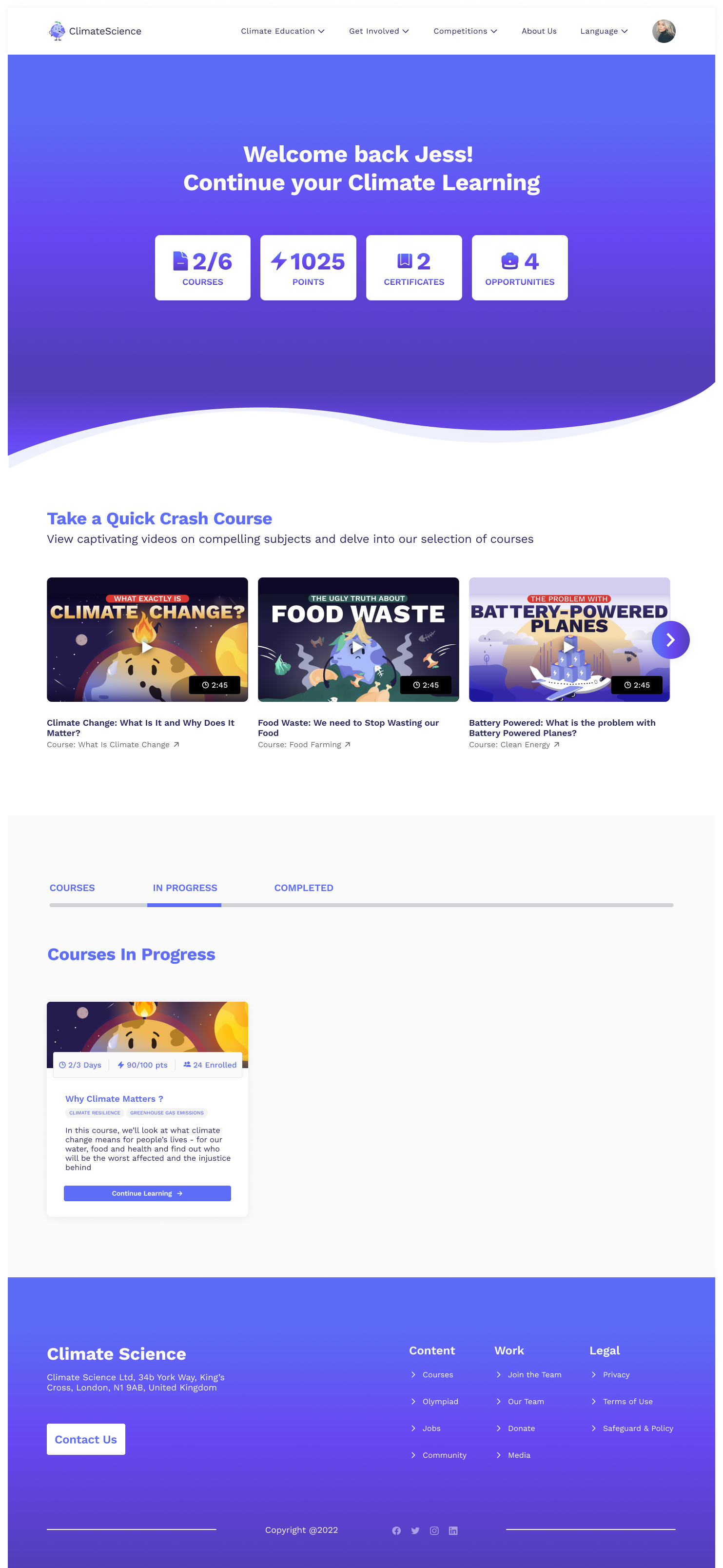
The first touchpoint into the Courses product is the Courses homepage. It needs to recognize if you’re new or a returning individual looking to progress on registered courses. The current ClimateScience website was unable to recognize if someone has completed or their progress on a particular chapter or course. In response, the design team created a separate homepage for returning individuals. This new experience will continue welcoming the individual back to their ClimateScience journey and let them pick up right where they left off.
Reading Between The Lines: Course Thumbnail & Descriptions Page
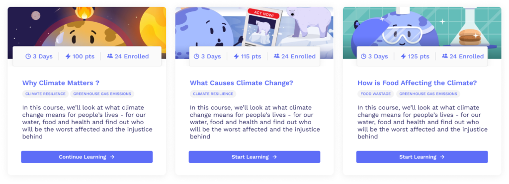
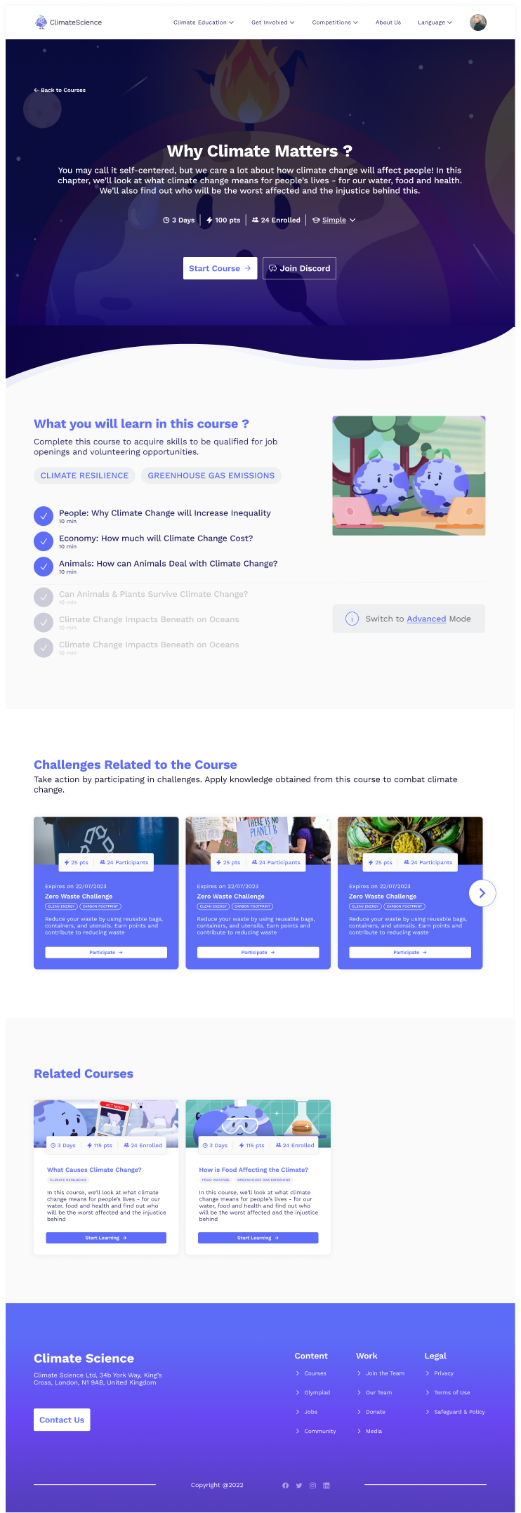
The design team created a new course thumbnail that shows the most important learning outcomes and commitment suggestions of each course. This element on a website is the first one an individual will use when trying to determine what learning journey to embark on. If they want to go further, the individual will be delivered to a new course details page, which was lacking on the original website. This is where the individual will be able to truly confirm if a course or chapter is the best to engage with based on their unique learning outcomes. It will also suggest opportunities that an individual can do offline successfully when the course is completed.
Opportunities To Change The World Offline: Challenges & The Action Hub
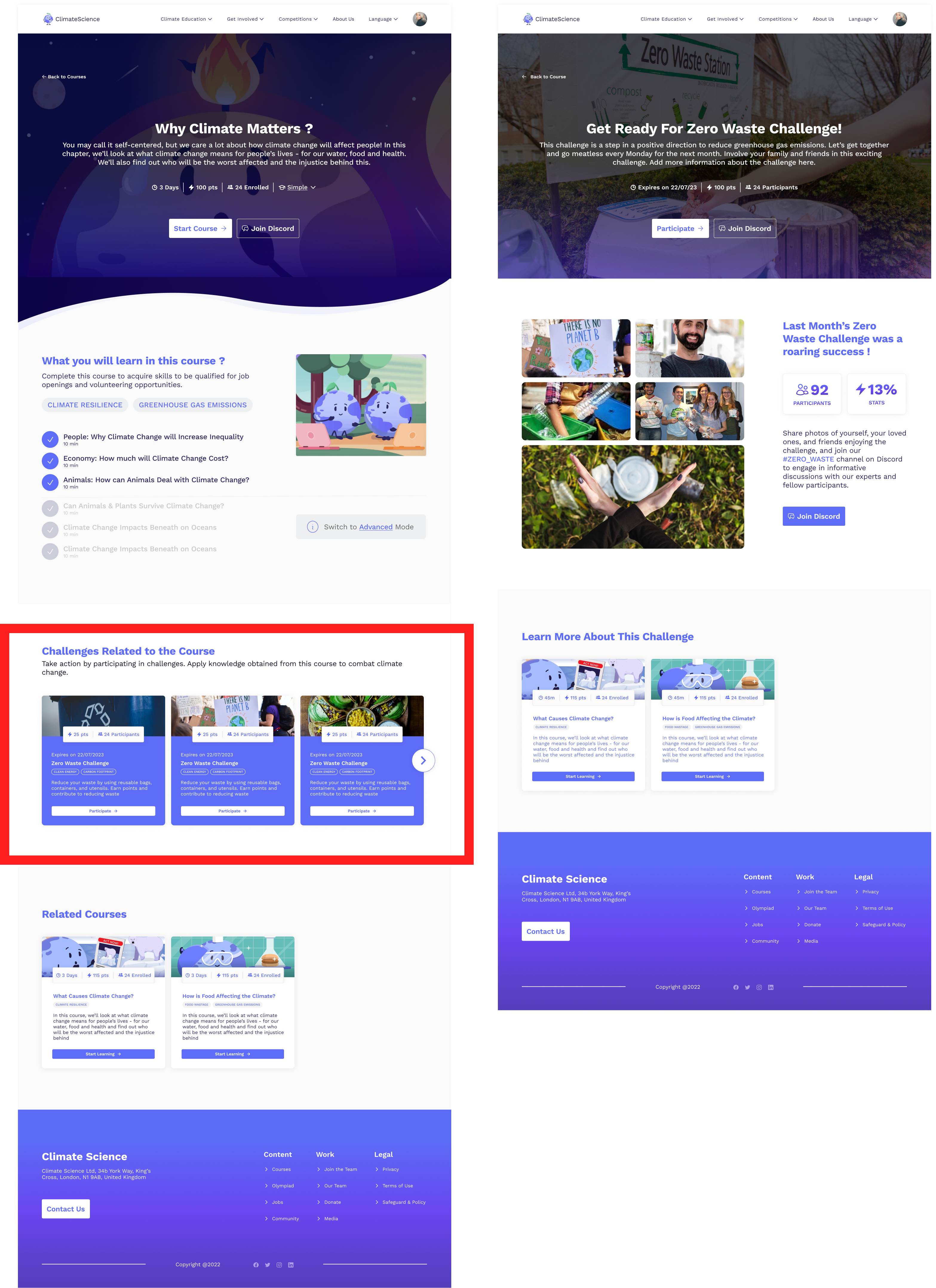
Climate change mitigation is unanimous – everyone believes we need to change. For each individual, change might be different depending on their regular schedule and responsibilities. So, commitment towards mitigating climate change will always remain different. Therefore, our design team created the ClimateChallenges and Action Hub to motivate individuals to take action off of the website. We paid particular attention to how these should be placed – each thumbnail to a challenge or volunteer opportunity would be shown depending on efforts within the online journey.
Since ClimateChallenges could be done with ease and on an individual’s own time, they were placed on the new Course details page. It’s at this point where a course hasn’t started yet so an individual’s commitment level to learning and mitigating climate change may be low. When the individual clicks on the ClimateChallenge thumbnail, they are redirected to a dedicated page about the challenge. Here, they can explore more details about the challenge, how to participate, and who is participating.
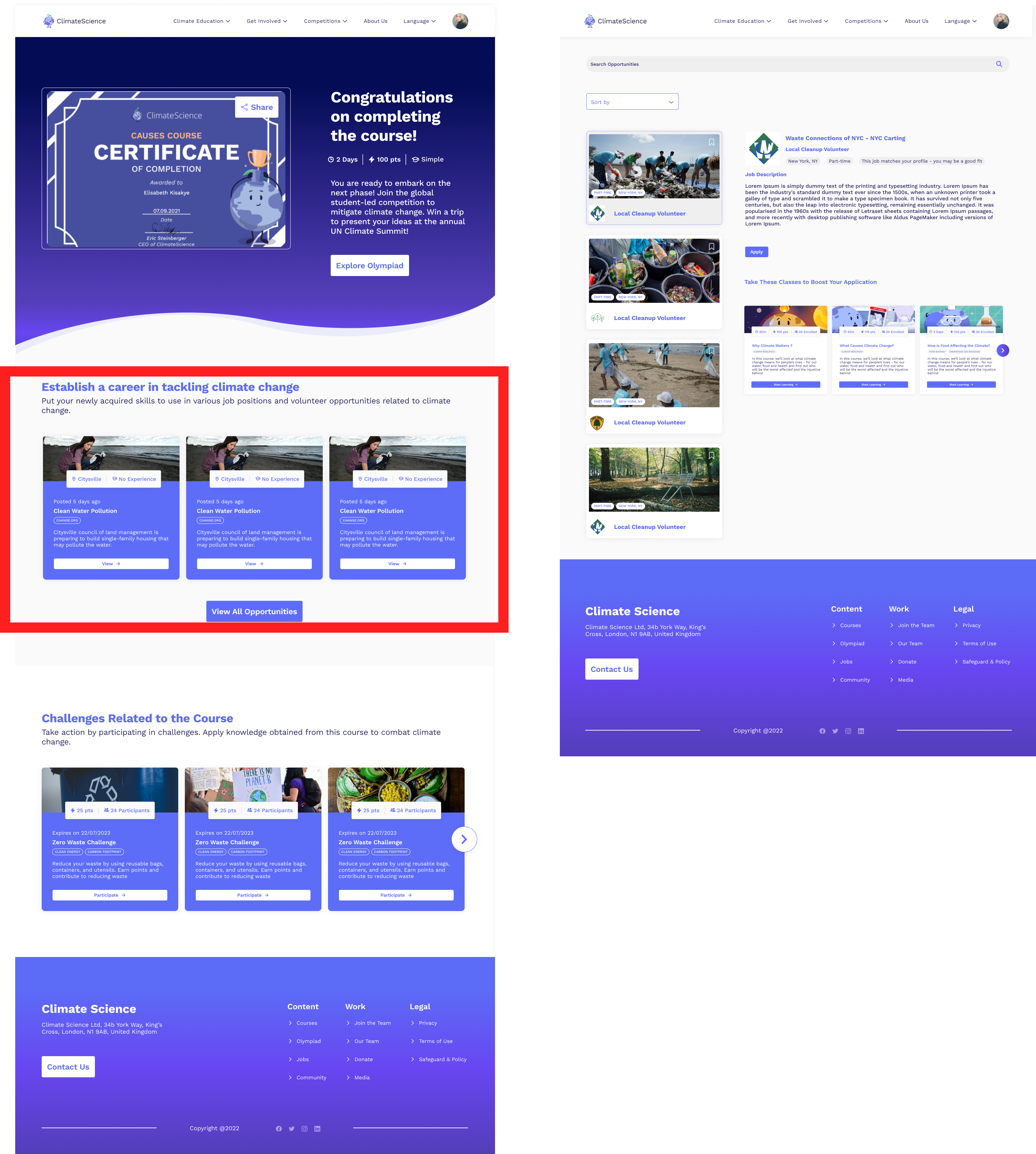
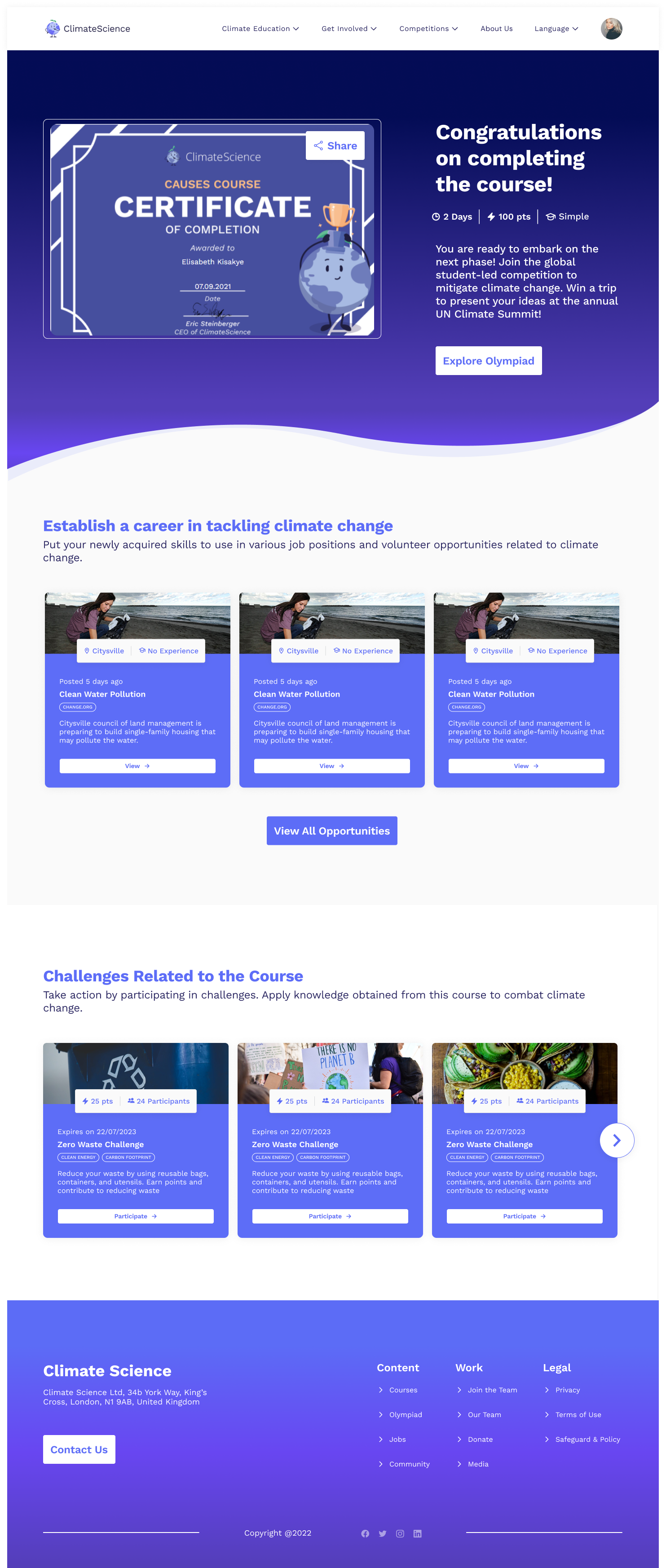
The thumbnails that lead toward the Action Hub are placed on the course certificate page. It’s at this point where an individual committed a lot of time and effort towards learning about climate change. Therefore, it would be likely that they have a high commitment level to mitigating opportunities, which the Action Hub will share with them. The opportunities in the action hub can range from volunteering to full-time positions related to climate change. When the opportunity details section opens up in the middle of the page, relevant courses will be suggested below that could help the individual succeed in the apparent opportunity. This placement of the course thumbnails stays in line with our goal of creating a coherent narrative and connecting the products together in a genuine way.
Choose Your Own Learning Journey: Courses Filter
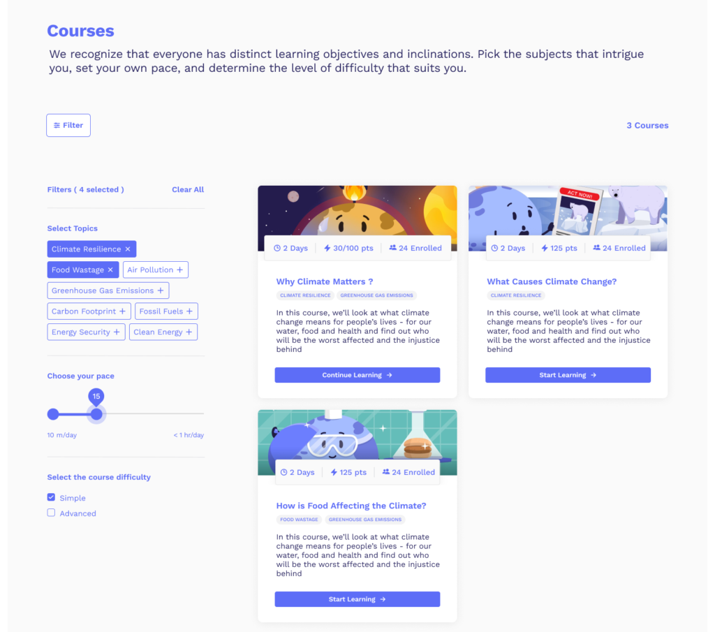
Individuals may need assistance with finding the right course that fits their learning goals and commitment levels. Most of the online learning websites we observed gave multiple opportunities to help individuals create their own list of courses easily with filtering based on topic, pace time, and course difficulty. As the ClimateScience course list gets longer, there will be more need for individuals to find courses efficiently without combing through multiple rows of thumbnails. The design team created a new Course Filter feature that can show relevant courses based on an individual’s topic desires and regular learning pace.
Congratulations, You Did It: Course Success UX
The original course success UX on the ClimateScience.org website was seen as a dead end. There was nothing available to show what the individual should do next based on their commitment to learning. The design team saw this as an excellent opportunity to create this coherent narrative and genuine connection between products by adding touchpoints to the Olympiad and Action Hub. We believe this is a momentous occasion for the individual – their momentum and commitment to engage is at its highest. So, why not nudge them to keep building on that? This placement helps individuals avoid dead ends in their experience with ClimateScience.org.
Next Steps
- The design team will deliver the prototype to the ClimateScience team in order for them to adopt the elements they’re willing and comfortable with developing on their own.
- An A/B testing strategy should be created in order to see the effects of separate elements. This way, the ClimateScience team can keep learning what works well for building retention & adoption.