
Knowunity, Europe’s largest e-learning platform, recently launched its mobile app in the US. Users can share and exchange resources like notes, study sheets, and test preparation materials while using the platform to communicate with other students across the country. This case study focuses on remote usability testing for Knowunity. The testing revealed that users found the platform easy to navigate, but also encountered some challenges with user usability and custom functionality. We derived six improvement suggestions based on the analysis of the test results.

About the Project
My Contributions
Our team comprises five members who collaboratively contribute to various aspects of the testing process, including planning, recruitment, hosting, note-taking, data analysis, presentation and report preparation, and client communication. During the preparation phase, I played a pivotal role in developing the screening questionnaire, test scenarios, and tasks. Furthermore, I designed the qualitative post-test questionnaire and developed the Consent Form for formal testing. As a team, we believe in maintaining consistent client communication, and thus, I was responsible for establishing and maintaining client relationships throughout the process. We contributed to participant recruitment, and I conducted test sessions for two participants. Additionally, I was involved in collecting, analyzing, and collating test results and creating presentation slides. I prepared slides for “Overall Findings and Recommendations” and “Recommendations,” and authored the “Introduction,” “Findings and Recommendations 6,” and “Conclusion” sections of the final report.
Team Members

Project Duration: 6 weeks (March- May 2023)
Design & Testing Tools: Figma, Canva, Google Sheets, Google Doc, Google Form, when2meet, Calendly , Otter AI and zoom.
Client Kick-Off Meeting
Objectives For This Study
- Launching a mobile app in the US along with the web version, involving login and notes upload as major features
- Evaluating the working of the mobile and web interfaces as parallel entities
- Checking whether icons, buttons, labels etc. are apt for high school students in the US
Target Users
Grades 9 to 12 students live in the U.S.
Focus of Project:
- Focus preferred on the mobile app, since it has been used the most in other markets
- Focus also preferred on the connection between mobile and web applications
Design the Study
Overview

Preparation
In a virtual meeting with Knowunity’s UX researcher, we discussed their goals and testing requirements in detail. The client provided us with a User Persona that they had developed within their company.
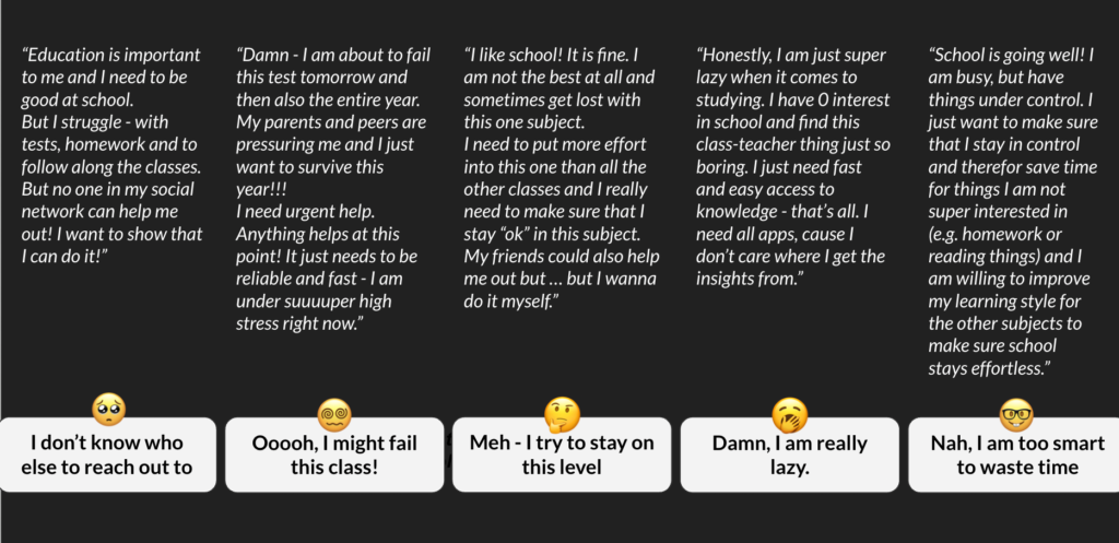
Based on the information we received from our clients, we have identified the learning requirements and objectives, and here is an overview of objective and outcomes.
- Checking whether icons, buttons, labels, etc. were relevant to high school students in the U.S
- Feedback on what aspects or user flows of the product could be made better
- Specification of aspects that may not work, along with explanations regarding why they may not work
- Recommendations to improve any issues found
- Identifying usability issues in the platform’s mobile application ahead of its launch in the U.S.
Target Users
Knowunity’s target users in the U.S. are students in grades 9-12. But because of U.S. law protecting children under the age of eighteen, we hear things like “not permitted to involve participants under the age of 18 without going through a bunch of other steps (which we would have had to start 2+ months ago).” Therefore, we communicate with our customers in a timely manner and target high school students over the age of 18.
Pre-Test Questionnaire
We designed pre-test questionnaire included five questions and one optional question in order to get to know participants better.
- What is your favorite subject at school? Why do you like it?
- How do you normally study for tests?
- What resources do you use to help you with schoolwork? Follow-up: Do you prefer to study by yourself or with a group?
- What do you think would make learning more fun for you?
- What is the biggest challenge, if any, that you face while studying?
- (Optional) Do you often discuss school work with your classmates and friends? What kind of external study materials do you use?
Creation of Scenarios and Tasks:
After combining the customer’s usability testing needs, we downloaded the beta version of Knowunity and browse-built the existing functionality with the following three tasks.
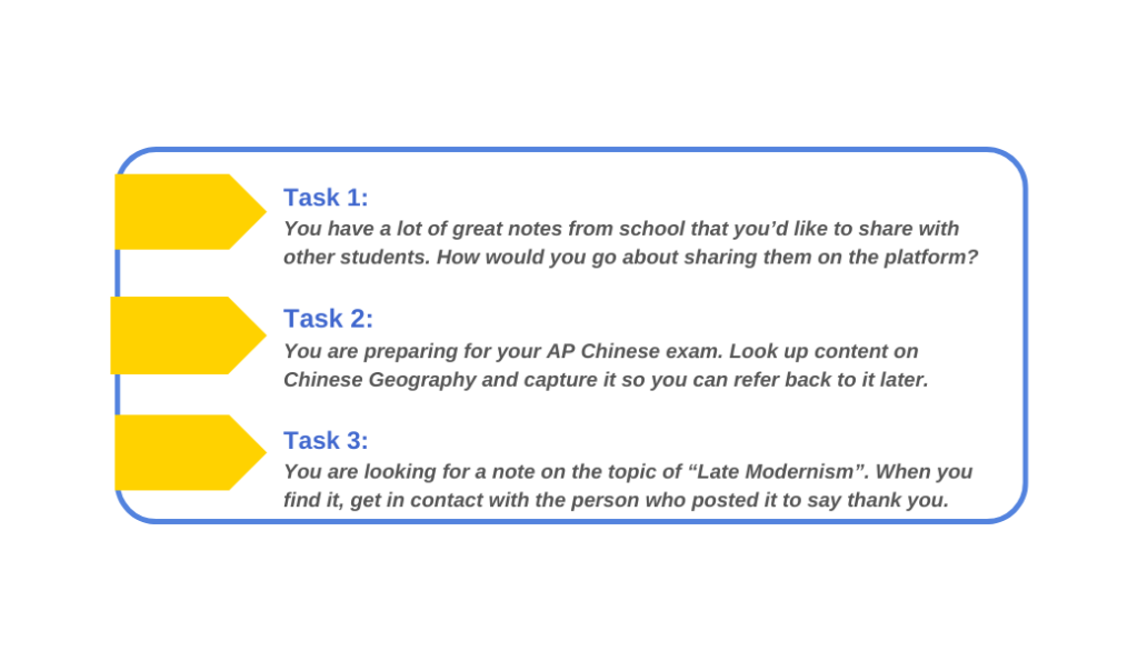
Participant Recruitment
To recruit participants, we created a screening questionnaire on Google Sheets, asking for basic age information and daily study habits. Our goal was to assess participants’ familiarity and acceptance of the e-learning platform and screen them based on our specific criteria. Our participants had to be proficient in English, over 18 years old, and U.S. high school students. The screening questionnaire also included the expected duration of the usability testing and the location of the test.
We distributed the screener on social media platforms such as Reddit and received over a hundred responses. From these, we screened 78 applicants and sent confirmation emails to the selected few for the second round of screening. After receiving positive responses, our team used When2Meet and Calendly to schedule online appointments with applicants. We then assigned team members to host the sessions according to each person’s availability.
Unfortunately, we encountered several no-shows during the scheduled testing sessions. After experiencing eleven out of twelve applicants ghosting on us, we decided to republish the recruitment information on other platforms. We also sent the recruitment message to the Pratt listing server, but we did not receive any responses. Finally, we resorted to distributing posters in public places in New York but were unsuccessful in finding the right participants.
In the end, we leveraged our social networks to successfully recruit six participants who met our requirements. We tested and analyzed the results accordingly.
Remote User Testing
We conducted our user testing sessions using Zoom. Each session was moderated by a team member, with some sessions also having a note taker. Also, we used Otter AI to assist with notetaking. The moderator guided the testing process, using our script, and before the test began, participants were asked to sign a consent form confirming their age of eighteen or older. The recording function was then turned on after the participant agreed or provided verbal consent. Each session lasted approximately 30 minutes. During the test, the moderator opened Knowunity and shares their phone screen on Zoom. Participants were provided with a Google Form with pre-task questions via email, which they need to complete during the testing. Participants were then instructed to verbally indicate which area they wanted to click on and which page they wanted to navigate to. This process allowed for users to express their thoughts out loud using the “Thinking Aloud” method. After each task, participants were required to rate the task’s difficulty and answer questions in the Google Form. At the end of all tasks, participants completed a post-test questionnaire. The questionnaire included both quantitative and qualitative questions, which were helpful for the research team in gathering follow-up information.
Result & Analysis
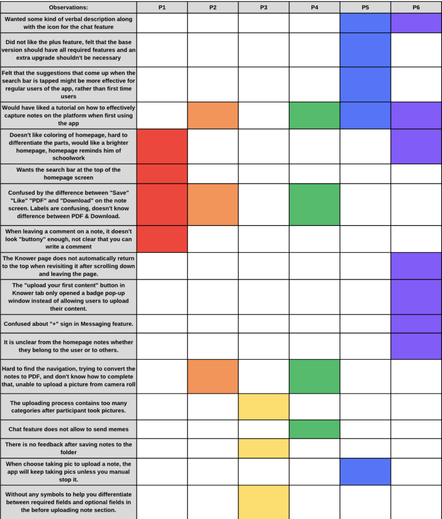
We keep track of observations regarding any issues or challenges encountered during meetings in a spreadsheet, with each participant assigned a column and color. If a participant faces a problem or challenge, the corresponding cell in the spreadsheet is colored with their assigned color. This helps us identify recurring issues and address them, accordingly, making recommendations to mitigate them.
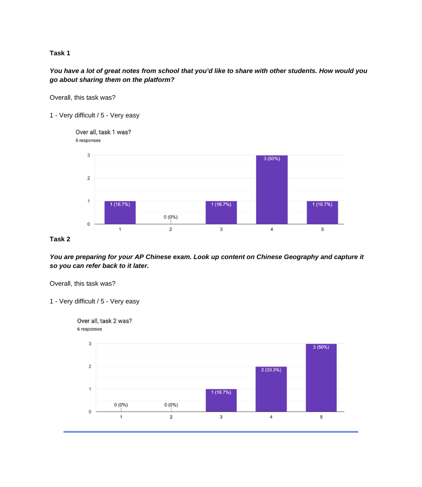
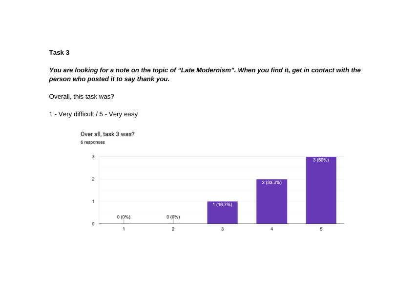
Recommendations
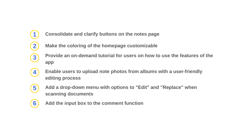
We collated the results of usability testing and data analysis, and provided six corresponding recommendations.
Recommendation 1
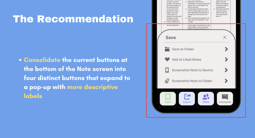
Our initial recommendation is to simplify and clarify the buttons on the Notes page. About half of the participants expressed confusion about the icons on the Notes page and their corresponding labels and found it difficult to differentiate between the button and its function. To address this issue, we propose merging the current buttons at the bottom of the Comments screen into four distinct buttons that expand into pop-ups with more descriptive labels.
Recommendation 2
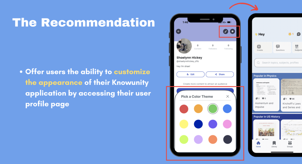
Approximately one-third of the participants found the current color scheme of the Knowunity homepage to be dull and reminiscent of school work. Moreover, the lack of contrast between colors made it difficult for some participants to distinguish between different sections. To address this issue, we propose a solution of offering customized background colors. Participants can change their theme colors by visiting the “My Profile” page. This feature is also helpful for colorblind users, as they can choose their own easily distinguishable colors.
Recommendation 3
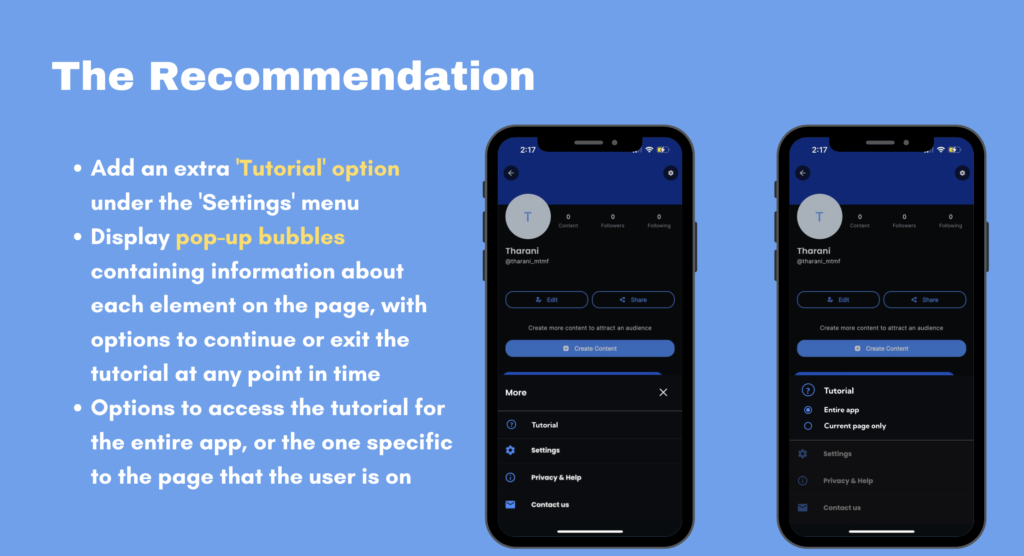
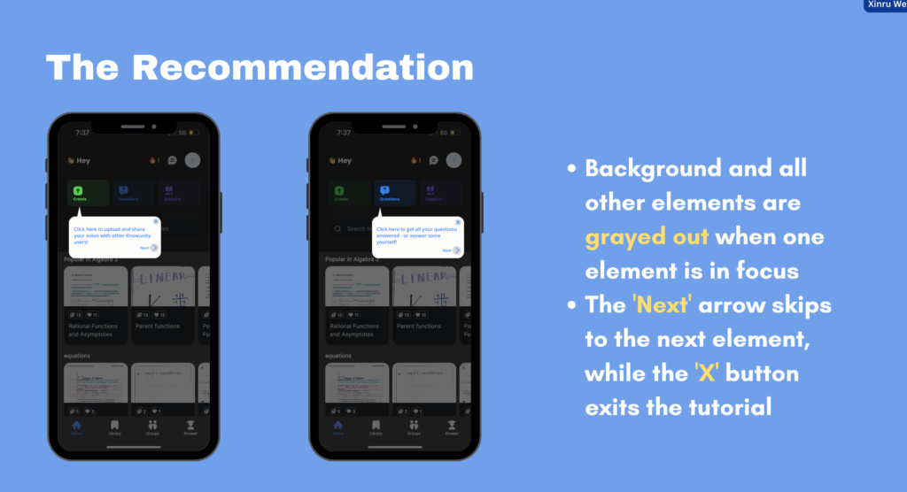
During the testing sessions, four participants expressed confusion about certain tasks on the app, such as how to capture notes for future use. They felt that a tutorial would be helpful in guiding them when they encountered difficulties. To address this, we recommend adding a Tutorials option in the Settings menu. This feature would display pop-up bubbles containing information about each element on the page, with the option to continue or exit the tutorial at any point. It would be designed to focus on one element at a time, while graying out the background and all other elements. Participants can click the “Next” arrow to move to the next element, or use the “X” button to exit the tutorial.
Recommendation 4
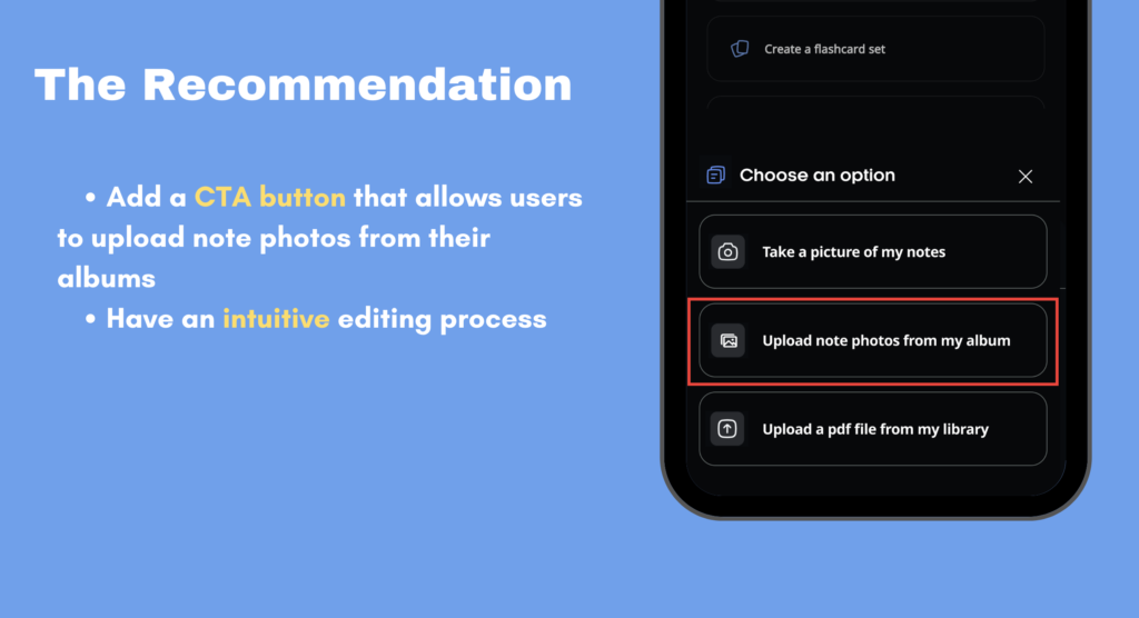
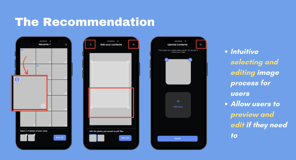
To improve the user experience, we recommend adding a CTA button that allows users to upload note photos from their albums when they want to upload notes. Additionally, we suggest providing users with an intuitive image selection and editing process, as well as the ability to preview and edit images when needed. This is because participants reported not knowing how to scan a PDF file from a photo album and were unable to upload photos of notes from their album. By implementing these changes, users will be able to easily upload and edit their notes, enhancing their overall experience with the app.
Recommendation 5
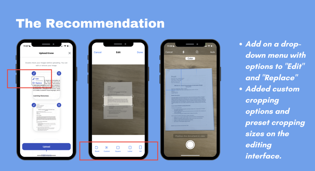
During testing, some participants were unsure how to edit images if they missed the cropping step. Currently, the system only supports manual cropping, which can be inconvenient and may result in uneven and unattractive note images. To address this, we recommend adding “Edit” and “Replace” options to the drop-down menu and incorporating custom cropping options and preset crop sizes on the editing interface.
Recommendation 6
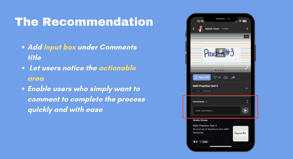
To enhance the user experience, we suggest adding a drop-down arrow that can be used to navigate to the annotation screen and simultaneously display the input box. Furthermore, we recommend including additional steps during the annotation process. Currently, the comment area appears to be non-actionable. To address this, we propose adding an input box under the Comment Title. This will draw attention to the actionable areas, allowing users who wish to leave a comment to complete the process quickly and easily.
Conclusion
Our team conducted a comprehensive analysis of three important features in Knowunity and made practical and low-difficulty recommendations. Our usability test reports have also generated great interest from our clients. However, we believe that our success was due to the high level of engagement and inclusivity between our team and the clients. Although we faced significant challenges in recruiting participants, our client trusted our process, and we kept them updated with the progress and any adjustments we made to the experimental method.
Our tests identified issues that the customers had already found but not yet addressed, as well as some new issues that they hadn’t covered. The client has indicated that they will share the report with the rest of the company to discuss feasibility. During the tests, the participants were able to complete almost all tasks, indicating that Knowunity has a straightforward design. With the successful launch of Knowunity’s mobile version in the US, we anticipate receiving more credible feedback that will help optimize the interface and functionality. In addition to its excellent design, the most valuable aspect of Knowunity is its open-minded and receptive development team.