Airbnb is a global marketplace for short or long-term homestays that connects potential guests directly with property owners.
Searching for Stays
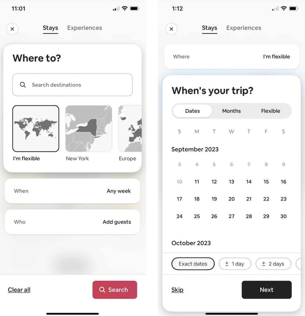
The “Stays” tab of the “Where To” section features good discoverability as it immediately makes clear through text what actions are possible – a user may search for a specific destination, or select a larger area on the map for travel. This is then paired with the use of signifiers: a search bar with prompting text, a button with a map already selected and highlighted to aid in selecting location, and some text already filled into certain buttons to give users an example of what to input (for example: the When button features a example answer of “Any week”). All of which let the user know how they can search for a stay and what they can enter as criteria when they do so. Airbnb’s search feature also uses constraints (location, dates, number of guests) to help a user narrow down their search and determine this criteria. However, an additional feature which is helpful is the option to skip adding certain constraints to a search in the event that a user is less sure about specific details of a trip. Because this allows for users who are less sure about specific details of their trip to still see what the app has to offer.
Searching for Experiences
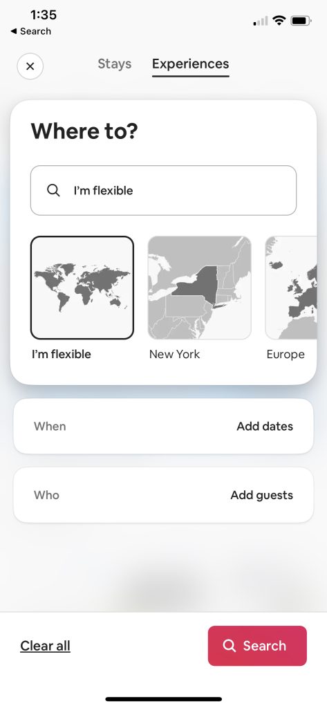
The one area where discoverability fails is on the second tab of the “Where To” screen. The “Experiences” tab is less clear, because it requires a user to have pre-existing knowledge in their head of the Airbnb app to understand that Experiences is another feature offered that isn’t a short term or long term stays, but rather bookable events or activities hosted by locals of a chosen destination. While surely most people’s knowledge of the world would provide them with a general idea of the meaning of experiences (based on the common use of the word itself), the context of this within the Airbnb app is not made clear at all through this screen. Moreover, the screen looks exactly the same as the “Stays” search tab. Therefore new users who wish to learn the context of the “Experience” tab must first go through the process of filling out all of the aforementioned search criteria in order to get a clearer understanding. Discoverability could be improved here by either adding a section at the bottom of the screen to explain what experiences are, or have some sort of text somewhere within the screen to act as a better signifier for what is possible when searching for an experience. For example, the text in the search bar could say: “search events and activities hosted by locals.”
Home Page
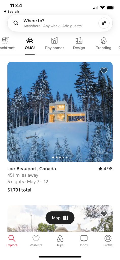
The use of icons on the home page help to bridge any gaps between users mental models and the various features and categories of search results on the homepage. Airbnb employs mapping in the form of familiar icons to make these features easier to understand. For example, the search category “OMG” is difficult to understand on its own, however the icon of an alien spaceship conveys that this category of stays might be strange, otherworldly, or unusual in some way based on the knowledge of the world that the image of a UFO holds such connotations. More common mapping examples which also rely on knowledge of the world in relation to experience using other apps is the filter icon in the right of the search bar. at the top of the screen This icon is commonly used across many applications and websites and therefore is associated with the act of filtering. Therefore upon seeing this option within a search bar users are likely to understand that they may filter search results by clicking the icon.
Wishlist
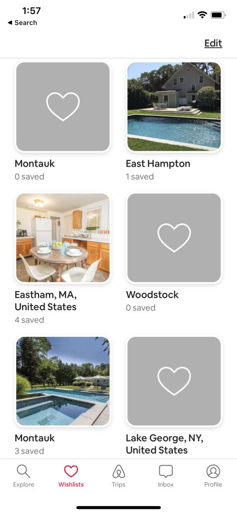
Airbnb offers users the option to save a specific listing to their “Wishlist.” In order to add a stay to the Wishlist users must add it to an existing folder or create a new one. One issue of this save feature that could use improvement is the feedback. If a specific stay doesn’t exist anymore, or has been fully booked it sometimes deletes itself from that saved trip file, or doesn’t make it immediately clear that the dates users were interested in have been taken. There could be better feedback here between the app and user which alerts users to changes made to their Wishlist. For example, Airbnb could show a saved stay, but with a darker translucent overlay and text to suggest that for some reason (wether it be that the rental cannot be found, or dates already booked) that the stay is no longer available. Having a stay removed entirely from a saved folder without altering users could lead to confusion and a sense that their initial action of saving the stay wasn’t received. Additionally, there are certain folders which have destinations but no saved trips or images. The lack of signifiers that provide clues about what these random empty folders mean also leads to confusion: did the user save a signal stay in this folder that no longer exists, was this folder created and not filled with anything? Why is this empty wishlist here, and how long has it been here? Empty wishlist folders should be removed from a users Wishlist, or at least have some sort of prompt which either tells users to finish creating a folder, or alert users that something had been in that folder, but no longer exists.
