Introduction
The Spotify mobile app is a digital interface designed for streaming music, creating playlists, and discovering new songs and artists. Its widespread usage, however, unveils a spectrum of design attributes, some commendable and others in need of refinement. In this critique, we will dissect the Spotify app’s design, leveraging Don Norman’s principles from “The Design of Everyday Things,” to unveil both its strengths and areas that require enhancement.
Discoverability
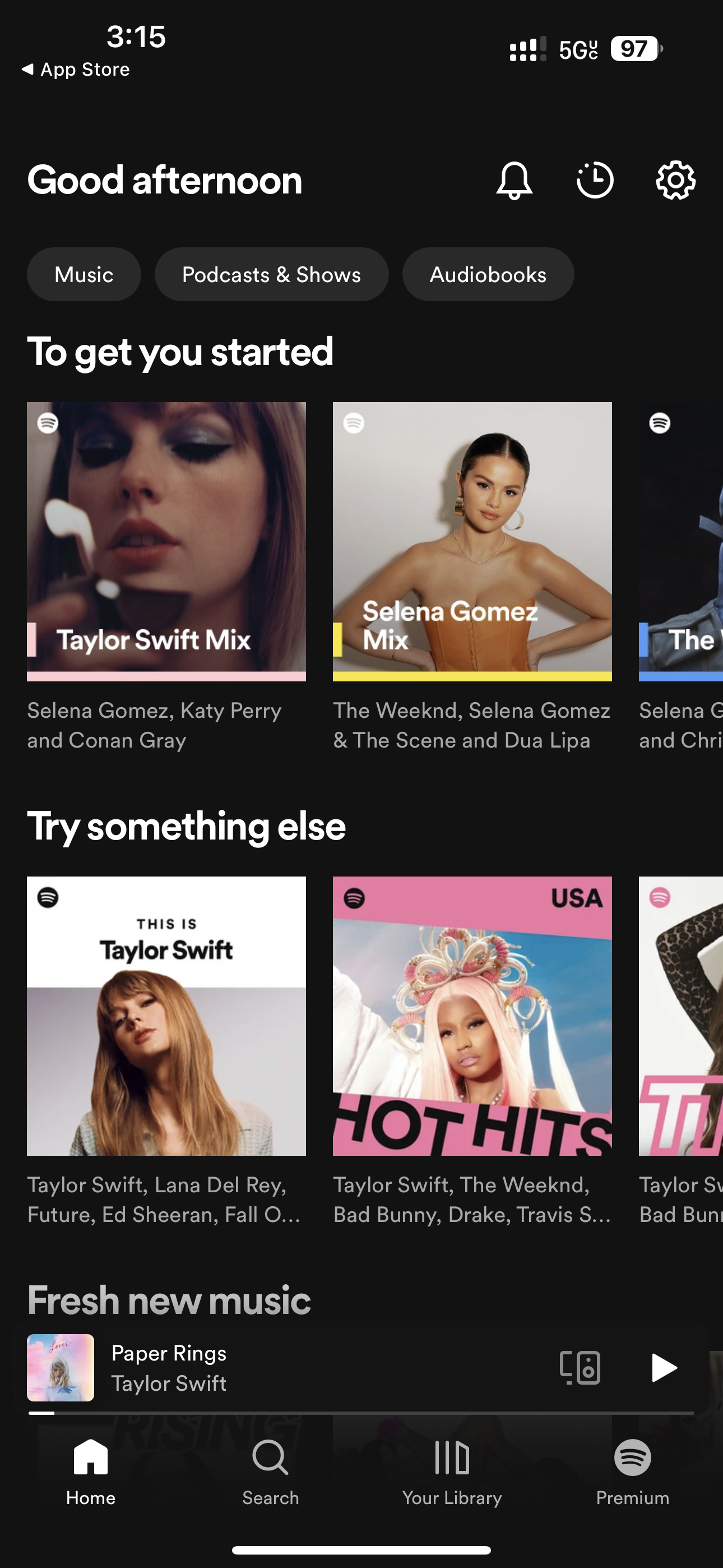
Spotify’s commendable strength lies in its outstanding discoverability. Norman underscores the pivotal role of ensuring that users can effortlessly discern the functions and features of a device or interface. Spotify has effectively embraced this principle by offering a user-friendly home screen experience. When users launch the app, they are immediately welcomed by a visually engaging homepage that thoughtfully presents a curated selection of playlists, recommended music, and recently played tracks.
some of the features are listed below
- Prominent Display: Spotify prioritizes the most relevant content, ensuring that the user’s attention is directed towards what matters most. This includes prominently featuring playlists tailored to the user’s preferences and listening history.
- Visual Appeal: The design aesthetics are captivating, with vibrant album art and visually striking playlists. This visual appeal not only makes the app enjoyable to use but also helps users quickly identify their favorite artists or albums.
- Intuitive Navigation: The arrangement of content on the homepage follows a logical flow, from the top hits to personalized recommendations. This aligns with Norman’s idea of creating a natural mapping between the user’s mental model and the system’s design, making it easy for users to find what they’re looking for.
- Engagement: By showcasing recently played tracks, Spotify encourages users to resume their music journey seamlessly. This not only enhances user engagement but also aligns with Norman’s concept of providing clear feedback regarding the system’s state.
Mapping

While the discoverability of Spotify is excellent, the mapping of some features can be improved. Mapping refers to the relationship between controls and their effects. In Spotify, the placement of the “Shuffle” and “Repeat” buttons during playback can be confusing. These buttons are located on the Now Playing screen, which is accessed by tapping on the album artwork. This placement is not intuitive since users might expect these controls to be easily accessible on the main playback screen.
Fixing the issue
To fix this issue, Spotify could incorporate these controls directly onto the main playback screen, aligning with Norman’s principle of making controls closely related to their functions. This would eliminate any confusion and make the interface more user-friendly.
Feedback

Spotify provides excellent feedback to users, another principle emphasized by Norman. For example, when users add a song to a playlist, they receive a visual confirmation, and the song appears in the playlist immediately. This immediate feedback reassures users that their actions have been successfully completed, enhancing the overall user experience.
Affordances

Despite its many strengths, Spotify’s app design falls short in terms of affordances. Affordances refer to the perceived actions an object or interface suggests. In Spotify, the icons used for actions like “Like” and “Add to Playlist” are not entirely clear. Users may not immediately understand the meaning of these icons, especially new users or those unfamiliar with Spotify’s design language.
Fixing the issue
To improve this, Spotify could use more descriptive labels alongside the icons or provide tooltips when users hover over these icons. This would align with Norman’s concept of making affordances more apparent, ensuring that users can easily grasp the available actions.
Conclusion
In summary, the Spotify mobile app showcases both commendable design aspects and areas for improvement. Its strong points include discoverability and feedback, which enhance the user experience. However, there are opportunities to improve mapping and affordances to make the interface even more intuitive and user-friendly. By applying Norman’s design principles and concepts, Spotify can further enhance its digital interface, ensuring a smoother and more enjoyable music streaming experience for its users.