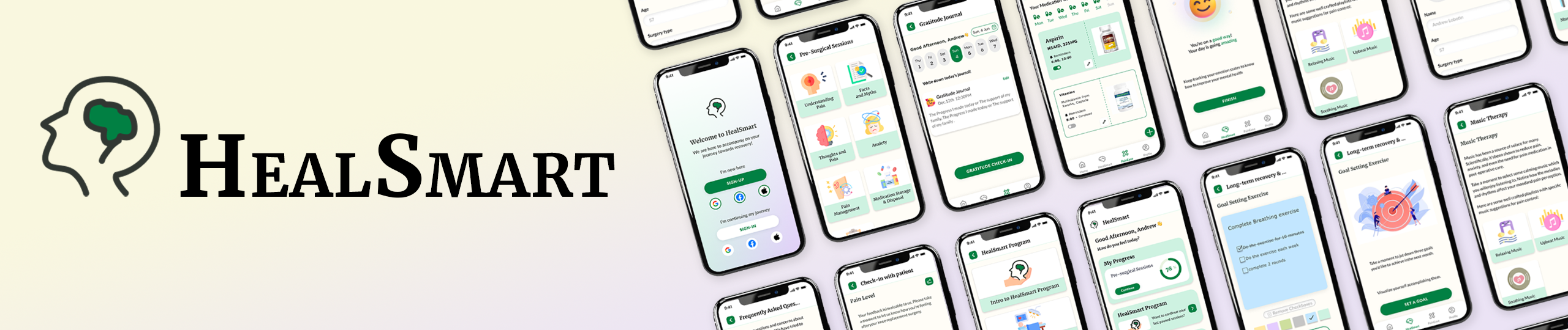
Introduction to the application
HealSmart is a digital application that seeks to educate patients about the risks and benefits of using opioids after surgeries as well as introduces new and innovative tools to help patients manage their pain and recovery more effectively.
Project Overview
This was a collaborative project with graduate students from Pratt Institute and the Behavioral Health Wellness Group (BHWG). Nishi Chitale, Roey Wang, Sayali Nikumbh, and Xinru Wen worked on the project for 3 months as part of the Projects in IXD class under the guidance of Prof. Hasan Hachem.
Interactive Prototype


Our Process
Exploratory Research
- Ecosystem Map
- Competitive Analysis
- Literature Review
- User Interviews
Schematic Design
- Information Architecture
- Product Architecture
- Persona
- Wireframes
Evaluative Research
- Tree Testing
- Client Feedback
- Expert Feedback
Visual Design
- Style Guide
- Component Library
- Visual Designs
- Interactive Prototype
Research Overview and Findings
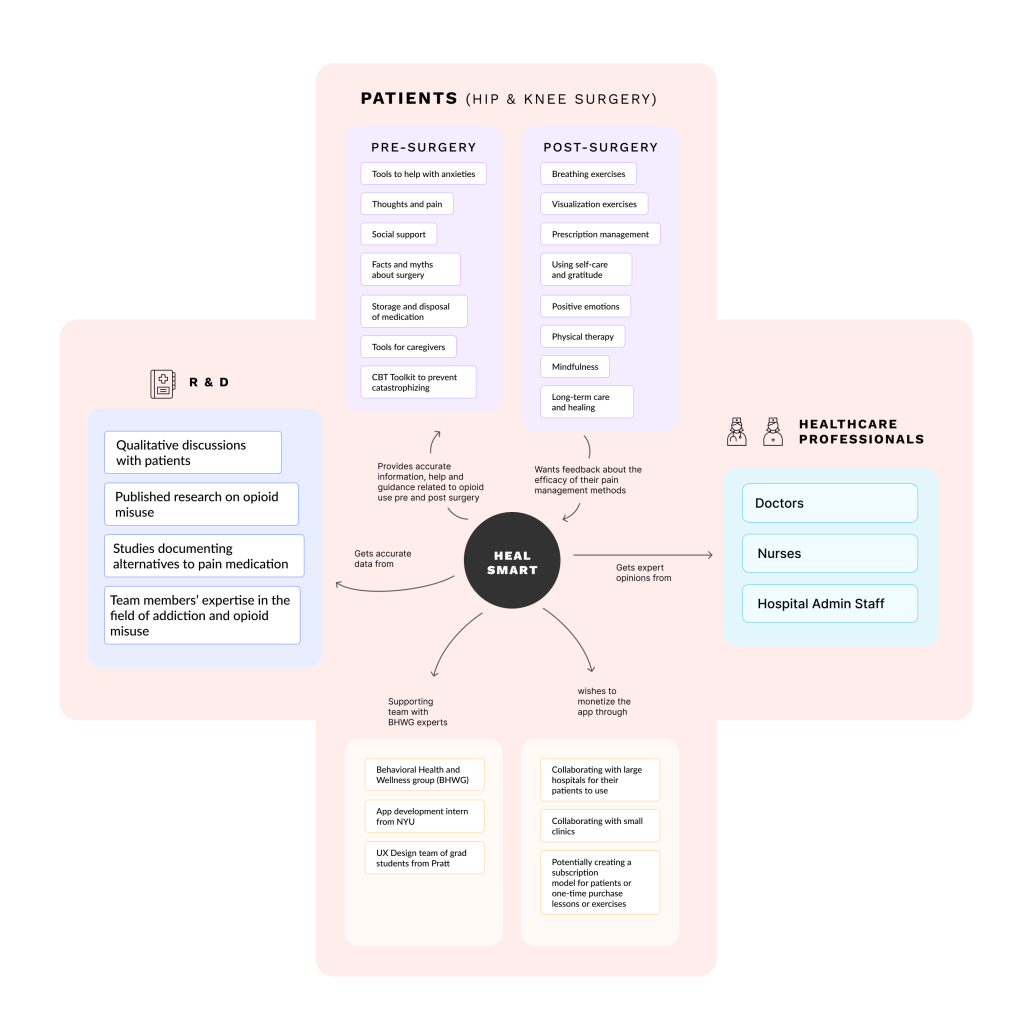
Ecosystem Map
This exercise helped us map out all the stakeholders involved in the application.
Key Quotes from User Interviews
“We discuss our pain management protocols after surgery, and the medications we prescribe, and titration as needed. We also discuss what they should do if the pain escalates.”
– Doctor
“I took a lot of Aspirin, Tylenol, and Advil every day and was sure that they were not good for my stomach in the long run. If indeed there is a way to get rid of this, I raised my hand, make it happen, please.”
– Patient
Findings from our Research
- Patients want a speedy recovery with minimum pain
- Patients are keen on following their doctor’s instructions and an interface that helps them keep a track of their medications as well as its effectiveness
- An effective interface will help the patients prepare themselves mentally and physically for their surgery as well as their recovery.
- A lot of patients that undergo hip and knee surgery are 45+ years old which makes accessibility and ease of use very important
Design Principles
Here are the 5 design principles based on which we worked to build this app:
Personalization: Each patient has a unique journey to recovery, which makes having a personalized experience for the user an essential part.
Engagement: Learning about pain management in the app is engaging and informative to reduce the cognitive load in the user.
Accessibility: Considering that most of the users are 45+, it’s crucial to have a simple and intuitive interface that adheres to WCAG accessibility guidelines.
Data Privacy and Security: As the app deals with sensitive healthcare information, prioritizing
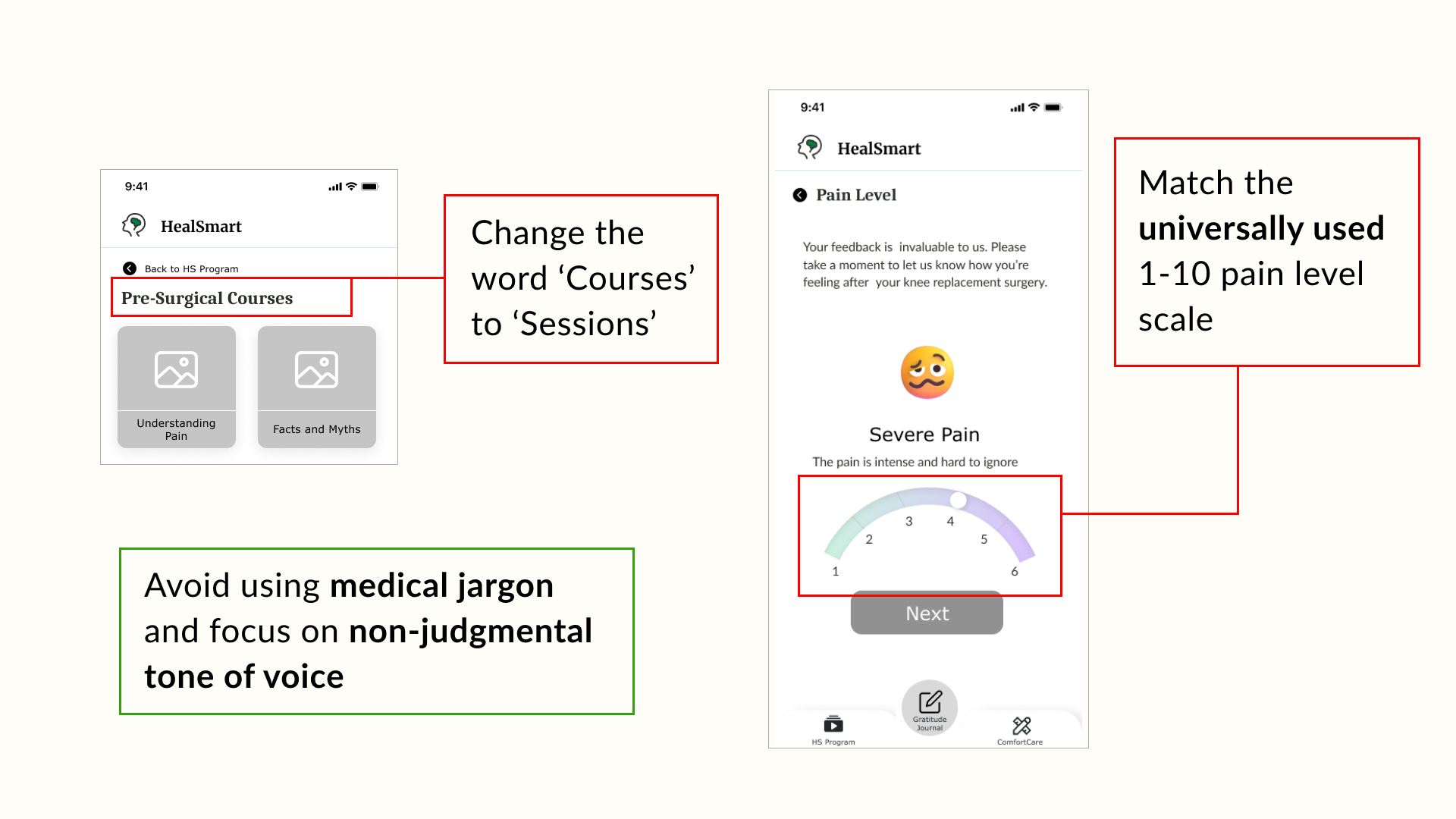
Stigma Reduction: As the topic of opioid addiction is a bit sensitive, using non-judgmental language and emphasizing that this app is a wellness education app is crucial.
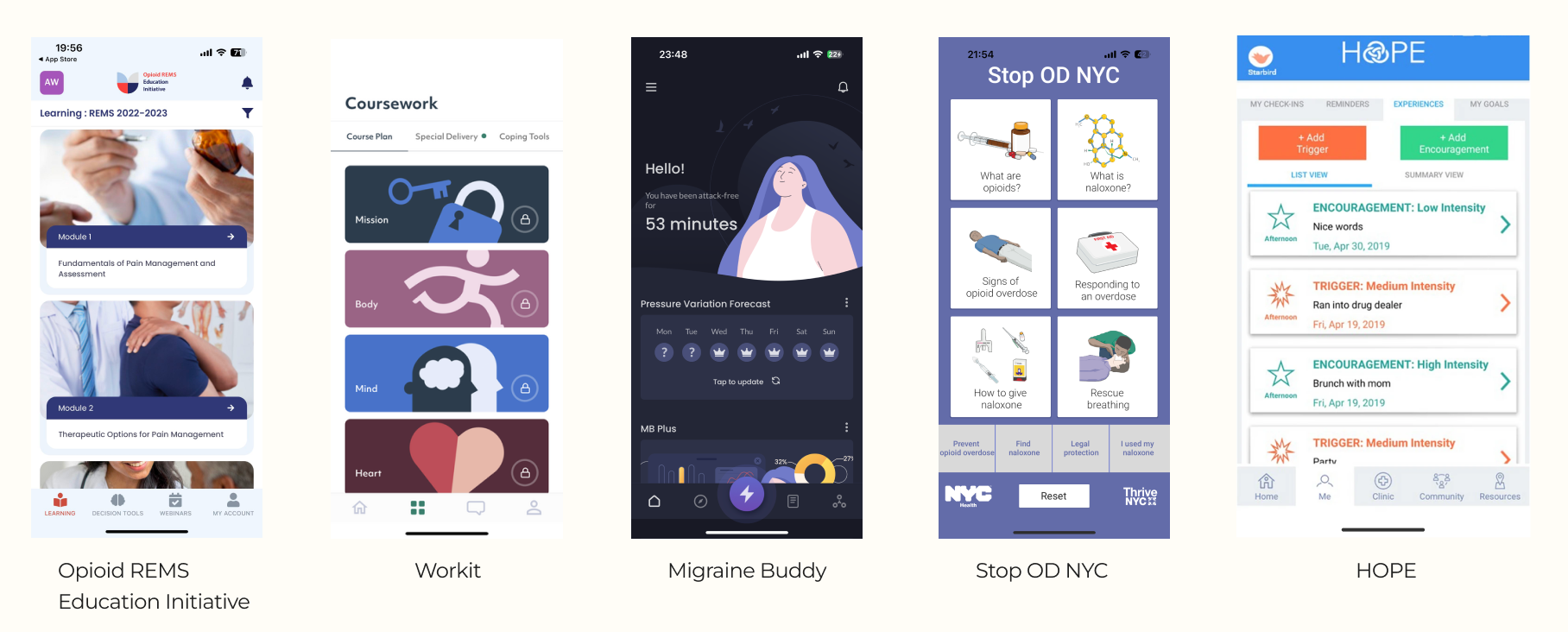
Competitive Analysis
For the competitive analysis, we looked at 2 websites and 3 mobile applications that were direct or indirect competitors of the Heal Smart app and came up with 4 insights.
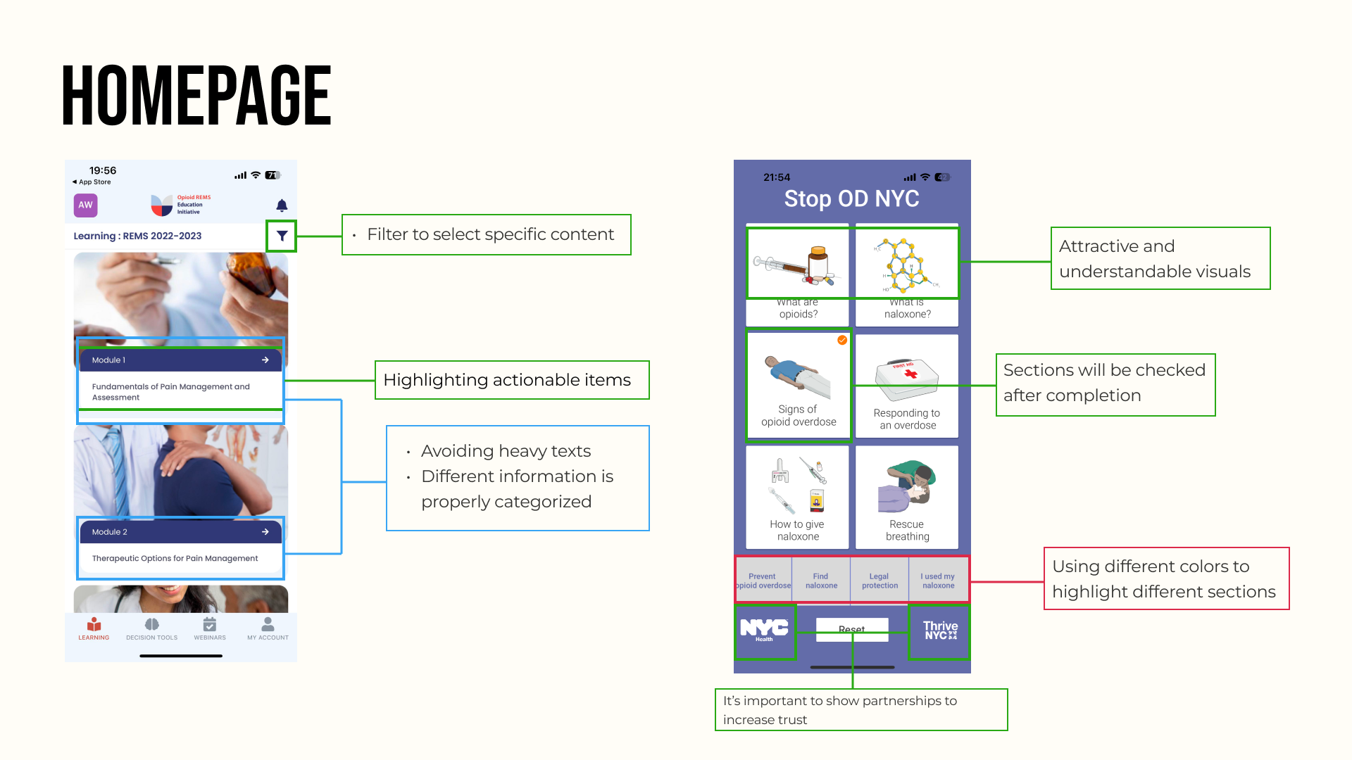
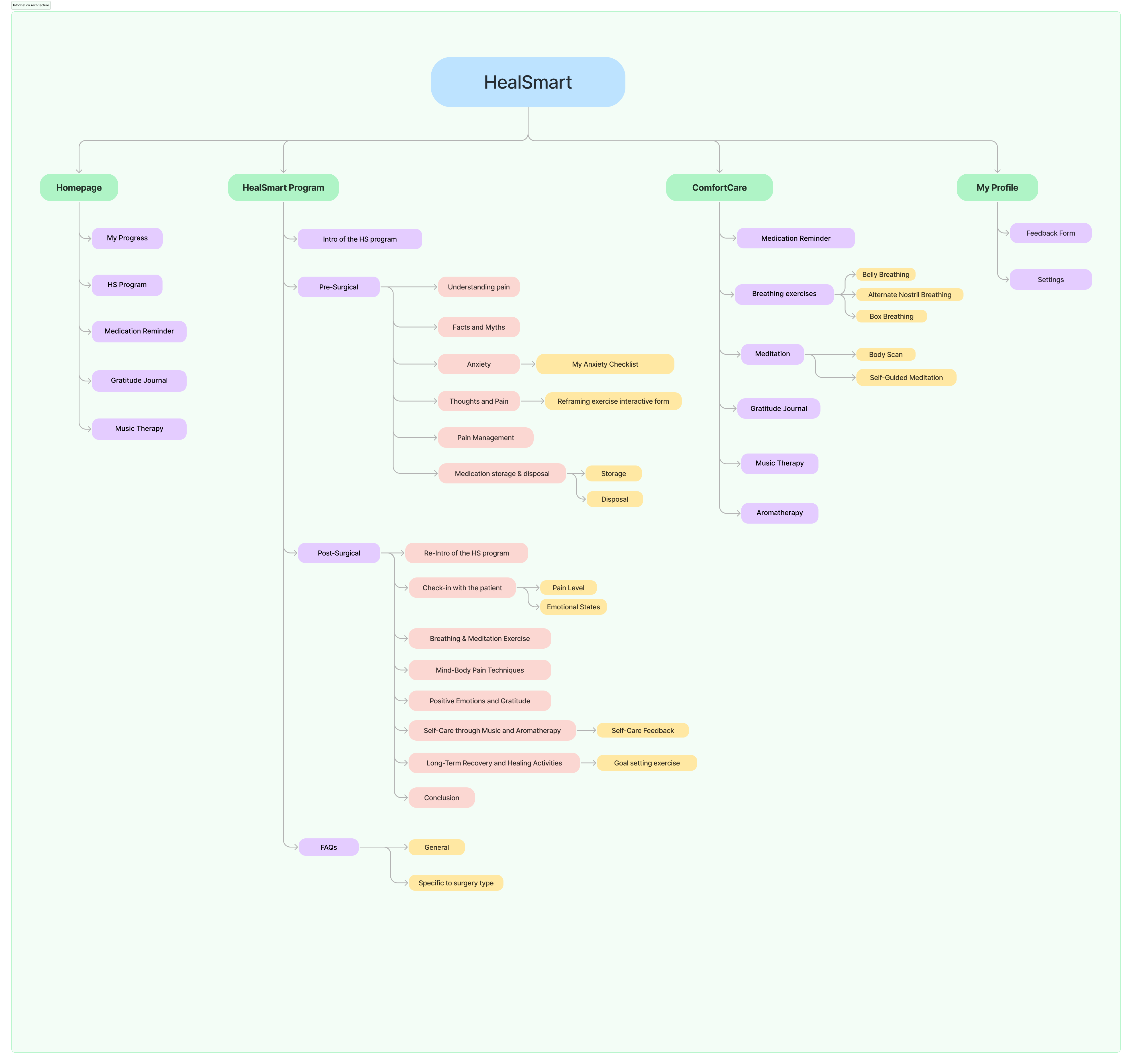
Information Architecture
We created the information architecture based on our client’s pre and post-surgical scripts to help us design and organize the information within our app. Through categorizing, labeling, and structuring information, we want to make the app easy for users to understand, navigate, and find what they’re looking for. We use the IA to make our homepage, MOP Program Main Page, PainEase Kit, and my profile.
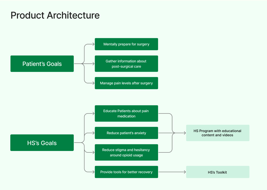
Product Architecture
The Product Architecture we created helps us understand how our app’s components or modules are organized and interact with each other. It plays a crucial role in determining how well our app can meet our target audience – patients’ intended objectives and adapt to changes or updates. When users interact with our app, they can find ways other than taking pills to cope with their pain. On the other hand, our app educates them to be aware of medication addiction and provides them with powerful tools to have a better recovery.
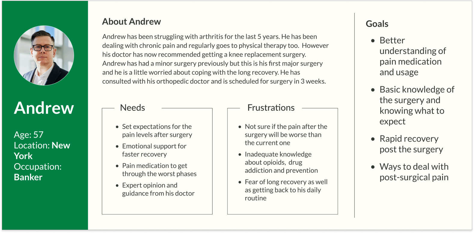
Persona
Using the findings from our research and interviews, we built a persona to reflect the needs, frustrations, and goals of our target user.
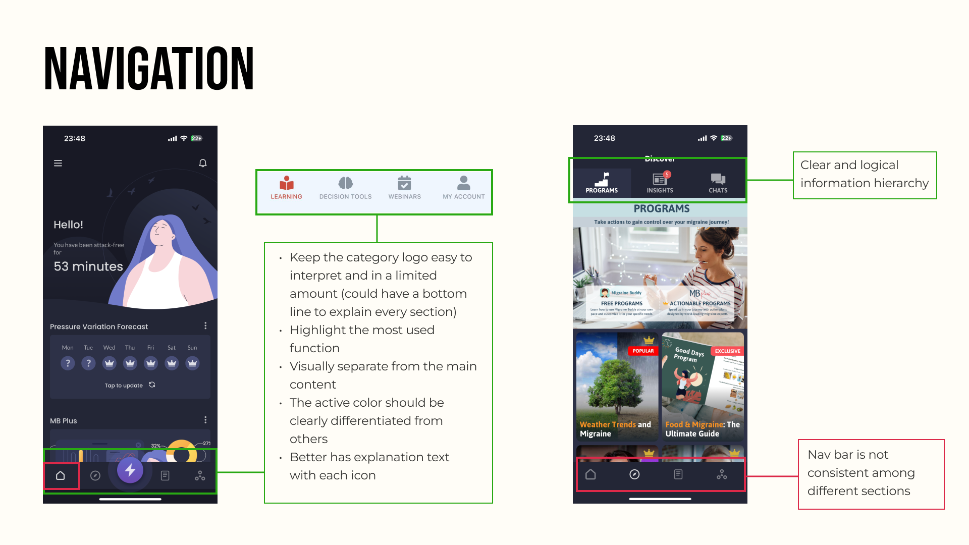
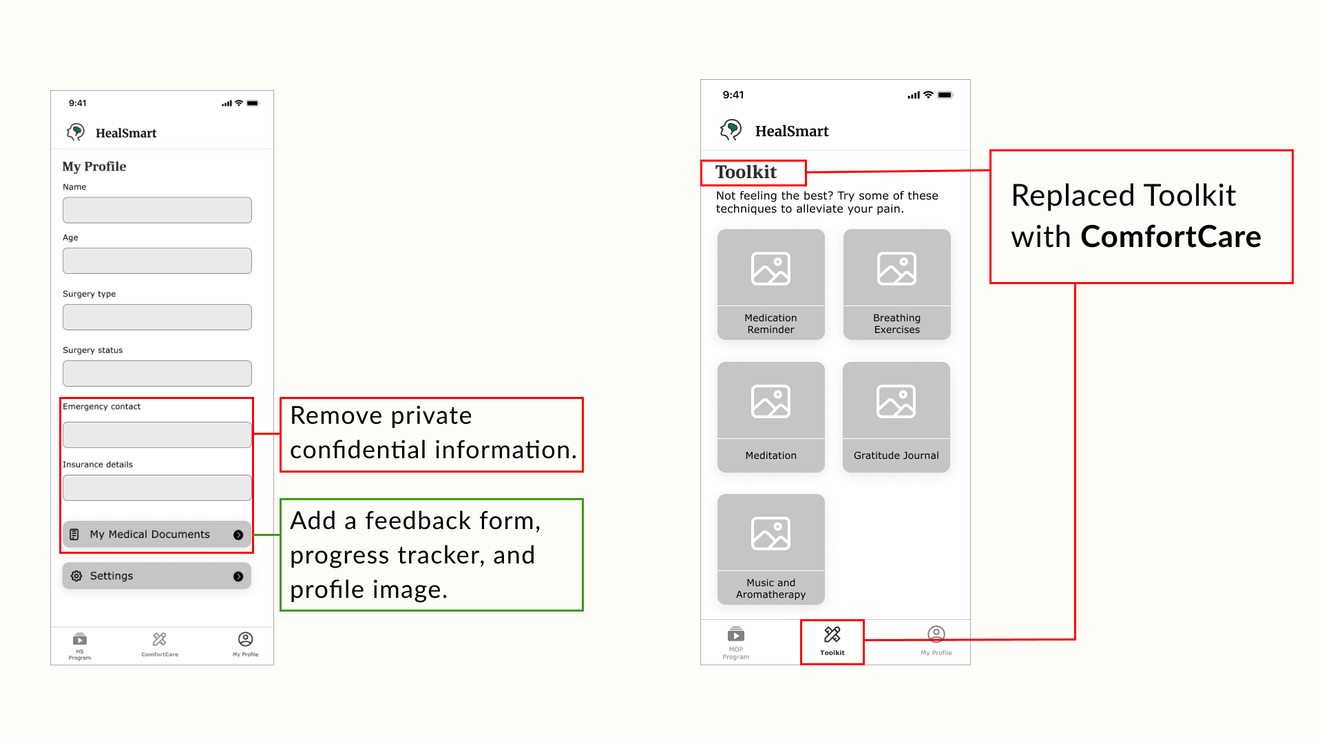
Wireframes
After having a design-decision meeting with our client, we made a few changes to our wireframes.
Visual Design
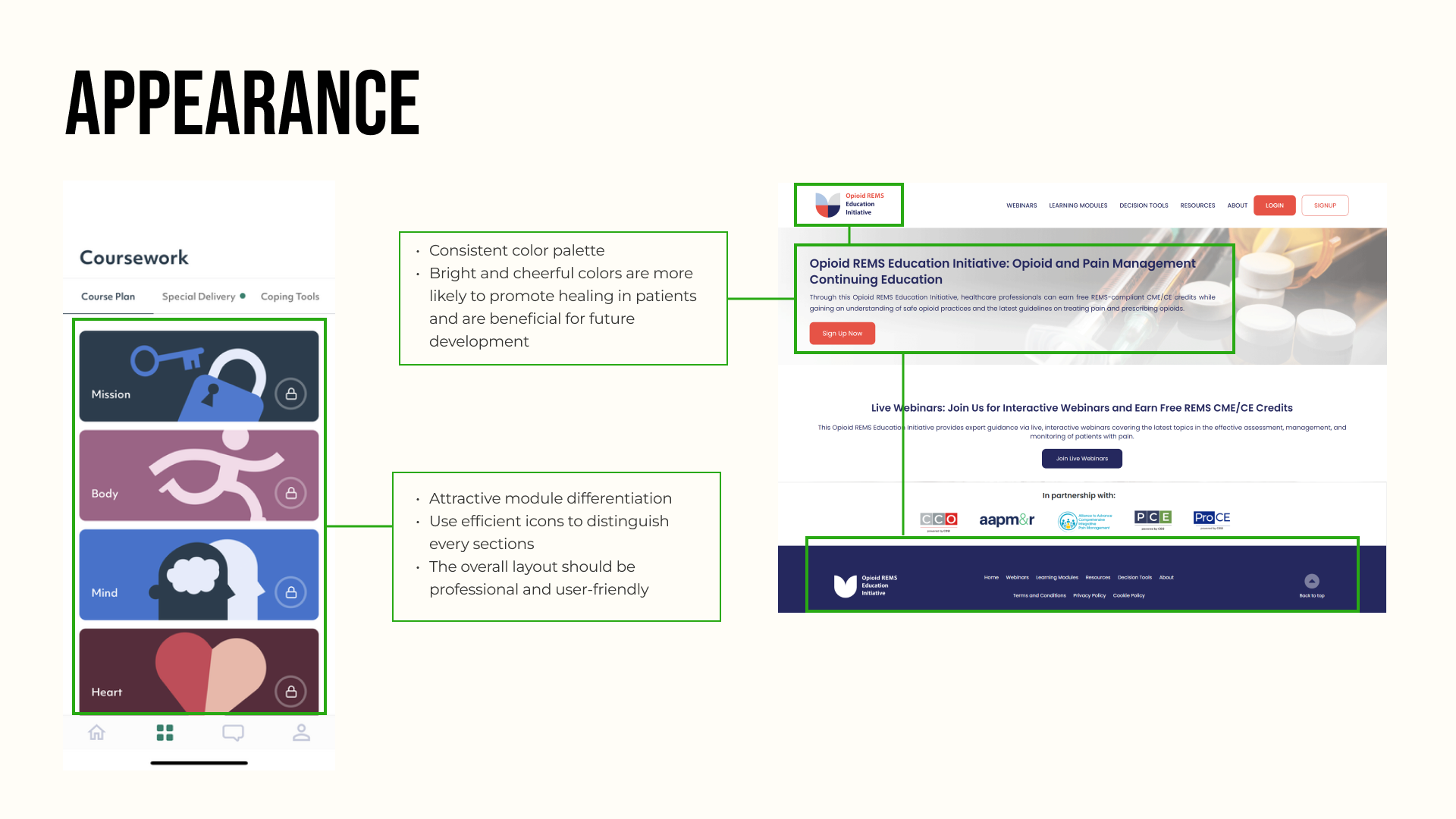
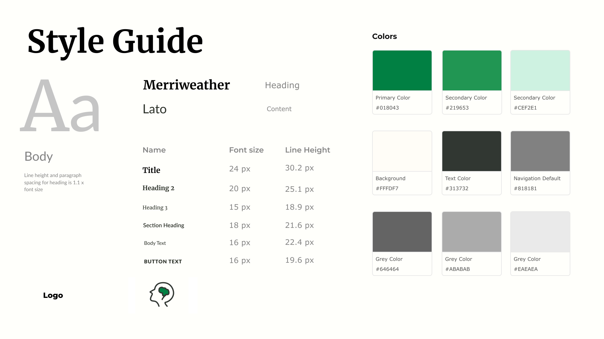
Style Guide
Fonts:
Titles: Merriweather font adds sophistication and emphasis to key elements. Content: Lato font for its clarity and readability, ensuring seamless communication.
Colors:
Theme Color: Calming and trustworthy green was adopted as the theme color for the healthcare app.
Logo: Green is prominently featured in the company logo, ensuring a cohesive brand identity.
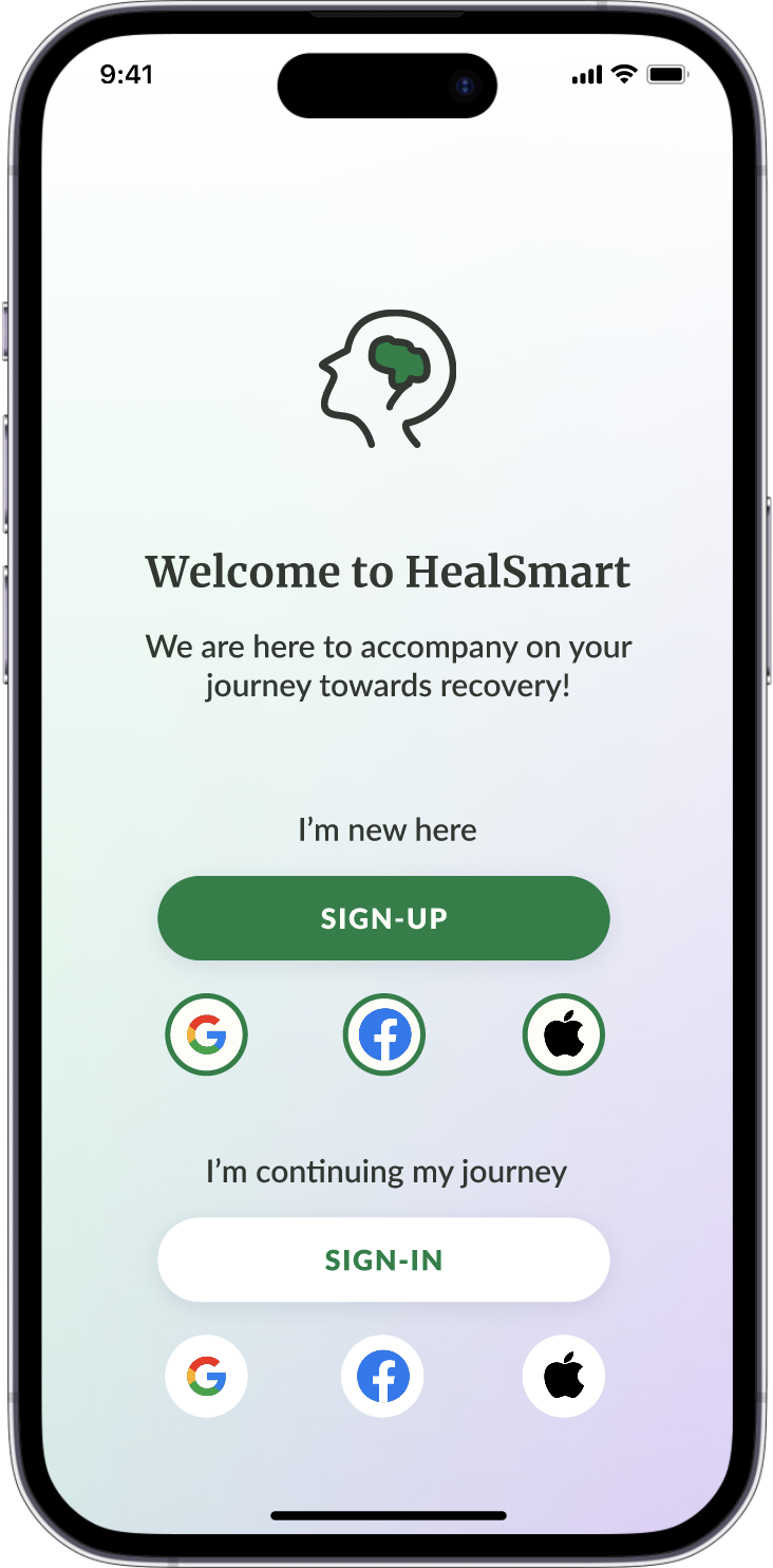
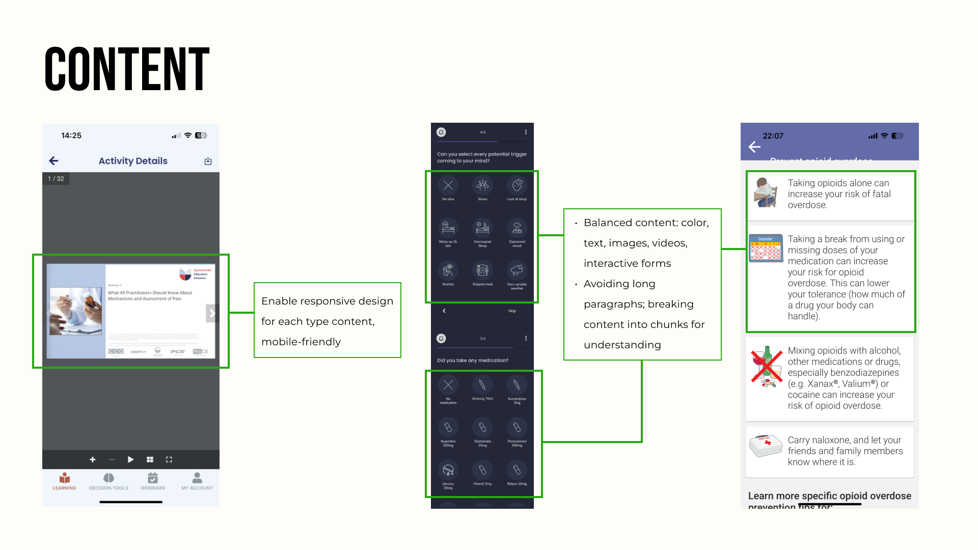
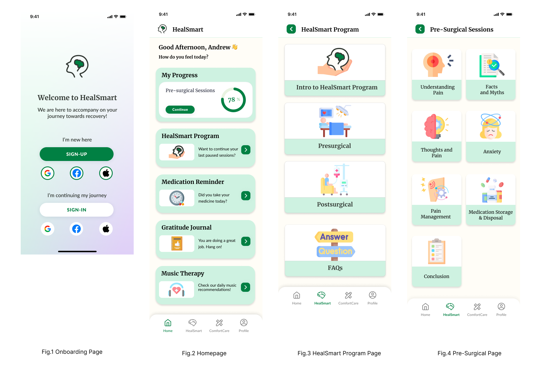
Key Screens
Conclusion
In wrapping up our healthcare education app project, it’s been a wild ride! Working with our client and diving into the nitty-gritty of design and functionality was a great experience under the guidance of our professor. As a group, we brought a mix of skills to the table, making the whole process a creative exercise. We learned a lot about real-world challenges, teamwork, and thinking on our feet. The app we’ve crafted not only meets our client’s needs but also serves as a hands-on lesson in the ever-exciting world of app development. Beyond the tech stuff, this project has taught us the ropes of effective communication and adaptability. We’re excited about the impact our app could have in the healthcare education scene and grateful for the practical insights that will stick with us long after the classroom days are over.