Client: Amon Carter American History Museum
Role:
- User Testing Researcher
- Participant Recruiting
- Interview Scheduling
- Data Analysis and Visualization
- Recommendations
Teammates:
- Cassandra Cyphers
- Bryony Hoare
- Shreedhar Verma
Duration: 5 Weeks, November – December 2023
Background
The Amon Carter Museum opened in 1961 and has since grown and expanded in size, both physical and collection wise. The Carter Museum is focused on giving back to the Fort Worth community, research and education, and the celebration of American art. In fall of 2019, the Carter reintroduced itself with a new look, a new website, and a renovated building with a reinstalled collection. In fall 2023, the Carter reached out to Pratt Institute’s Information Experience Design Program for a usability study on their new website.
Our team conducted a Moderated User Testing Study of the Amon Carter Museum website, with a focus on the Educator Resources located on select art pieces and the Digital Collections which is completely accessible via the Carter Museum website.
Using the experience of eight (8) select participants, we were able to find four (4) main usability issues and recommend potential solutions for each.
Methodology
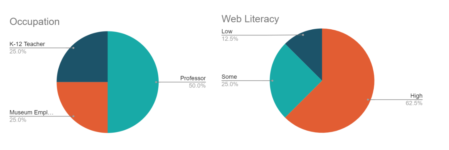
Moderated User Testing allows researchers to collect real time, qualitative data about the digital products in question. For the Carter Museum we focused on recruiting art history educators. Using a combination of personal networks and the Pratt Institute School of Liberal Arts and Science, History of Art and Design Program, we were able to find eight (8) participants who had experience with either museum curation and/or art history education. Participants by occupation and self-described web literacy shown below.
Each researcher interviewed two (2) participants via Zoom. Each participant was asked to answer five (5) question and complete five (5) tasks (shown below). We asked participants to think aloud as they explored the website, asking them follow up questions when necessary to identify any potential usability issues. Tasks and Questions listed below.
Findings
Discoverability of Educator Resources
- The global navigation bar did not give users enough information regarding the content within each tab, and none of the tabs immediately spoke to users when looking for educator resources.
Content on “For Educators” Page
- Users felt the “For Educators” page was disorganized. The call to action to subscribe to the newsletter threw users off and signified to them that they were on the wrong page.
Usability issues on ‘Collection’ Page
- Filters were either too vague or too specific for general purpose use.
- “On View” and “Educator Resources” buttons missed by 50% of users.
Content on Artwork Detail Pages
- Users felt “Educator Resources” was hidden between other content.
- Change in background color signified end of page making users miss most content.
- No indication of images are downloadable.
Recommendations
Educator Resources Page:
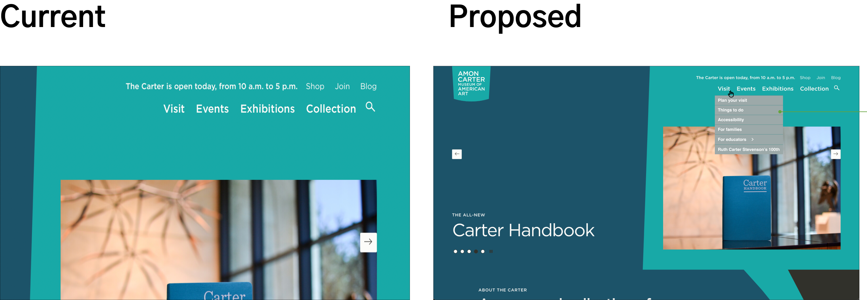
- The addition of visible subtabs will give users a better sense of the website’s sitemap and what is avaible for them to explore.
“For Educators” Page:
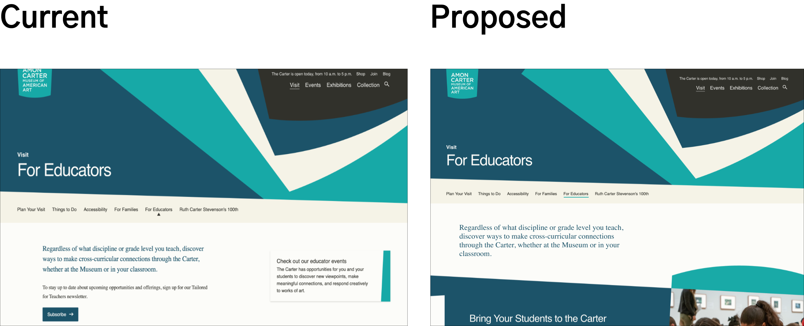
- Moving the “Subscribe” button and the educator events lower on the page will prevent confusion about the page’s contents.
“Collections” Page:
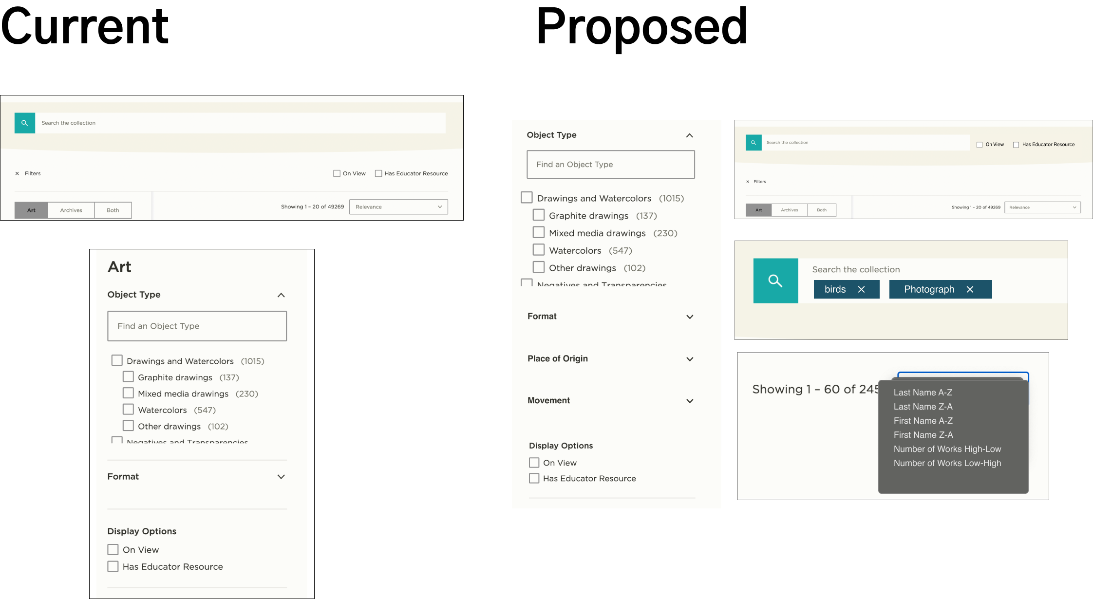
- User’s expertise with collection filters led us to suggest the addition of “Place of Origin” and “Movement” filters.
- The use of advanced search features is not obvious to users with lower web literacy. The addition of tags in the search to better control filters will allow for more accurate searches of particular works.
- Filtering by name for artists will provide more intuitive search results.
- The movement of “Has Educator Resources” and “On View” button to be in line with the search bar will prevent users from missing them as search filter options.
Artwork Detail Pages:
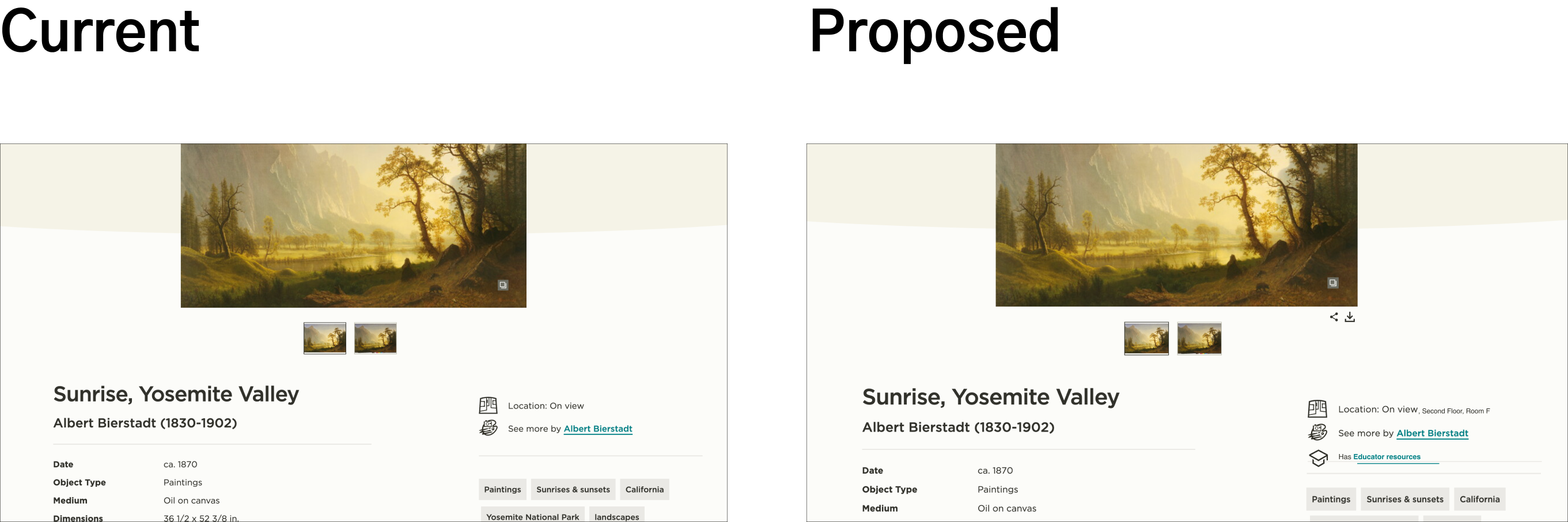
- Download and share buttons added to public domain images was requested by almost all participants, regarless of occupation.
- Jump to Educator Resources button to highlight and signify the presence of Educator Resources for teachers.
- Change in information architecture to move Educator Resources above Related Content and remove change in background color to prevent confusion (not shown).
Conclusion
Overall the client was very happy with the suggested mockups and impressed by the plethora of findings. The Amon Carter Museum provides a wealth of information for educators, researchers and general audiences alike. The redesigning of certain pages to accommodate their respective audience will increase overall usability and potentially user traffic for the Carter Museum website. It was a pleasure working with the Carter Museum and I look forward to seeing how their website grows and changes.