The interface I will be examining is the desktop version of Spotify. The platform has been around since 2006 and has evolved into one of the biggest music, podcast, and audiobook streaming platforms. At the start, however, Spotify was exclusively for music. These newly added features could contribute to Norman’s concept of the paradox of technology – the added functions may make the interface more complicated and harder to use. Overall, even with the new features, I think the interactivity cues on their platform are clear, and the interface feels intuitive and easy to learn.
When you initially create a Spotify account, the platform guides you through a series of questions designed to tailor recommendations to your musical preferences. This not only provides users with a more personalized experience but also contributes to shaping Spotify’s positive system image.
Creating a playlist
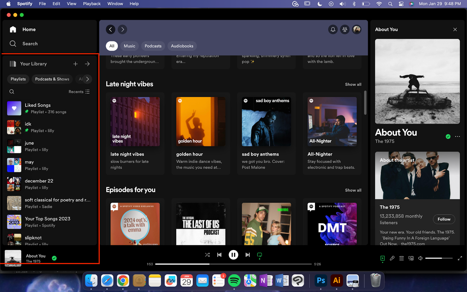
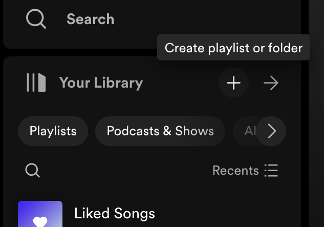
Users can access their library constantly while browsing through different tabs on Spotify. It is located on the left side of the screen and can be collapsed if users prefer (Figure 1). To make a playlist, users can press the “+” button, which provides hover feedback. This effect acts as a signifier and communicates to users that the button affords the ability to create a playlist (Figure 2).
Due to the color palette chosen for Spotify, there’s good contrast between the “+” button and the background. The white button on the black background adds to the button’s visibility, and makes it more discoverable for users.
(Figure 1)
(Figure 2)
Listening to music
Once users have created a playlist, or searched for a song, they can then proceed to listen to the music. The icons located at the bottom of the interface affords users the capabilities of pausing, playing, or skipping songs. The icons used provide clear mapping for users to understand the cause and effect relationship of buttons. For example, it’s clear that the “play” icon will begin the song, while the “pause” icon will stop it, because these icons have become the standard to represent their respective actions. Utilizing users’ knowledge in the world by using these visually recognizable icons helps to increase Spotify’s usability, and decrease users’ gulf of execution since they are correctly perceiving what is possible in the system.
Users can also skip to a certain part of the song by clicking on the horizontal line located under the play/pause button. However, this function lacks a signifier (Figure 3). To communicate this better, while users hover a bubble labeled “Skip” can appear above where their cursor is resting (Figure 4). This type of visual feedback would align with the rest of Spotify’s hover feedback, so it would add to the interface’s consistency.

(Figure 3)

(Figure 4)
For the free version of Spotify, users will not be able to pick specific songs to listen to. They will also have a limited amount of skips, while premium users have unlimited skips. This is a constraint put upon users with the free version.
Adding songs to playlists
Once users have created a playlist, they can begin to add songs. Users can use the search bar, which uses the magnifying glass icon to signify that it affords browsing, to look up a specific song, artist, or genre to look through. They will then click the ellipses button, which signifies that more functions are available, and select the playlist they want the song added to.
To show confirmation that it’s been added, visual feedback is given to the users in the form of a pop-up bubble, letting them know that their action was successful (Figure 5). Spotify provides users with consistent feedback which helps to minimize their gulf of evaluation – a responsive design lets users know where they are in the process of achieving their goal.

(Figure 5)
Users who utilize playlists made by other people will not be able to add new songs to the playlist. This is a constraint that’s put on the users and allows playlists to be shared without the users who created them having the fear of other people altering them.
Here is an example of Norman’s concept of the seven stages of action applied to a user adding a song to their playlist (Figure 6).
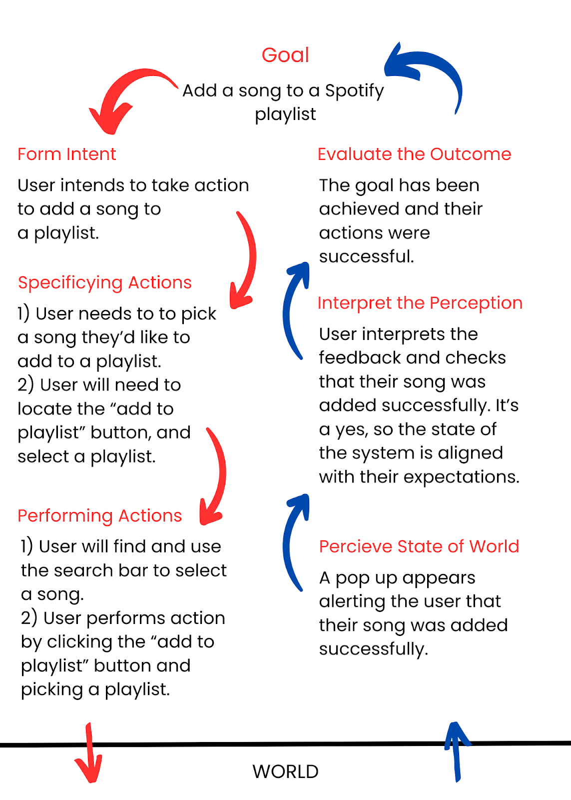
(Figure 6)
Conclusion
While many interfaces, including Spotify, provide a learnable and intuitive experience with great functionality, there is always room for enhancement. Spotify, although currently user-friendly, could benefit from additional feedback mechanisms, signifiers, and refinements to further elevate the platform’s usability.