
Introduction
Walmart, a global retail giant, offers a vast range of affordable products through its stores, e-commerce platforms, and app. It is one of the fastest growing and most dynamic e-commerce platforms. You can find a ton of items in a Walmart store or shop online through their website or app.
Being a frequent user of the Walmart app for online grocery shopping due to my busy schedule and commuting constraints, I’ve observed that the app lacks certain elements of good design as per ‘Don Norman’s’ design principles, even though they provide excellent delivery service. The purpose of this study is to evaluate and analyze Walmart’s app design per Don Norman’s book, ‘The Design of Everyday Things’.
The Process
To facilitate this study, I chose to purchase groceries using my typical method. However, my emphasis will be on scrutinizing the user interface and task flows. Traditionally, I navigate to the app’s landing page, search for items in the search bar, and add them to my cart. In this process, I hadn’t initially identified the issues with the app. This time, I’ll specifically highlight the issues that stand out at the most noticeable points while adding some fruits and vegetables to my shopping cart.
Step 1 : Browsing Groceries options
Problems:
Upon navigating to the landing page, I chose “Grocery & Essentials,” leading me to the respective page. However, I observed that my tendency to rely on the search bar stemmed from a weak visual hierarchy and a deficiency of robust signifiers on the Grocery page.
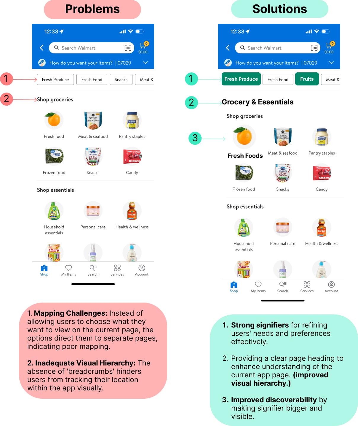
Solutions:
Enhanced user experience by incorporating clear visual cues to better understand and cater to user preferences. Strengthened visual hierarchy with a prominent page heading, improving location awareness. Increased discoverability by enhancing the visibility of fresh food signifiers.
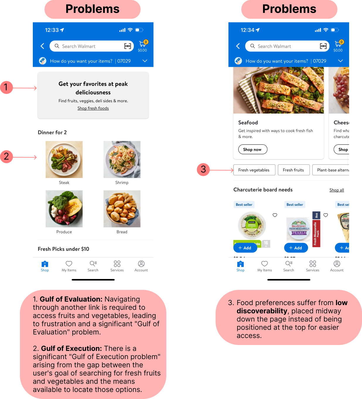
Step 2: Going through the Fresh Food Page and finding the fruits and vegetables options.
Problems:
Selecting the fresh food option on the Grocery and Essentials page redirects users to an extra page dedicated to fresh food, creating confusion. Further navigation through an additional link is necessary to reach fruits and vegetables, resulting in frustration and a notable “Gulf of Evaluation” issue. A “Gulf of Execution” problem emerges as users encounter a gap between their goal of finding fresh produce and the available means to locate these options. Additionally, food preferences face low discoverability, positioned midway down the page instead of at the top for more accessible access.
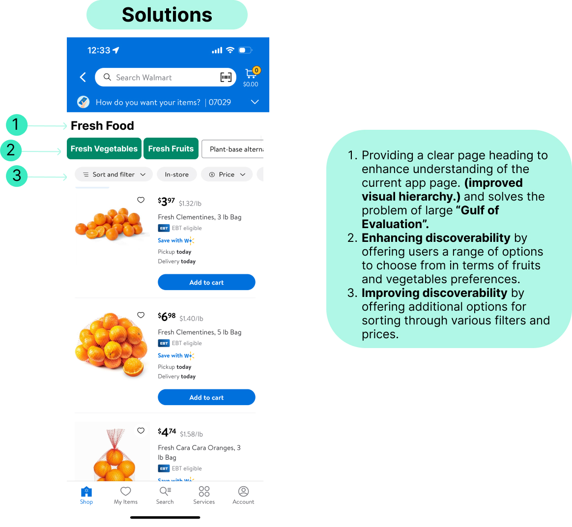
Solutions:
To tackle the issues mentioned earlier, I revamped the screen design. Now, users can easily grasp their current location in the app with a clear page heading, reducing the confusion caused by a significant “Gulf of Evaluation.” I’ve also amped up discoverability by giving users more choices for their fruit and vegetable preferences. Additionally, sorting through filters and prices is now more convenient, further enhancing the discoverability of available options.
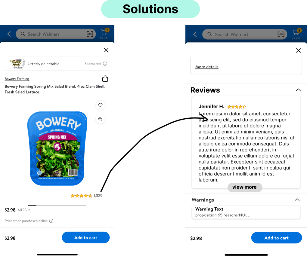
Step 3: Check product reviews
Problems:
While navigating through various products, the product column displays reviews and star ratings, which are absent when you open the product window. In Don Norman’s terms, this issue relates to a “Gulf of Evaluation,” where there’s a disconnect between the system’s output (reviews and ratings on the column) and the user’s understanding (missing information in the product window). This issue also aligns with the concept of a “Gulf of Execution” because there is a gap between the user’s goal of finding and accessing reviews for a product (the execution) and the means available within the interface to achieve that goal.
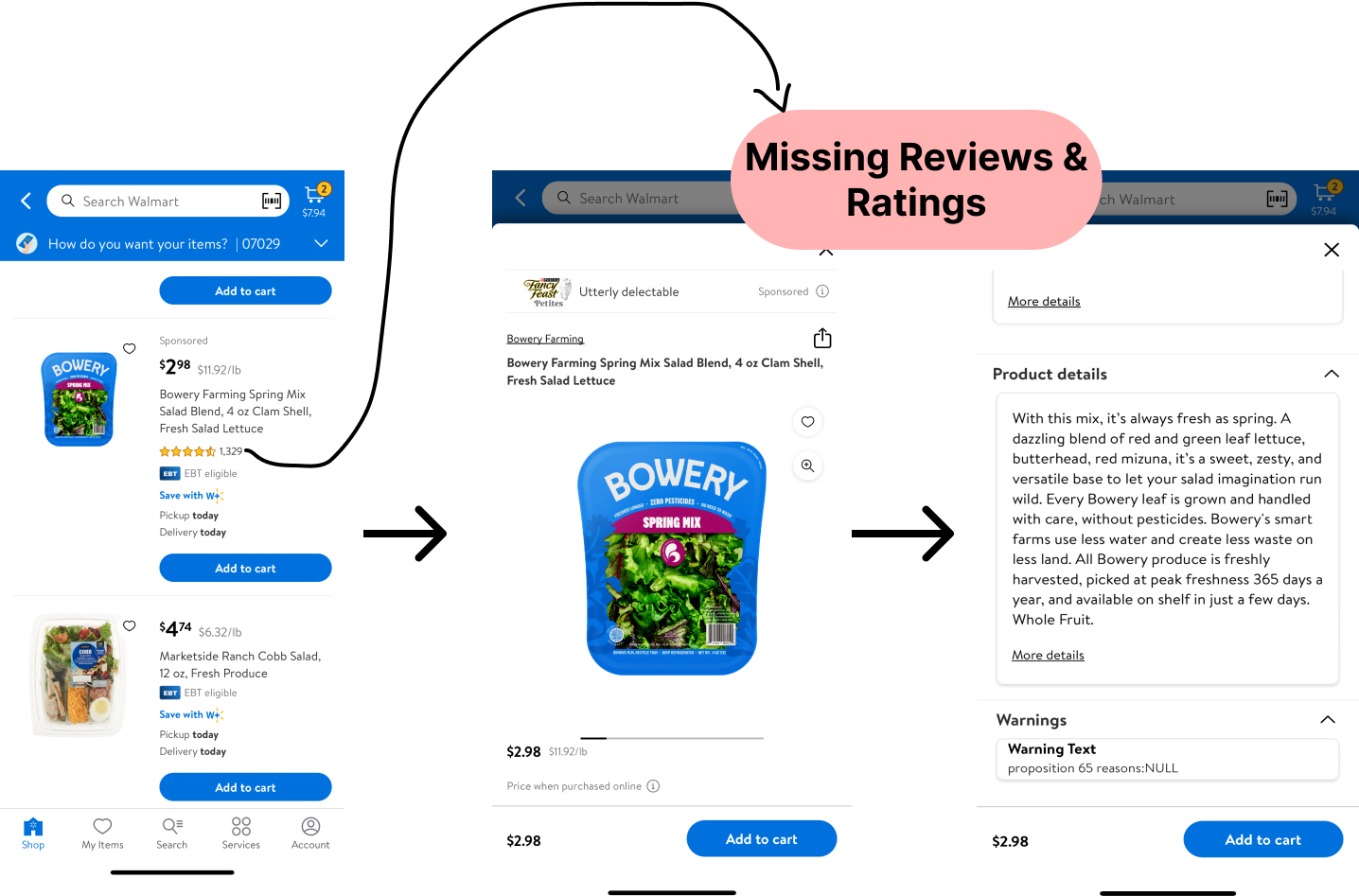
Solutions:
Adding the reviews button directly to the product window would help bridge this gap, making the execution of the user’s intent more straightforward and intuitive. By mapping the reviews button directly to the product window, there’s an improvement in the clarity of the system’s feedback, reducing the gap in evaluating the system’s response to the user’s action. This aligns with Norman’s design principles aimed at enhancing both execution and evaluation for a more user-friendly experience.
CONCLUSION
Analyzing Walmart’s app through Don Norman’s design principles reveals that while it offers decent service, there’s substantial room for enhancement. Despite being user-friendly for novices, applying Norman’s principles suggests significant opportunities for improvement. The task flow discussed is just a small example of potential enhancements, indicating a broader scope for refining the overall app experience.