Duration: Sep – Dec 2023
Team members: Cici Lin, Jennie Lin, Keyi Zhang, Nehal Sharma
Project Overview
WITNESS for Mass Incarceration (WITNESS) is an organisation aimed to support Formerly Incarcerated People (FIP). It is dedicated to transforming the lives of FIP by advocating for long-term solutions, fostering economic empowerment, and building generational wealth. Following extensive research, through strategic and comprehensive design including restructuring, streamlined navigation, visualising impact, and humanising FIP content, we intend to transform the WITNESS website into a hub that empowers FIP, cultivates community networks, raises awareness, and inspires support and donation, providing a dynamic and engaging online experience.
Research
Before starting the research, we have synthesized these three goals to direct our research from the initial meeting with our client Evie, the founder of WITNESS.
ORGANIZATIONAL PRINCIPLES
- Empowering: WITNESS empowers formerly incarcerated individuals through sustainable social enterprises and economic empowerment
- Connecting with Community: WITNESS builds community networks for FIP to rebuild their life
- Comforting & Improving Quality of Life: WITNESS makes life safer for people who were incarcerated and to help people build successful lives once they are home
- Raising Awareness: WITNESS aims to bring awareness among the society regarding FIP, people who can support the community by donations

Ecosystem Map
We developed an ecosystem map to better understand the relationships between Witness and the main stakeholders and audience.
Insights:
- Witness has a simple organizational structure itself, so our design would be mainly for external stakeholders.
- Funding comes mainly from funds rather than donations; thus, a donation flow will be developed to encourage contributions.
- Current website visitors, most of whom possess a certain level of awareness about FIP.

Technical Analysis
We examined the IA and key flows of the current website and identified potential opportunities for improvement.

Insights:
- A need to streamline the current information architecture.
- Seek a balance of visual and textual content on the website. Currently, in some sections, all-caps, white-on-black paragraphs may bring some visual burden.
- Show better visual hierarchy and consistency throughout the site.
- Transition from personal story to FIP stories, add more people’s stories of formerly incarcerated stories, to resonate more.
- Better arrange the number of buttons and links on a page, and also make them more organized.
Competitive Audit
To understand what competitors are doing on their websites and generate insights for our design solutions, we evaluated seven websites focusing on seven features: Homepage, Navigation, Information Architecture, Key flows and pages: Donation and About, Visual style and Storytelling.

Insights:
- Storytelling: Tailor the storytelling to WITNESS’s tone of voice, add storytelling structures/elements to make key flows more smooth.
- Information Architecture: Design a neat and balanced website with a reasonable amount of information.
- Homepage: Use visual segmentation for different sections.
- Donation: Always have donation CTAs clear and easy to access. Consider using the Donation button, floating box, floating beak to emphasize on donation.
Literature Review
We conducted surveys to gather insights on existing knowledge in FIPs, designing for non-profit organizations, storytelling from articles, videos, news and blogs.
Insights:
- About FIP: FIP is facing significant discrimination in the labor market. Storytelling as a powerful tool to build pathways for FIP’s reentry.
- About non-profits & donations: Use stories to explain ‘why to donate’ and call for donors. Tell positive stories to show the impact of WITNESS directly.
- UX & Storytelling: Use of visual UI elements like pictures and colors to create a memorable experience and build trust.
Interviews & Usability Testing
During our user testing process, we conducted interviews and gathered feedback from five participants: one potential visitor and four FIPs referred by our client. We wanted to learn about the mental models, behaviors and motivations in the interviews and to understand how users interact with the Witness website and uncover potential issues from the usability testing.

Insights:
- “I would like to learn about people I’m impacting, definitely I want to see like a story of at least a few of them, and how my money could make a change to their life” – People base their decision to donate on two crucial factors: the transparency of the organization and the reliability of the payment gateway.
- A compelling narrative, particularly when accompanied by visual elements, motivates people to donate. Visualizing the impact can further enhance and broaden WITNESS’s network.
- “So one thing about prisoners… I want to see wood and flowers because my world was concrete and steel. Now, I want brightness around me.” – Some participants prefer a lighter interface, especially FIPs.
- Participants had difficulty locating Events on the website.
- Website accessibility should be considered. Too much text and all-caps passages were difficult to read.
After thorough research, we’ve consolidated three main insights.
Research Insights

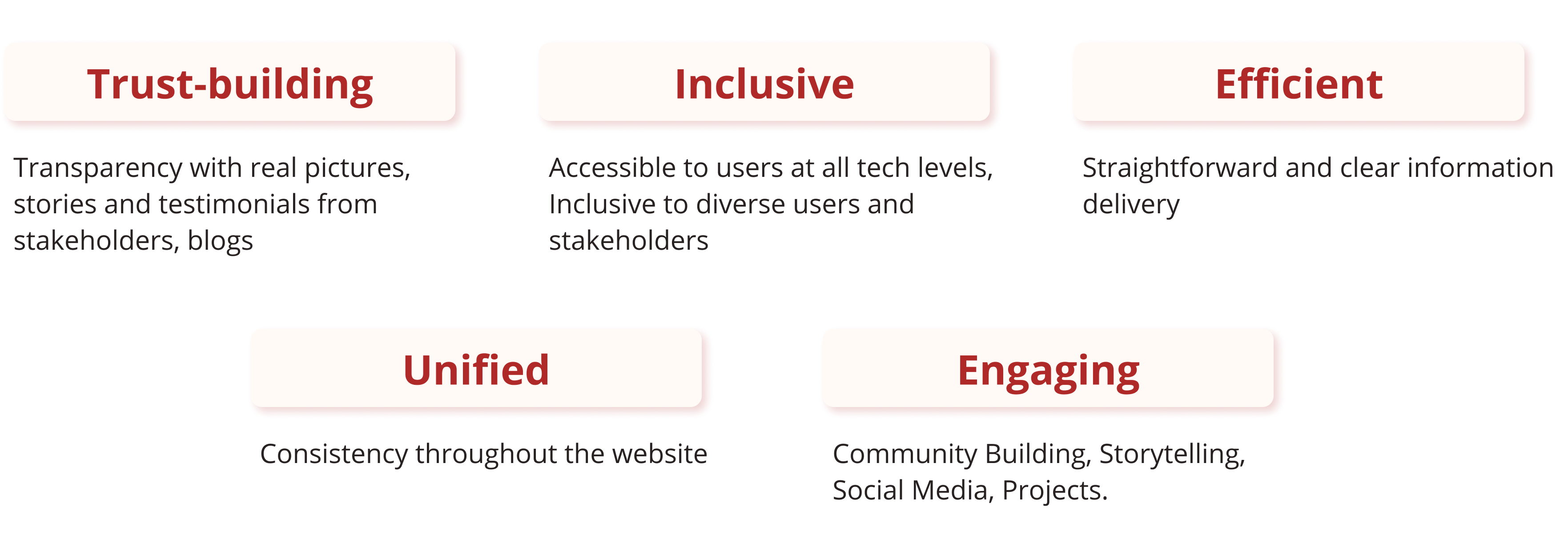
We also formulate and establish our Design Principles based on research and organizational principles. It includes Trust-building, Inclusive, Efficient, Unified and Engaging.
Design Principles
To bring those principles to life in the actual design process, we made our design strategies. They involve more detailed planning and specify the actions to implement our design principles effectively. They are categorized into three key aspects: Flow, Visual, and Content.
Design Strategies

Ideation
Product Diagram

Key Flows

Information Architecture
Informed by the explanatory research and tree testing with 12 participants, we mapped out the information architecture of the site.

Wireframing

Iterations
Insights
Based on testing the mid-fi prototypes, we have gained key insights to refine our following design.
#Insight 1: The use of imagery enhanced the immersive and engaging storytelling
In the mid-fi prototypes, we replaced the existing website images with full-width and positive ones. This attempt received much positive feedback from the testers. They could read the uplifting story from these images, especially the full-screen landing page image.
#Insight 2: Consider accessibility when choosing colours
The user testing and accessibility audit results showed that the current colour palette that the WITNESS website is using does not meet some accessibility standards. As inclusivity is one of our design principles, we need to twist the colour scheme for accessibility whilst maintaining WITNESS’s unique brand identity.
#Insight 3: Avoid using dense content on the website
While we were trying to tell a thorough story about WITNESS on the website, we included high-density content which could stop users from continuing reading. Some content chunks were also repeated across the site to cause redundancy.
#Insight 4: Build logistic plots and transitions for WITNESS’s story
Content chunks are the story plots we created for users in the WITNESS’s story. Between some plots, there were no smooth transitions. This lack of storytelling elements caused confusion among users.
Improvements
These insights directed us to iterate the mid-fi prototypes from four perspectives towards our design principles.
#Improvement 1: Maintain the consistency of positive content
Given the positive feedback from our choice of positive imagery, the overall content was decided to be maintained consistently positive. In addition to replacing other images with positive pictures, the plain text was revised into friendly and warm sentences. The overall tone of the site and vibe is aimed to be engaging and welcoming. In headings, straightforward phrases were adjusted into welcoming short sentences – e.g., Contact Us to Reach out to us for any help & The Story to See our moments.


#Improvement 2: Enhance the website accessibility while maintaining brand identity
The accessibility concern untangled our problem with the color palette choice. The testing adoption of the original brand colors reveals the problem of low color contrast, and hence low readability. To address this issue, the brand red was adjusted into a darker adjacent red. Also, pure black in a transparent gradient was adjusted into a solid dark gray.

#Improvement 3: Reorganise WITNESS’s story content to keep simplicity and clarity
We removed the programs from the homepage as it’s repetitive with the other projects section. Also, we placed the 2 FAQ category sections on their own page respectively to simplify reading.

#Improvement 4: Add transitions in between content chunks to ensure seamless storytelling
Contextual elements were decided to be supplemented to the WITNESS story on the site and bridge the understanding gap between each story plot. For instance, on the homepage, the heading and more project information were added in between the projects and news sections. These elements add more context to this section. It eventually ensures seamless storytelling on this page.

Design
Color and Typography

We have carefully selected a palette of sophisticated colors for our website, drawing inspiration from black, red, incarnadine, and white tones. This thoughtfully curated color scheme not only embodies elegance but also aligns seamlessly with our client ‘witness’s website. In addition to our distinctive color choices, we have opted for the refined and modern Open Sans font to enhance the overall visual appeal of our web design, ensuring a harmonious and captivating user experience.
Design Implementation
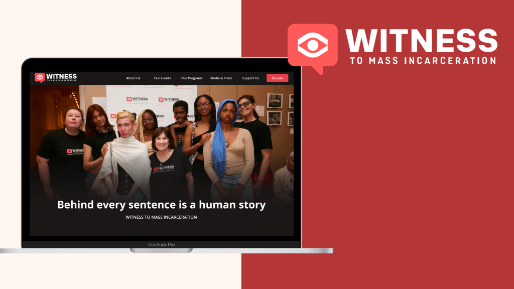
Homepage

We acquired the captivating image and compelling tagline from Evie, and after presenting it to our client, we received overwhelmingly positive feedback. The combination of Evie’s imagery and the thoughtfully crafted tagline has transformed our project, elevating its visual appeal to new heights. The client expressed admiration for the stunning aesthetics and the overall impact, emphasizing that the collaboration with Evie has truly enhanced the project’s visual identity. The seamless integration of the image and tagline not only meets but exceeds our client’s expectations, making the overall presentation more engaging and memorable. This successful collaboration underscores the importance of selecting the right elements to create a powerful and visually appealing message that resonates with our audience.

In our communication strategy, we have adopted the use of concise and impactful short sentences to effectively convey our identity and announce upcoming events. By distilling our essence into a brief sentence, we aim to provide a quick and memorable snapshot of who we are as an entity. This approach allows us to succinctly communicate our core values and purpose, creating a clear and immediate connection with our audience. Additionally, when unveiling our latest events, we leverage the power of brevity to generate anticipation and excitement. This concise messaging not only serves as a teaser for what’s to come but also ensures that our audience quickly grasps the essence of the upcoming event, sparking curiosity and engagement. The deliberate use of short sentences in these contexts enables us to make a swift and lasting impression, fostering a sense of intrigue and interest among our target audience.

Within our platform, we are dedicated to transparently showcasing the significant impact of our witness events on users. Through compelling statistics, we provide a comprehensive overview of how users have benefited from these transformative experiences. These statistics serve as a testament to the positive outcomes and value generated through our events. Moreover, in a strategic layout, we feature prominent project placements on the same page. This design not only enhances the user experience by offering a comprehensive snapshot of our initiatives but also allows users to delve deeper into specific projects. By incorporating interactive elements, users can seamlessly click through to explore various projects in more detail. It’s a dynamic and user-friendly presentation that not only informs but also encourages exploration, fostering a deeper connection between our audience and the impactful work we are engaged in
Learn About Witness


To enhance the user experience, we have meticulously organized the Learn Event page, ensuring clarity and a visually appealing layout. The order of information has been thoughtfully structured to guide users seamlessly through the content, making it easy to navigate and absorb key insights. Each section has been strategically placed to create a logical flow, providing a clear understanding of the event’s purpose and offerings. Additionally, we take the opportunity to introduce the concept of Witness Values on this page. Witness Values are the foundational principles that underpin our events, emphasizing the significance of observation, empathy, and shared experiences. Through concise and engaging descriptions, we aim to convey the inherent value of being a witness to impactful moments and the positive influence it has on personal and collective perspectives. By integrating these values into the Learn Event page, we not only inform our audience about the order of events but also impart a deeper understanding of the principles that guide and define our initiatives. This approach serves to enrich the user’s journey, making the Learn Event page a comprehensive and enlightening resource for those seeking both information and inspiration.
Meet The Team

In our organizational structure, we have implemented a systematic categorization of individuals, placing them within a hierarchical scale that reflects their roles and responsibilities. This hierarchical framework serves to establish a clear and efficient organizational structure, allowing for streamlined communication and decision-making processes. Each category within the hierarchy corresponds to specific roles, ensuring a well-defined chain of command and accountability. Furthermore, to specifically address the diverse skill sets and developmental stages of our interns, we have taken a nuanced approach by folding them into distinct categories based on their respective years. This tailored categorization allows us to recognize and support the unique contributions and growth trajectories of interns at different stages of their educational and professional journey
Community Stories

Within our platform, we have dedicated Community Stories pages that serve as a vibrant showcase of diverse and successful events facilitated by our dedicated witness teams. These pages are thoughtfully curated to share the compelling narratives and impactful experiences that have unfolded through the collaborative efforts of our teams. By featuring a variety of stories, we aim to highlight the versatility and breadth of our witness events, showcasing how they have made a positive difference across various contexts and communities. Through engaging multimedia content, including photographs, testimonials, and perhaps even video footage, we bring these stories to life, offering our audience a firsthand glimpse into the meaningful moments that have transpired. The Community Stories pages not only celebrate the accomplishments of our witness teams but also serve as a source of inspiration for others looking to embark on similar initiatives.
Events

In our user-friendly interface, we have strategically implemented a system of shortcuts to provide swift access to various events. This intuitive design enables users to navigate seamlessly between different events, enhancing their overall browsing experience. These shortcuts serve as convenient pathways, allowing individuals to effortlessly explore a diverse array of offerings without unnecessary navigation complexities. Moreover, we recognize the importance of preserving and reliving impactful moments. To cater to this, our platform features a dedicated section where users can revisit and savor moments from previous events. This engaging feature not only adds a nostalgic element but also facilitates a sense of continuity and connection for our community. By incorporating this functionality, we create a dynamic and interactive platform where users can easily transition between the present and past, fostering a deeper engagement with our content.
Help and Donation


Within our platform, we are committed to making a meaningful impact by providing avenues for support through our Help & Donation page. This dedicated page serves as a central hub where individuals can contribute to the financial well-being of our witness initiatives. We go beyond merely facilitating monetary donations; our emphasis extends to encouraging active participation and involvement. Our unique approach involves not only giving away funds but also fostering a culture of volunteerism. Through this page, individuals have the opportunity to offer their time, skills, and expertise to directly engage with witness initiatives, amplifying the positive impact of their contributions
Media and Contact Us


In our commitment to transparency and open communication, we have established a dedicated Media Page to serve as a comprehensive repository of information about witness events. This page is meticulously crafted to provide everyone with a clear understanding of the happenings and achievements within the witness community. Through engaging multimedia content, including photos, videos, and articles, we aim to offer a dynamic and immersive overview of the impactful moments and experiences that unfold during witness events. The Media Page serves as a vibrant narrative that captures the essence of our initiatives, fostering a sense of connection and shared understanding among our audience.
Future Steps
Considering the better implementations and greater impact in the future, we have come up with the following suggestions.
- Leverage positive content and keep this content strategy consistent throughout the site. For example, in addition to the images and welcoming text we have adopted in the prototypes, the content team can create videos and blog posts about FIP who received support from WITNESS to visualize the positive impact of WITNESS.
- Implement the proposed design on suggested Squarespace templates, like Lusaka and Comet. These templates have a similar visual and content style to our proposed design and show little tech barrier to implementing design.
- Update WITNESS website content more frequently and regularly. The constant and routine updates can improve the SEO and bring more traffic to the WITNESS website, then more likely to increase its donations via the website.