Little Alchemy 2 is a puzzle game where players start with four basic elements (air, earth, fire, and water) that they can combine into new elements, with a maximum of 720. This design critique is focused on the iOS app version, but it is also available on the web, Chrome, and Android.
STARTING PAGE
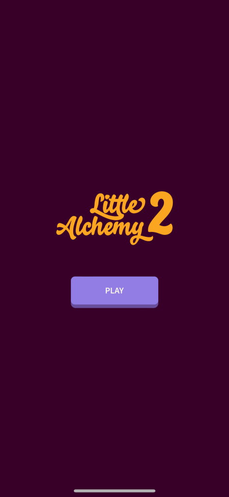
Upon downloading and opening the app, users are greeted with a page (figure 1) that simply shows Little Alchemy 2 and a purple “PLAY” button. The design works very well here based on Don Norman’s principles of design. The purple “PLAY” button is discoverable, as it is large and visible. Being the only button available on this page, it affords itself to being pressed. The signifier of the word “PLAY” makes it easy for the user to know what to do next. This starting page bridges the gulf of execution because the user can easily identify what needs to be done to start the game. Pressing the “PLAY” button leads the user to the home page, which bridges the gulf of evaluation since the user can easily see that their action led them to the game.
HOME / PLAY PAGE

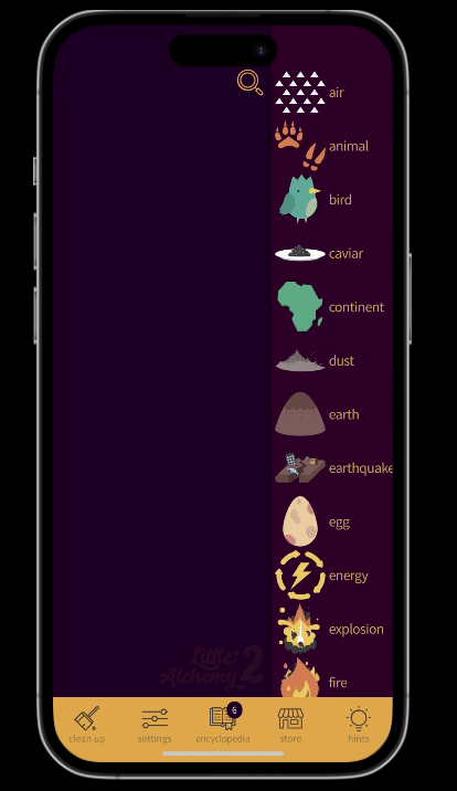
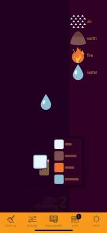
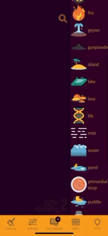
The user enters a page (figure 2) with a blank workspace on the left, with a search button on top, and 4 elements sorted alphabetically on the right – air, earth, fire, and water. The elements are shown with an image and text, which is a good design choice because the text offers accessibility to users who may not understand the image or need assistive technologies for the text. The text being associated with the image is good because it takes into account users’ short-term memory. If a user forgets what an element looks like, the text is there for clarification.
Users can scroll through elements, but there are no affordances for this. A solution would be to add a scroll bar, which would afford itself to be dragged/scrolled.
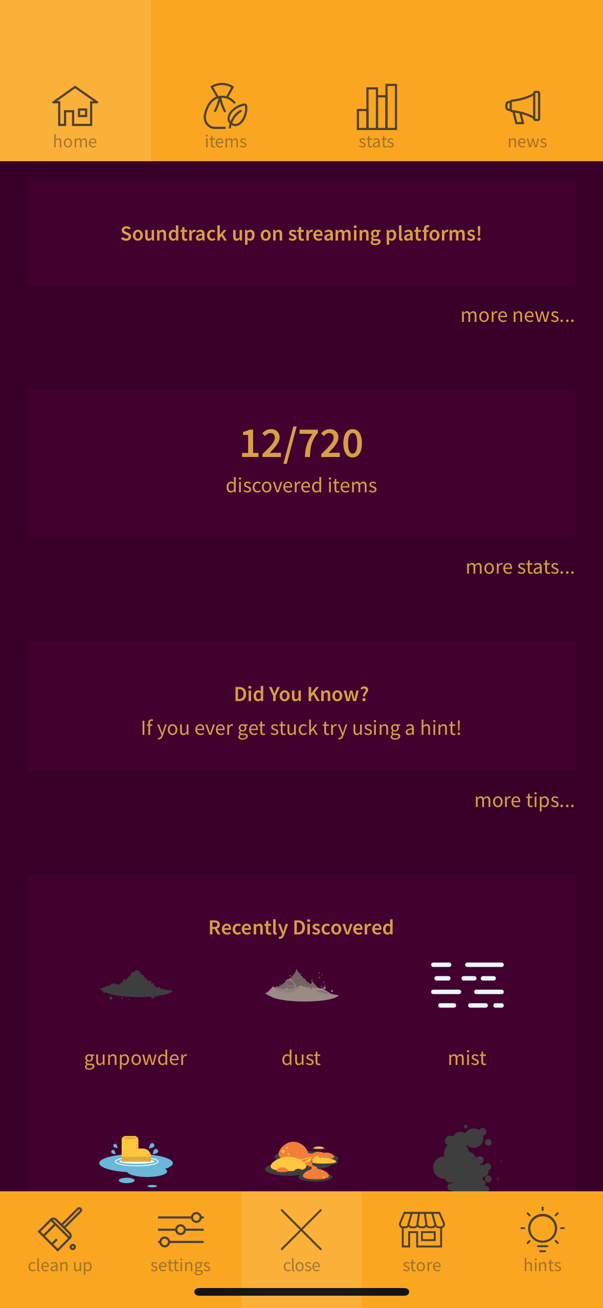
There are 5 features in the bottom banner – clean up, settings, encyclopedia, store, and hints. This banner follows standardization and builds a good conceptual model since users are used to seeing menu options on the bottom (in apps like Instagram, for instance). The buttons also have strong text signifiers that show the user what clicking on them will lead to. They also have feedback – for example, when a user clicks clean up, it clears the entire workspace.
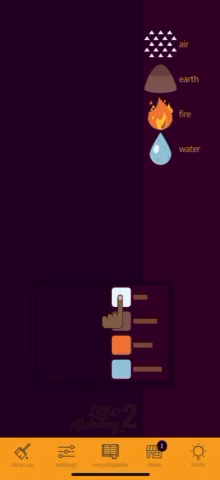
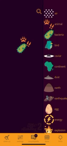
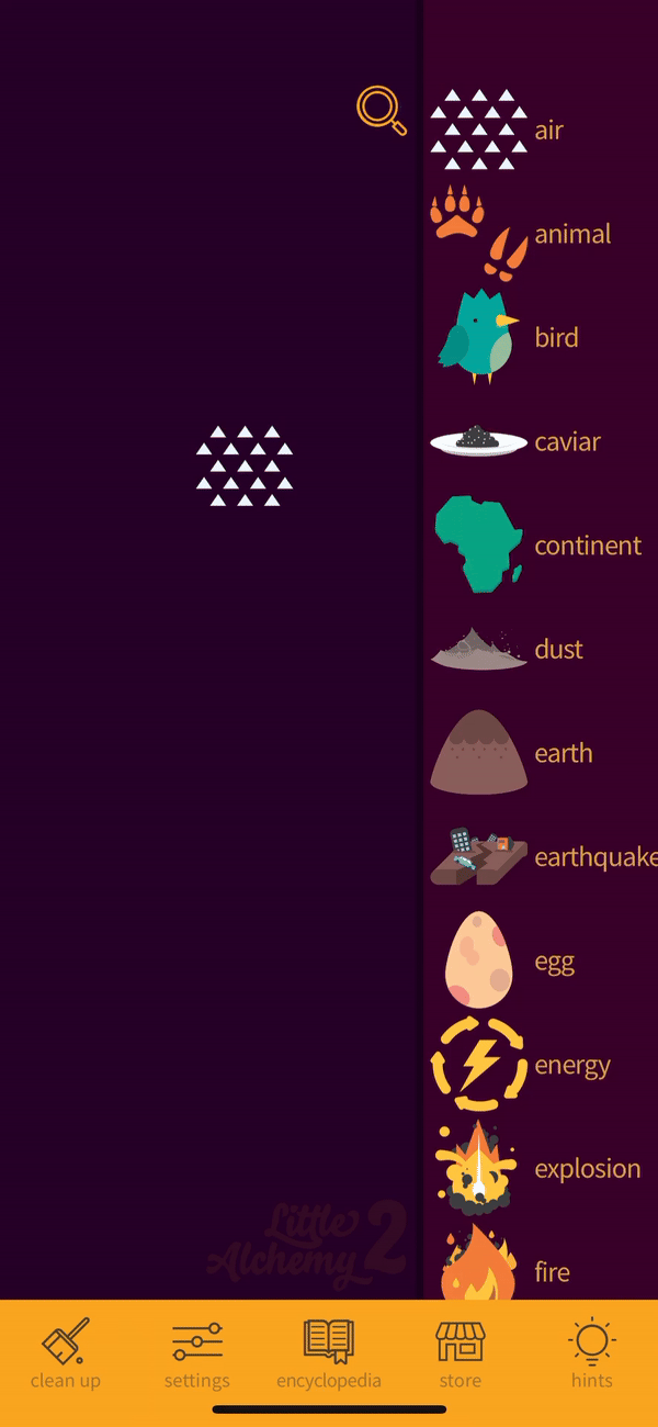
The search icon is designed well, but the search process (figure 3) is not. The icon is easily discoverable being large and at the top, and follows standardization, as it’s a generally known icon to users. When pressed, a cursor and the keyboard show up, which is good feedback and creates affordance to the action of typing. Elements show up as you type, with a physical constraint where the wrong spelling leads to a blank. However, the interaction ends there — clicking on the element closes the search and the element is still somewhere in the list where the user might not be able to find it. This is a problem because, with more elements on the screen throughout gameplay, a user might need the search feature to find and use an element in their workspace. If a user searches and clicks on the element to try to get it into their workspace, it won’t work, and the gulf of evaluation grows because they won’t understand why it didn’t work. This may affect users on the behavioral level with frustration or a feeling of lack of control.

A solution to this would be to allow the user to click on the item after it’s searched and have it show up on their workspace as a form of feedback. It could also navigate the right bar to the spot where the element is located. This solution is shown as a prototype (figure 4) below. The user clicks on the search, types salt into the screen, and it shows up on the workspace. The right element list would also scroll down (feedback would be an actual scroll, which is not shown in the prototype) to the area where the salt is located.
TUTORIAL AND HELP / FAQ
The first time a user plays, a tutorial (figures 5.1 and 5.2) is shown demonstrating how to drag and drop elements into the workspace and how combining them creates a new element. This is designed well in terms of learned mapping – a user learns to drag the item into the workspace, and it is expected to stay there. However, this video tutorial is only shown the first time the game is played, and it is the only tutorial shown. Only showing it once when the app is downloaded does not account for the limitation of users’ memories in case they forget how to play the game when they return to it. Because clicking on the elements doesn’t bring them to the workspace (only dragging does), this may lead to a larger gulf of execution in future plays where a user does not know what to do if they just see the empty workspace.
There are other features during gameplay – for instance, double tapping an element duplicates it. The design of these features is slightly poor because there are no affordances to indicate that a user can do this. A gulf of evaluation grows when a user completes this action and feedback does happen, but the user doesn’t know how it happened.
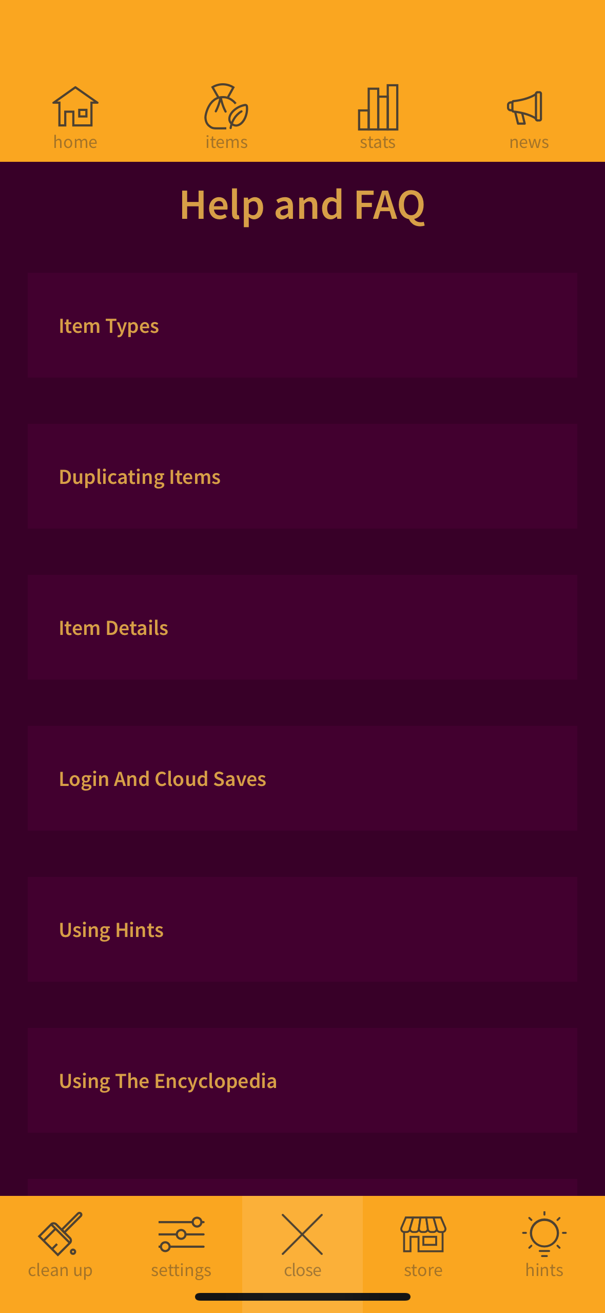
Finding features like this is possible when a user finds the Help and FAQ page (figure 6.2). Yet, finding it is a challenge because a user has to navigate to the encyclopedia (figure 6.1), and then click more tips… tucked away in the middle of the encyclopedia home page (figure 6.1). The conceptual model of the product doesn’t fit the mental model of the user, because a user may want to find Help and FAQ in settings. While the more tips… affords itself to be clicked, and there is feedback, which is getting to the Help and FAQ page, the signifier is not clear enough to indicate that an FAQ section would be there.
All of the issues above could be solved with the following design decisions:
- An in-depth tutorial at the beginning of a user’s journey into the game that includes all the features and tips a user can access. This makes for easy learnability. As users go through the tutorial, there should be clear feedback as they complete various actions (for example, during the tutorial of double tapping an element, a user does it, and the element duplicates).
- This tutorial should be accessible in the Help and FAQ section for future reference in case of memory lapses.
- The Help and FAQ page should be accessible in settings as a button with clear signifiers that lead to the page. It would be a good conceptual model since users will expect the page to be there based on standard conventions.
The prototype below (figure 7) shows what solutions #2 and #3 could look like – the Help and FAQ page located in the settings, and the game tutorial being part of the page if a user wants to refer back to it:
THE GAMEPLAY
When the user combines 2 elements, a screen pops up showing the new element, accompanied by its name and a text description (figure 8). It also gets added to the column on the right and can be used in new combinations. When a user tries to combine two items that can’t be combined, the items vibrate and remain on screen (figure 8.2). This process is well-designed because of its clear feedback. Both the pop-up screen and the vibration are indicators of results from the user action – without the feedback, a user wouldn’t know if the elements combined or not. The gulf of evaluation is therefore bridged because it is clear that combining two elements will yield some sort of response.

If a user tries to combine two items that have been previously combined, either 1) the element will be created again with a short animation (figure 9.1), or 2) there will be a vibration with the created element shown above for a moment (figure 9.2). This design is poor because of its inconsistency since the same action yields different results. It’s not clear why there are different feedback types, which may lead to confusion for the user.
The solution to this is simply to decide on one feedback option for this action to remain consistent. The 2nd option with the vibration is the best design because of the vibration feedback, and the clarity that the two elements can no longer create a new combination.
CONCLUSION
Some aspects of Little Alchemy 2, like the simplicity and clarity of the start page, follow Don Norman’s design principles well. However, when it comes to showcasing the app’s features and how to play, Little Alchemy 2 could use some work to help the user find and refer back to that information. While the gameplay is easy to understand and learn, with a bridged gulf of evaluation, there are some areas where feedback can be more consistent.