Introduction
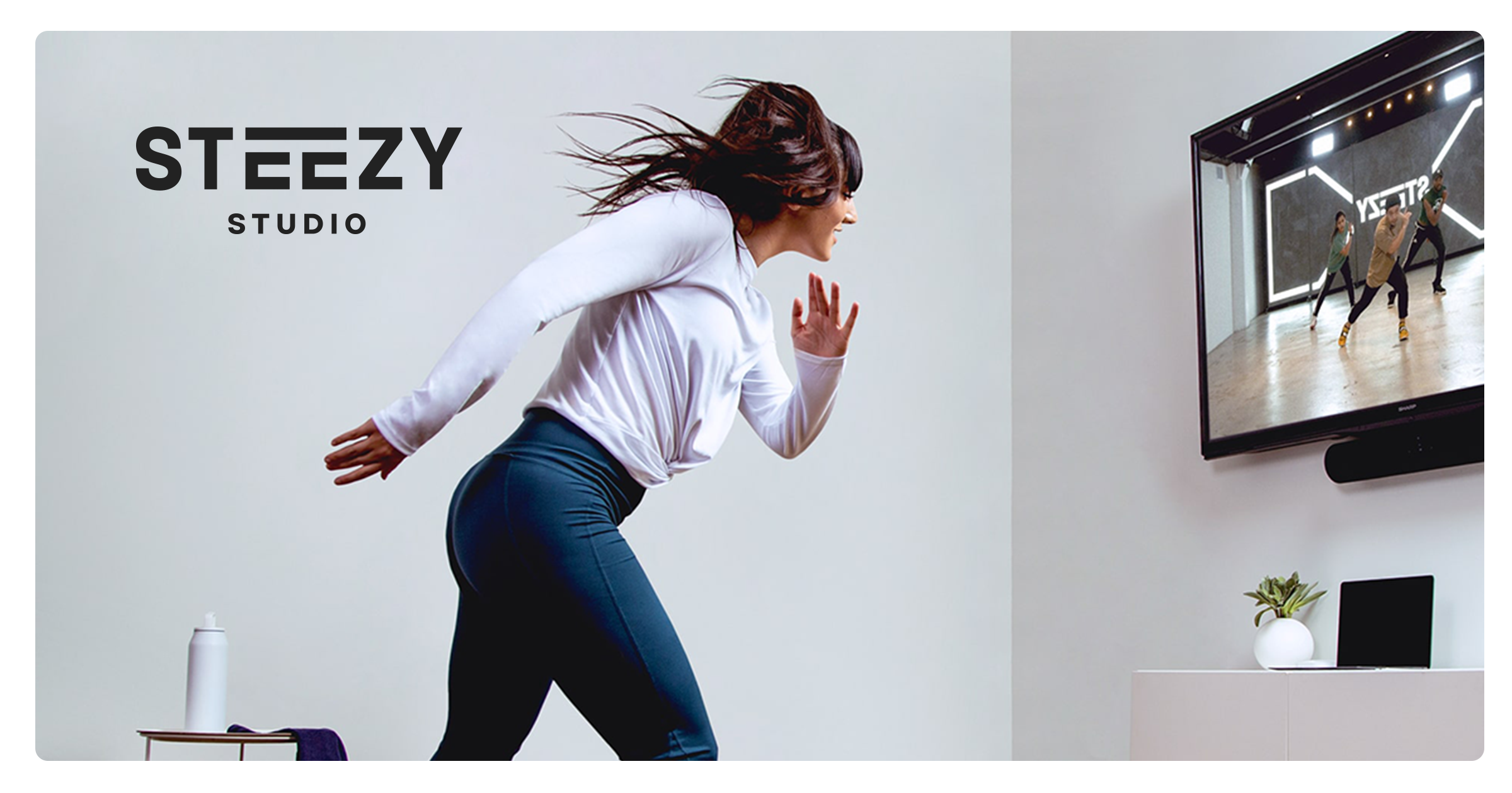
STEEZY studio is an online subscription service featuring hundreds of classes taught by world-renowned choreographers. The best part about STEEZY studio is you can do it all from your home. We’ll be taking a dive into the usability of their iPhone app based on the principles featured in Don Norman’s book: The Design of Everyday Things.
Browsing the Home Page
What works
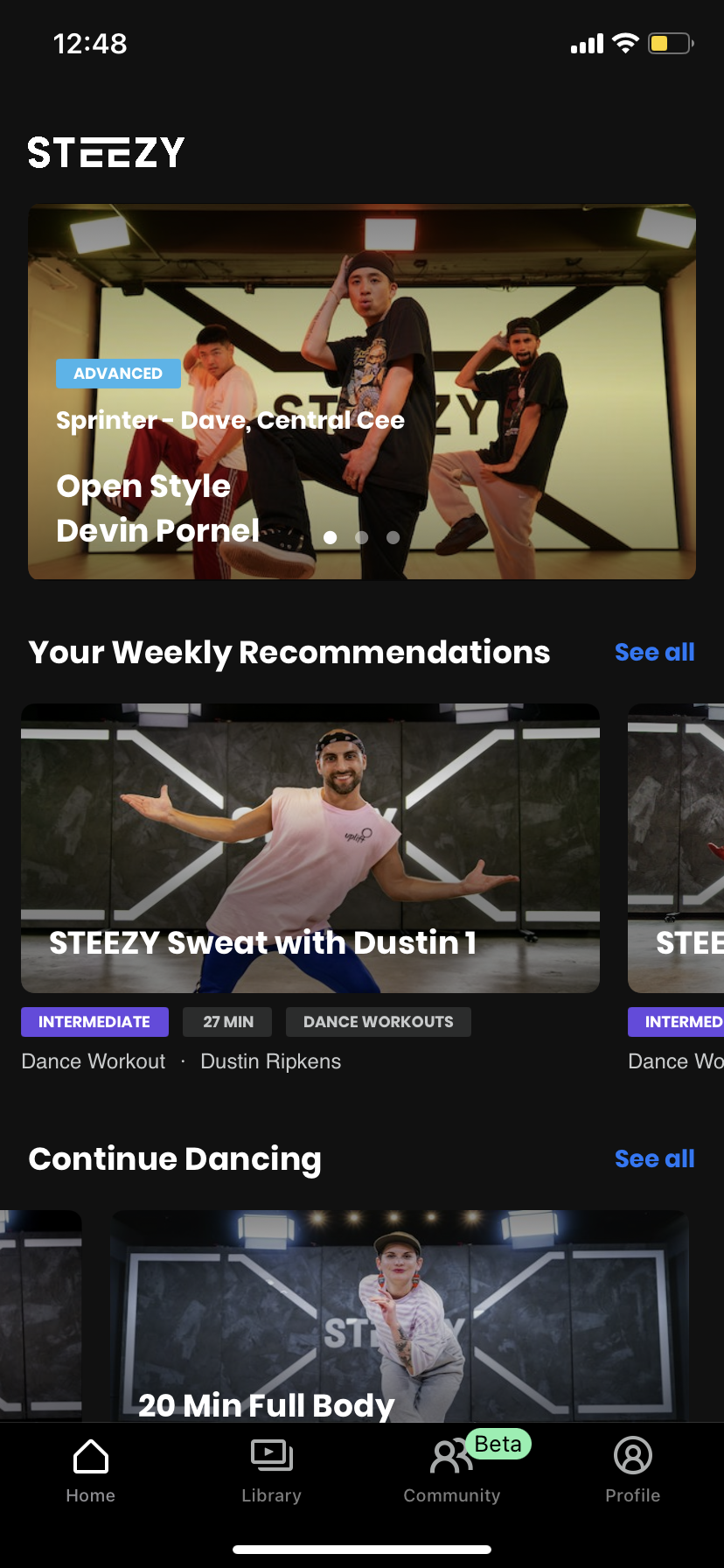
Upon entering the app, you are immediately greeted by recommendations on the ‘Home’ page. The first classes recommended are displayed via a carousel of thumbnails. The carousel affords swiping to see the next class. The dots signify the affordance of swiping based on a cultural constraint that almost all carousels maneuver the same way. There’s also mapping as each dot corresponds to a class in the same order and feedback as the opaque dots indicate the class you are currently viewing and moves along each swipe. Since the page cuts off content, it signifies there’s more to see and affords the action of scrolling either horizontally through the categories or vertically for the entire home page itself. To communicate that content can no longer be shown, the app constrains the affordance of scrolling in a bouncing fashion. If the user wanted to see more classes in a certain category, they would have to tap on the signifier ‘See all’ affording the ability to see a list of classes within that category.
What can be improved
There are slight edits using Norman’s principles that can be made to improve the usability of the home page. First, the home screen functions like the Youtube app in which there is no signifier that the thumbnails afford the function of a button. The user can be signified with a ‘See Class Details’ CTA button in the bottom right corner for each thumbnail. Furthermore mapping and feedback can be improved by adding a sidebar at the side to indicate where you are on the page and suggest where content starts and ends.
Using the search filter
What works
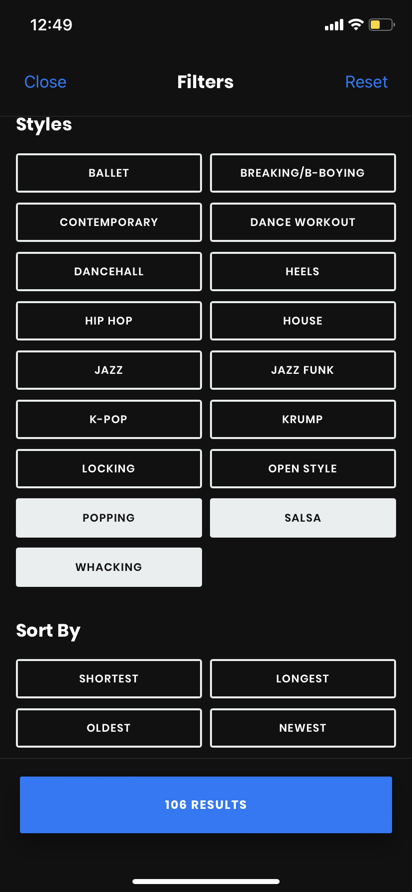
When you head over to their ‘Library’ section, the selection of classes are almost infinite. To make browsing more painless, the user can either search manually or use the filter option. Discoverability is fairly simple as there are the only two symbols on top: a funnel symbol signifying a method to filter through the classes and magnifying icon which pops up the search bar. After tapping on the filter option, the user must tap on specific attributes they want by pushing buttons. Feedback is displayed in two ways: button colors are inverted to indicate a selection has been made and the number of results on the button below changes. This feedback is great as it doesn’t let the user rely on their short term memory to remember what’s already been selected. The selection locks in until the user changes their mind or corrects any error they’ve committed.
What can be improved
To undo a selection of a search option, a user can simply click on a button again. However, it doesn’t work for all buttons as the ‘Sort By’ buttons can’t be undone by tapping again. The user either has to click ‘Reset’ but then affords the possibility of undoing all the selections that have already been made. Undoing by tapping should be a feature for all the buttons as the current state of the ‘Sort By’ category is a violation of a convention already established and makes changing a slip or mistake much more frustrating.
Using the loop feature
What works
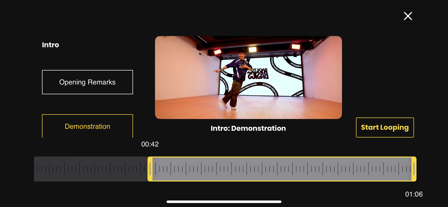
Once a user starts taking a class, they can access the looping feature to automatically replay a specific part they want in the video. Within the looping feature, the user is shown sections of the class on the side, the video itself in the middle, a ‘Start Looping’ CTA button, and a ruler-like tool on the bottom. The ruler-like tool is the method to trim the section for the looping feature, and feedback is shown as the times on both ends of the tool change in duration when scrolling the ends of the bar side to side. The times on both sections are the most clear signifiers tools are associated with the affordance of scrolling to manipulate the video length. The user will understand their loop is applied once they see the result of their video looping. Once they’re done, they can officially apply their edit by tapping on ‘Start Looping’
What can be improved
The tool can be improved by simply putting arrows, rather than just simple lines, to signify the affordance that the ends can be moved to change the duration of the loop. Furthermore, if the user only shortens the loop only by moving the end. they won’t know their edit is applied until the sample video ends at the new time they’ve set. In other words, feedback can be displayed by starting the loop instantly, regardless on what end they move, rather than having the user wait until the end of the loop to understand the change of duration has been applied.
Conclusion
The STEEZY app is effective in its usability with strong signifiers, constraints, and discoverability. However, it’s a little far from perfect. With more of Don Norman’s principles applied across the app, it’s ease of use and understandability can be a huge step up.