Team members: Gatha Bhakta, Tharani Prabu, Sanjana Subramani, Chelsea Yip
Project Overview
The National Gallery of Art is a museum of art dedicated to facilitating the exploration and experience of art and creativity. With a collection of more than 150,000 paintings, sculpture, decorative arts, photographs, prints, and drawings, the museum holds a prominent position among other art museums in the United States. Artle, NGA’s online spin-off of Wordle, is a fun way for players to explore the collection and engage with the museum virtually. The success of Artle prompted further exploration into gamifying the collection, which is the focus of this project.
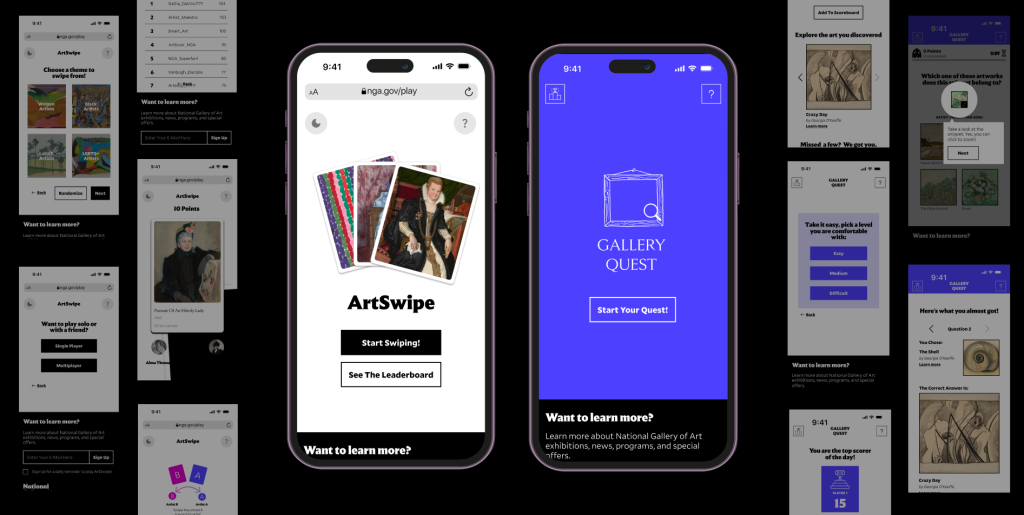
This project involves the creation of two online games that increase engagement with NGA’s collection by incorporating the collection into gameplay.
Under the guidance of our Professor Hasan Hachem, we designed and delivered two high fidelity game prototypes to the clients, named ArtSwipe and Gallery Quest, at the end of this project.
View the Gallery Quest prototype
Our process

Organizational goals
First, we came up with project principles to guide us through the process.
These project principles were prioritized based on the client’s goals described in our first client meeting. We came up with three major principles that we followed throughout the project.

Exploratory research
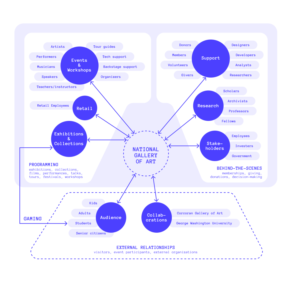
We created an ecosystem map to understand the relationships between various stakeholders of the NGA.
This was done to establish a clear picture of possible influences and supporting factors of the development of an online game for the NGA, guiding our decisions on feasibility and practicality.
We then carried out base research to understand game design in depth.
Our literature review focused on different game mechanics, game structure, rules for engaging gameplay and factors leading to the success of a game. From this review, we identified two major guiding principles that we incorporated into our design.
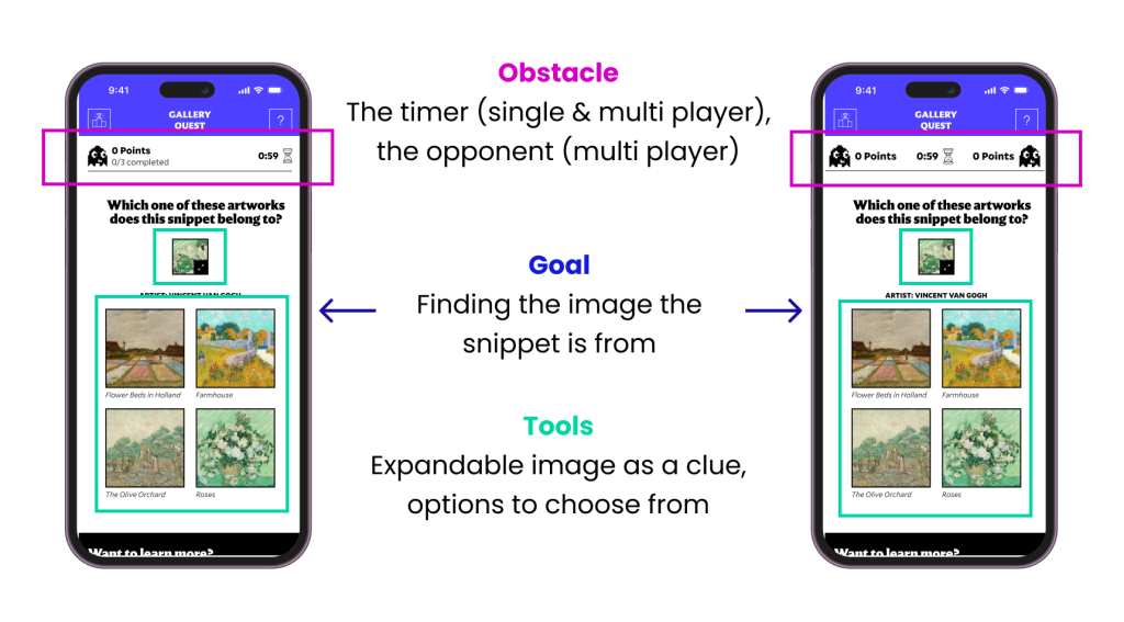
We identified three major questions/core elements to be presented to users, guiding their gameplay.

We also defined the difference between ‘complexity’ and ‘depth’ in game design.

We explored similar games as well, to inform our approach.
These games were all connected to other museums and had a similar purpose. Some of the games we studied include games by MetKids, Google Arts and Culture and Tate kids.
Through this exploration, we deduced different game mechanisms used in these games as inspiration for our own design.

Additionally, we interviewed six participants to discover more about how games become successful.
The participants were in and around the age group of 18-24, came from art and non-art backgrounds, and not all of them played games on a regular basis. This was an intentional decision to understand ways to create games that cater to the largest possible audience.
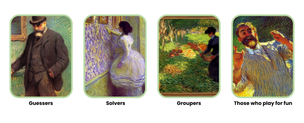
Based on all our research, we identified four player types that largely make up the gaming audience.
Schematic Design
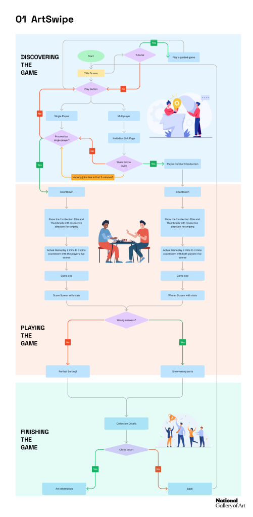
We created an information architecture diagram to help guide the basic flow and structure of our game.
We split up this diagram into three parts based on the three stages of user involvement with the game: discovery of the game, playing the game, and engagement outside of game time.

Then, we began brainstorming ideas for different games that we could possibly build.
Each team member came up with 1-3 ideas for games, from which we selected three ideas to present to the NGA team at the midpoint client presentation. While we highlighted the three that we shortlisted, we also displayed our other ideas to increase the variety of options. The NGA team selected two of their favorite ideas for development, one that we had shortlisted and one that we hadn’t.
We decided to develop our two shortlisted games, ArtSwipe and Gallery Quest, further.
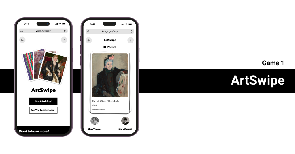
Creating Game 1: ArtSwipe
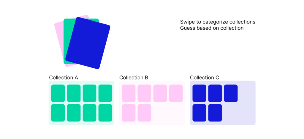
Initial representation of ArtSwipe
We first created a user flow to guide us while building the prototype.
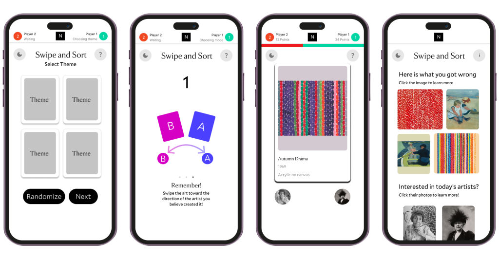
After creating the user flows, we created a prototype to test the gameplay.
ArtSwipe initial wireframes
We tested the prototypes with 6 participants to assess the playability and usability of the games.
We asked participants to play the game without any instruction, in order to see if the games were self explanatory. While the overall response was positive, we uncovered certain issues that needed to be addressed.
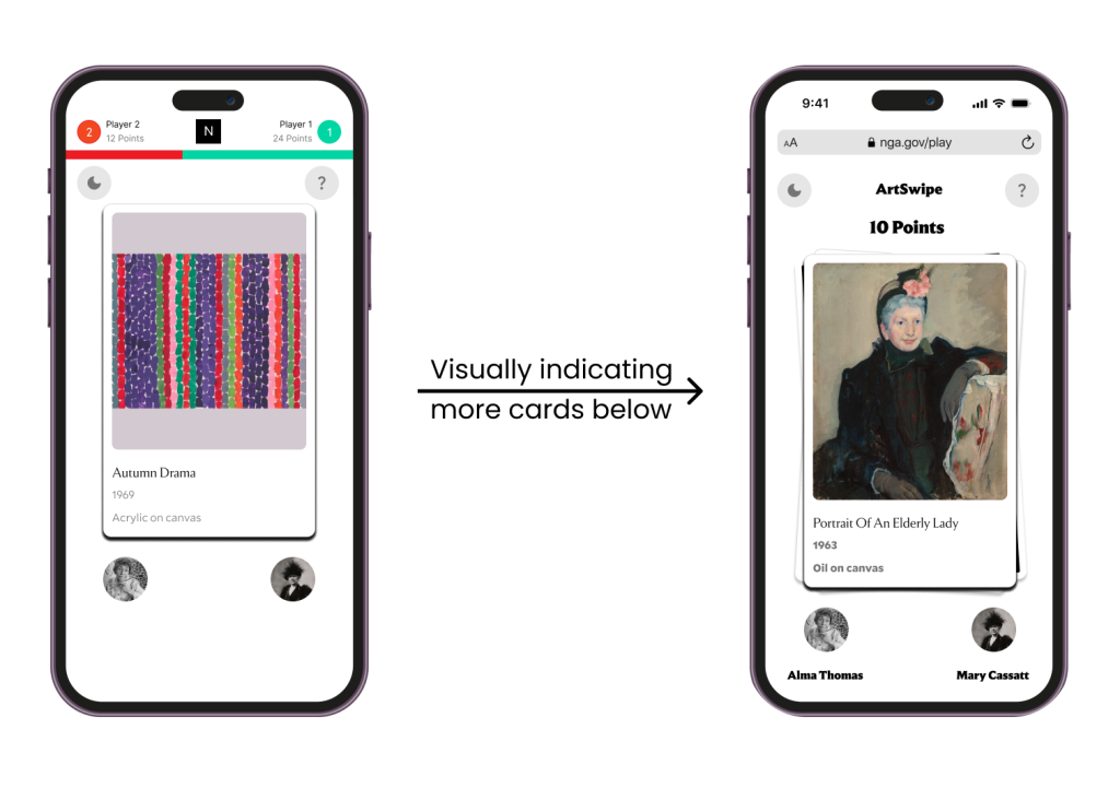
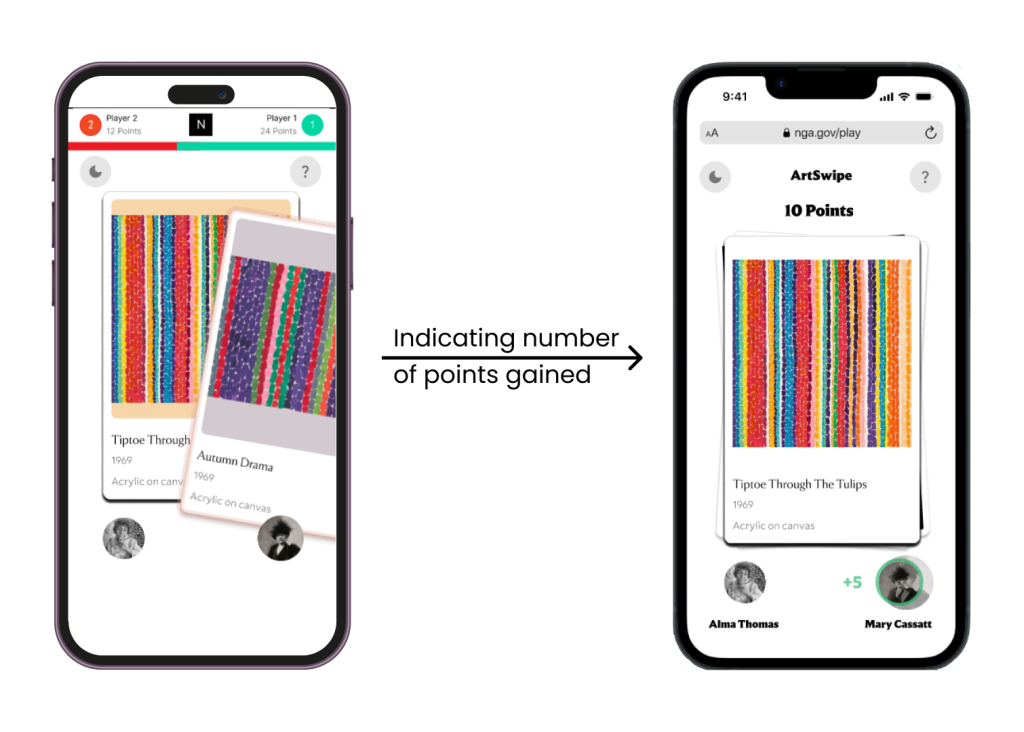
Testing showed that our gameplay was intuitive, but some minor changes were required.
Overall, participants liked the simplicity of the points scoring system and the top bar displaying live scores during the game. However, we found certain issues that needed to be fixed.
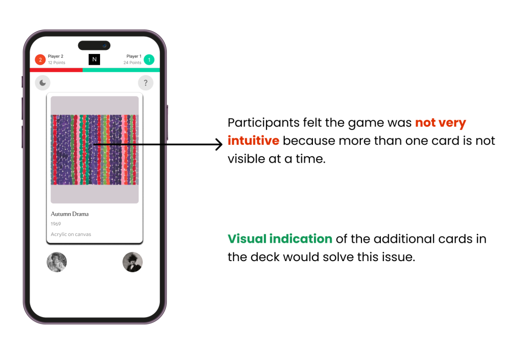
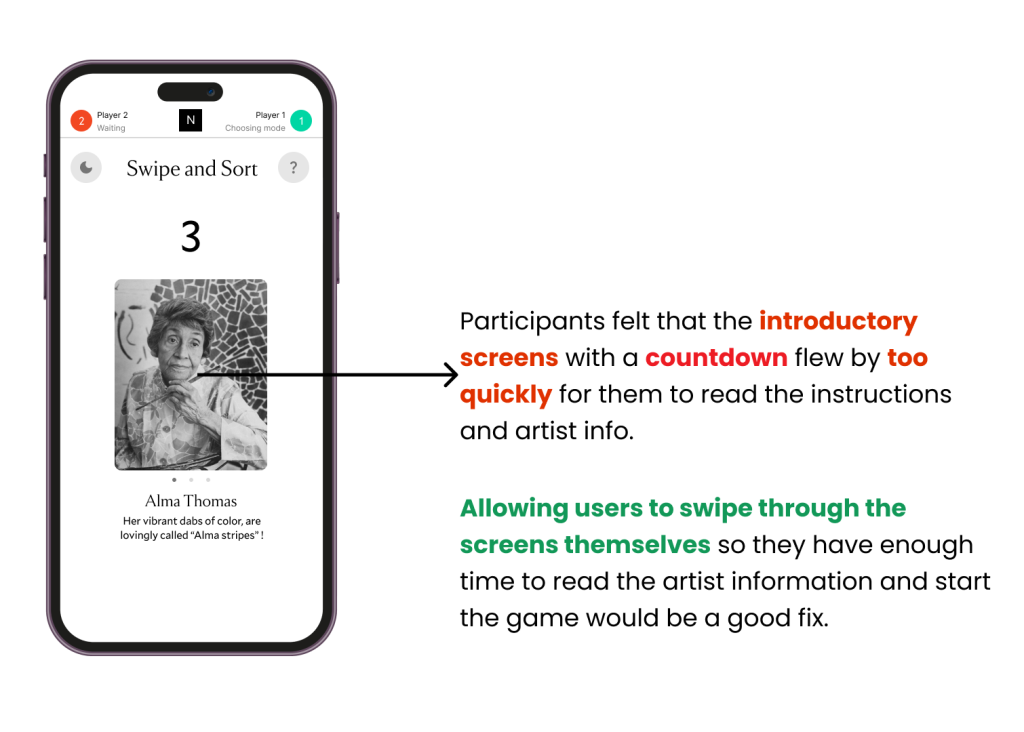
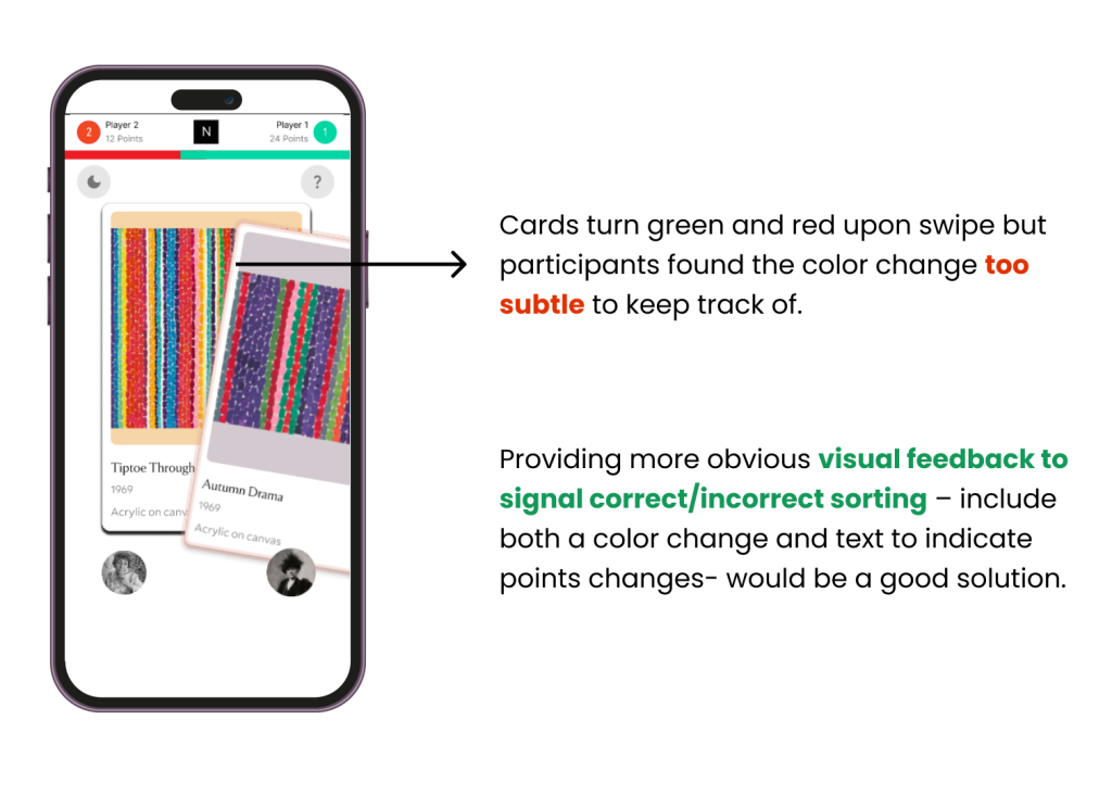

After incorporating fixes to these problems, we applied NGA’s style guide to update the look and feel of the prototypes to match NGA’s brand.
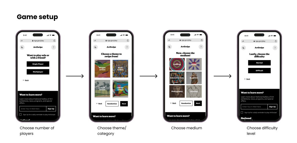
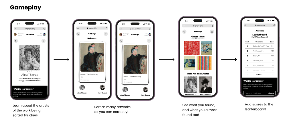
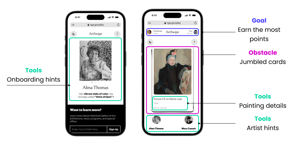
ArtSwipe final wireframes
View the ArtSwipe final prototype
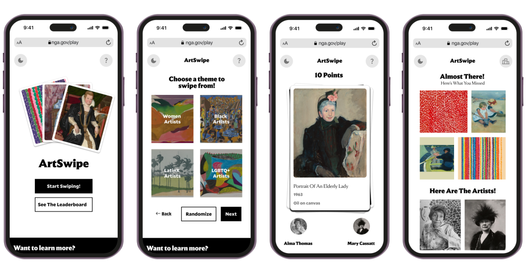
How to play ArtSwipe
Improvements we made based on testing results
How core game elements are incorporated in ArtSwipe
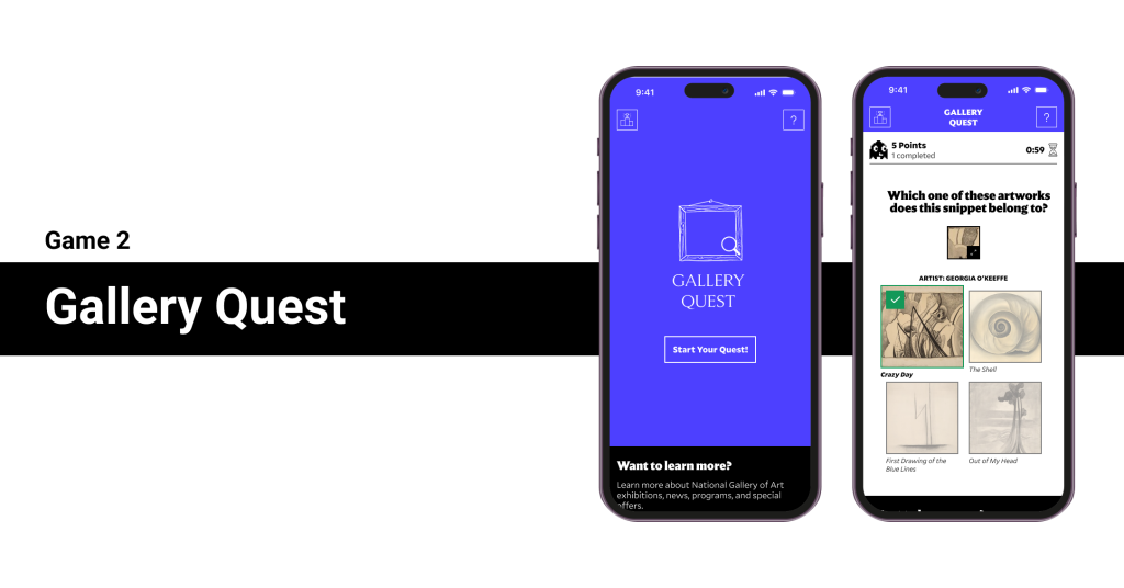
Creating Game 2: Gallery Quest
Initial representation of Gallery Quest
We first created a user flow to guide us while building the prototype.
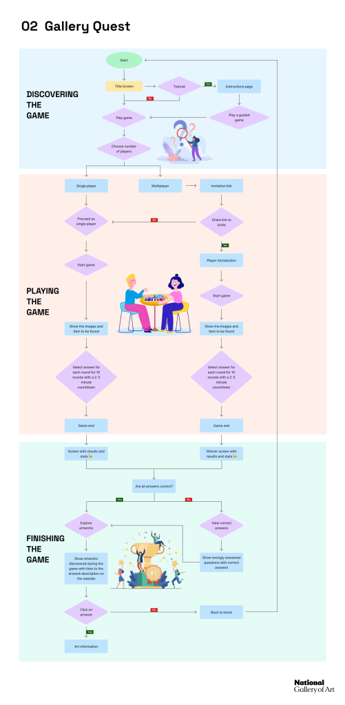
After creating the user flows, we created a prototype to test the gameplay.
ArtSwipe initial wireframes
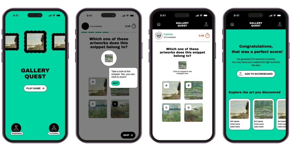
We tested the prototypes with 6 participants to assess the playability and usability of the game.
We asked participants to play the game without any instruction, in order to see if the games were self explanatory. The results were mostly positive, but we saw some room for improvement here as well.
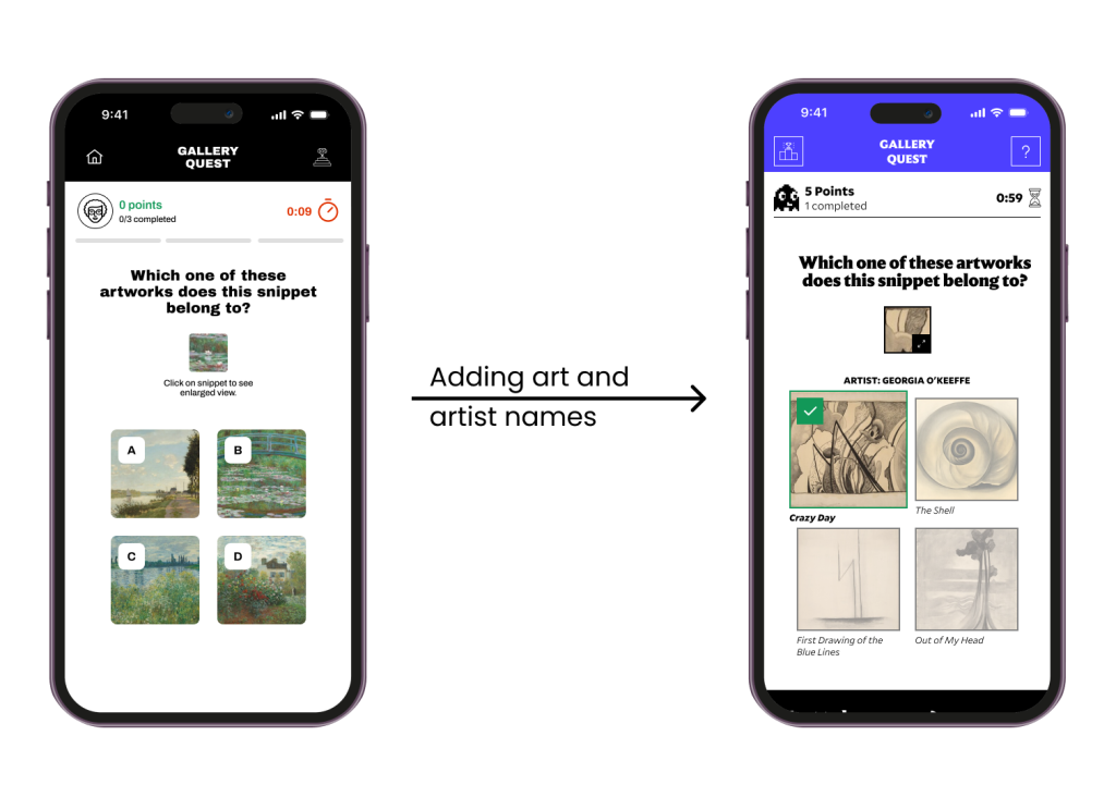
We discovered some issues that needed to be fixed through testing.
Participants enjoyed the visual design of the game and felt the gameplay was straightforward and easy to understand. However, we also uncovered some areas where things could be improved.
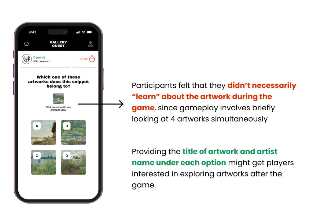
Some participants felt the game would quickly become repetitive and they would need a reason to come back to play it multiple times. A future possibility would be to consider additional opportunities and mechanisms to introduce depth to the game.
After incorporating fixes to these problems, we applied NGA’s style guide to update the look and feel of the prototypes to match NGA’s brand.
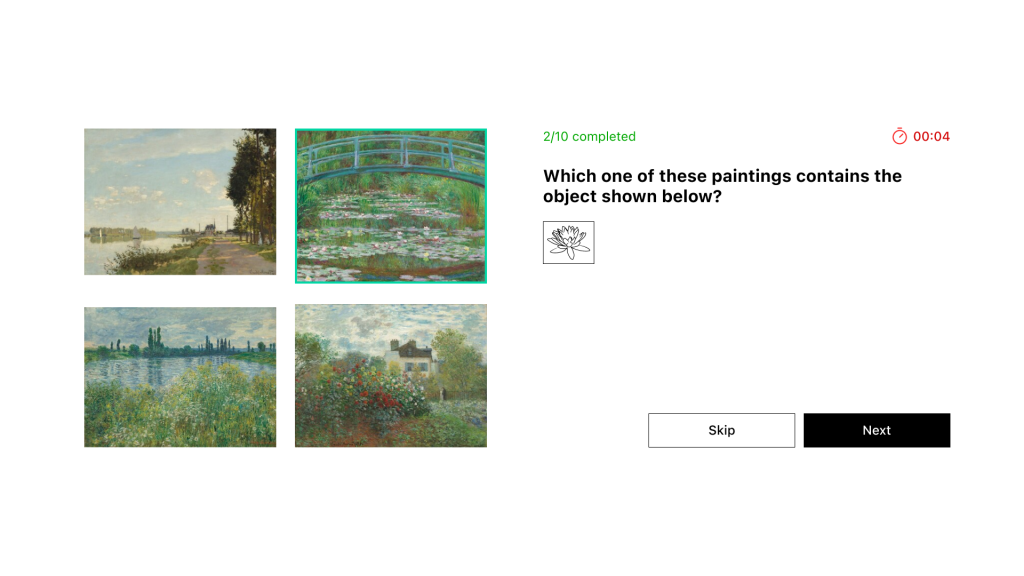
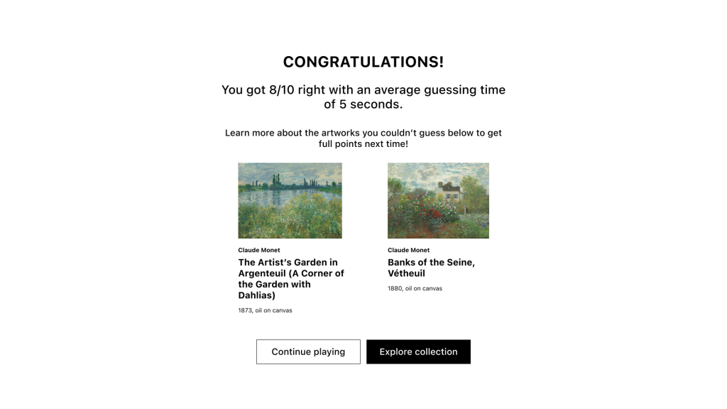
Gallery Quest final wireframes
View the Gallery Quest final prototype
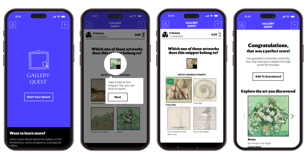
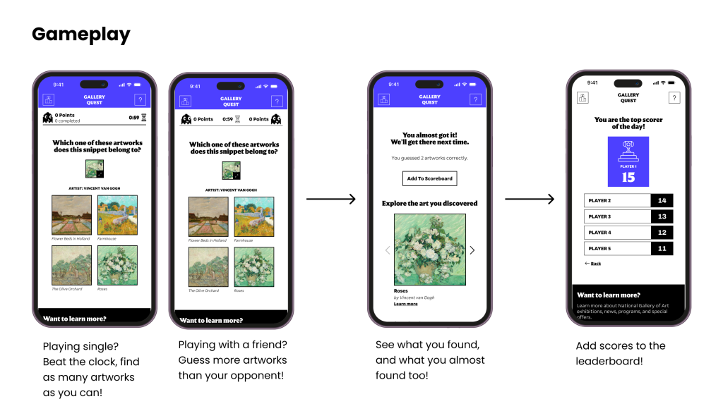
How to play Gallery Quest
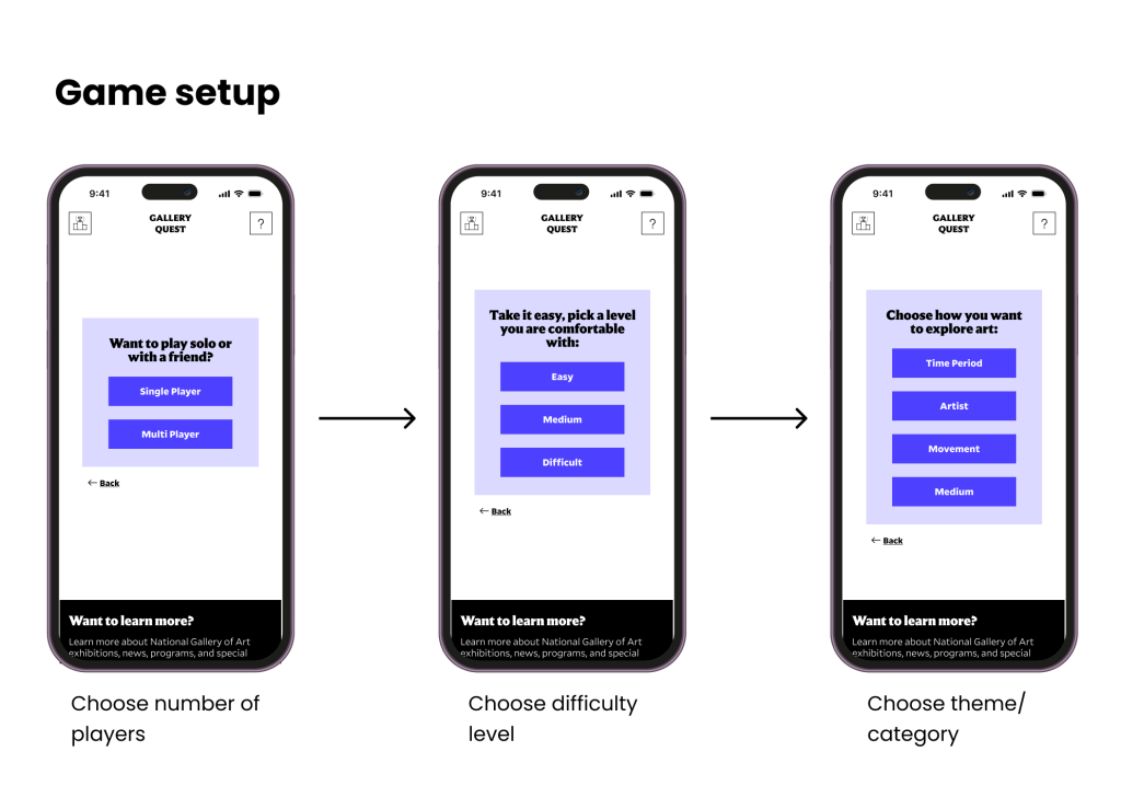
Improvements we made based on testing results
How core game principles are incorporated into Gallery Quest
Conclusion and reflection
Our final prototypes were received very positively by the NGA team during our final client presentation, with the team mentioning that they were impressed by the fact that we developed two games instead of the single game expected. This project was our team’s first time designing games of any sort, and was incredibly fun to work on. Future work on these games could include developing prototypes for a dark mode version and increasing the depth of the gameplay with additional rules or levels. We are thankful to our professor, Hasan Hachem, and the NGA team for their guidance and support throughout this project, and we look forward to engaging in more such projects in the future.

