Team members: Mary Haws, Becky Su, Trisha Khandelwal
Duration: January – April 2024 (4 months)
One Degree Impact has provided full-service grant management for non-profit organizations throughout the United States since 2003. Over 20 years of experience in the non-profit sector has reinforced their commitment to human connection and community, which defines the One Degree Impact brand. But this sense of connection was missing from their otherwise professional website. This project assessed the current website experience, created new designs with stronger branding in mind, and validated those designs with new and existing clients of One Degree Impact. With ready-to-implement desktop and mobile prototypes of a fully redesigned website, One Degree Impact can more effectively communicate their values and expertise to their clients.
Relationships are crucial in the non-profit sector.
When we first met with the team from One Degree Impact (ODI), their commitment to serving non-profits, to play their part in making real differences in the world, was abundantly clear, in addition to their grants-management expertise. Their logo and brand is based on the power of human connection and community.
We learned about the space they operate in: who communicates with whom, and how different connections in their network are leveraged to create funding opportunities for their clients.
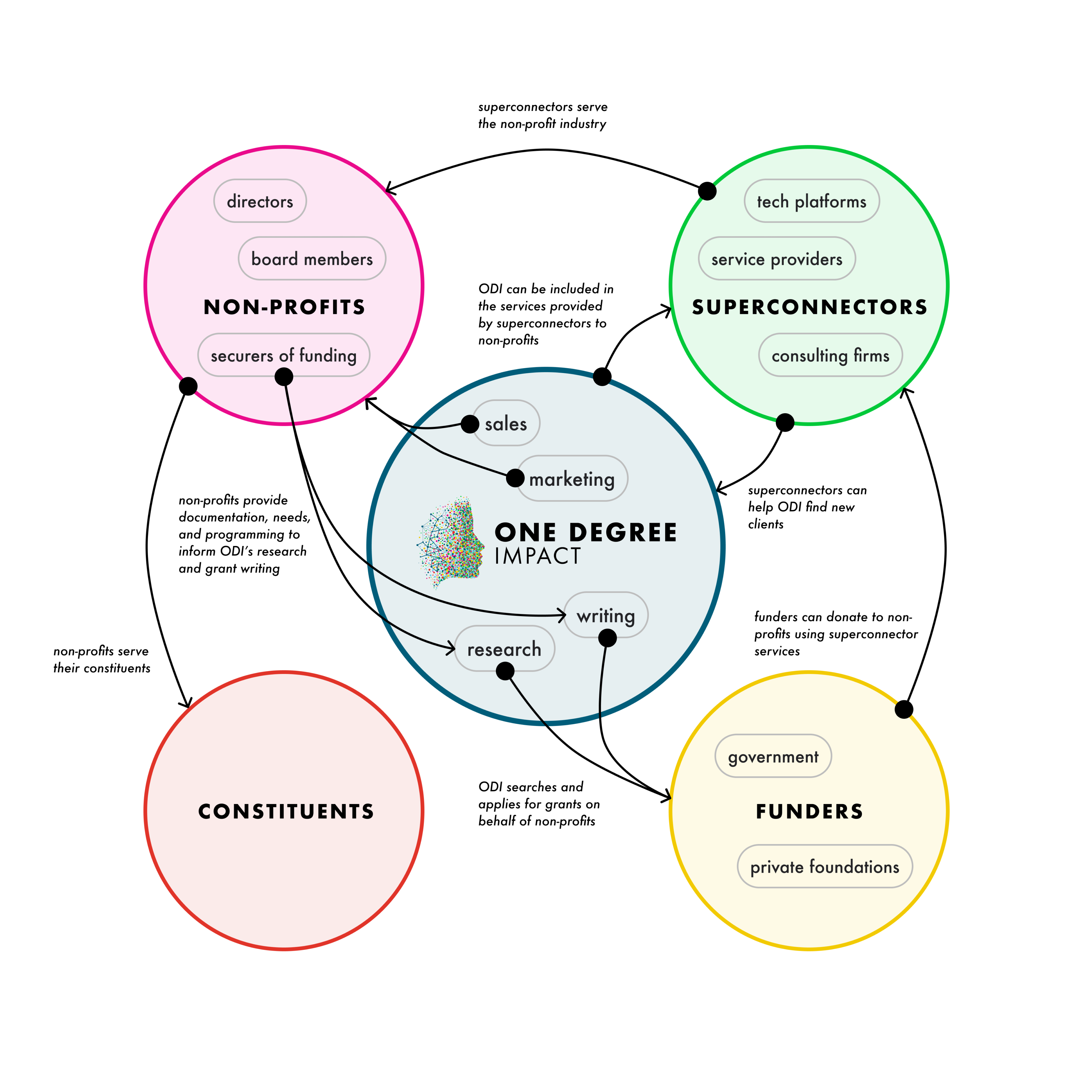
We created an ecosystem map to illustrate the key relationships in the ODI community. Understanding the stakeholders and their relationships helped us contextualize our project and goals.
We articulated a set of principles to guide our project, aligning with ODI’s goals.
The ODI team shared their motivations for working with us for a website redesign. Most importantly, they wanted to understand and reinforce the purpose of their website, as they were unsure of how it currently served new versus existing clients. ODI also hoped their personality would be more apparent in the redesign, as their current site places the most emphasis on clarity of services.
With their goals and brand in mind, we formed this set of three principles to guide the project:
- Redefining purpose: understanding and communicating the purpose of the website
- Investing in human connections: demonstrating investment in human relationships to deliver value to non-profits and their constituents
- Balancing clarity an personality: clarifying services while also emphasizing ODI’s personality and flexibility

Our process relied on qualitative and quantitative data collection to inform design iterations.
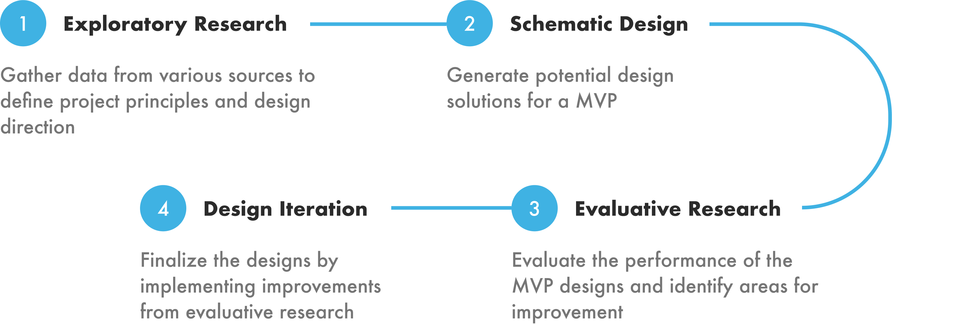
The four stages of our approach to redesigning a website for ODI were exploratory research, schematic design, evaluative research, and design iteration. A balance of research and design allowed us to create thoughtful, data driven solutions while always keeping our project principles in mind.
EXPLORATORY RESEARCH
We leveraged a variety of exploratory research methods to identify design opportunities.
Exploratory research was the first stage of our four-step approach. Our research methods included a literature review, competitive audit, technical analysis, interviews, and behavior analytics.

Relationships are most effectively built through trust.
The literature review and competitive audit revealed similar strategies for trust-building on commercial websites. Strategies for enhancing a sense of trust in a brand include: sharing mission, being transparent, and leveraging social proof. We saw ODI’s competitors use these strategies as they told stories about their work and motivations, and demonstrated the impact they facilitated.
Trust can also be reinforced through improved usability and accessibility.
We conducted a technical analysis of the current website to identify opportunities for improving its usability and accessibility. The main issues uncovered were:
- Navigational inconsistencies: The website used a single page to convey almost all of its content. The main navigation links that scrolled to corresponding sections of the page were in a different order than what appeared on the page.
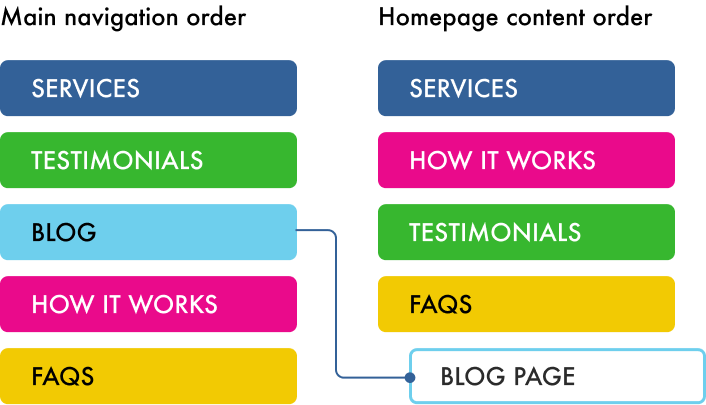
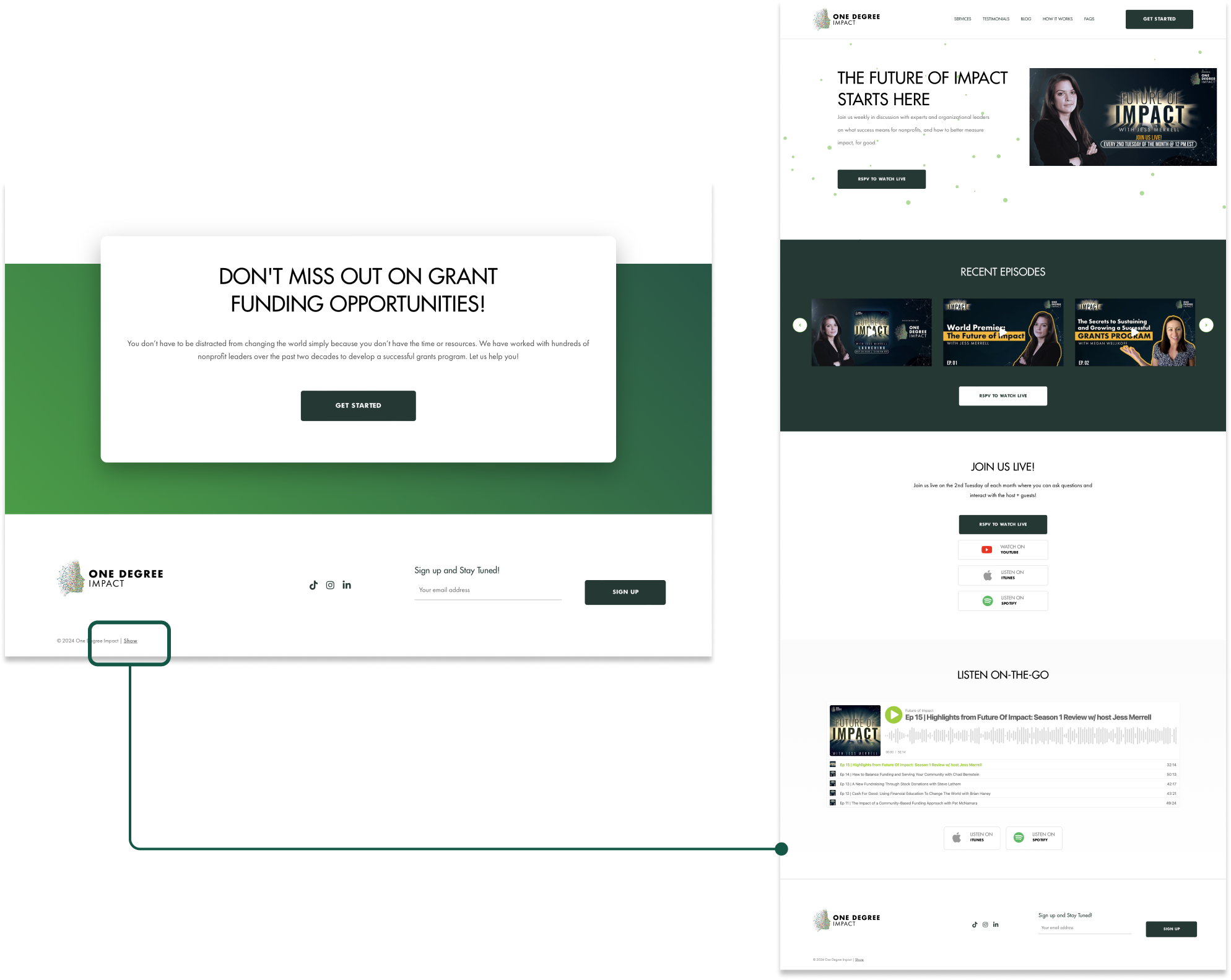
- Lack of discoverability: ODI creates valuable resources in the form of blog articles and podcast episodes. However, the link to their podcast content was hidden in the footer.
Interviews with current clients revealed how we could emphasize ODI’s differentiators and welcome all types of clients to the website.
We conducted one-on-one interviews with four existing clients to better understand their experiences with ODI and its website. We asked them to remember their impressions of ODI when they were new clients, and to imagine how the current website would serve the needs of new versus existing clients to understand the perspectives of different user groups. Google analytics data supplemented client feedback about their usage and impressions of the website. These data led to 3 key insights.
Insight #1: The website could better reflect ODI’s brand and value.
Clients gave the website a rating of 3.5 out of 5 for how well it aligned with their understanding of ODI’s services and value. They felt that, based on their experiences with ODI, there was an opportunity to better communicate the brand and what sets them apart from their competitors.
This ties into our second project principle for investing in human connections via branding.

Insight #2: ODI offers uniquely personalized membership plans.
We learned that a key differentiator of ODI is their flexible memberships. All of the clients we interviewed shared their positive experiences with the customization of services and projects offered. This gave them a sense that ODI is invested in their growth, but clients didn’t see this communicated on the current site.
This finding aligns with our third project principle for balancing clarity of services with personality.
Insight #3: The current website is targeted towards new clients.
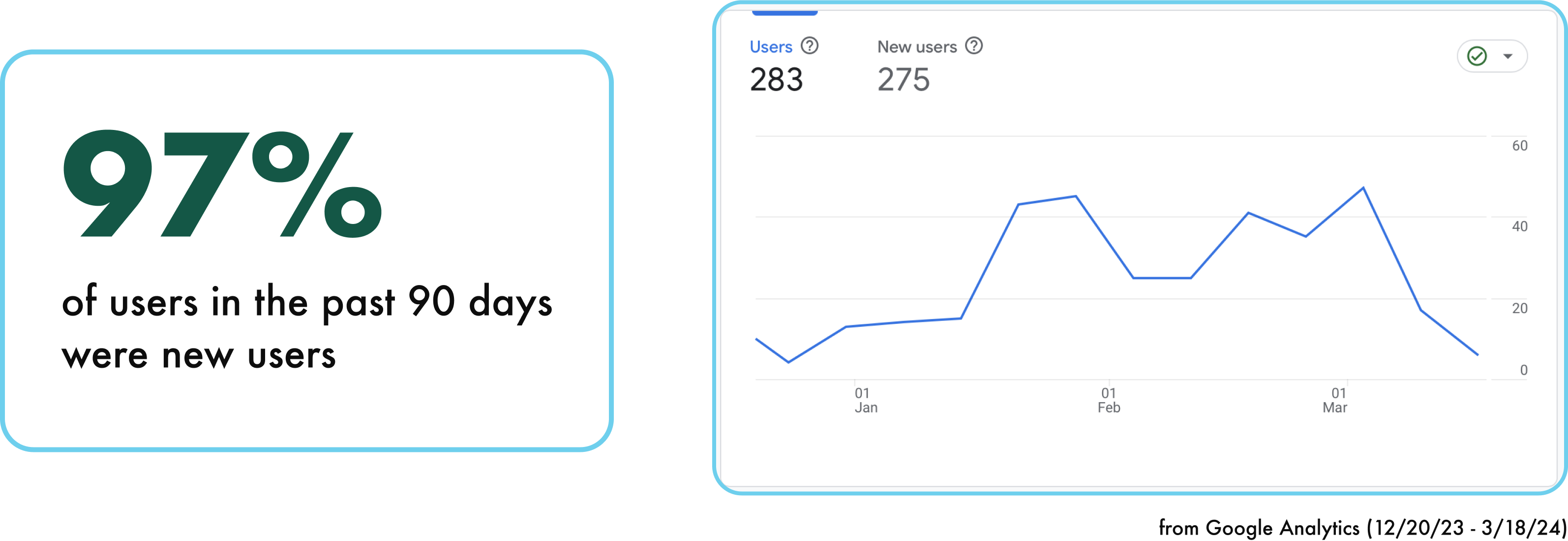
3 out of 4 participants, who were existing clients, said they felt that the website isn’t catered towards them, but rather towards potential clients. This sentiment is supported by usage data: Google Analytics showed that 97% of users in the past 90 days were new users. But opportunities for engaging existing clients in the redesigned website revealed: clients wanted a way to sign in to ODI’s proprietary grant management dashboard, and thought that the blog and podcast provide value to new and existing clients alike.
This helps us meet our first project principle of redefining the purpose of the website; not only can the website communicate the services and value ODI offers to potential clients, it can also engage current clients with valuable tools and knowledge.

SCHEMATIC DESIGN
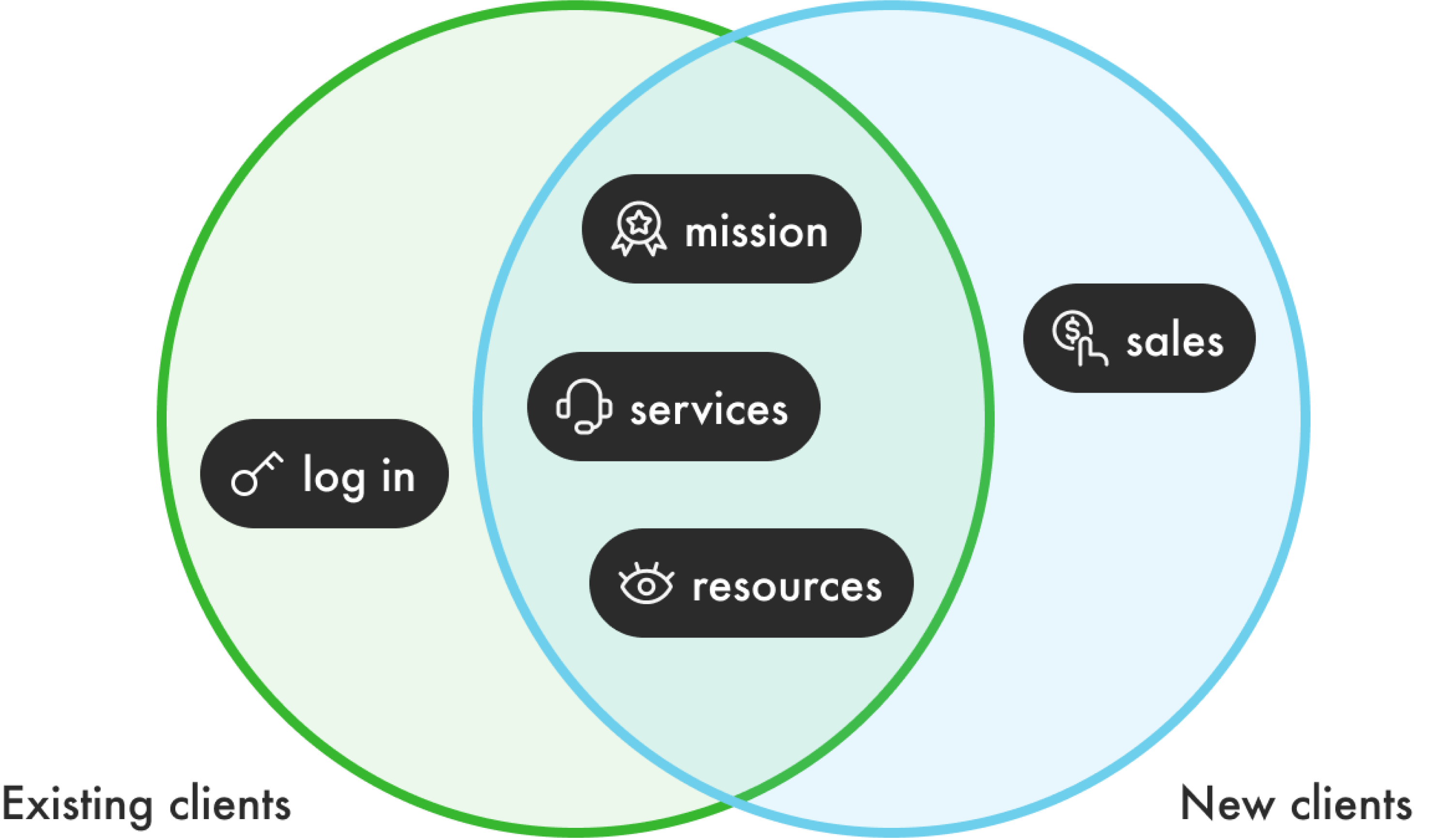
ODI’s mission, services, and resources became the core of our design strategy.
In developing a comprehensive design strategy for ODI’s website, we centered our approach around the organization’s mission, services, and resources. This focus guided our strategic decisions to ensure that both new and existing clients have a more engaging and informative experience.
Our strategic approach reflects our three project principles.
Clarifying Purpose and Resources
(aligned with Project Principle #1: Redefining Purpose)
- For New Clients: Design the website to clarify ODI’s mission right from the first interaction, with streamlined paths to explore services and resources that might be of interest to them.
- For Existing Clients: Create clearly marked sections or a dedicated dashboard that addresses their specific needs and enhances their ongoing engagement with advanced resources and support options.
Utilizing Storytelling to Enhance Brand Awareness
(aligned with Project Principle #2: Investing in Human Connection, and Project Principle #3: Balancing Clarity and Personality)
- Integrate storytelling elements throughout the site that communicate ODI’s values and the impact of its work. These narratives will be woven into various sections of the website, using compelling visuals and text to forge a stronger emotional connection with users.
Restructuring Information to Improve Navigation and Emphasize Services
(aligned with Project Principle #3: Balancing Clarity and Personality)
- Reorganize the website’s architecture to offer intuitive and user-friendly navigation. This includes grouping related services and resources logically and using clear, descriptive labels for all menu items.
- Highlight key services with well-placed call-to-action buttons and engaging descriptions that guide users through ODI’s offerings seamlessly.
This strategy informed the structure of the new website.
We developed a new information architecture that features dedicated pages for communicating mission, services, and resources. The final version shown here was updated after conducting evaluative research, which is covered in the next section.

EVALUATIVE RESEARCH
We tested low-fidelity wireframes with new and existing clients to refine the navigation and layout of our designs.
The wireframes covered five key workflows:
- Homepage browsing
- Learn about ODI
- Become a member
- Hear from the community
- Browse resources
These reflect the five pages in the main navigation of the new website, and were covered in our usability testing. Our goals for testing were to evaluate the usability of the navigation and layout and to identify areas for improvement to be addressed in the final design iteration.
We recruited 8 participants for our usability study: 2 participants were existing clients from the first round of interviews, and the remaining 6 participants were “new clients” who had experience working at non-profits.
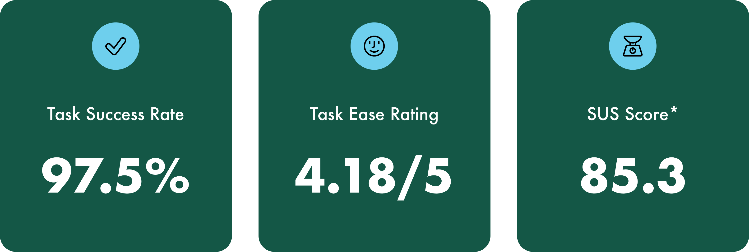
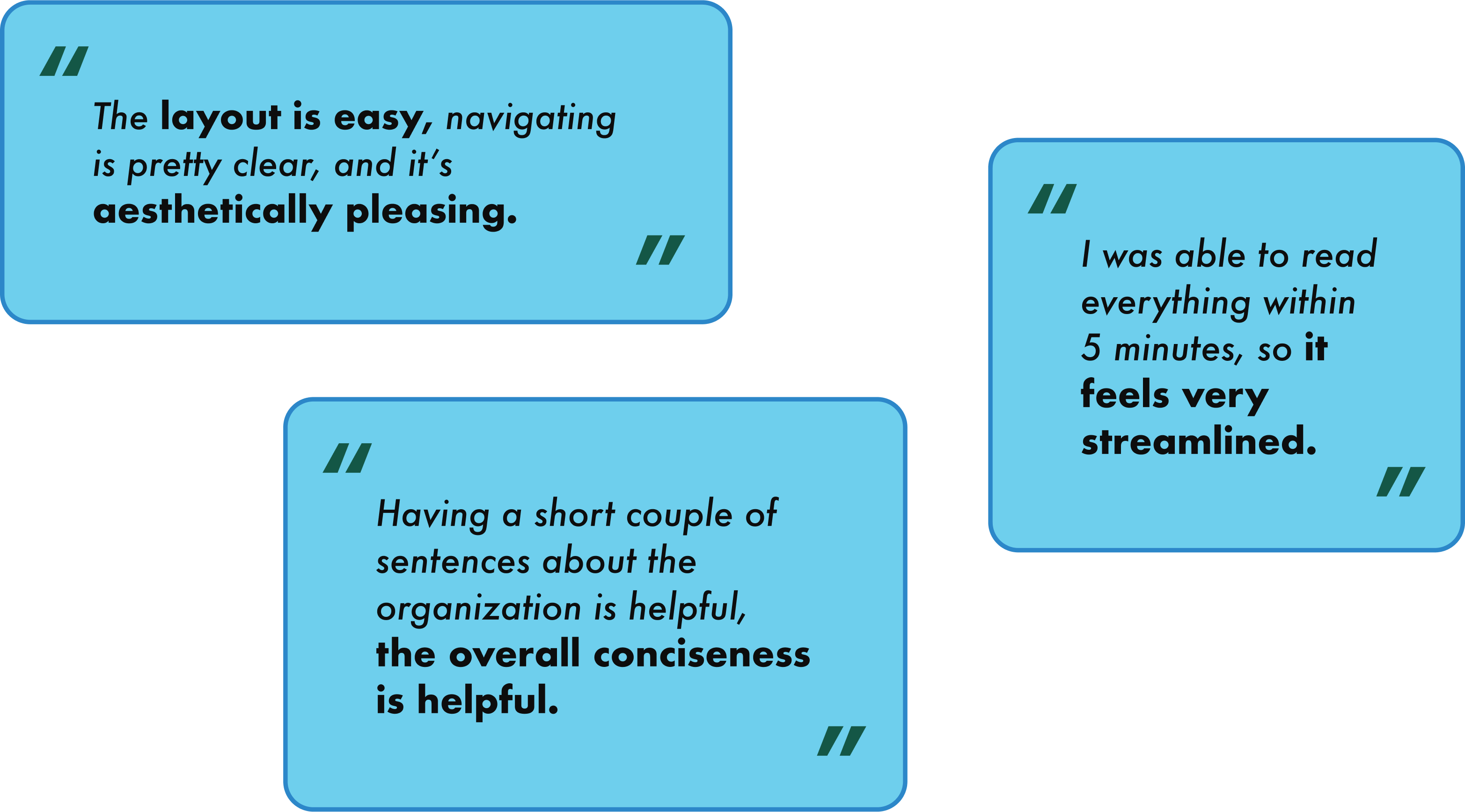
The prototype performed well overall, but needed improvements to navigation labels and resource filters.
Overall, participants found the prototype easy to use, which is reflected across 3 usability metrics: task success rate, average task ease rating, and the SUS score. Participants also expressed that the experience felt streamlined and concise.
Based on participants’ feedback, we made improvements to the language used in navigation labels and the filtering system in resources; these improvements are addressed in the section below.
DESIGN ITERATION
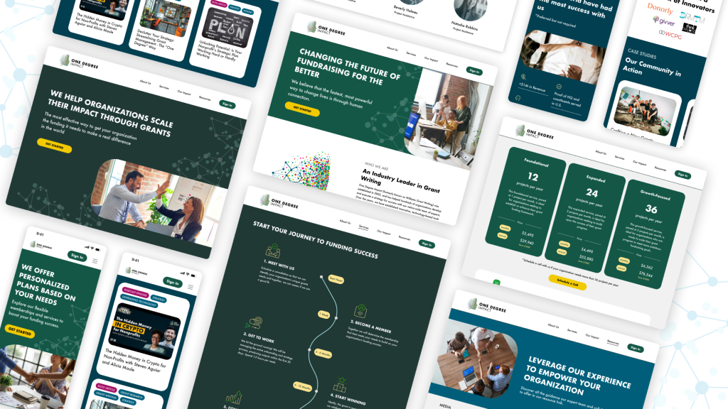
We created high-fidelity desktop and mobile prototypes that follow a content strategy for enhancing ODI’s brand and community.
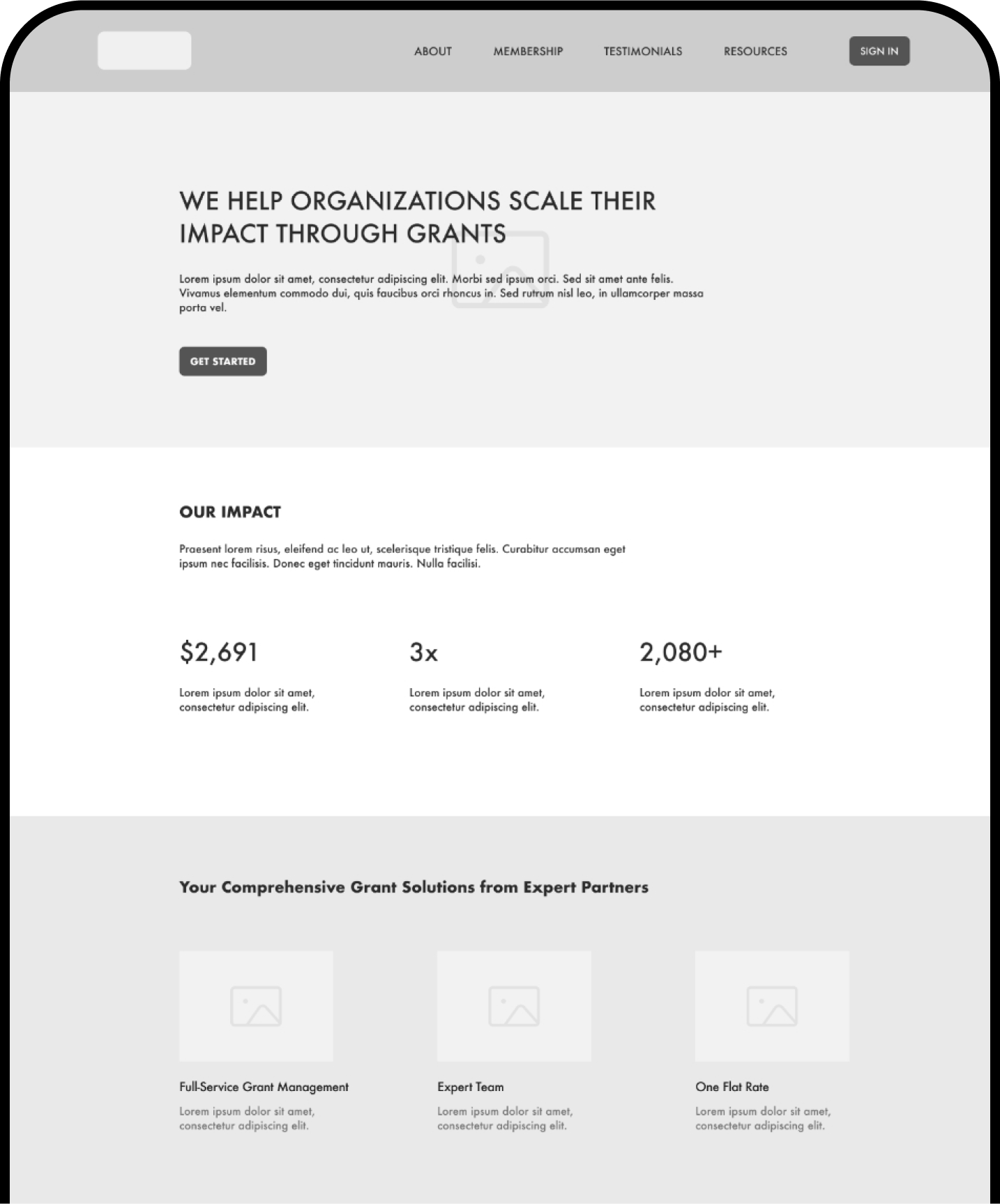
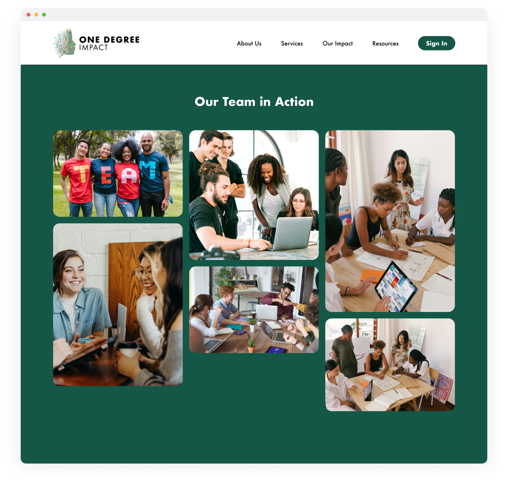
Considering our project principles, design strategy, and usability testing results, we created final designs that focused on branding and content, particularly by showing human connection through imagery, writing concise content, reflecting the logo, and emphasizing ODI’s community.

Homepage Browsing
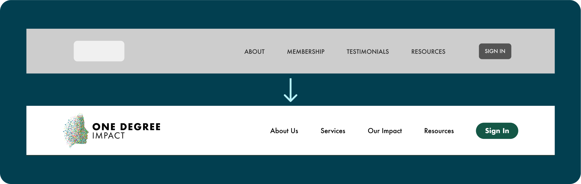
Usability Improvement: Navigation Labels
We refined label names to make the navigation more intuitive and align with user expectations.
- “About” to “About Us”: Adding “us” personalizes this section, inviting users to learn more about the people behind ODI. It suggests a friendly, welcoming tone.
- “Membership” to “Services”: This change clarifies that this section is about the services ODI offers, not just membership options.
- “Testimonials” to “Our Impact”: This label shift focuses on the tangible impacts ODI has had on its clients, rather than merely showcasing client praise.
Key Features of the Homepage
- Humanizing the hero section: To enhance the human connection on ODI’s website, we redesigned the hero image by incorporating a human-focused photograph alongside a revamped version of the dot graphic that complements ODI’s logo.
- Emphasizing critical metrics: Integrating these specific metrics effectively communicates ODI’s achievements and reliability, bolstering credibility and enhancing trust.

- Showcasing the process: To effectively communicate the process of working with ODI, we redesigned their plan flow to provide potential clients with a more streamlined streamlined visual that outlines each step of working with ODI.

Learn about ODI
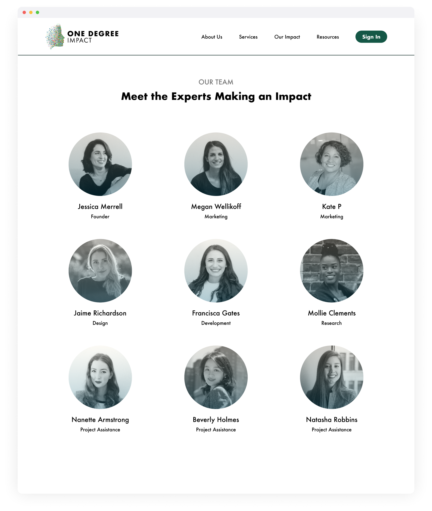
Key Features of the “About Us” Page
- Storytelling with the logo: We incorporated ODI’s logo, which shows their commitment to forming meaningful human connections. Sections about “Who We Are” and “What We Do” are visually linked to the logo, communicating their mission clearly.

- Displaying team photos: Showing the team behind ODI’s mission and works helps establish a connection, enhancing trust and transparency in the organization.
Hear from the Community
Key Features of the “Our Impact” Page
- Showcasing client logos: Displaying a selection of client logos can enhance the credibility of ODI and point to its successful outcomes.
- Telling success stories: We added a section for case studies, which would allow ODI to tell stories of success that they have enabled.

Browse Resources
Usability Improvement: Resource Filters
Based on our usability testing results, we created 2 levels of filters for media type and topic to help users target their specific interests. The single level caused confusion, as it combined these different types of filters.
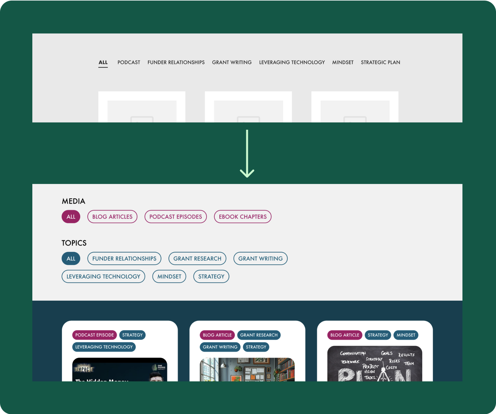
Key Features of the “Resources” Page
- Tagging content: The two levels of filters (media and topic) we created as a result of usability testing are also reflected in the resource cards themselves. Each pieces of content is tagged with a media type and one or more topics to guide users through their search.

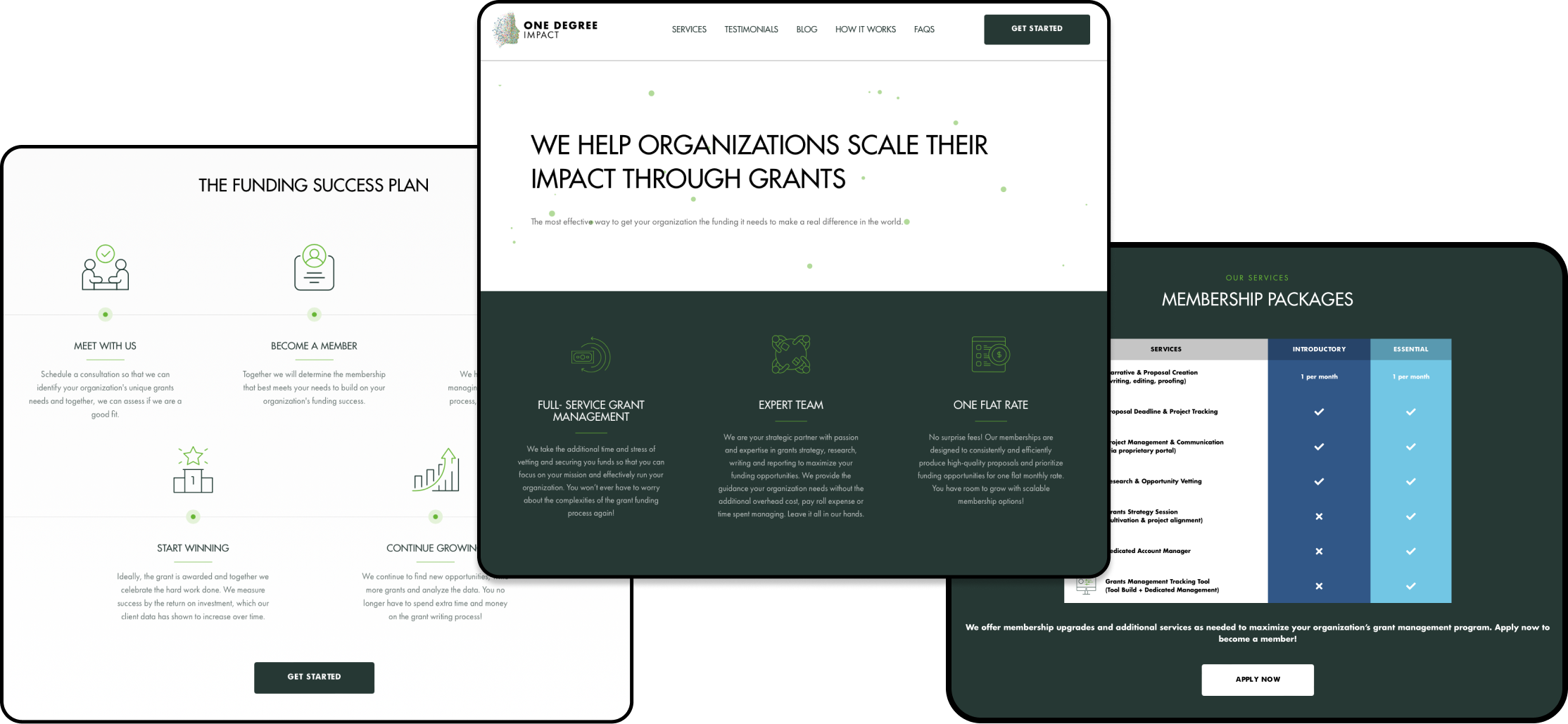
(ANOTHER) DESIGN ITERATION
We created a final design iteration after helping the ODI team find the best way to communicate their services.
Our proposed designs included a calculator feature that would allow users to see an estimated price from bundling desired services. This would help communicate the flexibility of ODI’s services, a characteristic which came up repeatedly in our interviews with existing clients as a positive differentiator of ODI. After receiving positive feedback with ideas for improvement from our usability tests, we presented a membership table with built-in calculator for selecting optional services to ODI.

The ODI team liked the calculator feature when we first showed them the wireframes. However, seeing the improved high-fidelity version helped them realize that it wouldn’t meet their current needs. They were still figuring out the structure of their memberships internally, so we had to pivot to their current model, iterating on our designs once again.
The calculator feature was ultimately removed to better represent ODI’s current membership structure. This structure is still flexible, as emphasized by their clients, but not in terms of pricing, which is what the calculator would have communicated. Now, three membership tiers are outlined, along with services that are included with each membership plan and the types of projects members are able to choose when working with ODI.
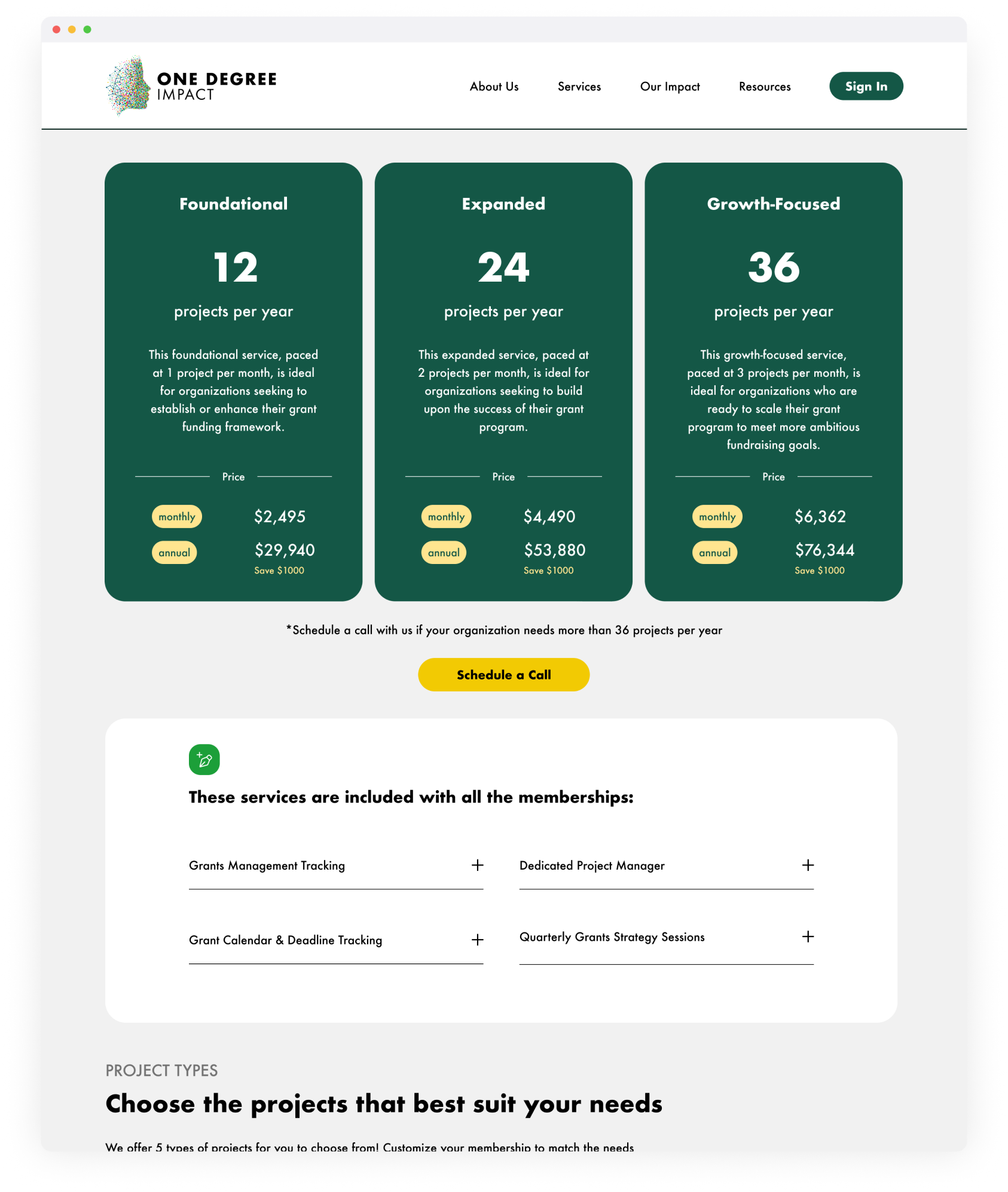
Although this pivot was a challenge to meet within the deadline, it helped the ODI team reflect on how to best conceptualize their own membership plans, and it helped us gain clarity on how to best communicate a complex system in a straightforward way. Without these realizations, we would not have fully met our original project principles, and users may have lost a sense of clarity and connection with ODI.
ODI was excited to implement our designs.
“Over the past 10 years as an entrepreneur, I’ve worked with probably a half a dozen or a dozen marketing companies, and when anybody pitches a website, I’m like, ‘I guess it looks good, I have no idea.’ So the fact that you guys have all the research behind it that shows people you tested, and people using it, that just really means so much to me because it feels so much more comforting. I really appreciate you guys and all the effort you put into this. It makes me feel comfortable that the website will be highly usable and valuable for our clients.”
Jess Merrell, Founder & CEO of One Degree Impact
Reflection & Next Steps
From this project we found that, as designers, it is important to be flexible and able to adjust at any point. We encountered a situation where our client adjusted their service while we were finalizing the design. The ability to communicate with the client in an effective way to clarify their needs and make changes to our design quickly is a skill that designers should always possess.
This project also provided us with valuable collaborative experience, not only in designing a website but also in helping ODI reflect on their brand and service. ODI has an extraordinary mission and service, and we are glad to have helped them discover the best parts of themselves through our designs.
Our next steps include:
- Documentation: ODI will build the website in the near future. To ensure our client can construct the website without barriers, we will provide them with a well-structured Figma file containing the elements and design rules they need. This includes color templates, font families, icons, and images.
- Iteration: Conducted user testing for the high-fidelity prototype to collect participant feedback and identify issues with website usability.
- Keeping Track: Given that ODI plans to build the website on WordPress, which has more limitations compared to custom coding, it’s essential to keep track of any issues encountered in translating our design into reality. Provide alternative design solution if needed.