PROJECT DETAILS
MY ROLE
User Experience Designer
User Researcher
TIMELINE
15 Weeks
TOOLS
Figma
Miro
Zero Height
TEAM MEMBERS

TIMELINE

CONDUCTING A UI INVENTORY
As an engaged member of the Reddit community, I deeply appreciated the platform’s unique design and user experience. However, through performing an UI Inventory on the site, I noticed opportunities to enhance consistency across various UI elements such as icons, links, text styles, and more. Leading me to create a comprehensive design system for Reddit-inspired interfaces. I deconstructed and categorized these UI elements into modular building blocks, following the atomic design framework. After 2 weeks of doing that, my team took another 2 weeks to add elements I might have missed and conduct an accessibility audit.
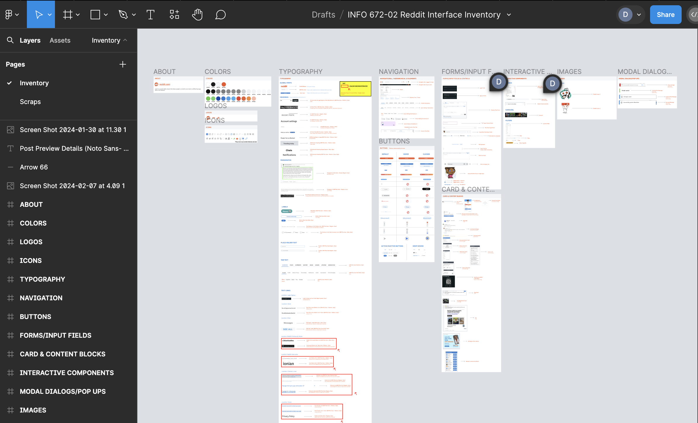
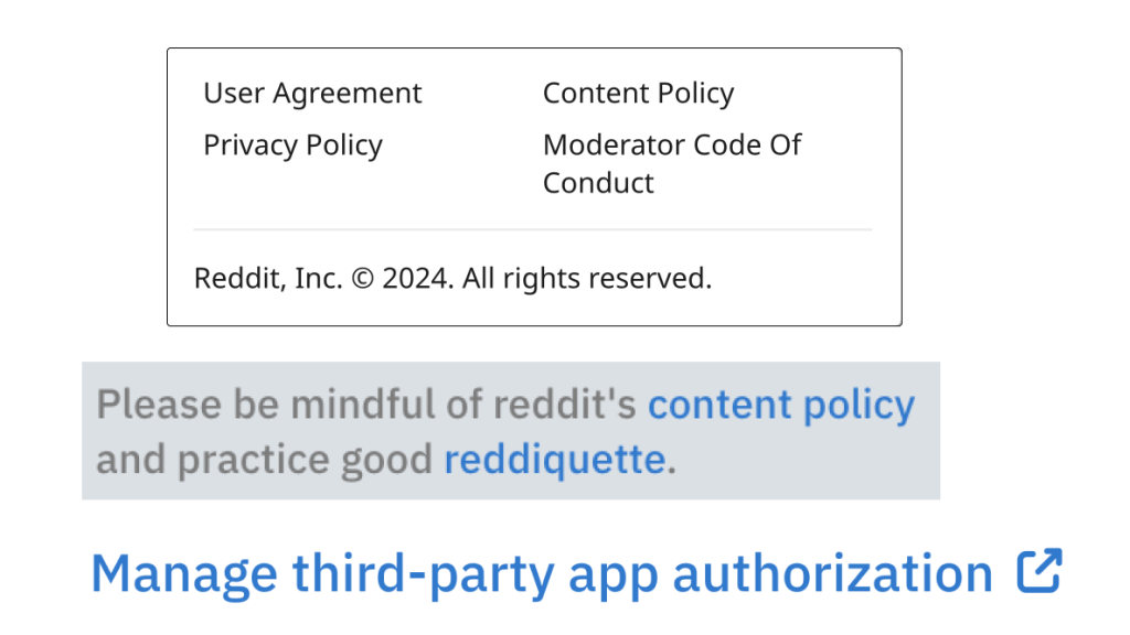
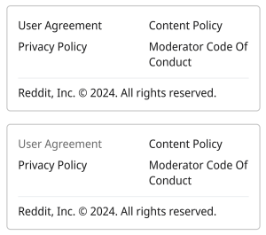
Examples of Inconsistencies Found During the UI Inventory
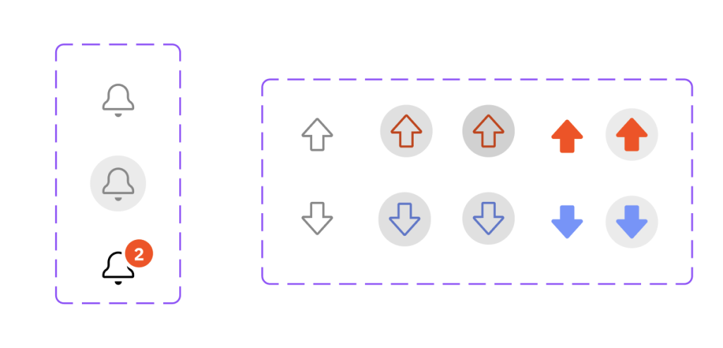
Examples of Improvements Made While Creating the UI Kit
Creating the UI Kit
The team decided that the “Home Feed”, “Create a Post,” and “Post Thread” pages would be our scope for the project due to Reddit being a huge website and our time constraints to complete the project.
HOW TO CREATE CONSISTENT DESIGNS ACROSS THE TEAM?
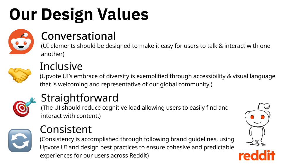
By using DESIGN PRINCIPLES! The design principles are guidelines that team members agree that design decisions should be made on so that it helps create consistency despite different people working on one product. We created that by examining the existing brand values of Reddit and brainstormed our own design principles. These principles drive the UI component’s design and the documentation we created on Zeroheight.
Expect the Unexpected
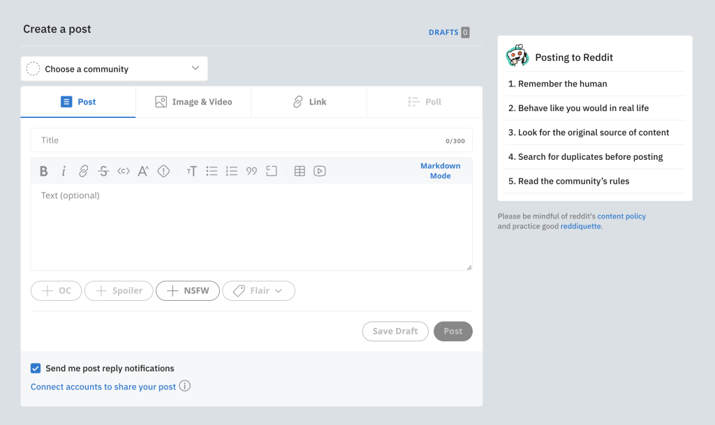
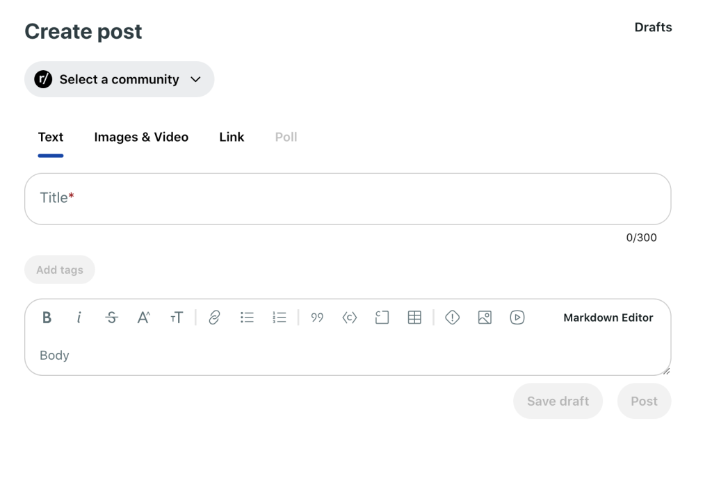
One significant hurdle was Reddit’s mid-project redesign, which required me to carefully evaluate whether to pivot towards the new design direction or maintain alignment with the original aesthetic that users had grown accustomed to. I decided to proceed with the original design, recognizing the enduring familiarity and affinity users had for its iconic elements and to be able to complete the project within the time constraints.
Usability Testing
100% of all participants were able to find the UI Kit online within 30s.
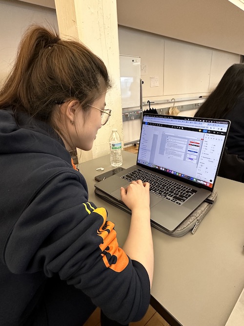
To validate and refine the design system, I conducted 20 minute usability testing sessions with 2 out of the 4 people my team conducted the usability test with.
Their feedback proved invaluable, highlighting areas for improvement and guiding the addition of missing components, such as comments, replies, and pills. This iterative process also allowed us to address typography inconsistencies and optimize the organization and discoverability of components.
Creating the Design System
A UI Kit and a Design System are not synonymous terms. The UI Kit is a collection of pre-built UI elements. While the Design System is a living document that is revered as the “Source of Truth” that not only includes the UI Kit but design principles, usage/guidelines and resources.
NO DESIGN SYSTEM IS COMPLETE WITHOUT DOCUMENTATION
Community Adoption & Impact
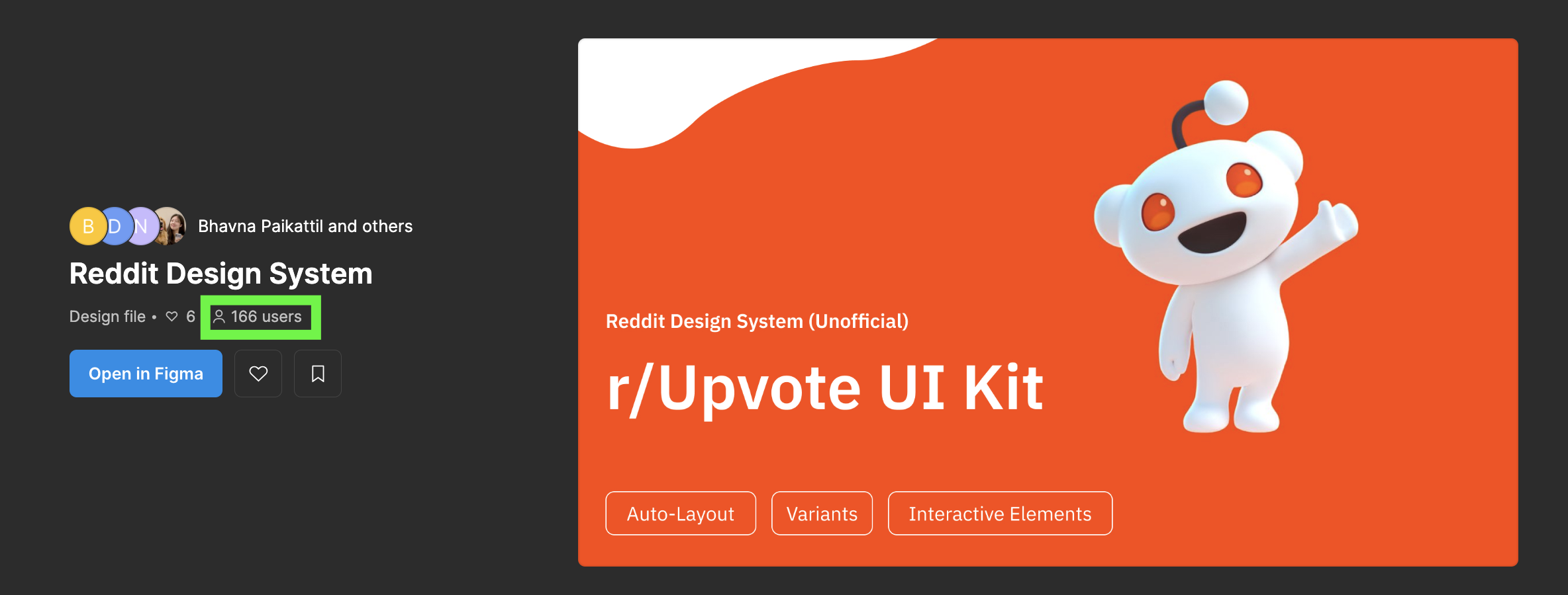
Recognizing the potential value of Upvote UI for the design community, I published the design system on the Figma Community page. Since we published the UI Kit 3 weeks ago, it has garnered approximately 166 users, indicating a demand for well-crafted, Reddit-inspired design foundations.
Looking Ahead
As the Upvote UI design system continues to evolve and gain traction, it holds the potential to become a widely adopted standard for Reddit-inspired design patterns, streamlining workflows and elevating the quality of user experiences for people that do not have internal access to Reddit’s official design system. In the future, the things that the team could work on is updating the current components we have now to the redesigned version of Reddit and creating more components for different pages that were outside of our scope for this sprint.
