Introduction
Amtrak is a travel application designed to streamline the process of planning and booking train journeys across the United States. It offers features such as real-time train schedules, ticket purchasing, and seat reservations. Users can easily search for routes, view fare options, and manage their bookings directly from the app. The Amtrak app also provides updates on train delays and platform changes, ensuring that travelers are informed throughout their journey.
While the app serves the essential purpose of facilitating train travel, the objective of this study is to evaluate and analyze its design according to Don Norman’s principles in ‘The Design of Everyday Things
The Process
I’m a regular traveler in the US, and one of my preferred modes of travel is by train. I enjoy it more than driving or flying because I can peacefully take in the views along the way.
However, my first experience using the Amtrak app was quite frustrating. It was a Thursday in mid-November, and people were bundled up in bulky winter clothes in the Midwest. I traveled with my service dog, uncertain about what preparations were necessary for the journey with my furry companion. Despite purchasing a pet ticket (which I later learned I didn’t need) and thoroughly checking the app, website, and even Facebook reviews, I was still questioned by the staff and felt embarrassed in front of other passengers for not having a pet cage.
Throughout the five-hour journey, I was assigned an uncomfortable seat near the restroom. Additionally, I struggled to pull up my ticket QR code for the inspector due to poor cell signal. I spent considerable time switching between email and the app to locate my ticket, which was another awkward moment. In discussions with friends, I learned they too had faced issues such as unnoticed train cancellations and unexpectedly long waiting times at the station. This collective experience highlights a range of problems that need addressing to improve the user experience with the Amtrak app.

Homepage
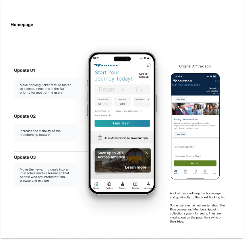
The original homepage lacked simplicity and clarity in information integration, leading users to often miss out on valuable promotions or events. Here are three improvements I’ve made:
PROBLEM
For Amtrak ticket book system. First, users often skip the homepage and go directly to the ticket booking page, indicating that the homepage fails to effectively showcase important information about ride passes and membership point systems. This leads to users missing out on potential savings, reflecting a lack of visibility of system status, where users are not promptly aware of the key features and their benefits.
Secondly, users do not receive clear feedback during the booking process about the potential savings from ride passes and points, highlighting a lack of feedback. Without timely feedback, users are unaware of how to take advantage of these features, resulting in missed opportunities.
Additionally, the functionality of ride passes and points might not be intuitive, making it difficult for users to recognize and use these features, pointing to poor affordance and signifiers. The design lacks clear cues and guidance, causing confusion about the existence and use of these savings features.
Lastly, the system does not effectively prevent user errors, lacking proper guidance and educational measures to help users fully utilize these features, indicating insufficient error prevention. Improving these design aspects—by enhancing visibility on the homepage, providing timely feedback, optimizing functional cues, and addressing error prevention—can significantly improve user experience and ensure users make the most of all available features and benefits

Login Page flow
Originally Logged flow
PROBLEM
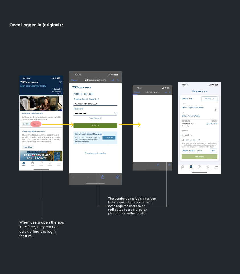
Based on user feedback, when users open the Amtrak app, they cannot quickly find the login feature, which primarily relates to issues with system status visibility and error prevention. The visibility of system status is insufficient; the login button is not prominent or is hidden in a non-intuitive location, making it difficult for users to immediately confirm whether they need to log in or how to do so. This design flaw causes confusion and frustration for users. In terms of error prevention, the lack of clear visual indicators and logical navigation may lead users to make mistakes or misunderstandings while searching for the login feature. Improving the design requires enhancing the visibility of the login feature and providing clear navigation guidance to prevent errors during user interaction, thereby improving the overall user experience.
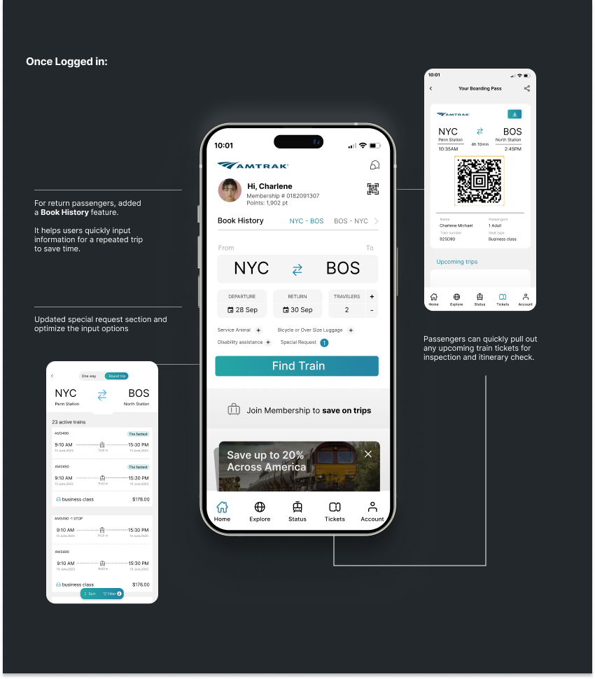
Recommended Logged flow

Explore Page flow
Originally Logged flow
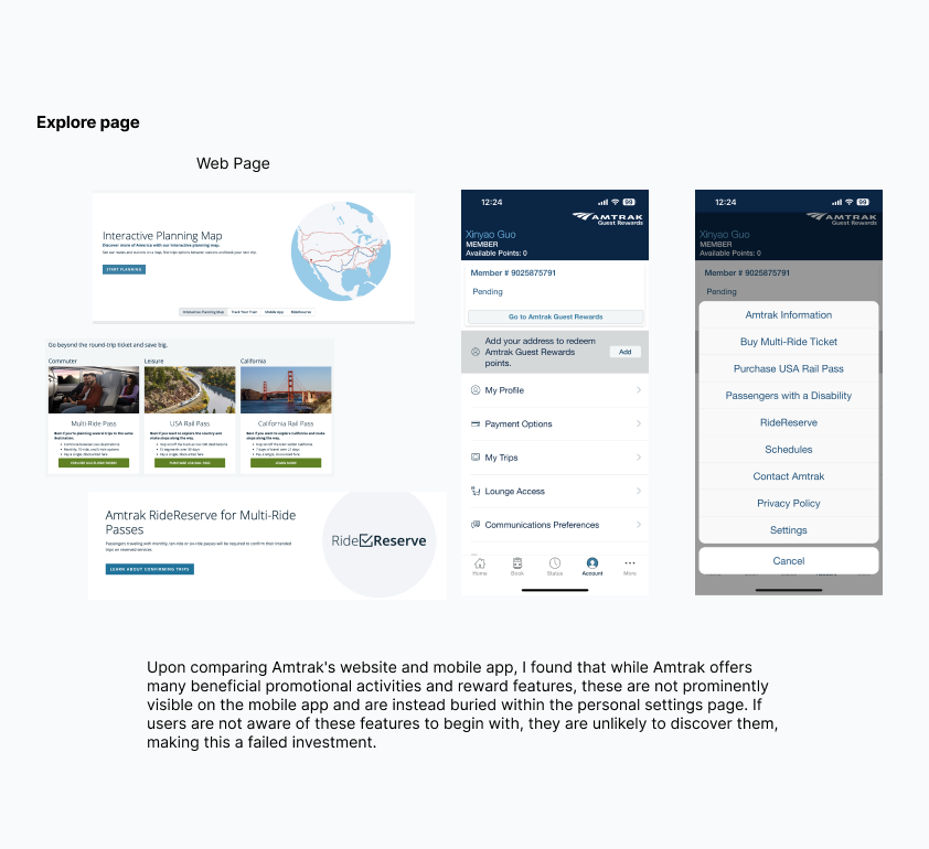
Recommended explore page
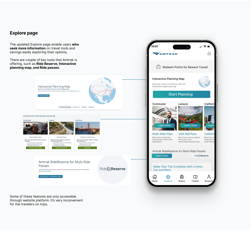
PROBLEM
The Amtrak mobile app has several key design issues that violate Don Norman’s design principles, impacting user experience. Firstly, the hidden placement of rewards and promotional features in the personal settings page makes it difficult for users to discover and utilize these important functions, violating the principle of visibility of system status. Secondly, the difficulty in accessing and discovering these features limits users’ control and freedom, affecting their engagement. The design does not match user expectations, leading to increased interface complexity, requiring users to take extra steps to find these features, which goes against minimalist design principles. Additionally, the app fails to effectively guide users, causing them to potentially miss out on rewards and promotions, thus not preventing user errors. By improving feature visibility, simplifying the process, and enhancing user guidance, the user experience can be significantly improved, ensuring users can better utilize the value provided by the platform.
Conclusion
Amtrak’s mobile app supports user engagement with rewards and promotional features, but it suffers from significant design issues that impact usability. The app exhibits weak signifiers and poor mappings, resulting in noticeable Gulf of Execution and Gulf of Evaluation. While it attempts to align with the conceptual models of other popular travel and booking apps, these issues prevent it from effectively matching users’ mental models.
The lack of clear visibility for key features like ride passes, membership points, and the login button creates confusion, making navigation through the app unnecessarily complex. Users are often left unsure about how to access and utilize these features, reflecting a mismatch between the app’s design and users’ expectations.
To address these issues and improve the user experience, Amtrak should incorporate Usability Testing to identify pain points and make informed design changes. By aligning the app’s interface with users’ mental models and ensuring clear signifiers and mappings, Amtrak can enhance usability, making it easier for users to find and use important features, and ultimately improve overall engagement with the app.