Apple Wallet is a built-in digital wallet app in iOS that allows users to store credit cards, boarding passes, event tickets, and more. While the app provides easy access to these items, it has several usability issues that may create confusion and frustration. This case study will analyze four specific problems with the Apple Wallet that I have faced as a user and propose solutions based on Don Norman’s design principles. Improving these aspects can help Apple Wallet become a more intuitive and user-friendly app.
Problem 1: Lack of feedback when adding new cards or tickets
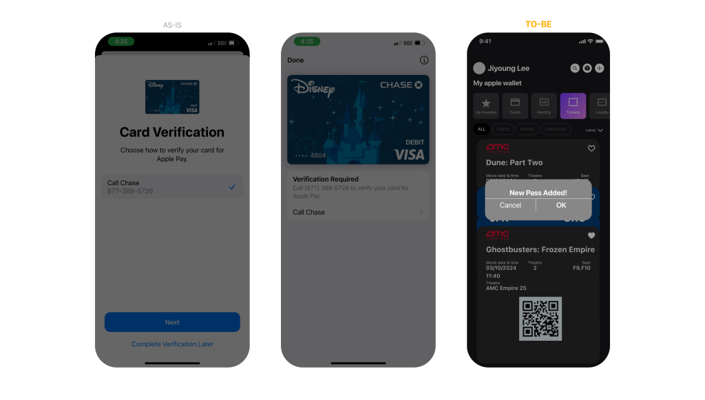
As a user, I find that Apple Wallet lacks adequate feedback. When new cards or passes are added, a feedback screen briefly appears before automatically transitioning to the “Card Verification” screen. From the user’s perspective, this confirmation feedback screen can easily go unnoticed, especially if they are not paying close attention. This issue is significant because it does not adhere to Norman’s principle of Feedback, which asserts that a system should provide clear and immediate responses to users’ actions.
Solution:
To follow Norman’s principle of feedback, Apple Wallet should display a prompt screen that requires users to click an “OK” button to acknowledge the action that new card/pass has been added. Additionally, the newly added item could be briefly highlighted or animated to draw attention. This approach would provide clear and immediate feedback, reducing uncertainty and enhancing user confidence.
Problem 2: Unclear categorization and organization of cards and tickets
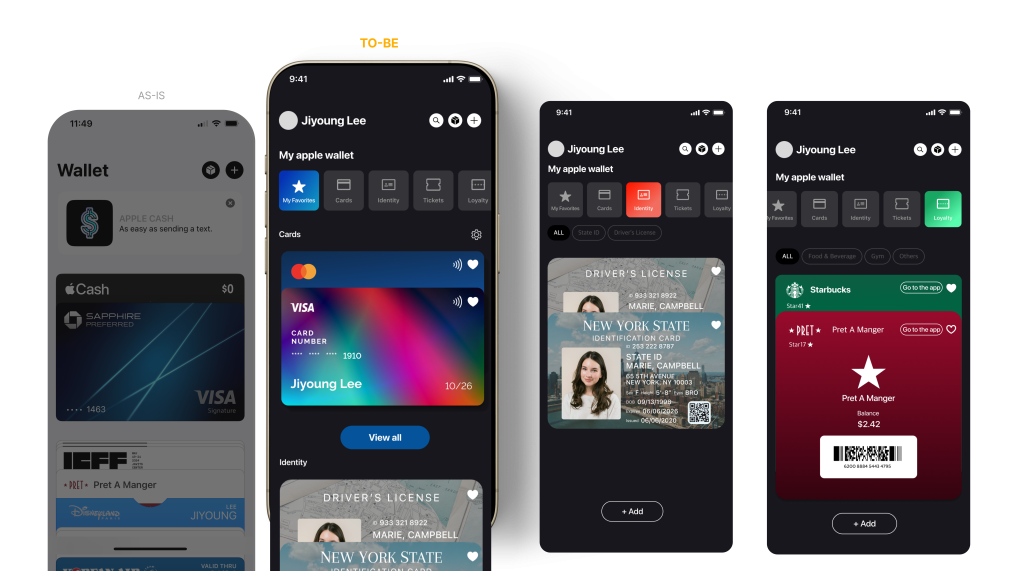
As a user, I get confused when having to find a specific pass and I can’t locate it. Apple Wallet does not effectively differentiate between various types of items (e.g., credit cards, loyalty cards, tickets) in its display. All items appear in a single scroll list with similar visual elements, making it challenging for users to quickly find specific items. This does not follow Norman’s principle of Natural Mapping. Natural Mapping is where the layout should reflect the users’ mental model of where items belong. In Apple Wallet, users mostly have to scroll down long, uncategorized list of look for specific card or tickets which increases the cognitive load and reduce efficiency.
Solution:
To follow Norman’s principle of natural mapping, Apple Wallet should categorize items into distinct sections, such as “Payment Cards,” “Identity,” “Tickets,” and “Loyalty Cards.” This organization would help users navigate the app more efficiently and locate items quickly according to their needs. Moreover, incorporating distinct colors or icons to represent each category would strengthen natural mapping, providing visual cues that direct users to the relevant section.
Problem 3: Poor discoverability of some features like delation of expired passes.
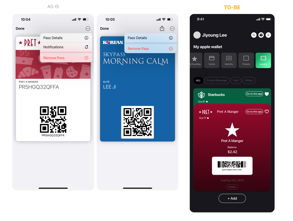
As a user, I find it crucial to have visible features, such as the option to delete expired passes, to help keep my Apple Wallet organized. Apple Wallet current feature does not align with Norman’s principle of discoverability, which states that users should easily understand what actions are possible and how to perform them. Unclear feature discoverability will lead user to frustration and limit the app’s functionality because users may not realize the full range of available actions.
Solution:
To follow Norman’s principle of Discoverability, Apple Wallet should make key features more visible by adding prominent buttons or icons for actions like updating or deleting passes directly on the main screen. For example, placing an “Update” button next to a boarding pass/loyalty card that is about to expire or a “Delete” button on an expired pass would make these options more apparent. These changes would also align with Norman’s principle of visibility, ensuring that all possible actions are clearly presented to the user.
Problem 4: Lack of direct sharing options for tickets or passes
As a user, I would like the ability to directly share boarding passes or tickets with the person I’m attending the event with. The current need to take screenshots and send them manually represents a poor conceptual model—users do not have a clear understanding of how to perform the desired action within the app, leading to confusion and inefficiency. Additionally, the interface lacks the necessary affordances for seamless sharing, meaning there are no visible cues or features that suggest how to accomplish this task.
Solution:
To follow Norman’s principle of usability and improve the conceptual model, Apple Wallet should introduce a clear and straightforward affordance for sharing passes and tickets. This could be achieved by adding, signifier, a visible “Share” button next to each boarding pass or ticket, making the sharing function more discoverable and intuitive. The button should have a recognizable icon, such as a “send” or “share” symbol, to provide strong signifiers that clearly communicate its purpose.
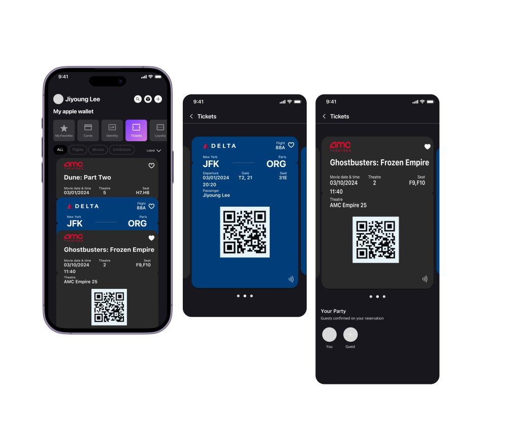
The above solutions that aligns with Don Norman’s principles can improve usability and user experience. A clear feedback will help users feel less frustrated when adding new cards or tickets. Organizing the items in it’s category will make it easier for users to quickly locate what they need. Additionally, making essential features, such as the option to delete expired passes, more visible will enable users to fully utilize the app’s capabilities and minimize frustration. By implementing these suggestions, Apple Wallet can become a more user-friendly and efficient tool that better aligns with users’ expectations and needs.