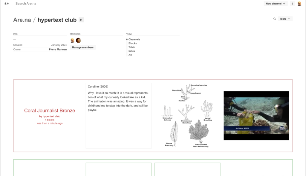
Are.na is a social media platform that allows the user to save and organize different digital content like images, videos, and links. It serves as a toolkit to manage and sort information about different topics. The main feature of the product is to create channels and add pieces of information (Blocks) in them. Users can make the channels either private or public and have the option to collaborate with other users in the channels.The target audience for the platform are Students, hobbyists and knowledge collectors. This platform has gained popularity among designers and architects.
1. Usability
The layout of the website presents usability challenges. Users might find it is confusing due to the inconsistent navigation map through the pages. The current design lacks visibility and consistency when it comes to the navigation menu of the site.
PROBLEM: The navigation menu is visible when on the explore or feed page (figure 1) but it disappears when on the profile page (figure 2). There are no signifiers of how to access the feed or the explore page.
SOLUTION: This issue can be resolved by keeping the navigation menu consistent through all the pages aligning with visibility and mapping principles.


2. Visual Design
The platform focuses on the idea of minimalism; keeping things as simple and organized as possible. However, while minimalism can reduce clutter, it should not compromise functionality. The design should balance perceptual affordances that clearly indicate user interaction.
PROBLEM: While using the website to create collections, the + icon button lacks a descriptive label. The descriptive label only appears while hovering over it.

SOLUTION: Make the descriptive label always visible to improve perceptual affordances and reduce ambiguity (Figure4).

3. Functionality
The website does a good job of using affordances as demands and requests. To be able to use the platform you need to make an account, here the affordance is a demand. When you create an account your first suggested task is to make a channel, which can also be skipped if the user is already familiar. Creating a channel as a primary task emphasizes the platform’s main feature, aligning well with the goal.
5. User Experience (UX)
Are.na is user focused and aims to keep the platform simple with no AI, algorithms, or ads. There is one goal to provide space for the user to gather their thoughts, reflect and build upon ideas either on their or by collaborating. The design of the app fulfills this purpose by keeping the UI minimalistic and by using effective feedback mechanisms and affordances. Example of such user feedback includes the popup notification for creating a new channel. After using the platform user might feel less stress and anxiety.
6. Alignment with Standards
Evaluating the design against Jakob Nielsen’s 10 Usability Heuristics reveals some issues:
- Visibility of system status: The system should always keep users informed about what is going on through appropriate feedback within a reasonable time. This means users should be aware of any progress made, such as loading indicators or status messages. The system provides feedback in the form of popups but their location is in the bottom right corner of the screen and disappear after a few seconds. This makes them easy to miss by the users and are not sufficiently noticeable.
- Consistency and standards: The design should follow platform conventions and maintain consistency in terms of terminology, layout, and design elements. Inconsistent navigation elements undermine user expectations. Users are left to wonder whether different words, situations, or actions mean the same thing.
