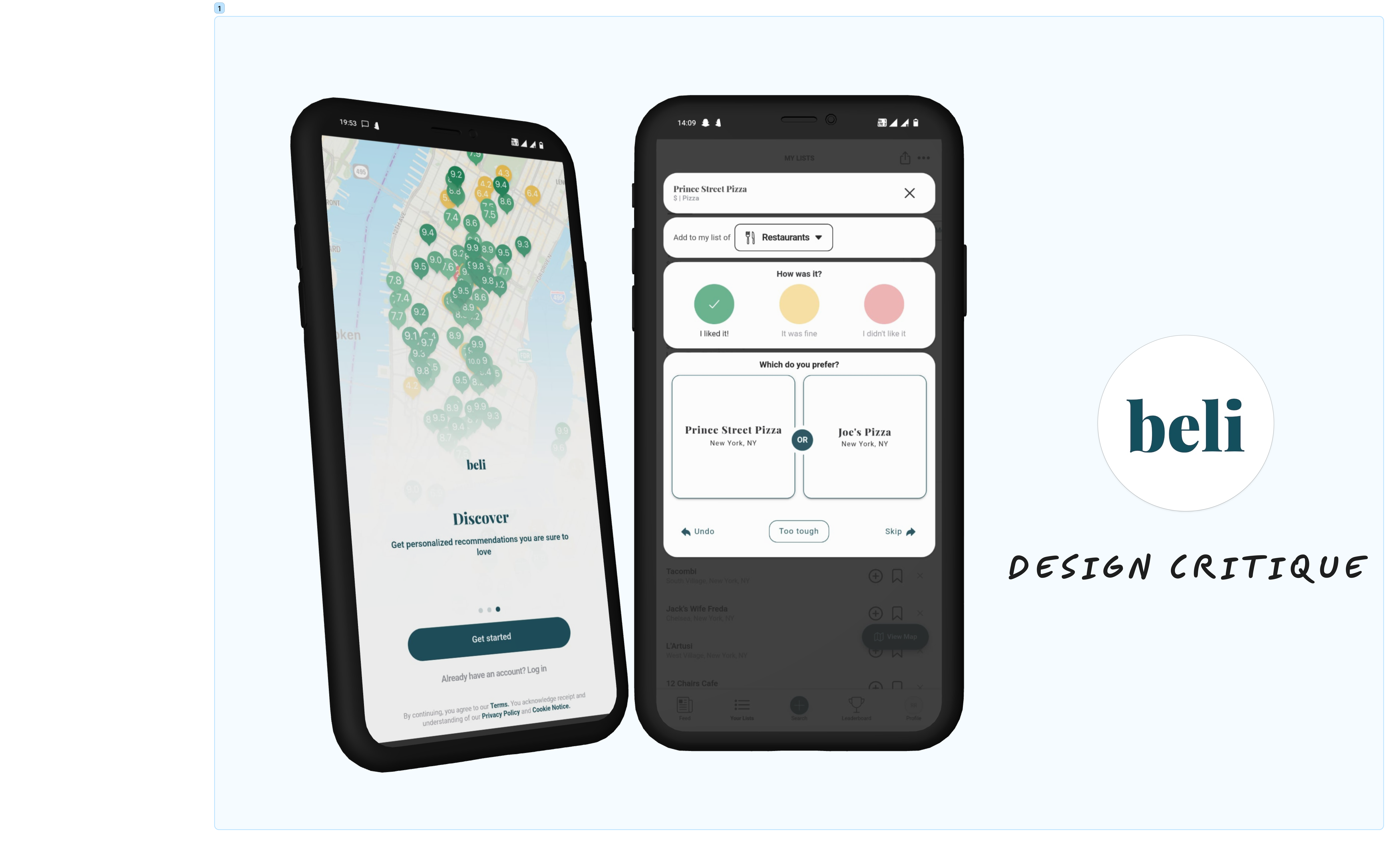
Beli is a restaurant ranking and recommendation app for rating and discovering the best dining spots. Users can create a network of food critics by following their friends to see where they are eating. The app also allows users to create their own list of dining spots that they have already been to or want to try.
Let’s dive into how Beli uses the different theories mentioned by Don Norman in Design of Everyday Things and Jenny Davis in How Artifacts Afford.
User goal 1 – Onboarding
The onboarding process is pretty lengthy requiring users to fill up a lot of details related to their profile and food preferences. An interesting observation was that the app doesn’t let users move forward without inviting at least 4 friends. On the page only the invite buttons look clickable which leads users to mandatorily click on it (Constraints).
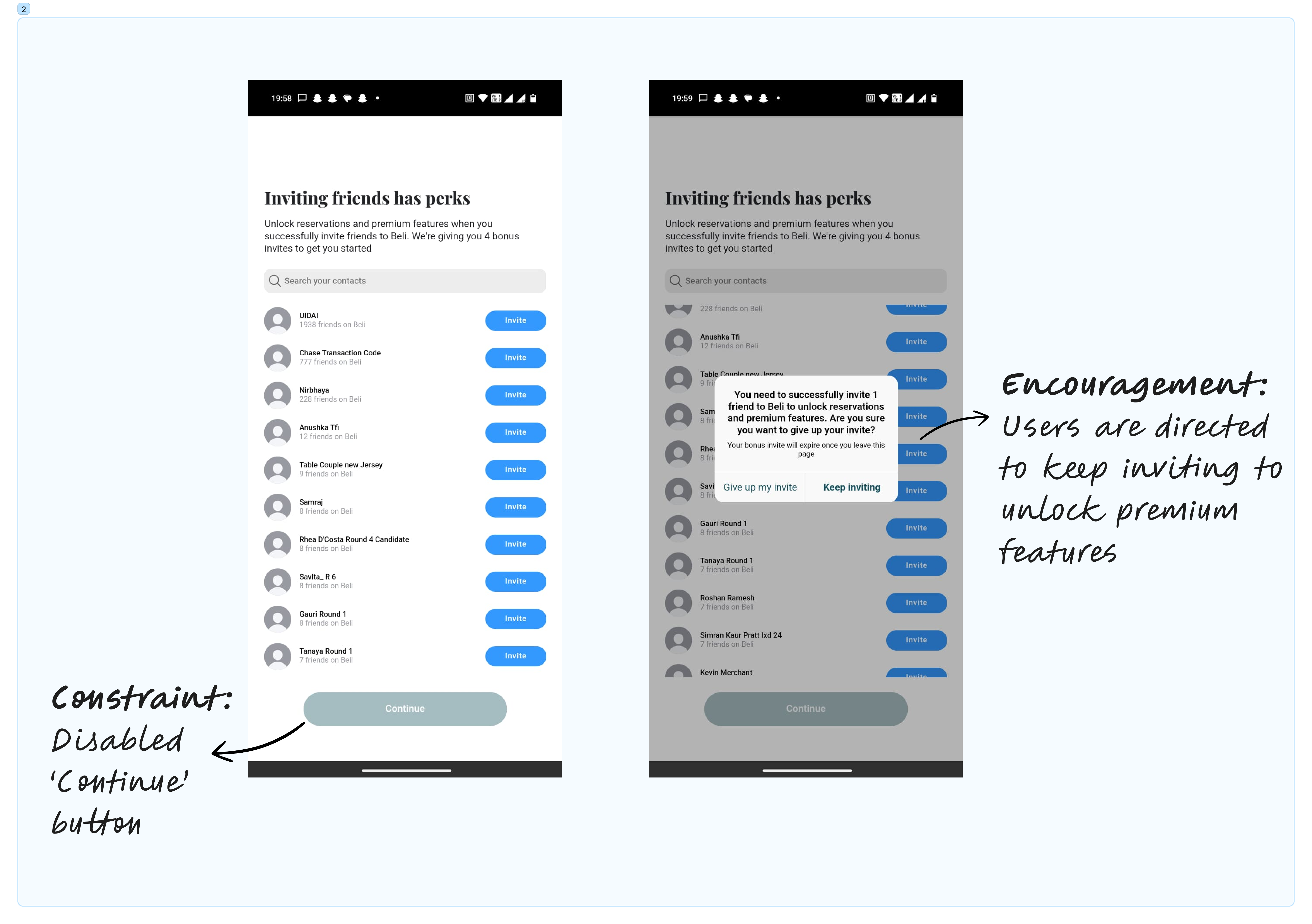
The ‘Continue’ CTA button appears disabled (Refusal), however, it affords the action of being clicked. Accidentally clicking on it, triggers a pop-up message that informs users to invite friends to unlock premium features. Both the ‘Give up my invite’ and bold ‘Keep inviting’ CTA options prompt the users to invite more friends to the app by making them feel they will lose out on something valuable if they don’t do so (Encouragement).
On inviting my first friend, I was still not allowed to ‘Continue’ into the app. The Gulf of Evaluation was only fulfilled and the Continue button was enabled only after I invited 4 friends to join the app (Demand). This step might be problematic as it could be daunting for first time users and can cause a negative Behavioral Cognitive Response.
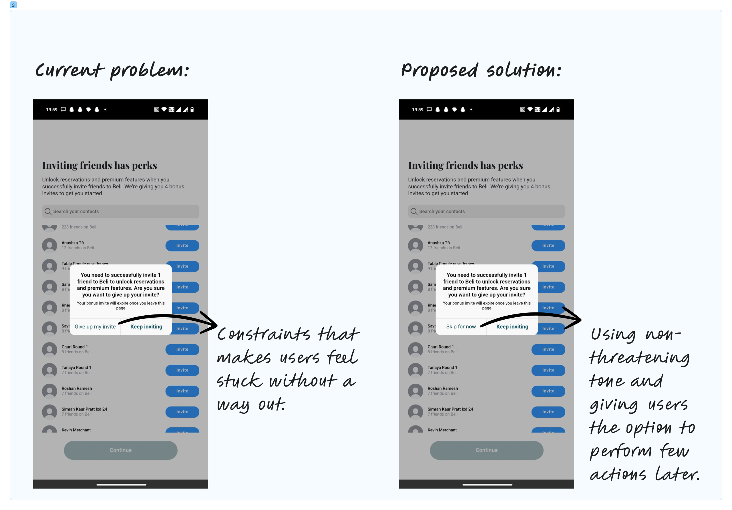
Proposed Solution – Beli could balance their constraints by allowing users to skip certain steps during onboarding (like inviting friends). Instead of using harsh CTAs like ‘Give up my invite’ it could say ‘Skip for now’. The app could then prompt users to perform these actions at a later time whenever they use the app.
User goal 2 – Discovering food spots
Once onboarded users see a simple interface with ’coach marks’ on the screen to make users aware of the various icons/ buttons (Signifiers) on their interface and its meaning. The coach marks also allow users to create a conceptual model of how the app works.
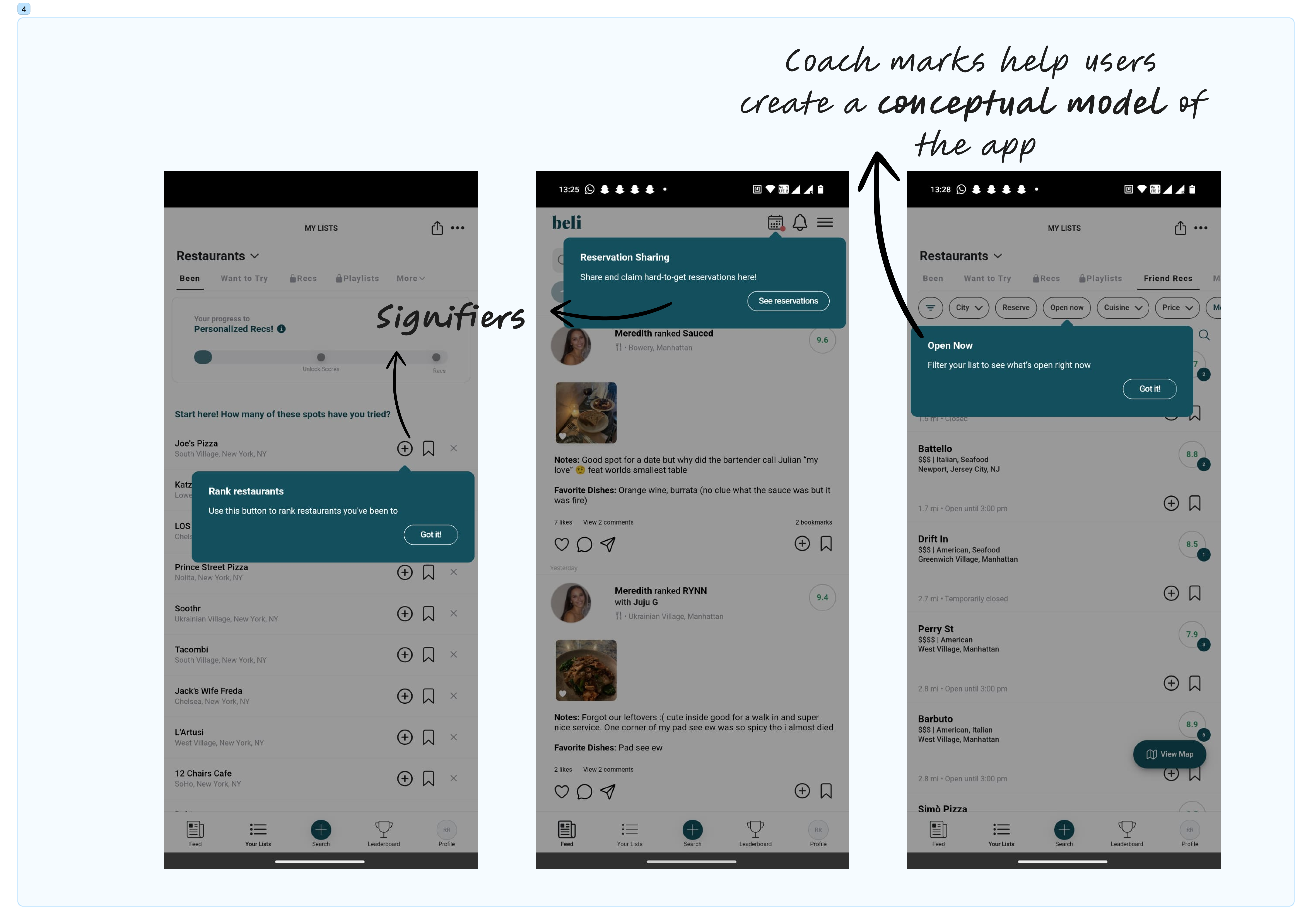
The 5 food categories – Restaurants, Bars, Bakeries, Coffee & Tea, and Ice Cream & Dessert are indicated by 5 distinct icons which are used throughout the app in different places. This makes it easy for the users to map the different categories of food joints, eliminating the need for labels (Mapping).
User goal 3- Rating places
The use of a progress bar on the ‘My Lists’ page makes users aware of how close they are to unlocking new features on the app (Mapping).
As first time users some features are locked initially and need users to do certain tasks to unlock them (Eg – complete 10 reviews to unlock the scores feature). The lock icon affords the action of clicking despite lacking any signifier. If users click on the lock icon, it lets them know what needs to be done in order to unlock that feature (Encouragement).
The app provides positive celebratory messages when users achieve certain milestones (Feedback).
Users can also see ratings/ places saved by them on a map. This brings the Knowledge in the Head and Knowledge in the World together, helping users recall the spots they want to explore in the city (Mapping).
User goal 4- Socializing with friends
The app heavily emphasizes adding and inviting friends during the onboarding process. Based on my experience with similar apps that allow social engagements, I expected to see an accessible friends list (Conceptual model). However, friend’s profiles on Beli can only be accessed via feed (if friends post a rating and it appears on the feed), via search bar (which gives results of all members on the platform), or via platform leaderboard. This could be confusing to users as one of Beli’s mian USPs is to allow friends to plan outings based on common preferences. I would recommend that Beli make the process of ‘discovering friends’ more convenient.
Proposed solution- Adding a section called ‘Friends’ to the ‘Your Lists’ page to access all the profiles of people I follow.
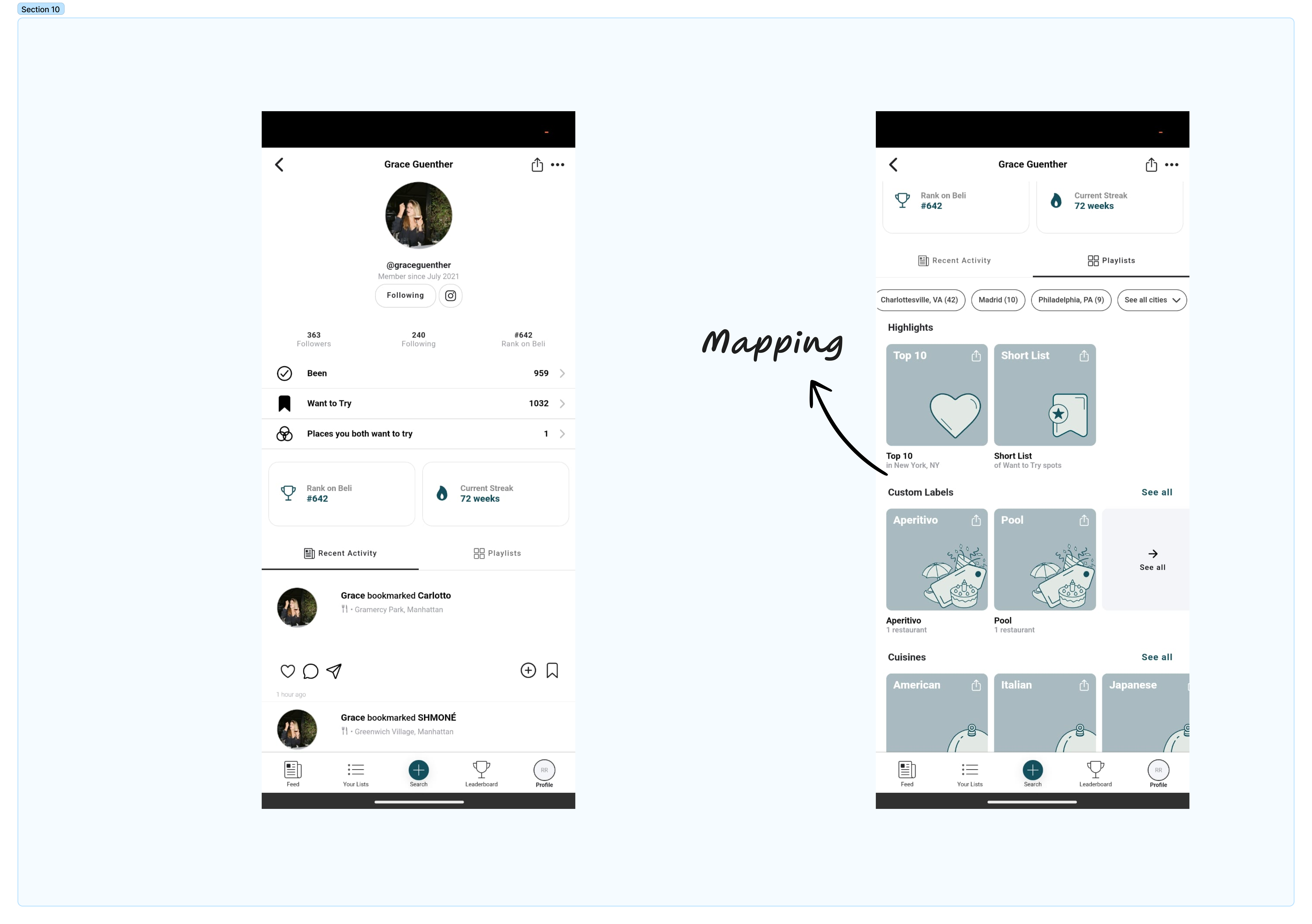
Once users find their friend’s profile, they see a well-sectioned page with an option to find ‘Places you both want to try’ and a playlist tab that reveals their preferences in a highly categorized manner (Mapping).
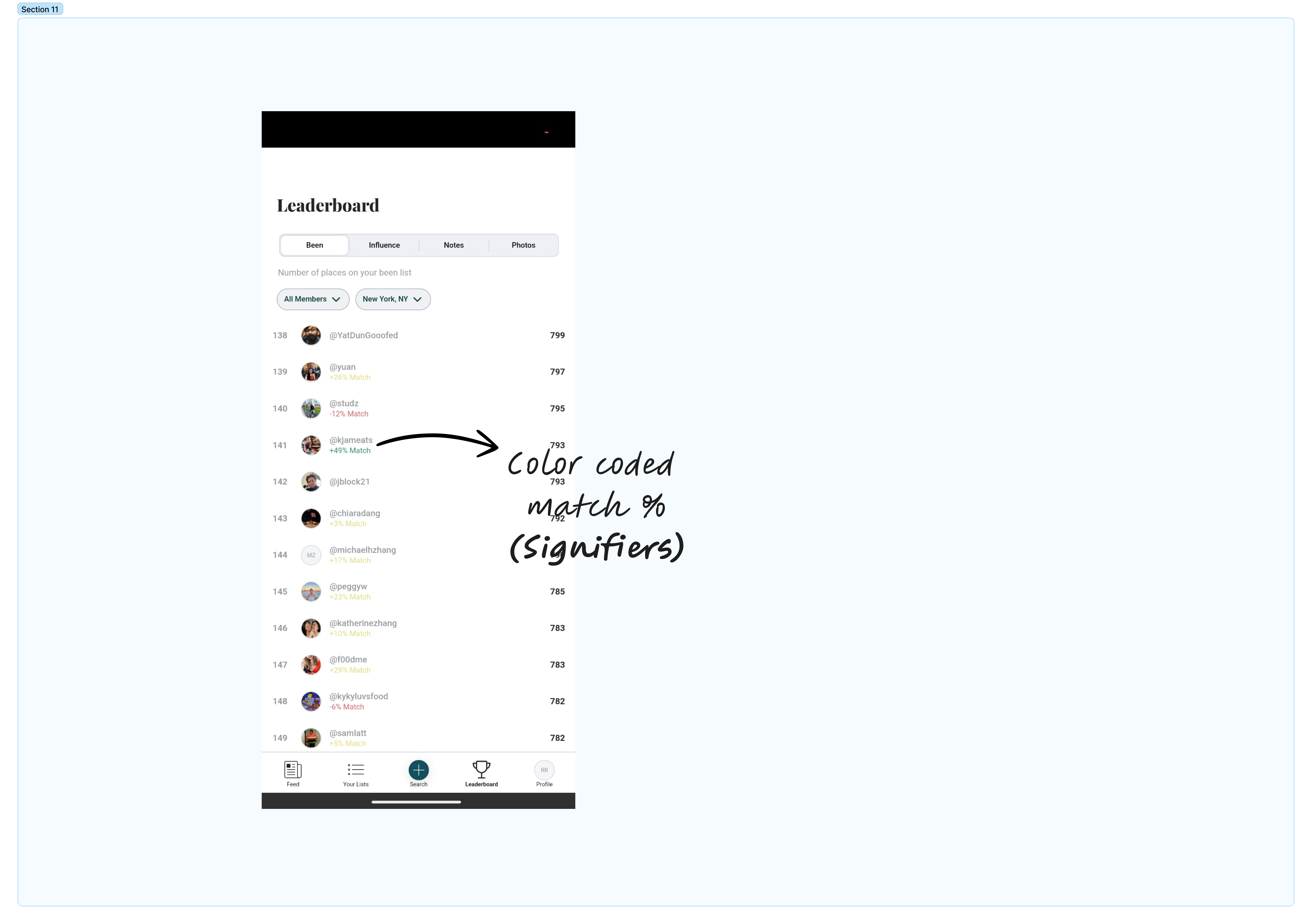
User goal 5- Tracking Leaderboard.
The leaderboard section shows me all users on the platform, with a color coded % match indicating the similarity in preferences. The match scores that were green marked, encouraged me to follow users with similar tastes (Signifiers, Encouragement).
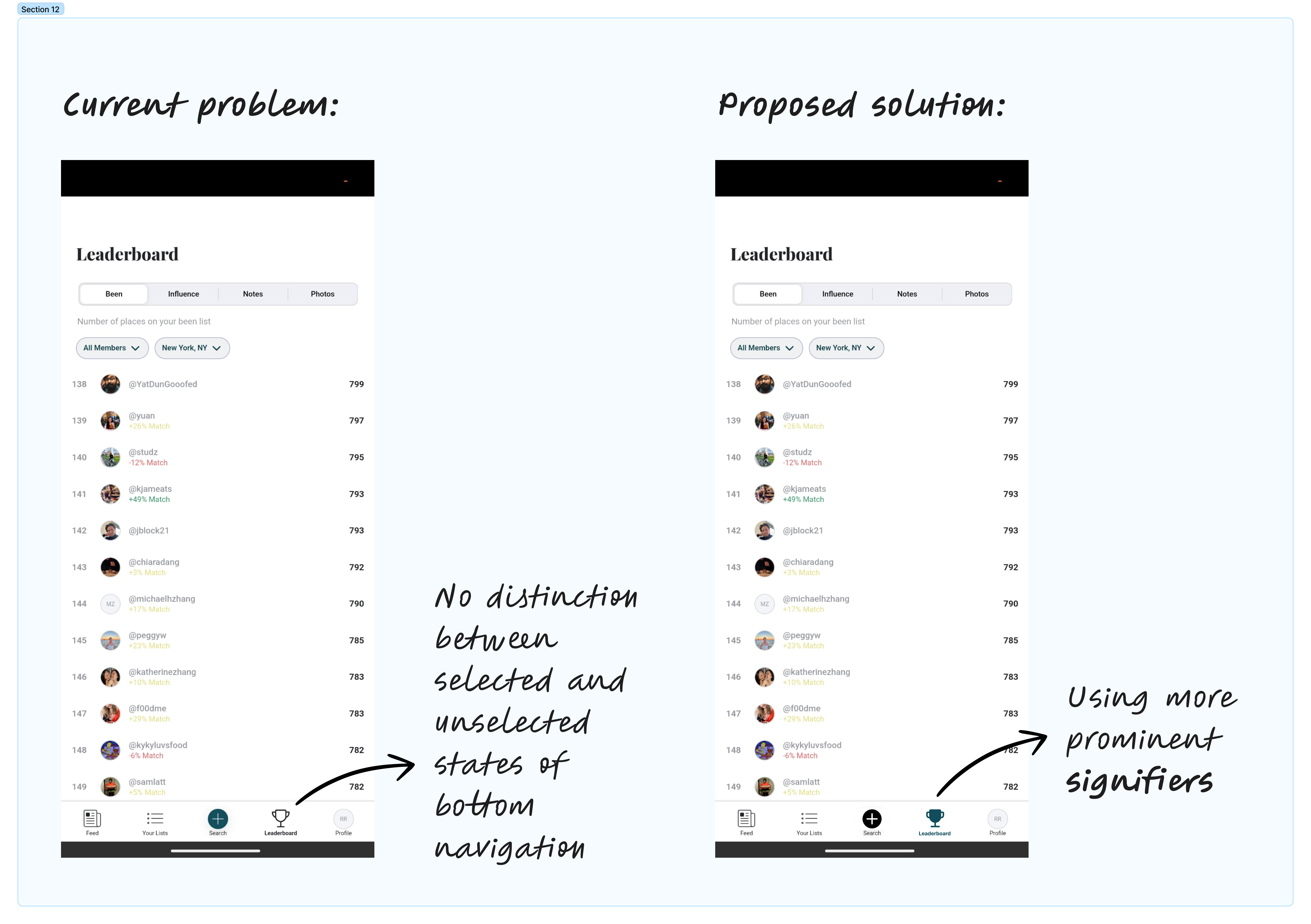
A final observation was on the bottom navigation of the app, where the selected and unselected states (signifiers) are not very clearly distinguishable.
Proposed Solution: Beli should stick to its design system here to use Dark Green to highlight the selected tab in the navigation.
Conclusion:
Beli is an innovative product and it’s certainly paving the way to be the go-to app for foodies. It rapidly gained popularity in cities like New York. It does a good job incorporating various design principles to engage its users. However, it could use some changes to make the overall experience more seamless and satisfactory for the users.