
Bend is a wellness-focused app for users who want to incorporate stretching and light exercises into their daily lives. The numerous poses and well-curated programs help you target specific needs for your body and promote a healthy lifestyle. Its easy-to-use and colourful interface makes stretching an enjoyable activity.
While the app has taken some user-friendly approaches, the purpose of this article is to analyse its user experience based on the principles discussed in Don Norman’s “The Design of Everyday Things”.
Describing the user and the process
For this article, my primary focus will be a new user. A user who has just downloaded the application can check out how the whole thing works before committing to the application, which is a great way to have a trial period. There are two processes that the app takes new users through:
- Onboarding
This process focuses on getting to know the user, their preferences and their limitations. It’s in a questionnaire format and the responses are recorded to help customise their experience in the app.
- Accessing Exercises
This process involves the user starting to use the app by exploring the various exercises and stretching programs(pre-made queue of exercises). The user can test out if the app is of help to them and sign up.
1. Onboarding
A first-time user initially lands on the welcome screen where the CTA says “Get Started”. They are not asked to create an account at the start.
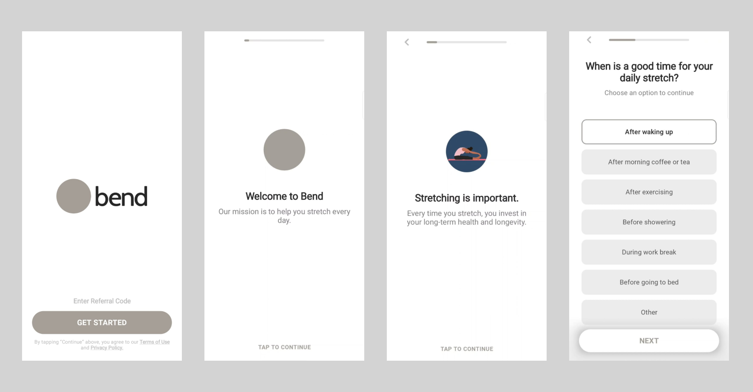
Problem 1. A.: Text Dump
The “Get Started” action takes the user to more text rather than actually getting started:
- There is a mapping delay which leads to user frustration.
Even though we have a small progress bar on the top, it’s hard to evaluate how much time these steps individually take which
- This causes an issue in the clarity of information.
Solution
Move the welcome message to the welcome screen. This makes the questionnaire one more step closer.
Make the text-related sections auto-progress with a time limit of 1-1.5 seconds. This gives the users more time to focus on the questionnaire rather than carefully going through all the text.
Problem 1. B.: Where are the CTAs
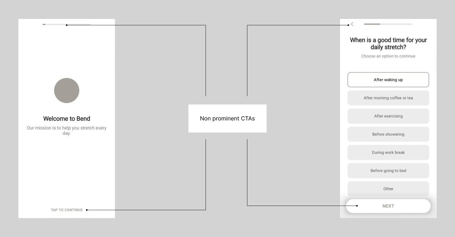
The CTAs(buttons, action messages, etc) are not prominent. This seems to be a recurring problem throughout the application (discussed in the 2. B. as well)
- The unintentional lack of importance for the signifiers leads to a lack of discoverability and overall confusion while going through the process
Solution
A change in the colour palette and choosing a striking primary colour will help give importance to the signifiers.
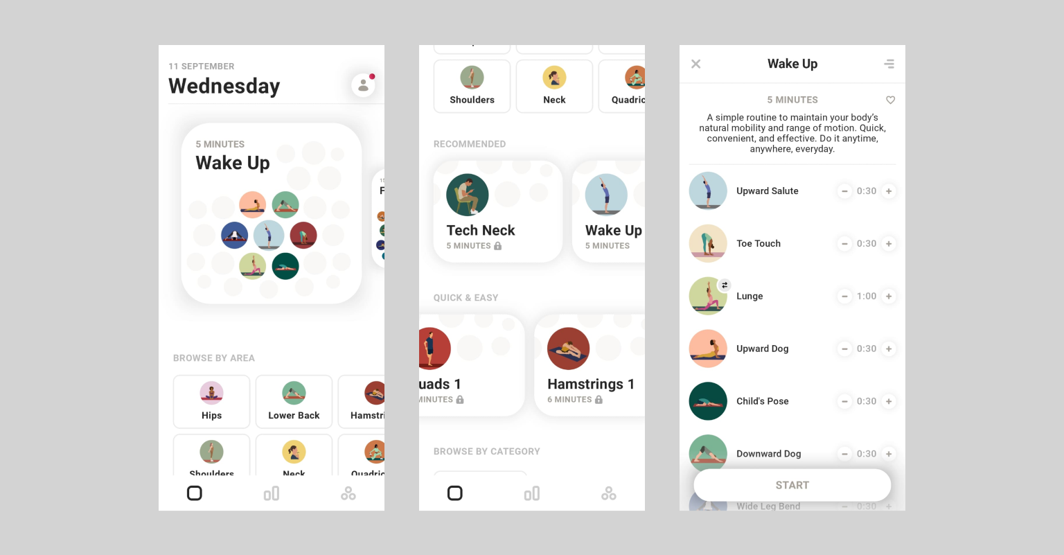
2. Accessing exercises
After the onboarding process, the user is taken to the exercise screen where they can view exercise programs, stretching exercises focused on certain body parts or programs catered to fixing issues(like posture, desk fatigue, etc.). The illustrations make the experience something to look forward to and make the concept of exercise fun.
Problem 2. A.: Bombarding Promotion
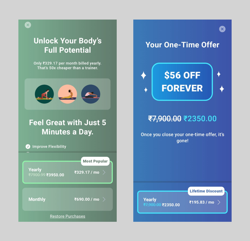
The promotion for premium, when the user is first navigated to this screen, defeats the whole purpose of getting to know the app without creating an account.
- This causes a mapping issue and bad feedback after the long questionnaire, hindering the user’s flow of checking out exercises.
Solution
Let’s remove the promotions.
Most of the programs and exercises are locked for free users. This is a good enough signifier that will prompt the user to sign up for premium if they like the app. The promotion for premium can start after the first few days of installing the app.
Problem 2. B.: Where are the CTAs (Part 2)
As discussed in 1. B., the CTAs are not very prominent. In fact, it’s a critical issue in this flow because the CTAs look disabled.
- This creates a big confusion in the affordances since a lot of the programs are locked for new users
Solution
As discussed earlier, a change in the colour palette and choosing a striking primary colour will help give importance to the signifiers.
The start button could be a play button at the very top so that it’s the very first thing any user notices.
- To give more attention to the play button, the illustrations should have a lighter, pastel background.
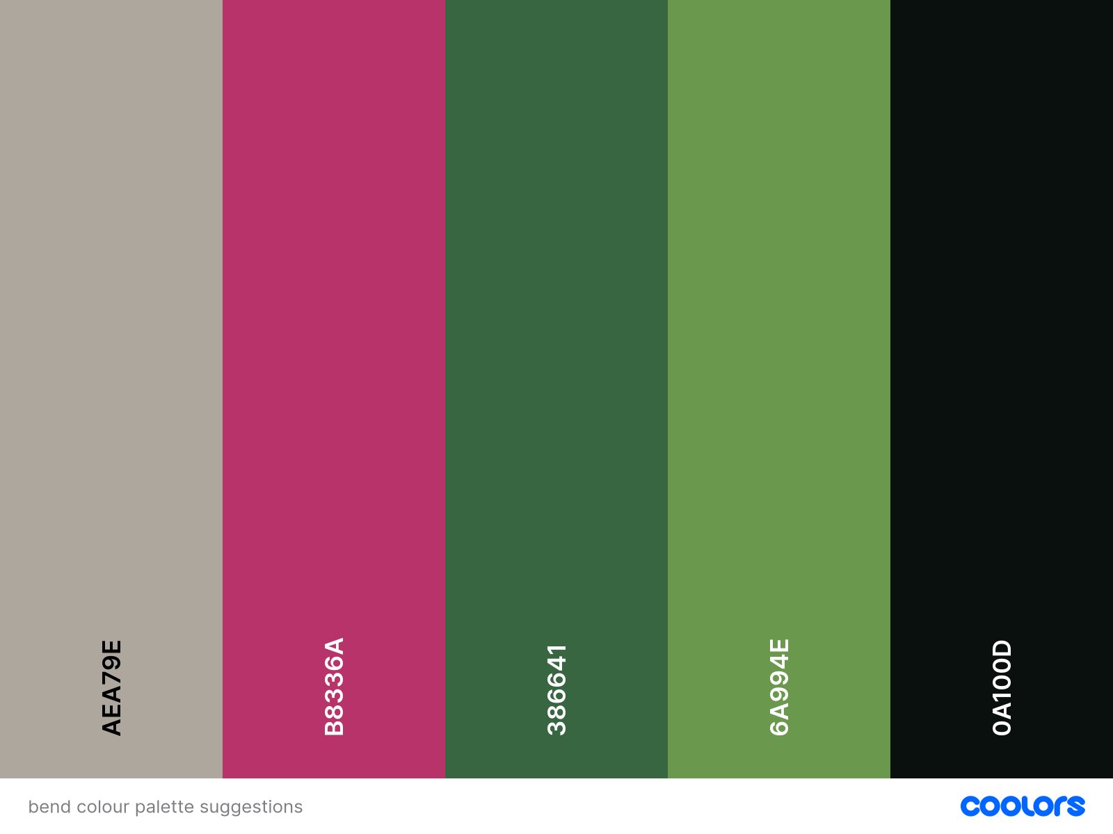
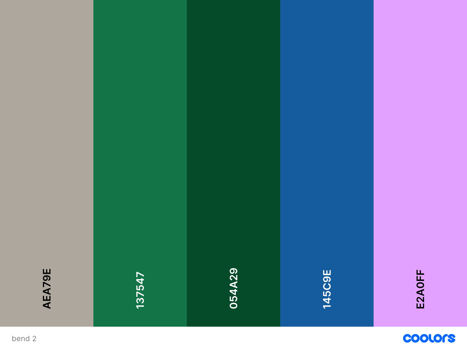
Here are a few colour palette suggestions. Soothing colours like the greens here go with the overall idea of the app
Problem 2. C.: How do I exercise?
Once the user starts an exercise, there is a lot they have to read to understand how to perform the exercise. If this is in the middle of a program, one has to take time to sit and read or take significant breaks between exercises to understand.
- This leads to poor discoverability of the exercises and a break in their flow.
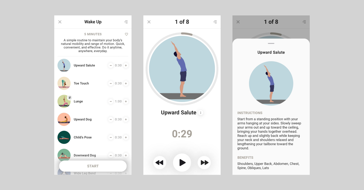
Solution
It is better to narrate or show each step with illustrations or both to make the user easily understand how to perform the exercise. This increases simplicity and makes the whole process clear.
Problem 2. D.: Am I exercising?
There is no indication of the exercise running when we play it – there’s complete silence until it’s time to change the exercise.
- This causes an issue in feedback once the user starts the exercise.
- This leads to the gulf in execution
Solution
The narration solution discussed in 2. C. helps solve the problem as well since it will indicate that the exercise has started once the user hits play.
Conclusion
Bend is a great and simple app for those who want to start and get acquainted with daily stretches and exercises.
But there are a lot of instances, especially while accessing exercises, where the discoverability of exercises is weak. It does a great job of keeping everything minimal, but this process also costs the application. The poor discoverability leads to a gulf of execution and a gulf of evaluation and an overall confusing experience for first-time users.