
Introduction
Booking.com is a travel app that helps people find great hotels, hostels, or apartments efficiently, users can also use this app to book flights, rental cars, and other things about travel.
Every time I travel, I used to use Booking.com to search the available hotels. Even though I’m familiar with its functions, I still have some confusion or frustration during the search process.
This design critique will follow the design philosophy made by Don Norman in The Design of Everyday Things (Revised and Expanded Version). Though Booking has website and app formats, where some of the problems overlap, this critique will focus on the Booking.com app to clarify the delivery.
Discussion
1. Hotel Map Viewing
- Problem
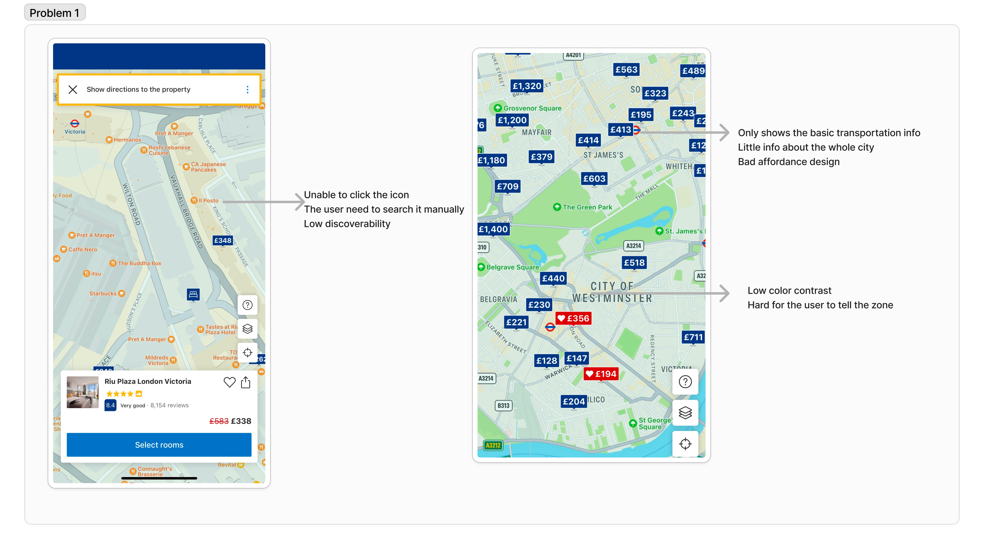
Location matters when people choose a place to stay. However, the facility icons on the map around the neighborhood (transportation, café, etc.) are unclickable, which have a low understanding and provide poor feedback. The users can only know the places’ names except any other information about them. Otherwise, the users need to search it manually on Google Map. Looking around the neighborhood is a very possible action for users looking for a hotel, while the map has a poor interaction design, showing a bad affordance example.
- Solution
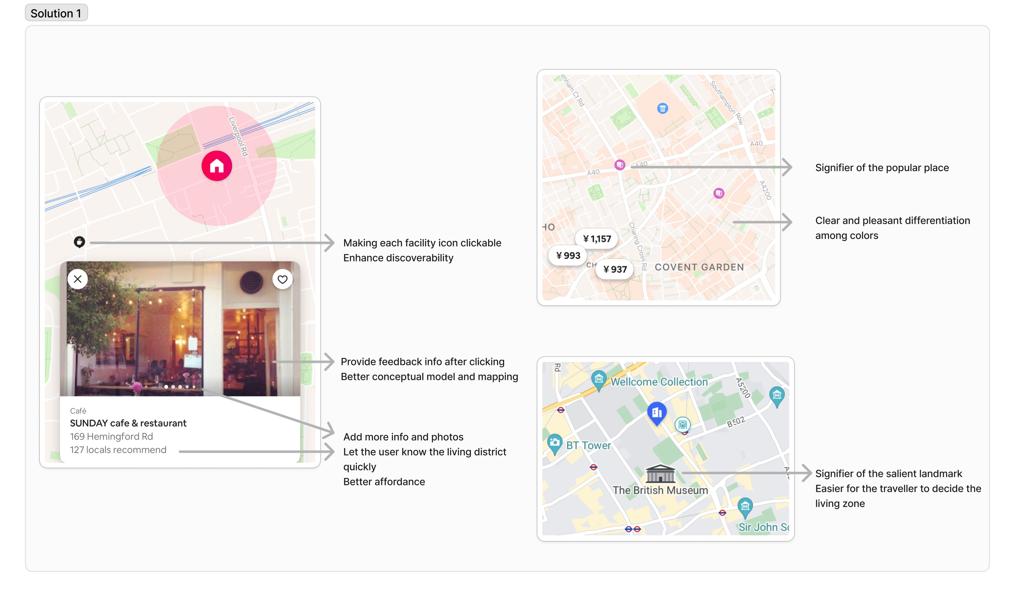
To make every facility icon clickable and provide feedback, which is more information about them. Other travel apps such as Airbnb and Trip, both provide pleasant feedback and understanding through clicking icons, then the facility information will show up from the bottom, taking advantage of the mapping. Besides, Booking can also add more icons on the city’s landmarks and tourist attractions to optimize the system image, thus making it easier to find the district they prefer.
Hotel Wishlist & Comparison
- Problem
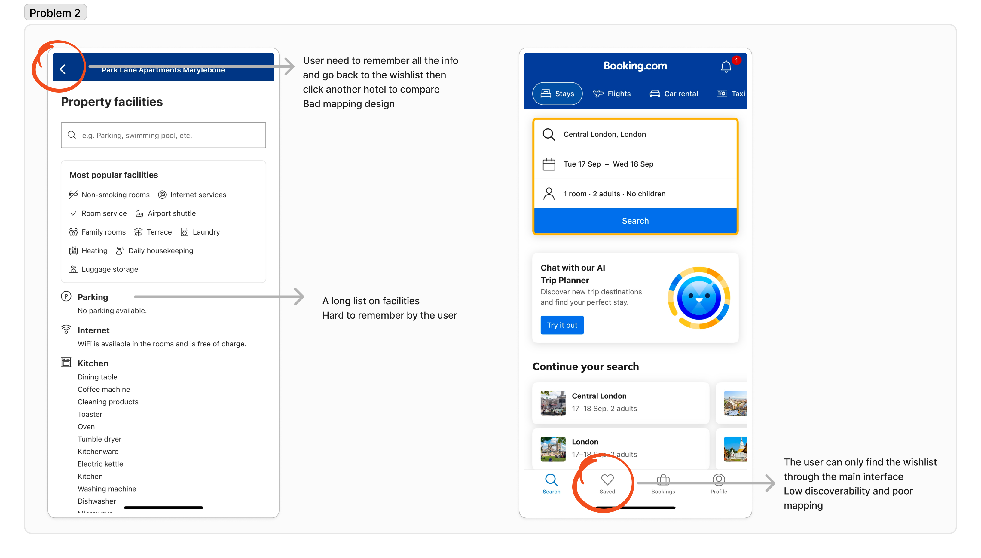
When the user or traveler wants to find a place, it’s necessary to compare each of the hotels. But that’s a complicated process to do this on Booking. The user needs to save the hotels into a wish list folder, then click each of the hotel links and remember the information such as price and facilities, then swipe twice to go back and click twice to find another hotel and compare the information with the memory of the last hotel. The long comparing process doesn’t take advantage of the spatial layout, showing a poor mapping design. The designers don’t know how the wish list could be used in the app and give a bad affordance, and the absence of comparison complicates the booking process, showing a bad conceptual model.
- Solution
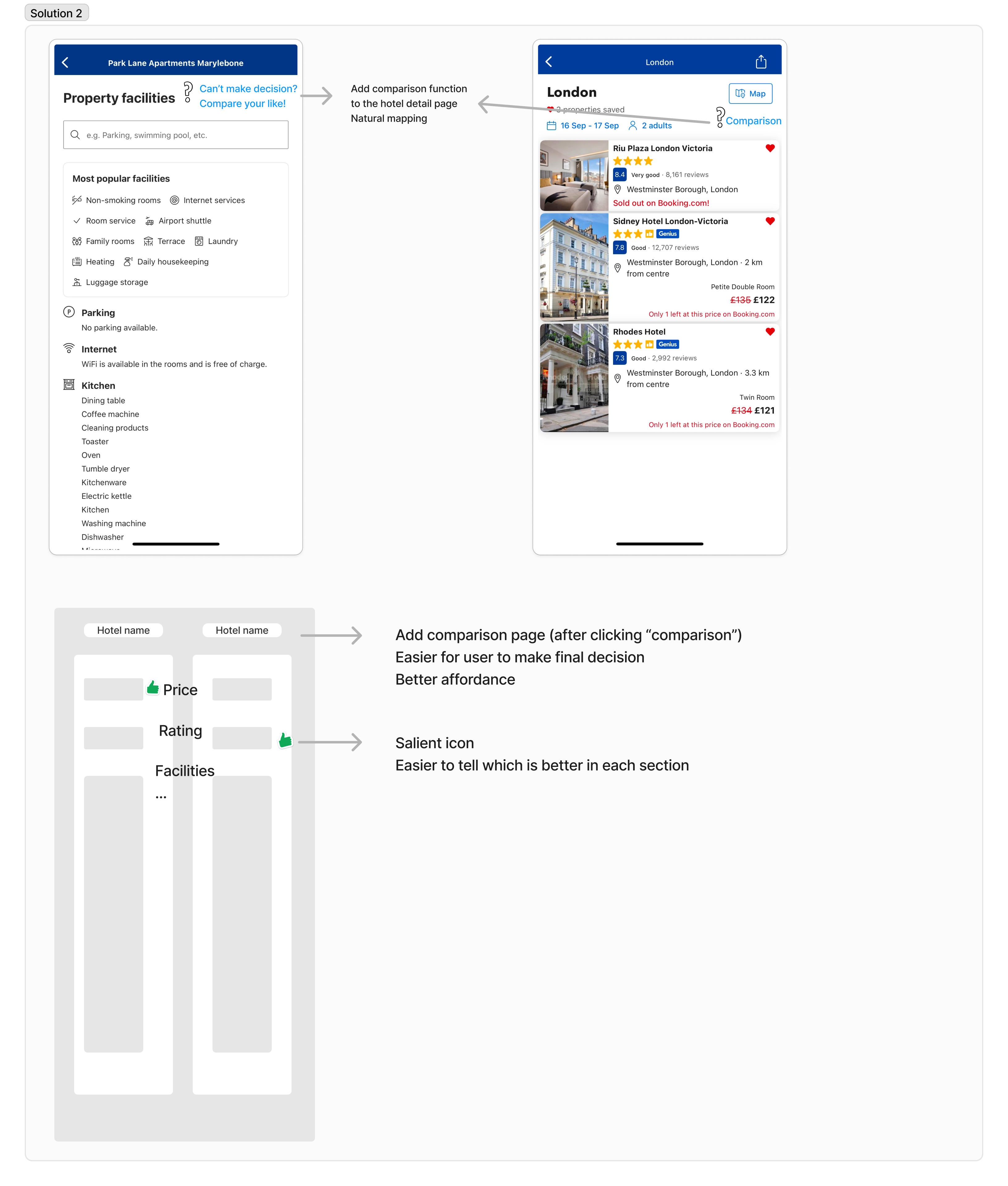
After clicking the “like” icon, provide feedback under the bottom of the screen showing “saved to XX list” and “check”. Add one more “comparison” function, placing the signifier icon at the upper right corner of the hotel detail page to take advantage of spatial mapping. Choose two or three hotels in the wish list to do the comparison and show the detailed data on each section of the comparison. The comparison page simplifies the decision-making process.
Genius Membership
- Problem
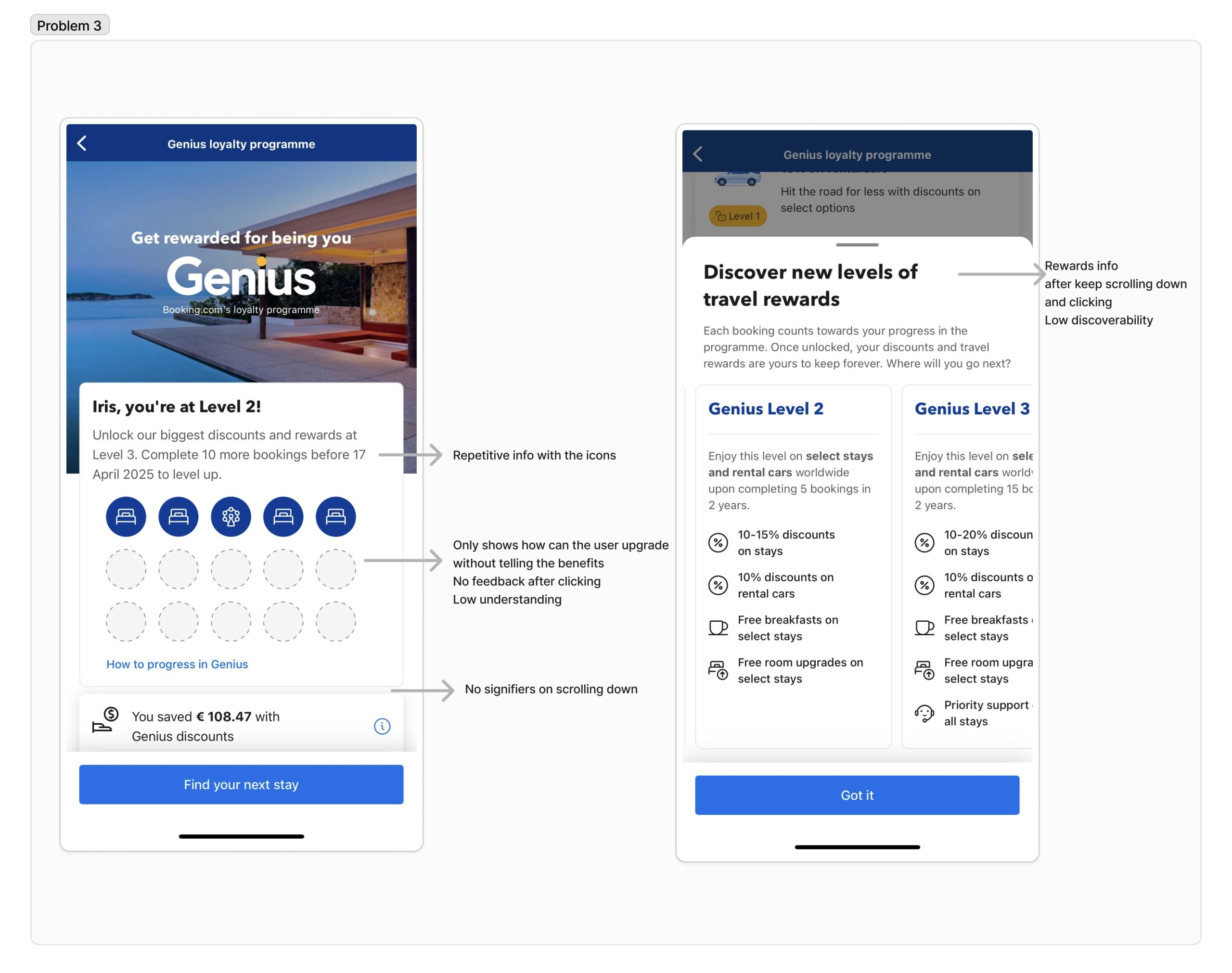
The more bookings the users made, the higher the level of their membership. The genius membership information can be found in the user’s profile section. However, it only shows how far the user is from the next level, while the user has no idea what’s the benefits and rewards unless they keep scrolling down, which has no signifier to guide the users and has a low discoverability.
- Solution
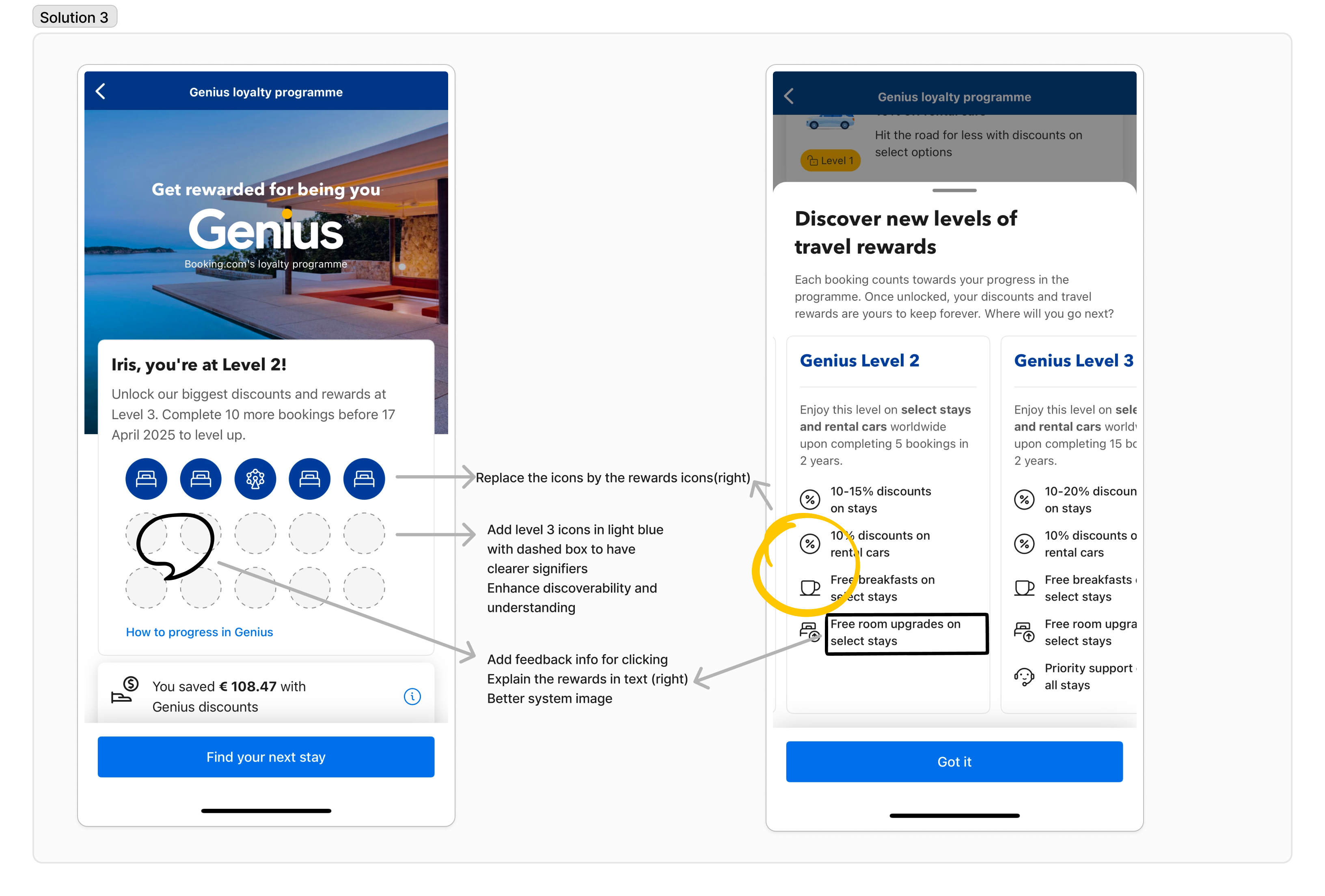
Instead of showing how many bookings should be made for upgrading, show the rewards icons in the section, and change the grey icons into light blue to make the signifier more visible and enhance discoverability. Add feedback on the rewards icons so the user will know what they can get by upgrading their levels clearly, attracting the user to make more bookings.
Conclusion
Booking provides abundant hotels and travel-relevant resources; however, the booking process shows a low discoverability, which is one of the most important characteristics of design. The absence of signifiers and feedback leads to confusion about use, which shows a poor affordance design. Those problems can be solved if the designers enhance their understanding of the Gulf of Evaluation and Execution, and do more usability testing.