
Photo by Rubaitul Azad on Unsplash
Chase Bank’s mobile banking app offers a comprehensive set of features designed to make managing finances simple—from checking balances to paying bills and depositing checks. However, while the app provides essential functionality, some design choices could be improved to create a more intuitive and confident user experience.
In this critique, I’ll examine the Chase Mobile Banking app using key principles from Don Norman’s The Design of Everyday Things, which emphasizes user-centered design, affordance, signifiers, and semantic constraints. Although the app delivers on its core features, there are areas where design refinements could better align with these principles, improving overall user experience.
The experience so far
With limited experience using U.S. banking apps and coming from a country like India, where digital finance is rapidly advancing, I found Chase’s mobile app to be largely effective, yet there were a few moments where the design felt less than straightforward. While it offers a rich set of features, there are design inconsistencies and unclear interactions that create hesitation or confusion. Below are the main points where the app could be improved to better meet user expectations.
Frustration #1: The Elusive Account Details
The Chase homepage offers customizable chips for frequently used actions, such as sending utility payments via Zelle®. However, accessing account details isn’t immediately obvious. The small “▶” signifier next to the account number is easy to miss, especially since the slider icon for the “Pay & Transfer” section is more prominent. This lack of clear affordance makes it difficult to figure out how to access account details without hunting around the app.
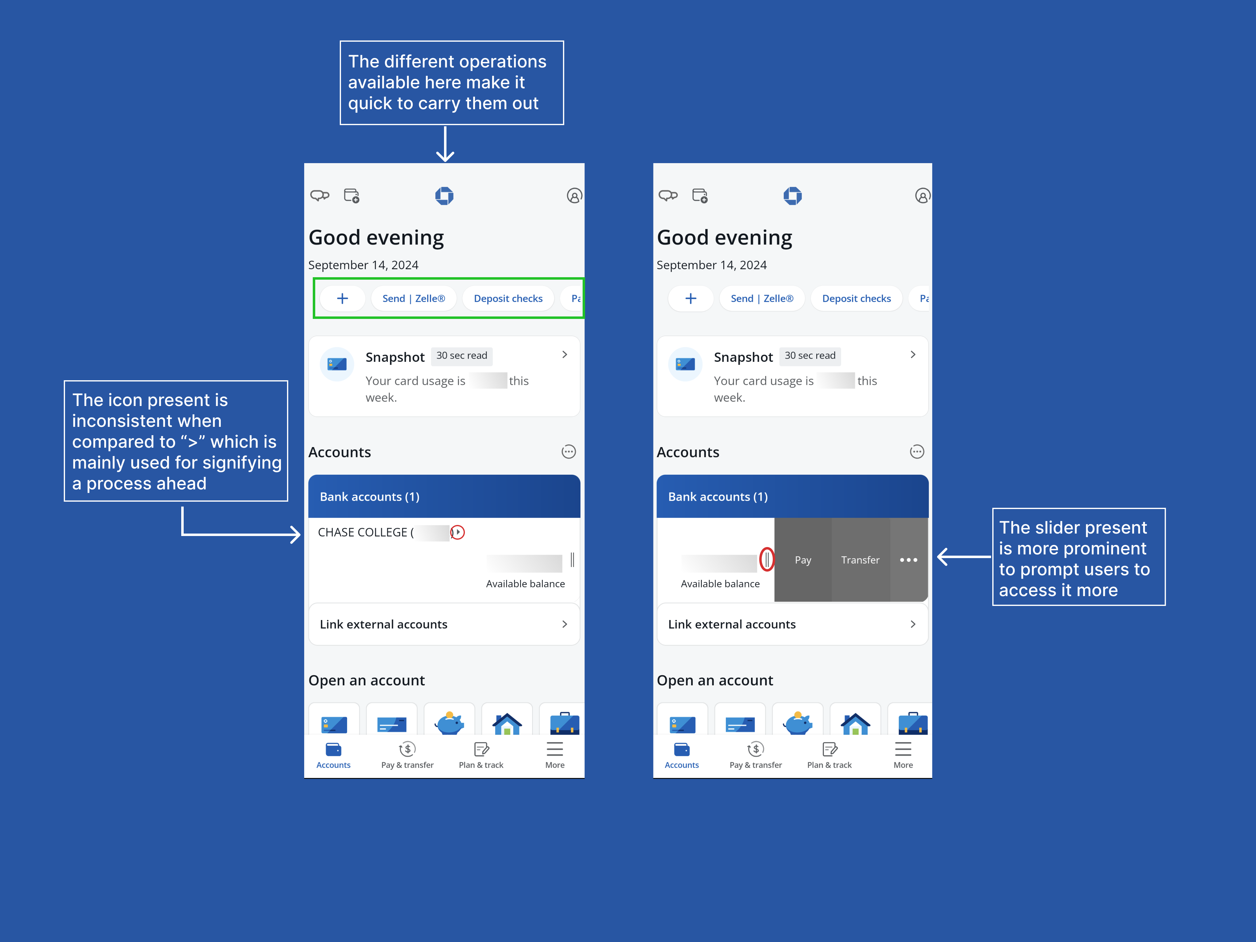
Solution?
A larger “>” icon or a “View Account >” button in the account section would improve discoverability and provide better affordance, making it clearer that account details are available to view.
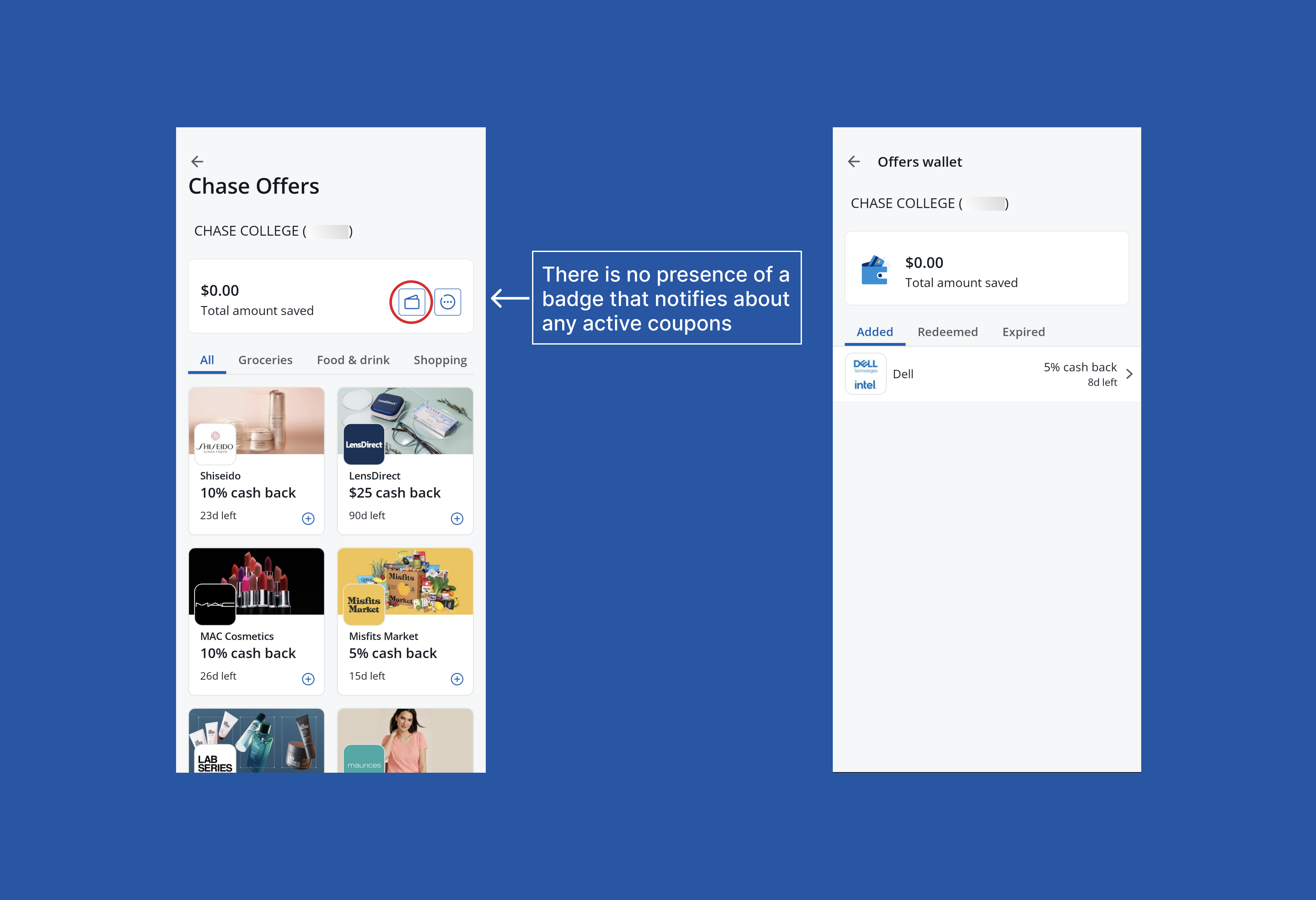
Frustration #2: The Hidden Offer Wallet
Chase offers attractive deals and cashback, which can be saved to the digital wallet. However, after saving offers, there is no immediate feedback or indication of where they are stored. Users either need to navigate to the wallet section (which lacks prominent signifiers) or scroll to the bottom of the page to find their saved deals. This lack of clear feedback creates unnecessary friction when trying to track active offers, making it harder for users to stay engaged with the deals they’ve saved
Solution?
Adding a notification badge on the wallet section would act as a helpful signifier, indicating that offers are stored there. Additionally, introducing alerts for offers nearing expiration would encourage users to engage with the app before deals expire, improving overall user experience.
Goodbye, my expired coupon :’)
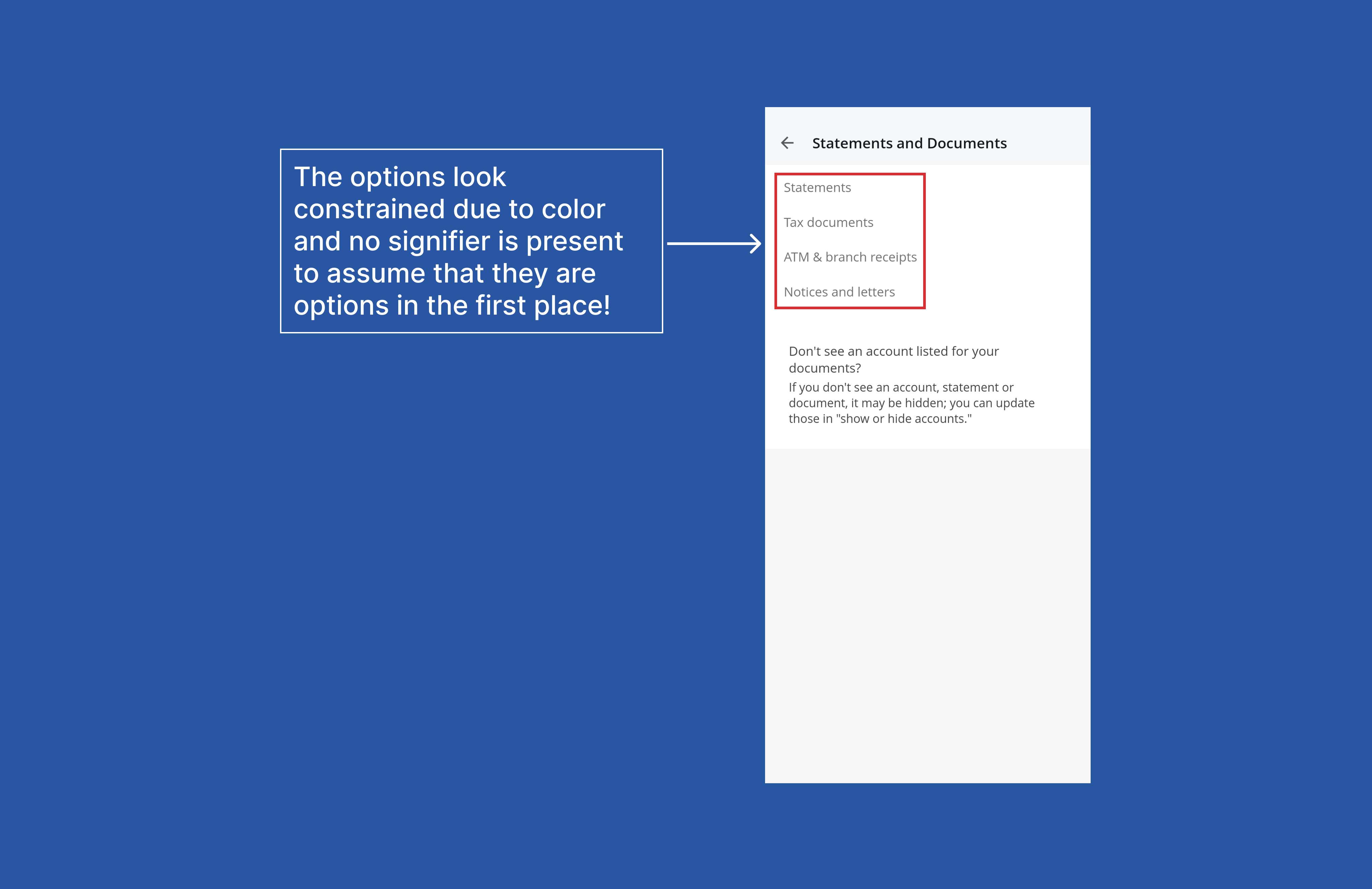
Frustration #3: Grayed-Out Options and False Constraints
n the Self Service section, the “Statements and Tax Forms” options were grayed out, creating the impression that they were unavailable or restricted. However, when selected, they were fully accessible. These false semantic constraints led to unnecessary hesitation and confusion about what was possible within the app.
Solution?
Displaying these options as active, following the app’s UI guidelines, would remove any ambiguity. Using a clear signifier to mark these options as accessible would improve discoverability and make users feel more confident in navigating the app.
Ongoing Frustration: No Virtual Debit Card Access
One key frustration is the lack of an option to view debit card details virtually. When users need to enter card information for online purchases, they must have the physical card on hand. This can be inconvenient, especially if the card is misplaced or unavailable.
Solution?
A secure section where users can view their debit card details—including the card number and expiration date—would address this issue. Adding additional authentication measures, such as OTP or biometric verification, would ensure that only the authorized user can access these details, enhancing both security and convenience.
To conclude,
The Chase Mobile Banking app is a powerful tool for managing personal finances, but some design inconsistencies and unclear interactions can detract from the overall user experience. By refining the design, Chase can create a more intuitive app that instills greater confidence and delivers a smoother experience for users.