
The Citi Bike app allows users to ride bikes to and from just about anywhere in New York City with their public bike-sharing system. Users can view all stations, get directions to stations, plan routes, and more — no membership required!
Checking out a bike
Citi Bike has over a thousand docks and even more bikes available throughout the city. The idea is simple: a user goes to a dock and uses the app to unlock the bike from the dock. To end the ride, the user must park the bike at another dock nearby their destination where the bike will then lock into the dock, awaiting its next passenger.
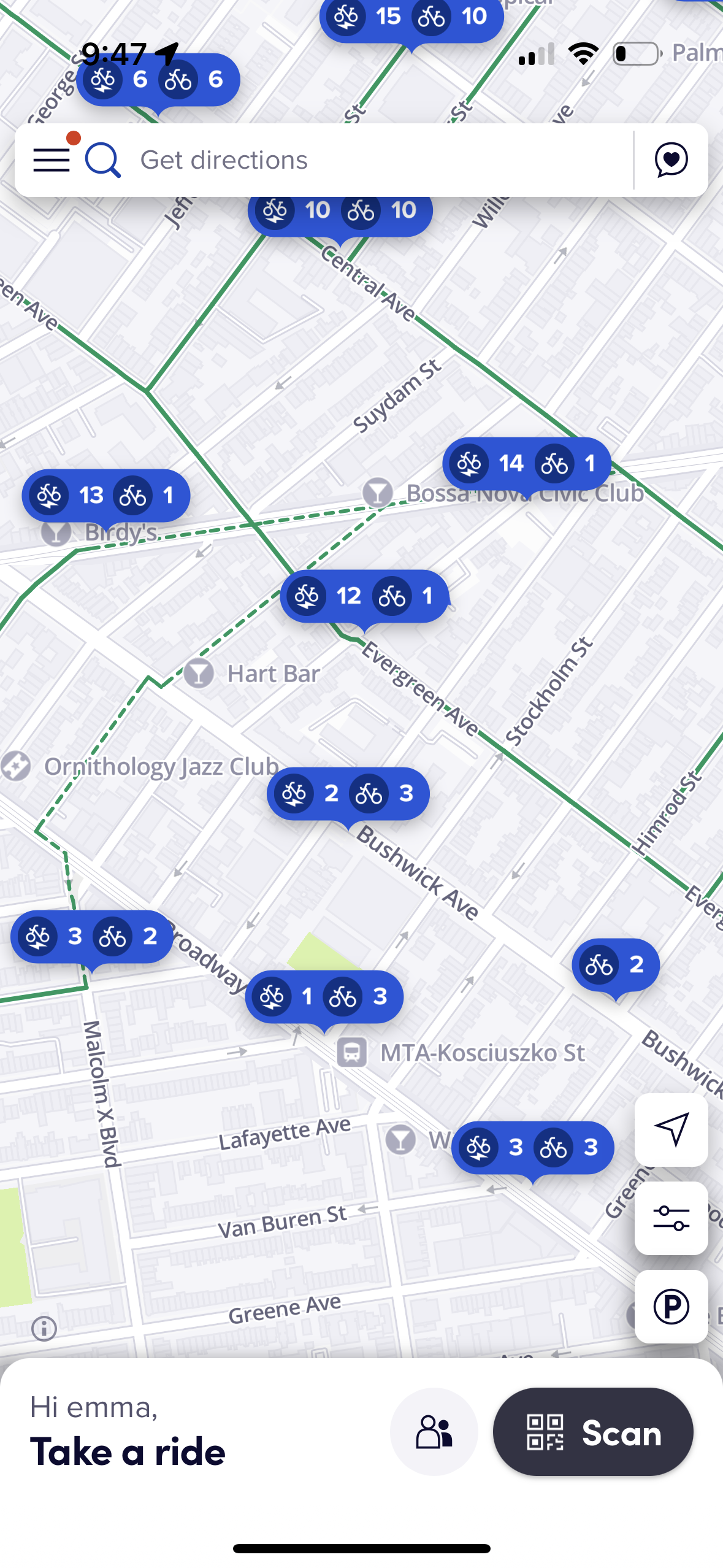
Checking out a bike is effortless with the Citi Bike app. It combines in-app constraints and real world signifiers to streamline the process and get users on their way. The main interface of the app features a map that shows all the stations and the number of bikes. The map is easy to read as it follows conventions that have been created as a result of the rising popularity of GPS over the past few decades. It also maps the station locations directly to the real-world so users know exactly where to go.
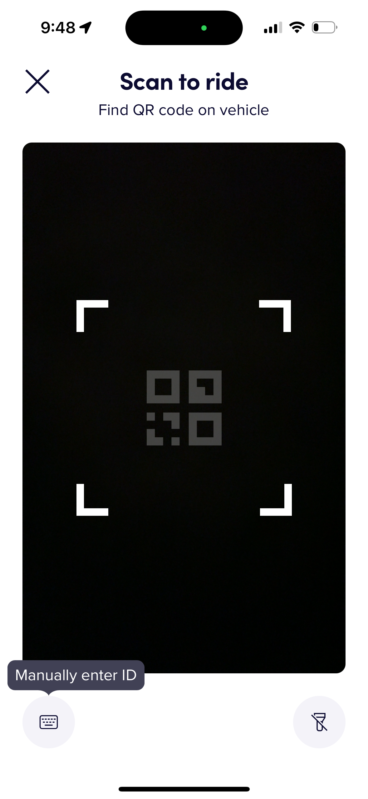
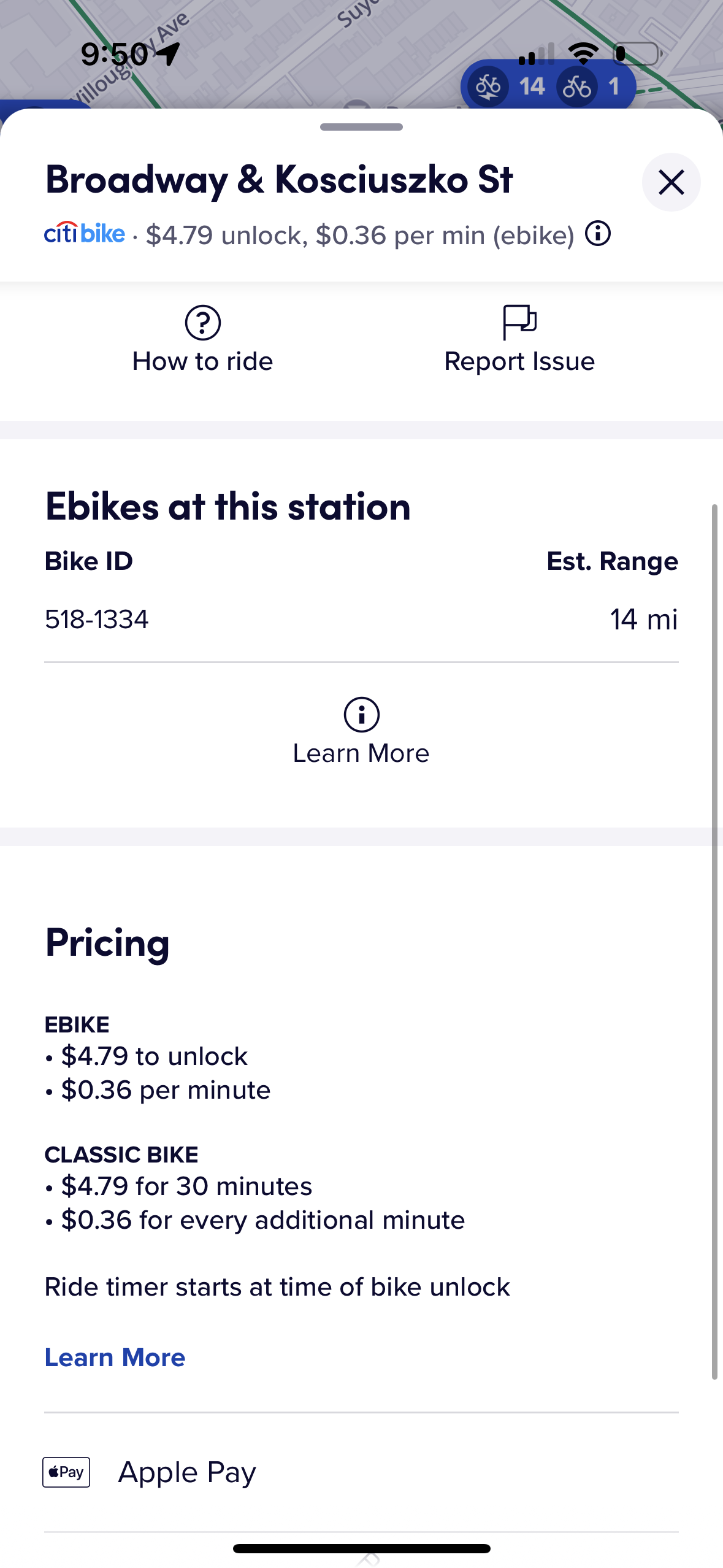
To unlock a bike from the dock, they must either scan the QR code, or enter in the ID, both of which are found directly on the bike. This is a prime example of forcing functions. To access a bike, a user must authenticate it by scanning the QR code or entering the ID from their device, otherwise the bike will not release. Therefore, many signifiers exist within the app to point the user to perform the correct action. When a user first joins the app, they are instructed to scan the bike’s QR code to use it, the scan button is in multiple places in the app, and the QR code acts as a signifier in itself. Although it is a relatively new type of signifier, QR codes must be scanned by a phone to be of any use, so its very presence informs the user of what they should be doing. Additionally, once the user presses the scan button, the camera takes up nearly the entire screen, acting as a constraint that prevent other actions and distractions. On the scanning screen, the user can only do one thing – scan the QR code.
Viewing parking spots
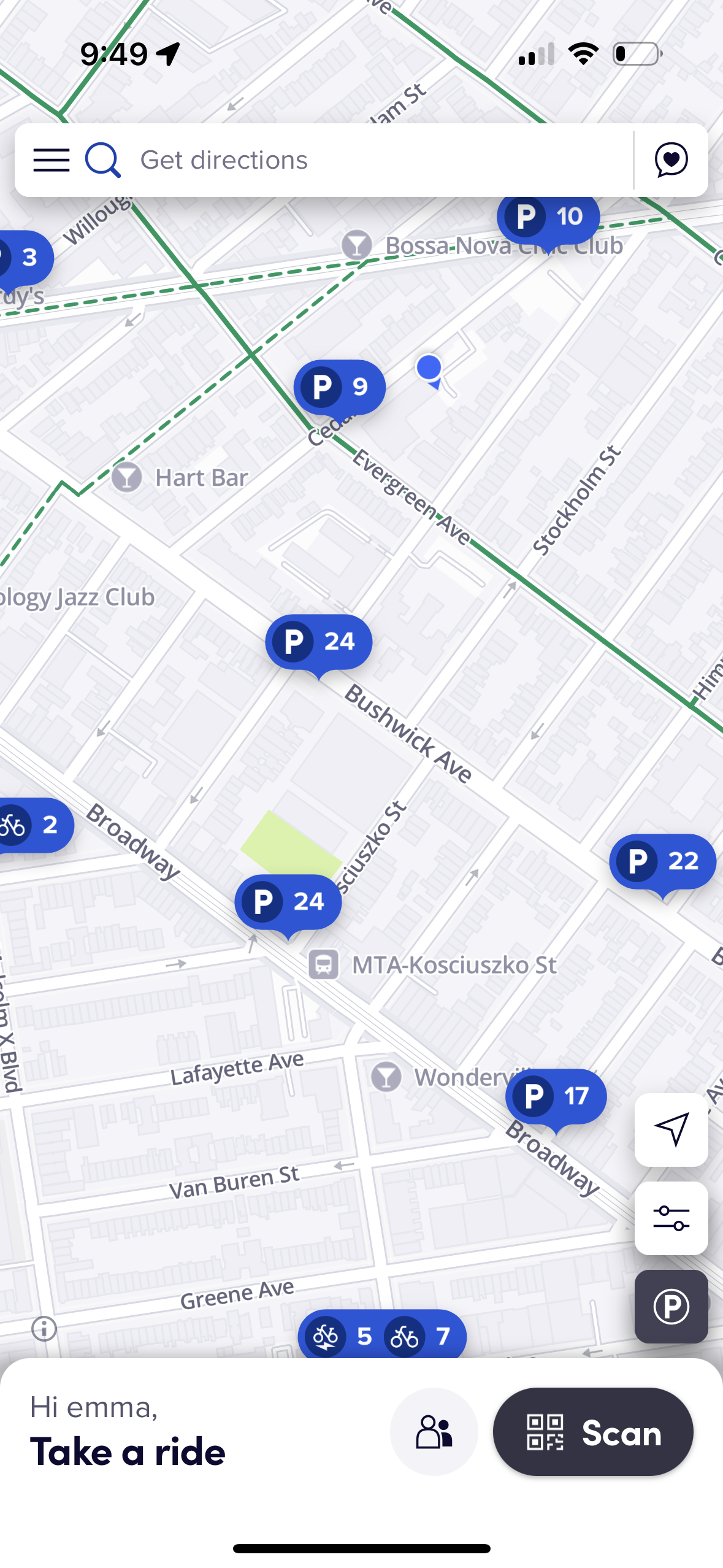
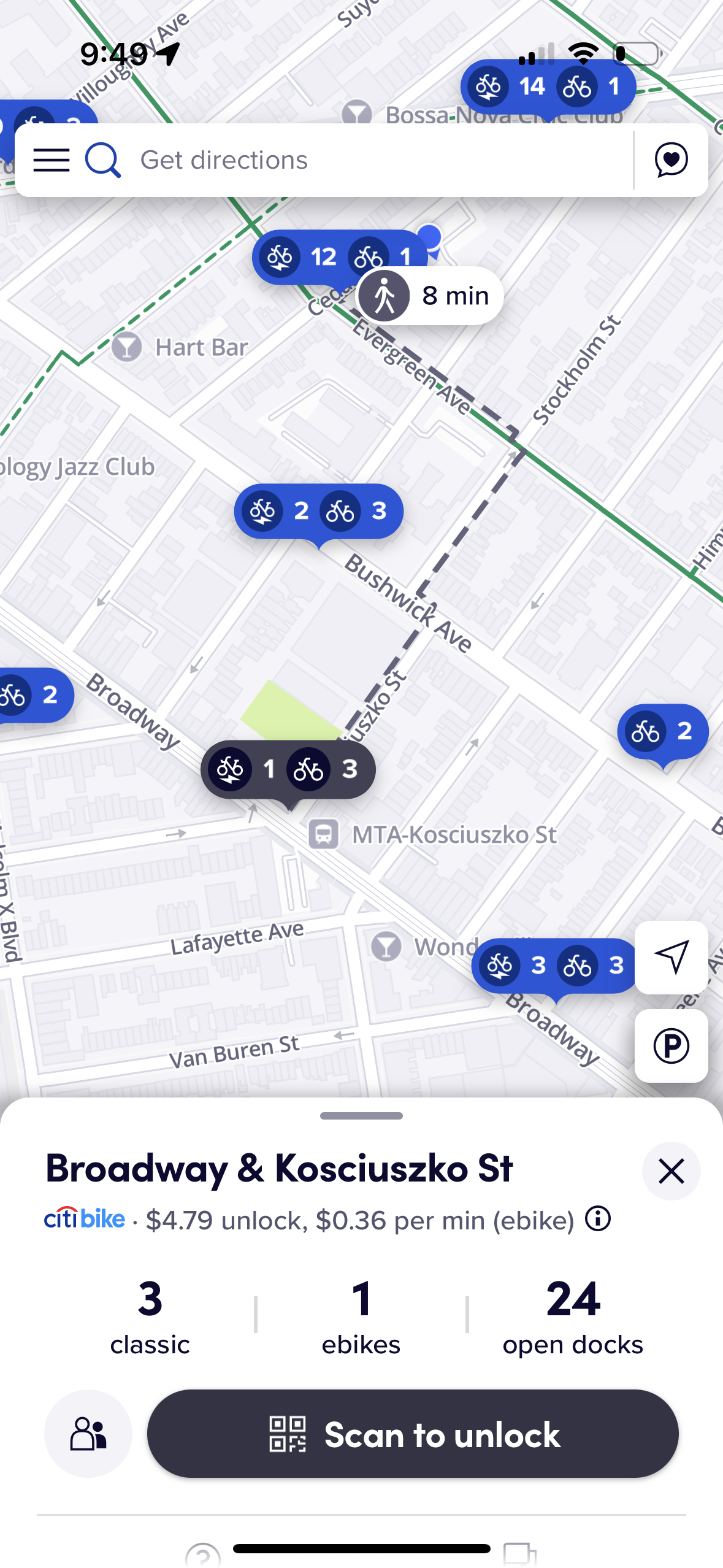
Users can’t just park a Citi Bike anywhere; it must be put back at a station to end the ride and prevent further charges from being incurred. Because of this, it is important for users to know if the station at their destination even has an empty dock to return their bike. Have you ever driven to a place, only to have to park 3 blocks away because there were no parking spots? It’s a frustrating and time consuming experience. Fortunately, Citi Bike has multiple ways to check for empty spots beforehand (if only there was something like this for street parking cars!). Not only can users view empty docks when they select a station, but they can change the mode of the map to only show parking spots. When the “P” button in the bottom right corner is pressed, the stations on the map show the number of parking spots available instead of the number of bikes. Don Norman emphasizes that the difference between modes should be very distinct and while there is a relatively clear difference in the size of the pointers when switching modes, it could be further enhanced by changing another element like color. This will ensure that a user knows exactly which mode they are in.
However Citi Bike still handles its modes very well and the blend of constraints and signifiers makes using a Citi Bike fast and seamless. The point of the app is to help people use their bikes, and it provides a straightforward approach of doing so. The Citi Bike designers have done a fantastic job of getting right to the point.
Routing and Directions
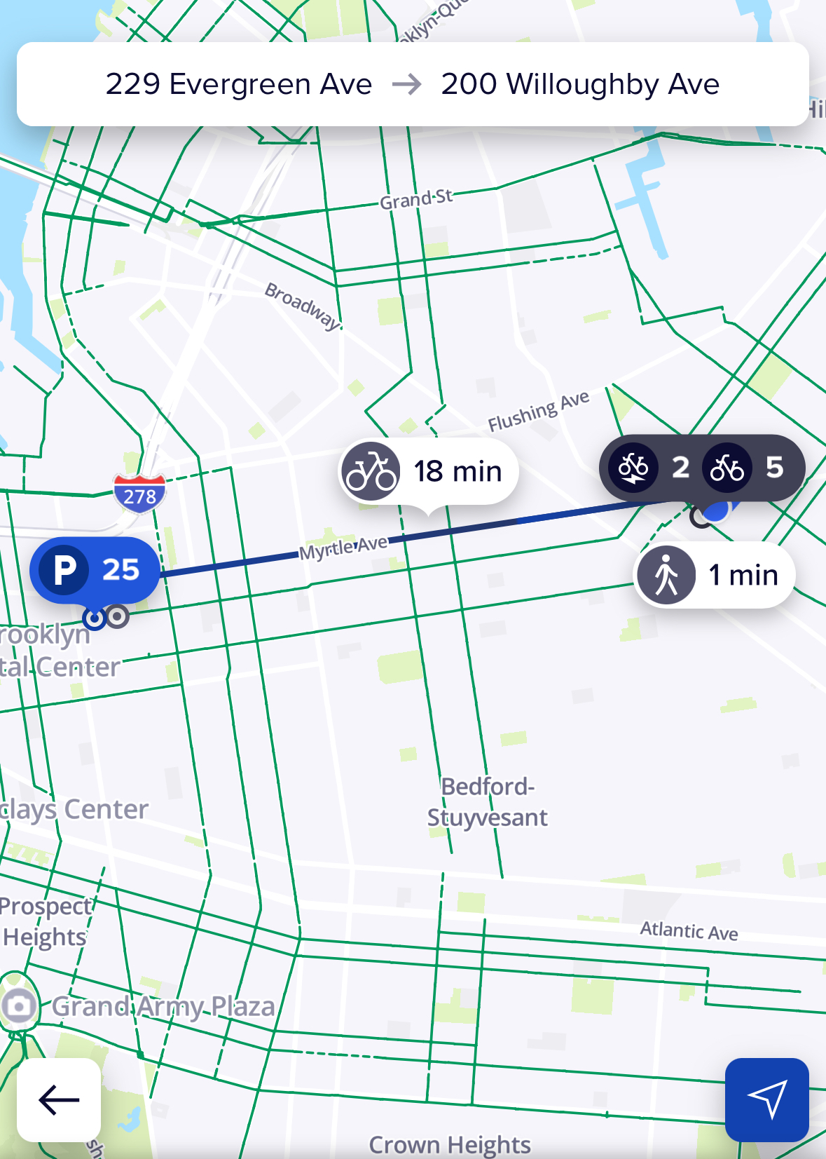
Like any other mapping app, users can type in a destination and Citi Bike will automatically navigate the shortest route to the station closest to the destination. Unlike most other mapping apps, however, only one route is provided. There are many cases in which a user may not want to take the optimal route. The route could be on a busy street and they are not comfortable traveling down that path, or they may want to avoid steep hills — the possibilities are endless. Flexible design makes products accessible to all users. Everyone has different needs, which is why flexible design is so important. Citi Bike routing creates unnecessary constraints due to its lack of alternative routes. If a user wishes to find another way to get to their destination, they must exit the app and go to a different one like Google Maps or City Mapper in order to find an alternate path. Citi Bike could benefit from implementing the option to take different routes, allowing users to avoid traffic or terrain, select scenic paths, or take familiar routes, which would provide flexible options for everyone.
Navigating to a station
Another navigational issue that Citi Bike has is its inability to route directly to a station. There are several reasons a rider may want to get directions to a specific stations rather than an address such as avoiding busy or full stations, optimizing their route, or maintaining flexible travel plans. When a user knows the station they want to travel to rather than a building or location nearby, it may seem natural that Citi Bike should provide directions from the user’s location straight to a station, but the reality is not so. If a user needs to travel to a specific station, there is no way to get a direct route there unless they find a building or address close to that station and map to it, which is inefficient and complicated.
In this case, the gulf of execution is too large and the design does not effectively bridge the gap between the system and the goal. The user wants to map directly to a station, but the system only allows them to do so through workaround tactics, increasing cognitive load and making users more prone to error and frustration. A quick fix would be to add a button when a station is selected that will return a path to the station (and hopefully alternate ones) for the user to navigate to.
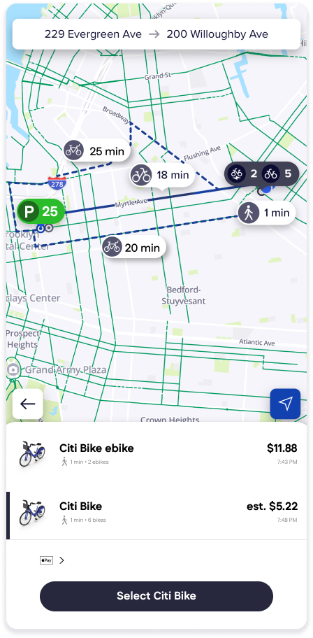
To visualize the possible improvements I mentioned within the app, I developed a high-fidelity wireframe (pictured to the left). It includes a differently colored parking pill to create an even clearer distinction between the modes as well as what alternate routes might look like. Most of the map elements were taken directly from the app, with the bottom half and added features developed by myself as closely to the real app as possible. Despite its navigational issues, Citi Bike is still a prominent part of New York City living and has done its job to get New Yorkers from point A to point B. With easily discoverable features and clever design, Citi Bike has successfully connected a mobile application and a physical object together to create delightful experience both digitally and on the bike paths.
Sources:
Norman, D. (2013). The Design of Everyday Things: Revised and Expanded Edition. Basic Books.