ClassPass is a monthly subscription service where users can purchase credits that can then be exchanged for gym time, workout classes, beauty services, and more at participating locations.
Users can book classes at studios using the website or via the ClassPass app. Each class is worth a different amount of credits depending on factors like the class type, studio, location, duration, and time of day. Once a user is signed up for a class, those amount of credits will be deducted from their monthly account.
The Context
Historically, the fitness industry has been dominated by traditional big box gym facilities that provide a variety of fitness equipment and free weights in addition to a selection of group classes. Over the last 15 to 20 years, there has been a significant increase in popularity of boutique fitness studios that offer very specialised group classes and are disrupting traditional gym models, especially in terms of flexible membership models.
While there are few chains and franchises that have emerged over the last few years such as SoulCycle, SolidCore, CrossFit, Pure Barre etc. the very large majority of this segment of the fitness market is fragmented and these fitness studios are typically run by a local small business owner with one location. ClassPass allows users to discover such studios and in turn, helps studios fill up their classes.
The Users
- A typical ClassPass member is 25-45 years of age and may have tried boutique fitness classes but does not typically have loyalty to a specific brand. Generally, ClassPass users are variety seekers who enjoy trying different workouts and wellness experiences each month.
- Gyms or boutique fitness studios
Given a certain number of users per month, Classpass has a precise fixed revenue based on its set membership cost but a variable cost structure given that it pays its studios per class attended.
Goals
To summarise, the core gaps that ClassPass filled were:
On the demand side
- Variety — Users can enjoy different types of classes without having to pay for multiple individual, often very expensive, memberships
- Accessibility — With access to all participating locations across cities and even countries, ClassPass makes fitness accessible when travelling
- Social Aspect — The app allows users to see what classes their friends are taking, this allows users to get recommendations based on what their friends like, and it often prompts users to reach out to friends and ask if they want to go to a class together.
On the Supply side
- Customer Acquisition — A challenge faced by boutique fitness studios is often customer acquisition. They typically have a fairly fixed operating cost to serve their customers and offer a certain number of classes each day—these typically include rent, utilities, teacher and staff pay. Sparing a few popular studios in the market and a few select class times, a very large majority of studios and class times are often operating under capacity and the incremental cost of serving additional customers is minimal. Studios are therefore on an ongoing quest to attract more customers through the door and convert them into regular paying members—this is where ClassPass fills the gap.
- Tech Integration — ClassPass has a number of tools integrated on the platform that can help studios with their processes. Through integration with Mindbody (the dominant software system used by a large portion of fitness studios in the US), consumers have a smooth experience once they show up at the studio. What used to take 10 minutes of paperwork in the past, was now all automated through software. SmartRate dynamically prices available spots based on factors like popularity, location and time to help optimize revenue. SmartTools, an intelligent spot management system, uses real-time data to predict empty spots and adjust rates to fill them. By analyzing historic booking patterns, SmartSpot only lists spots that are less likely to fill on their own, so direct clientele can be protected.
User Journey
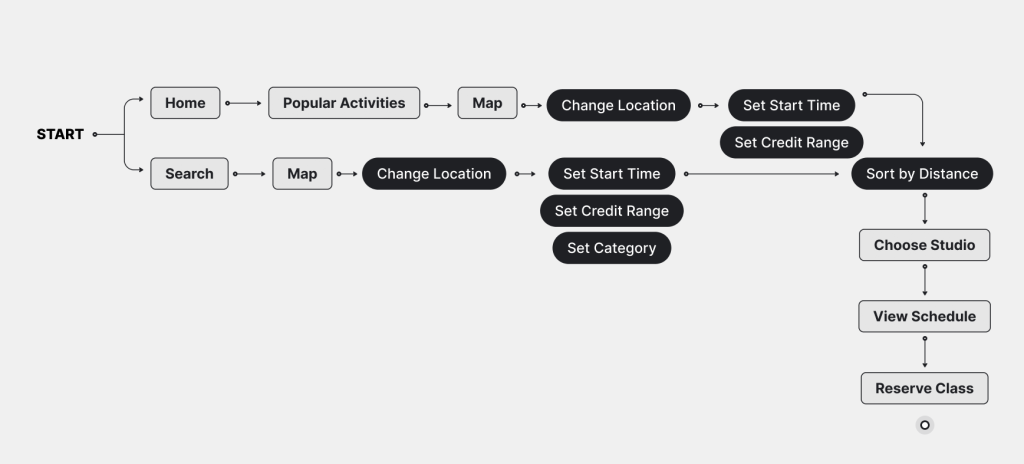
To critique this app I chose a user journey.
(I used the ClassPass free trial for this exercise)
Intent: I want to book a yoga class near college so I can go after class.
User: A 23 year old graduate student passionate about fitness. She enjoys taking specialised group classes and prefers to do so at times that fit her schedule. Her place of residence is far away from her college and she attends classes near both locations.
Scenario: The user wants to book a yoga class near her Institute in Manhattan.
Goals: To book a yoga class within the user’s constraints.
Constraints: Category (yoga), Location (near campus), Time (after 11:30am), Credits available in the User’s Account (11)
Identifying Gaps
Problem — “Recommended” Section
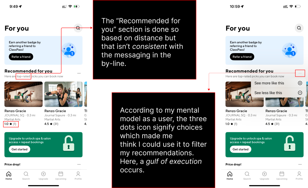
The “Recommended for you” section is done so based on distance but that isn’t consistent with the messaging in the by-line. According to a user’s mental model, the three dots icon signifies choices which makes one think it could be used to filter recommendations. Here, a gulf of execution occurs.
Solution
The section with suggested classes can be based on personal trends, friends’ activity, popular picks near you (based on ratings), or even suggested combos depending on the number of credits a user has left. The three dots can be removed as they aren’t in line with the mental model of a user and instead, interrupt the conceptual model of the application by confusing the user.
Problem — “Price drop” Section
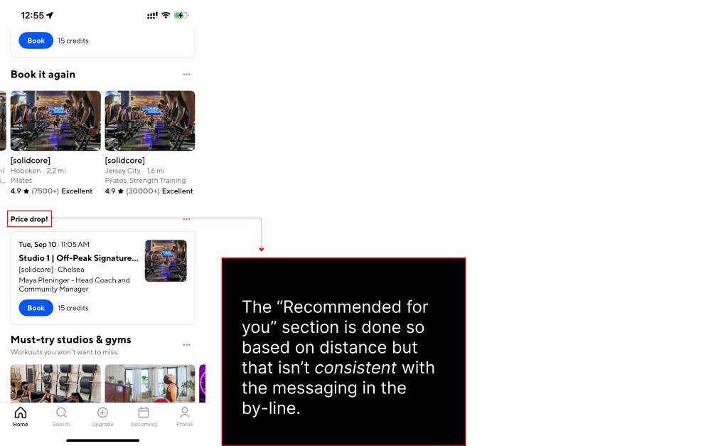
The “Price drop!” recommendations currently occur in a vertical scroll. This hampers discoverability and makes it difficult for users to compare options.
Solution
These can be put in a horizontal scroll for easy comparison— this interaction pattern will save on vertical scroll for the user and the last card overflowing off the screen creates the affordance that one can scroll right to see more.
Problem — Lack of Signifiers for Filter Being Applied
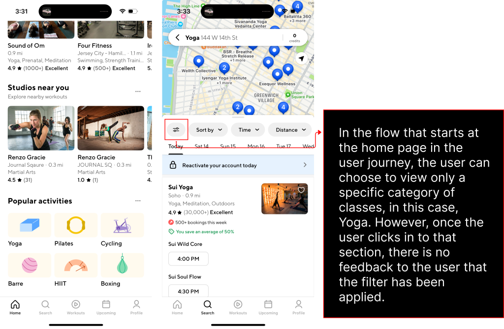
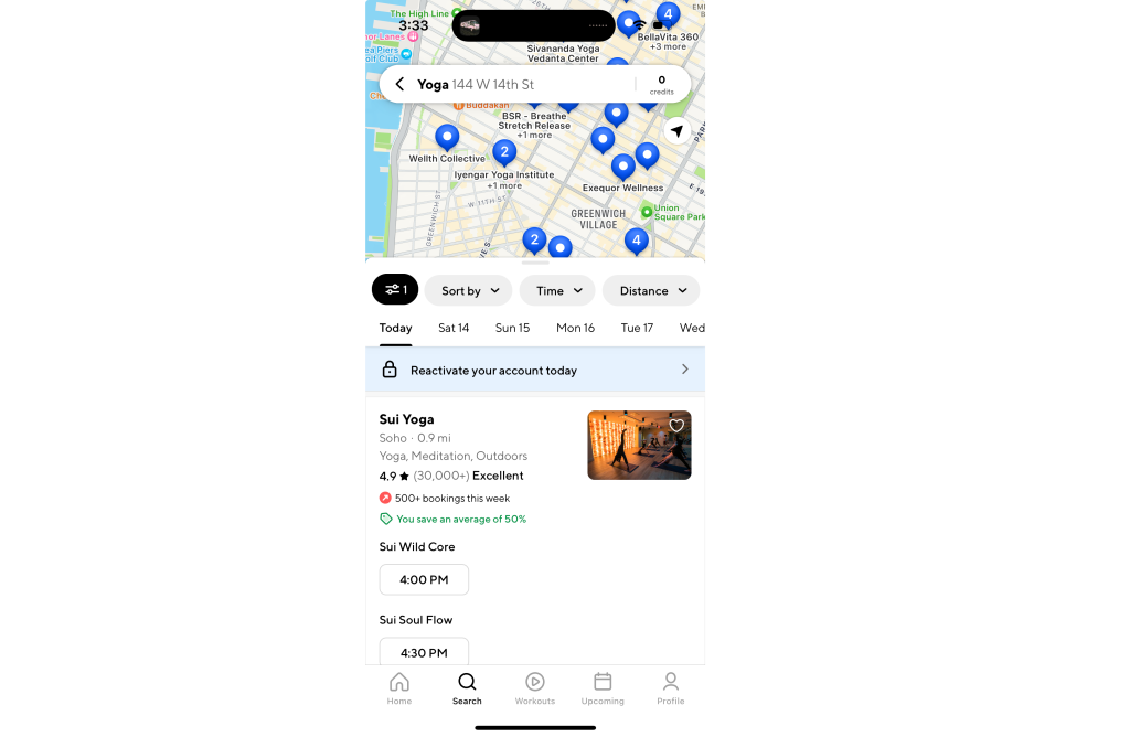
In the flow that starts at the home page in the user journey, the user can choose to view only a specific category of classes, in this case, Yoga. However, once the user clicks in to that section, there is no feedback to the user that the filter has been applied.
Solution
An indicative change can occur to the filter tab to signify progress in the user journey. This could be a change in colour accompanied by a numerical tally of active filters.
Problem — Lack of Signifiers for Sold Out Classes
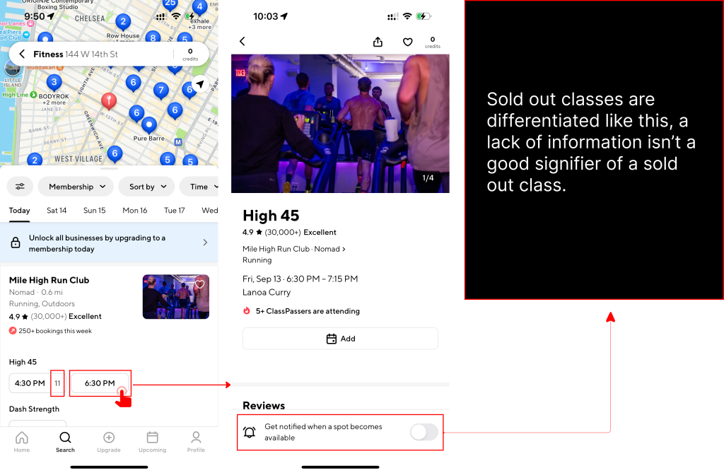
Studios have available classes displayed along with the number of credits they’re worth. Some class slots aren’t accompanied by credits, this is meant to indicate sold out classes, however it doesn’t align with one’s mental model to associate a lack of information about cost with unavailability of class. Here, a gulf of evaluation occurs.
Solution
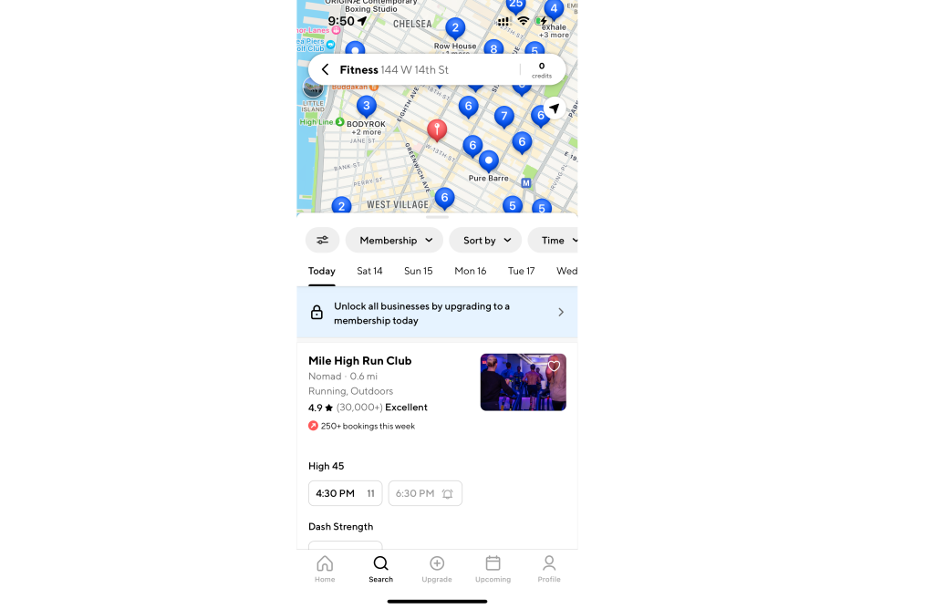
A solution could be to have a greyed out class slot tab along with an icon for the option to notify when available.
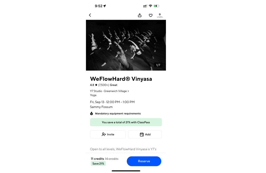
Problem — Lack of Discoverability for Class Requirements
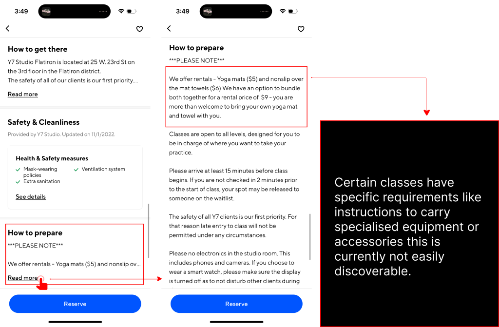
Certain classes have specific requirements like instructions to carry specialised equipment or accessories, a requirement to arrive early before the first class at the studio to get acquainted with the machinery and even information on cost for renting mandatory equipment.
This information is found under the “How to prepare” section which occurs far into the vertical scroll and is an expandable section—so information is not visible at a glance.
Solution
The fact that a class has mandatory equipment requirements should be indicated on the landing page for booking the class.
Problem — Reserved Classes
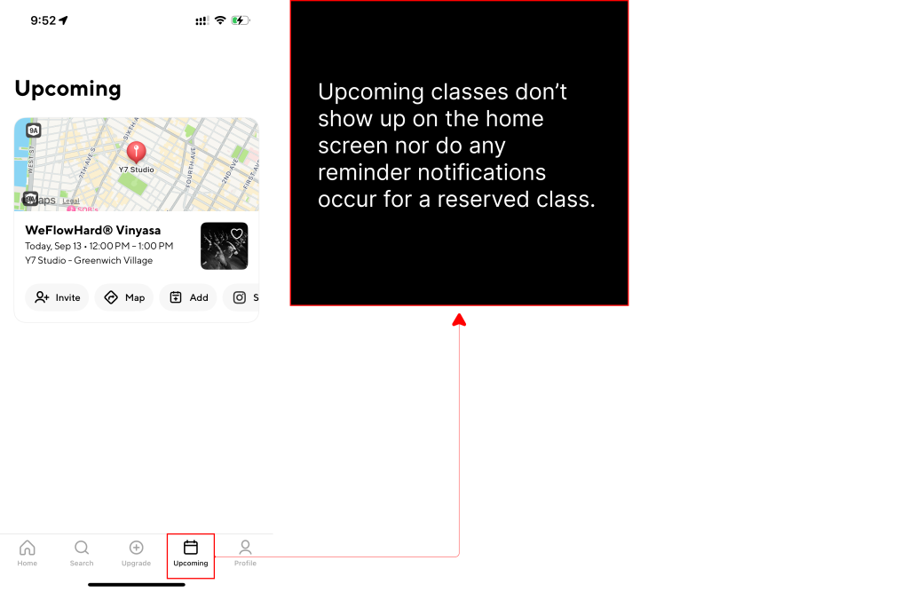
Once a class is reserved, one’s booking can be seen in the “Upcoming” tab on the application. This isn’t as discoverable as elements on the homepage and can easily be forgotten or missed by the user. Since ClassPass’ business model is such that they benefit from a user missing a class, they have not made it such that the user can easily be reminded of reservations through push notifications either.
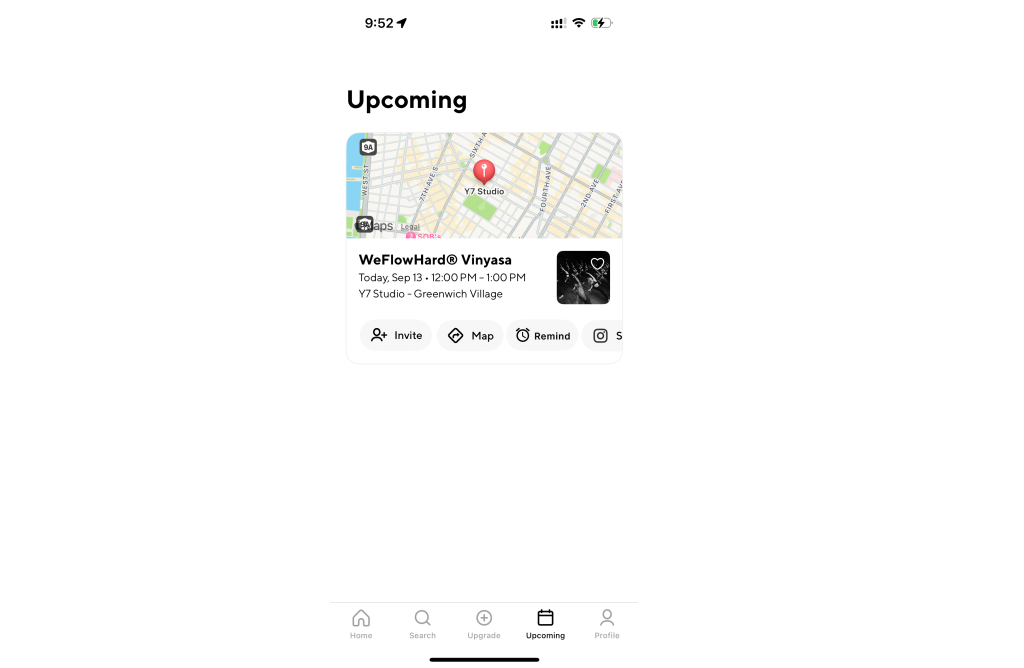
Solution
Although ClassPass’ business benefits from missed classes, customer loyalty is an important aspect to consider. ClassPass needs to appeal to users as a platform that supports their fitness goals and enables them on their journey. One way they can do this is by adding a “Remind” option. They currently allow users to add a reserved class as an event to calendar, however, this method does not have a default notify function and the user is not reminded of the class.
By providing an option for the user to set a reminder in an accessible manner that aligns with one’s mental model of setting reminders for events, ClassPass will be able to match user needs while not directly compromising their business.
Conclusion
ClassPass is a great platform that democratizes access to boutique fitness studios by making their typically expensive classes more affordable and accessible to a broader audience. Having studied ClassPass’ business model and strategy, which revolves around subscription-based pricing and flexible class choices, I formulated suggestions that would allow improved user experience without hampering business goals. The app’s conceptual model aligns well with a user’s mental model of booking and attending classes, but there are opportunities to further enhance user satisfaction. By implementing the proposed improvements, the app can become more intuitive and user-friendly, helping ClassPass drive even greater engagement and satisfaction among its customers while supporting its growth strategy.
