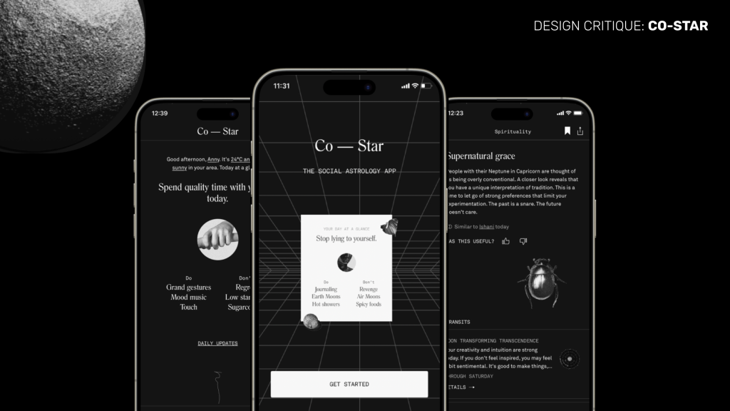
Co-Star is an astrology app that uses data from NASA, interpreted by humans and applied by AI, to generate customized readings based on the user’s natal chart. This hyper personalized app “provides an experience centered on the self” by offering daily horoscopes and astrology charts, compatibility reports with other users and friends, and other tailored insights. This design critique outlines the main goals of a Co-Star user and examines how the interface either supports or hinders the achievement of those goals.
REGISTRATION
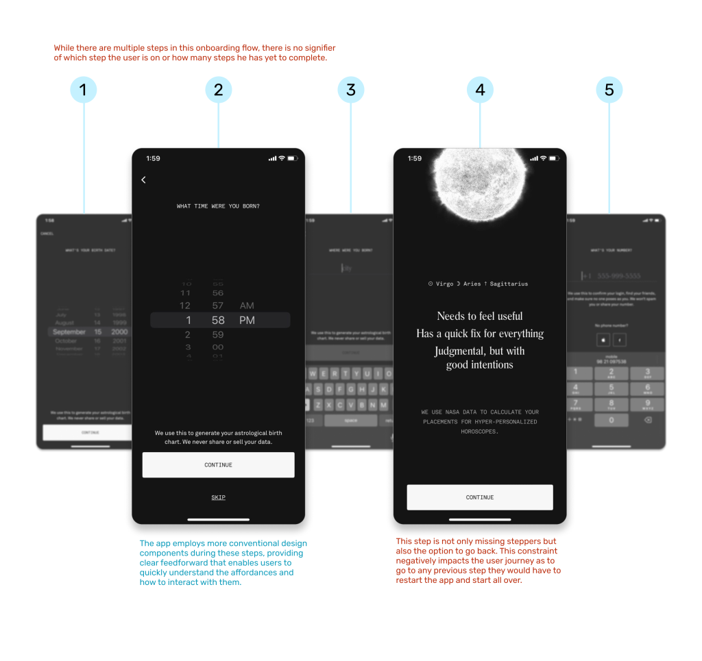
For first-time users, Co-Star’s onboarding flow is generally straightforward and easy to follow. Each step is confined to a single screen, providing clear feedback as users progress, with the screen changing after each completed step. The app effectively uses the ‘CONTINUE’ button as a clear signifier, showing how to finalize each step once the task is completed. However, the flow suffers from inconsistent mapping between steps, making navigation feel less intuitive. While users are asked to provide detailed birth information, the lack of clear mapping or visibility of the system’s status leaves them unsure about what comes next.
This experience could be improved by incorporating step indicators and ensuring a back button is available at each step, allowing users to easily navigate and edit their information as needed. As Don Norman notes in The Design of Everyday Things, “Feedback is essential to keep the user informed of what is going on.”
SELF REFLECTION
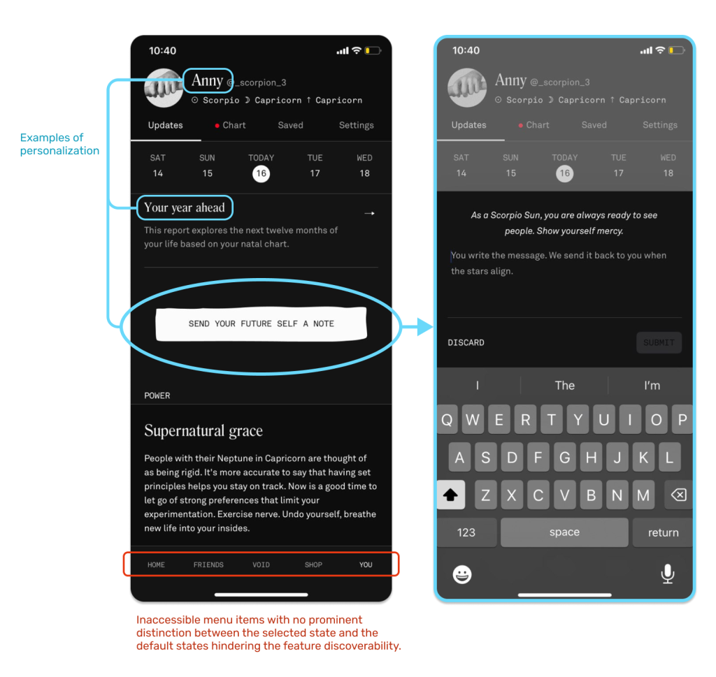
Once logged in, Co-Star’s user experience creates a feeling of leafing through a journal rather than interacting with a typical app; with its monochrome design, black-and-white image accents and copy-heavy screens. This design system strategically connect’s with the user’s visceral level of processing, with a subconscious assertion of the app’s “healthy” nature compared to more traditional apps like Instagram and TikTok. The lack of visual distractions like ads, gifs and flashy buttons also allows the user to sit with the content that they are reading and allow it to set into their reflective level of processing.
The app also emphasizes personalization at every step – from its personal greeting at the top of the home page to nuanced features like ‘send your future self a note’, which taps into the user’s mental models of personal reminders or private journals. However while Co-Star’s interface is minimalist and visually appealing, the discoverability of its features is not always successful. The app’s choice of abstract icons and ambiguous phrases can confuse new users who may struggle to access key features like their natal chart or friend connections. A user’s visual dexterity might also be challenged while using this app as the font sizes are smaller than average, especially the menu items located in the primary navigation at the bottom of the screen.
INQUIRY AND LEARNING
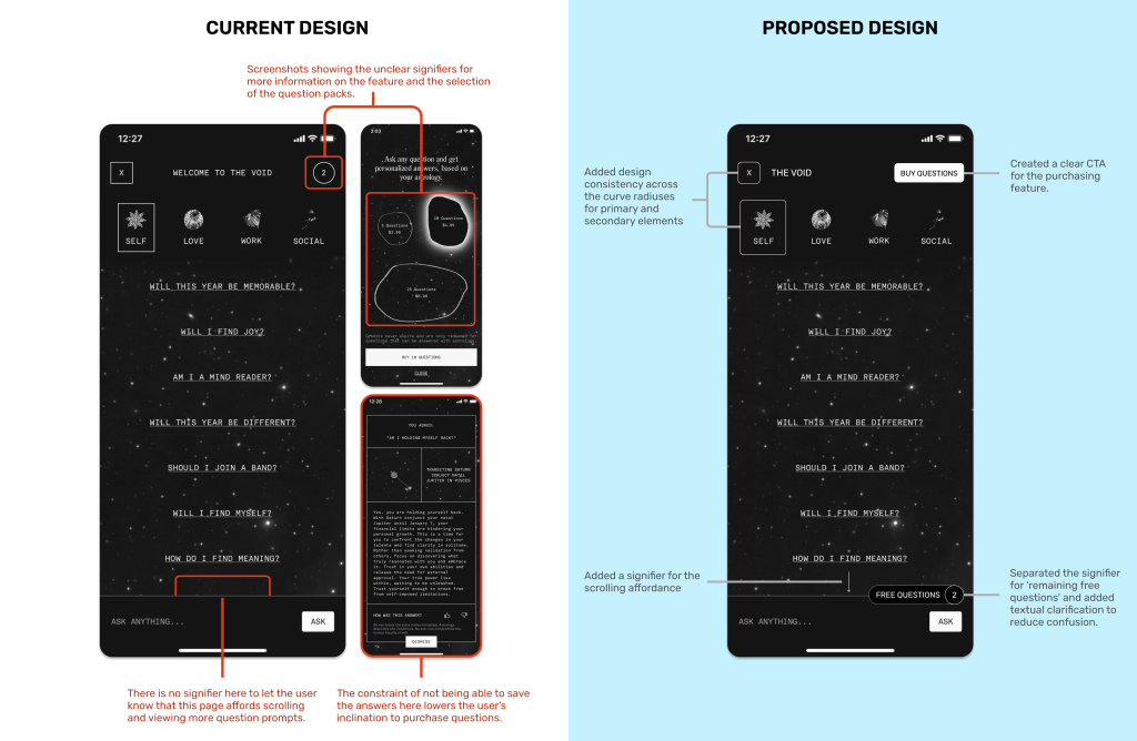
Co-Star functions as an “exploratory interface”, encouraging users to delve deeper into self-discovery through astrology. Instead of relying on traditional CTAs, the app uses subtle signifiers like ‘DETAILS’ or delicate arrows, encouraging users to explore further. The ‘VOID’ feature enriches this journey by allowing users to ask custom questions and receive personalized answers, adding another layer of discovery and learning. Unlike the rest of the app, ‘VOID’ provides visual feedback through a galaxy-themed loading animation while the user’s answer is being generated; creating the impression of stars being mapped in real time.
This said, ‘VOID’ is one of the app’s paid features, which is not realized to its full potential. It does not bridge the ‘Gulf of Execution’ due to the lack of information on the page to understand the details of the purchase – where will my answers be saved? Can I retrieve my paid questions once used? Is there a limit to how many questions I can buy? Etc. The signifiers to understand this feature are also very subtle – the number on the top right is the only way to view the purchase options and the selections for the question packs are irregular shapes instead of buttons. Here the addition of info blurbs, clearly marked CTA’s and titled sub-sections could prevent the user from experiencing learned helplessness while attempting to understand this feature.
SOCIAL SHARING/POSTING
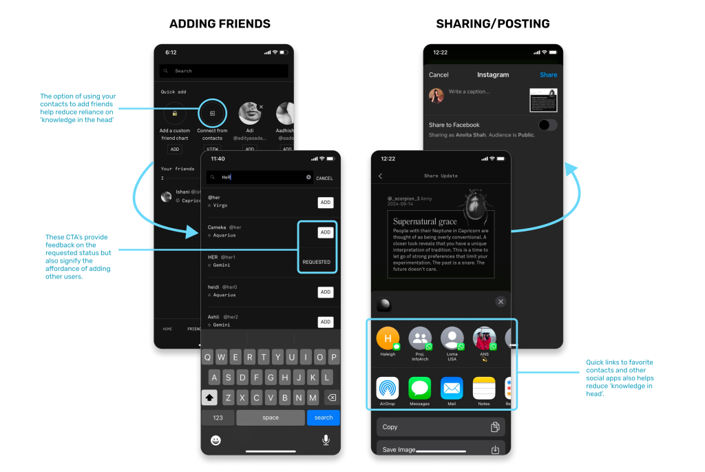
Lastly, rather than letting the app be solely an individual experience, Co-Star focuses on fostering connections and sharing insights between users and their friends. A user can post their daily reports across their choice of social apps by clicking on the share button on the top right corner of the screen. Although not all the reports and charts provide this affordance and it is unclear to differentiate why it does or does not afford sharing. This ambiguity overlooks Don Norman’s principle that “good design makes sure that appropriate actions are visible, and the user understands what to do.”
Another key social feature is the ability to add friends and compare charts. The ‘quick add’ option is intuitive and efficient, allowing users to find friends either manually or through their contacts, minimizing the need for “knowledge in the head.” Once a friend is added, the ‘requested’ status provides clear feedback, indicating that the friend request is in progress.
CONCLUSION
Co-Star presents a modern, accessible approach to astrology, with a strong emphasis on self-reflection and personalization. While it succeeds in providing tailored insights and sparking curiosity, it falls short in key areas of the user experience. The trade-off that it makes for its minimalist design over adequate signifiers and necessary mapping leaves the users uncertain and unable to fully achieve their goals. By enhancing the onboarding flow, providing clearer signifiers, and offering more feedback – particularly for paid features – Co-Star can not only captivate users visually but also offer a more intuitive and seamless experience.
