
Introduction
The Discover Bank mobile app allows users to manage their bank and credit card accounts, pay bills, and deposit checks, among other things, all in one place. This design critique aims to examine the Discover Bank mobile app’s user experience by reviewing three features: view credit card transactions, search transactions, and tag/manage transaction tags.
View Credit Card Transactions
Issues:
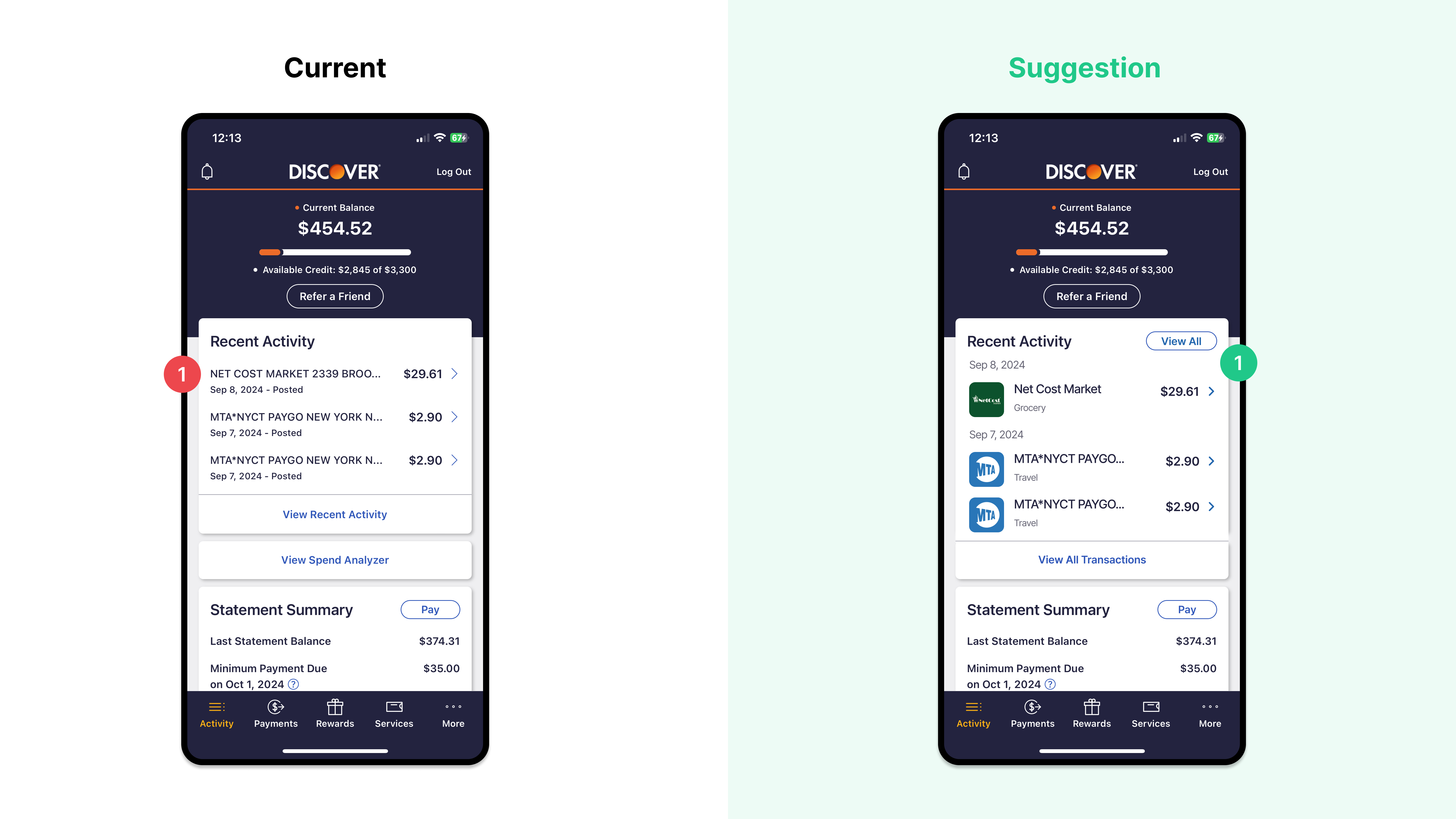
Transition information is cluttered and hard-to-read. This low visibility makes it more difficult for users to track transactions.
Suggestions:
Optimize the hierarchy of transaction information.
- Add visual logos of the merchant to help users quickly recognize the transaction.
- Position the date of the transaction at the top of each transaction, and group transactions that occur on the same day to increase proximity.
Search Credit Card Transactions
Issues:
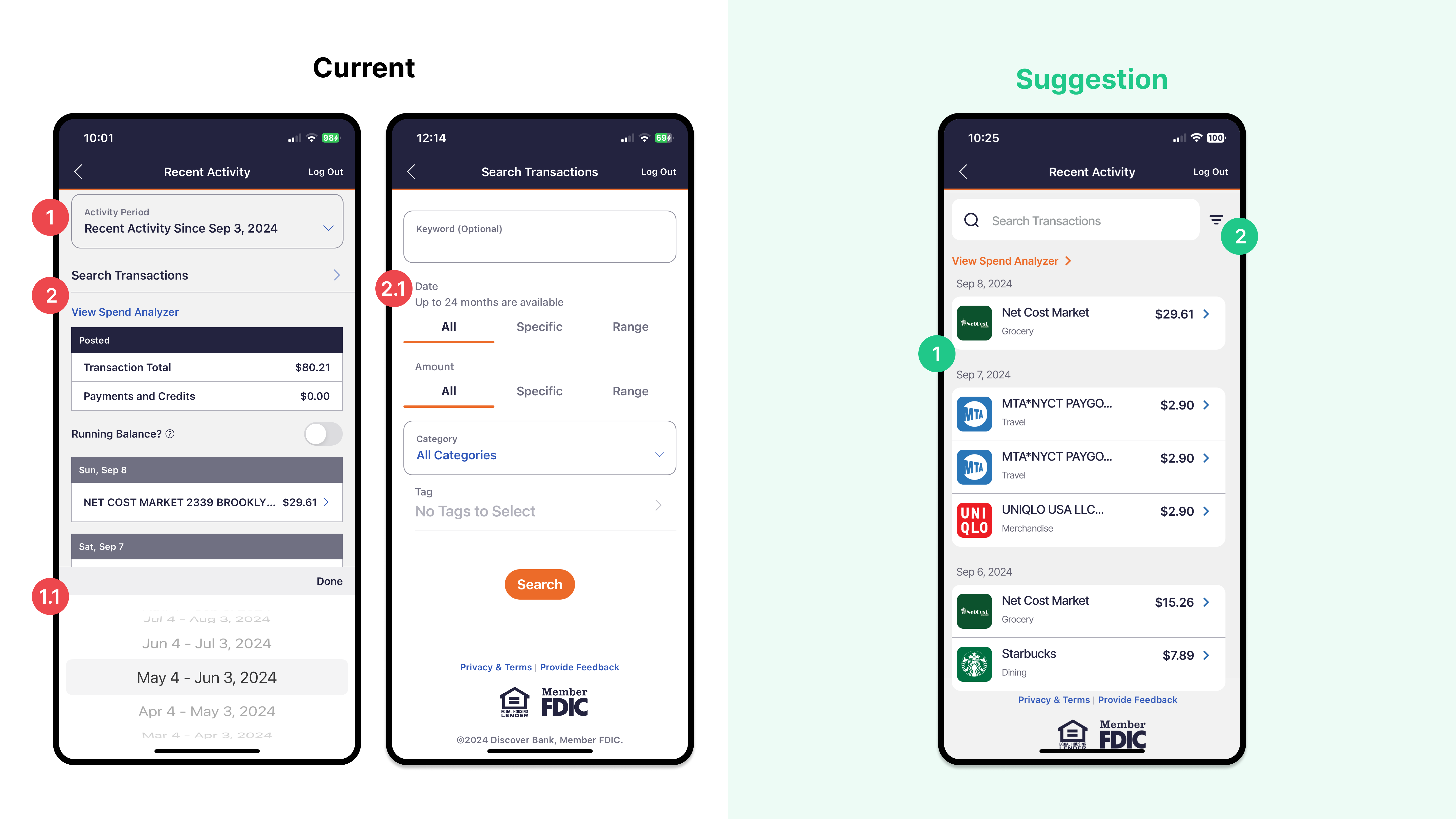
- Users can only see a limited list of transactions constrained to the transaction activity period they select. Users cannot see all transactions at a glance; they need to scroll through and select a list of date ranges. Users require extra effort to view transactions. Users may make errors due to memory lapses, forgetting the date of purchase.
- The “Search Transactions” filter lacks a clear signifier. When the user taps on the “Search Transactions” filter, it opens a new screen with controls that occupy the entire screen. The key filters “Date” and “Amount” are not discoverable.
Suggestions:
- Introduce a search bar with a clear signifier on the “Recent Activity” screen and provide visual cues to users so they can look up transactions directly on the same screen.
- Following industry standards, place a filter setting icon on the right side of the search bar to allow users to further modify search results.
Create and Manage Transactions Tags
The Discover App allows users to tag transactions, making it easier for them to organize and track their purchases. On the Transaction Details page, users have the option to add a tag to a transaction.
Issues:
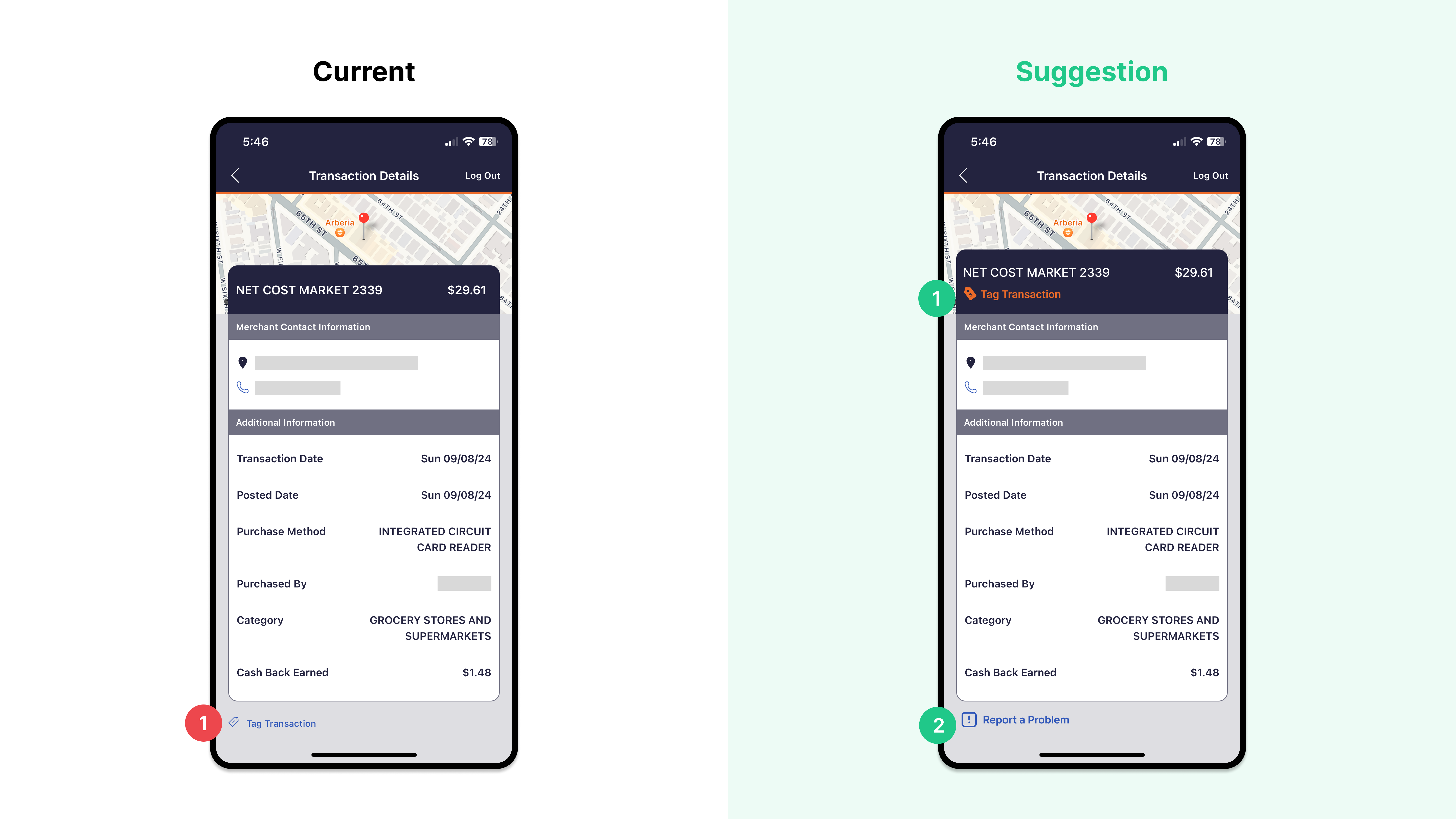
- The tag feature, located at the bottom of the transaction details page, is not discoverable to users.
- The Transaction Details page lacks a way for users to report problems or dispute charges, a common feature that customers see on mobile banking apps. This does not align with users’ expectations of the real world or meet industry standards.
Suggestions:
- To improve visibility, position the “Tag Transaction” feature to the top of the page, right below the merchant’s name. Change the color from blue to orange to enhance the feature’s design with clear signifiers. The tag information will also be reflected in the “Recent Activity” home screen, ensuring consistent design.
- Introduce the “Report a Problem” feature at the bottom of the transaction details to allow users to dispute charges if they need.
Issue:
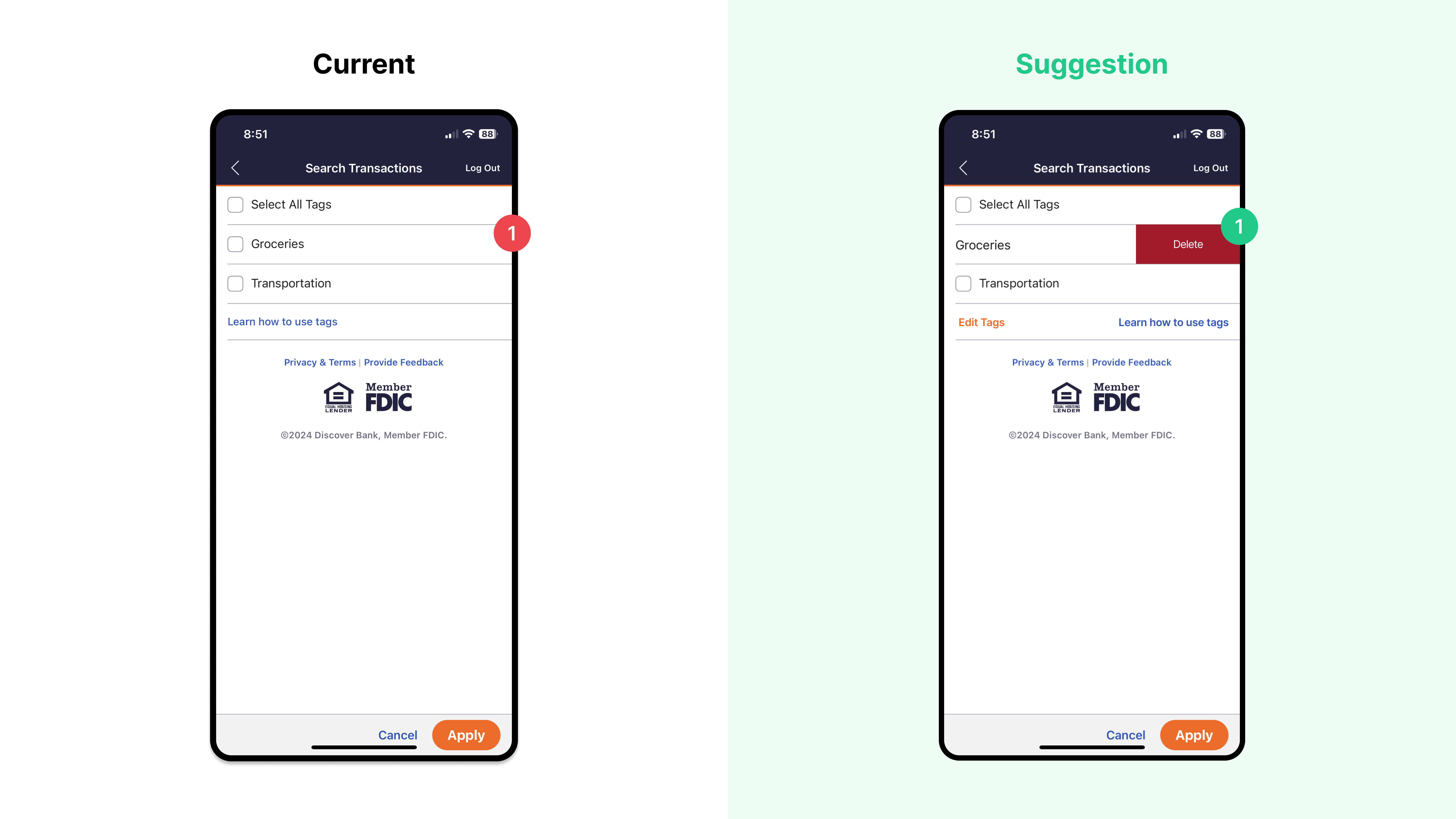
- Users cannot edit or delete a transaction tag when they make a mistake or typo, or if they change their mind and no longer wish to use it.
Suggestion:
- Introduce the “Edit Tags” setting, with the ability to delete tags, to give users more control over their transaction tags. Position it at the bottom of the tags to provide good mapping.