Etherscan is the premier Ethereum blockchain explorer that provides real-time information on blockchain transactions, smart contracts, and wallet activities. As an essential tool for blockchain developers, crypto enthusiasts, and casual users alike, Etherscan is highly functional, but its user experience is lacking in several key areas. By evaluating the website through the lens of Don Norman’s design concepts, it becomes evident that certain usability enhancements would greatly benefit its user base. Specifically, these changes would help Etherscan’s usability among less technical users.
Home Screen Visibility
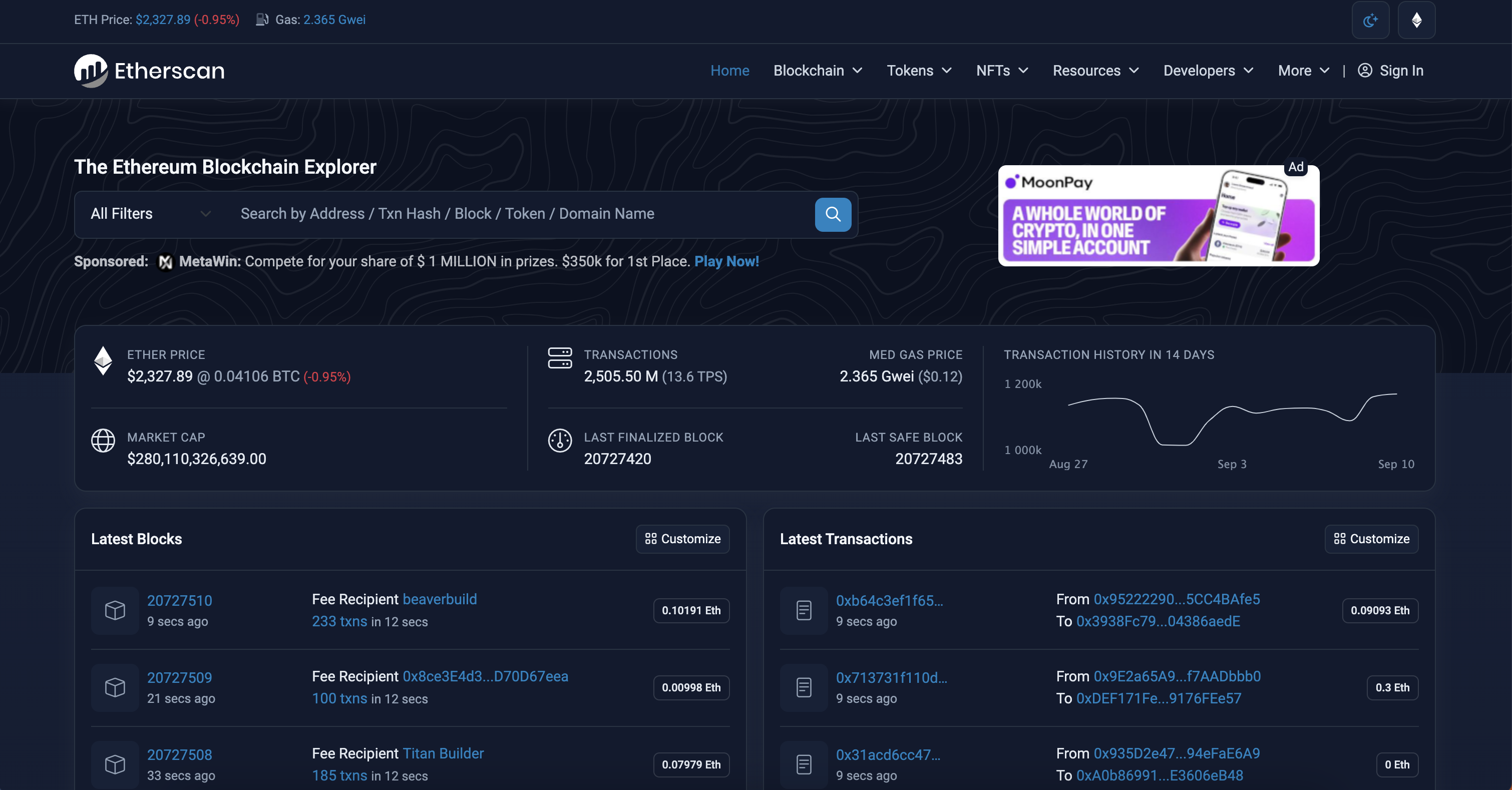
Since Etherscan is primarily a blockchain explorer, it would be reasonable to infer that the search function should be the most accessible and easy to locate function of the homepage. There is not much to do on Etherscan if you are not searching a specific address, transaction hash, smart contract, etc. – the search function on Etherscan’s homepage should be extremely discoverable to users.
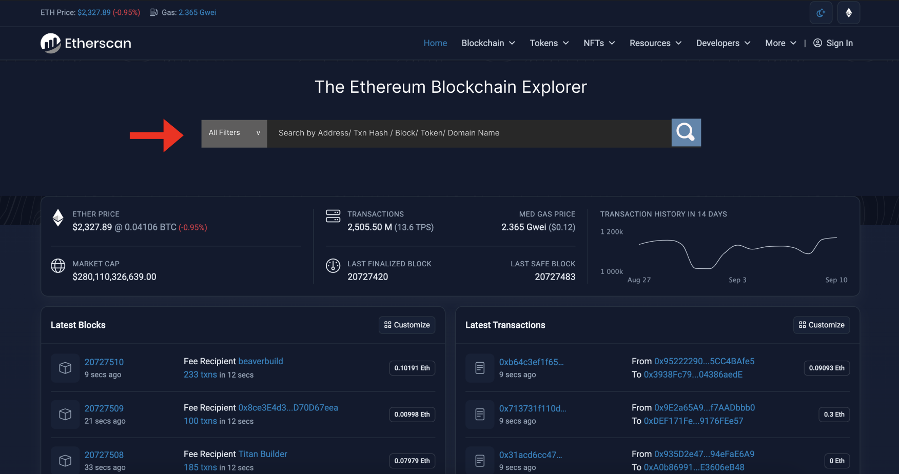
Unfortunately, Etherscan’s search box is hidden amongst a tightly packed and cluttered homepage. It is not immediately clear where the search box is, and it is not located in common areas that align with our mental models (such as by the navigation bar). This reflects poor discoverability, and it would be in Etherscan’s best interest to make their search box more immediately apparent to users visiting the site. This could be done simply by enlarging the entire search box, and reserving the entire upper hero section of the site for it, with plenty of empty screen around it. This change would clear out the surrounding clutter and bring users’ eyes naturally right to it (realistically, this would also have to be approved by the sponsors currently taking up that real estate).
Example Solution:
Visual Hierarchy: Transaction Page
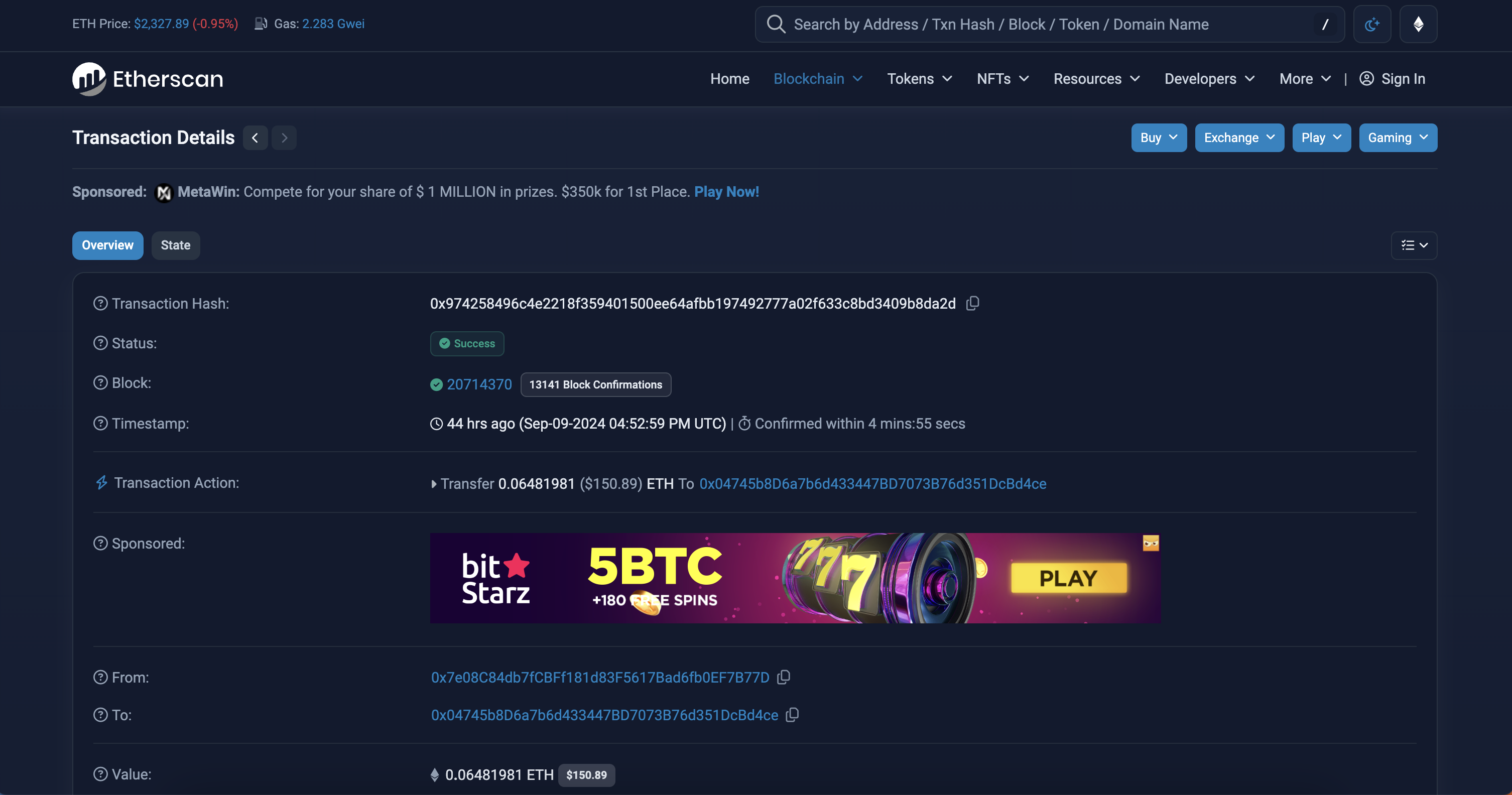
The transaction page really highlights Etherscan’s skew towards representing information for more technically fluent users versus beginners. As a beginner viewing a specific transaction, it is almost impossible to immediately tell what is going on here. I even chose one of the simplest possible transactions to show, which is just transferring ethereum from one person to another. The information given is in an extremely poorly optimized visual hierarchy.
“Transaction Action” is the primary piece of information required to understand any transaction, and Etherscan only slightly caters towards making that noticeable. It has faint line dividers, but is a few items down vertically on the information card. Additionally, It has a unique signifier (a lightning bolt versus a question mark), however this signifier is vague and misleading – this type of iconography is generally reserved for indicating that something is quicker than something else. The color is also blue, which is elsewhere used to indicate a hyperlink. All of this is conflicting with our general schemas and “Knowledge of the World’ as described by Don Norman.
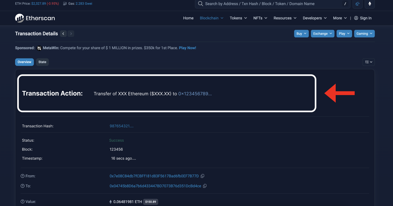
It would be beneficial to beginner users if “Transaction Action” was at the top of the content hierarchy. It should be in its own content card above the rest, and should not include any misleading or vague signifiers/tags.
Example Solution:
Ineffective Feedback on Errors
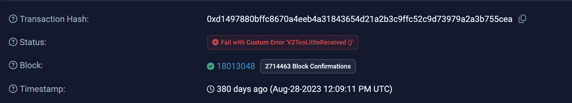
This screenshot shows the top section of the info card of a failed transaction. While there is an attempt at clear feedback directed towards the user, it is extremely unhelpful and jargon-heavy. It is clear that the transaction failed due to the red box and font, however it is not at all obvious why it failed or what the user can do knowing that it failed – it only says “Fail with Custom Error ‘V2TooLittleReceived ()”. There needs to be clear feedback in layman’s terms, and the status code information should be secondary, as it is only useful for people with intermediate and above technical knowledge.
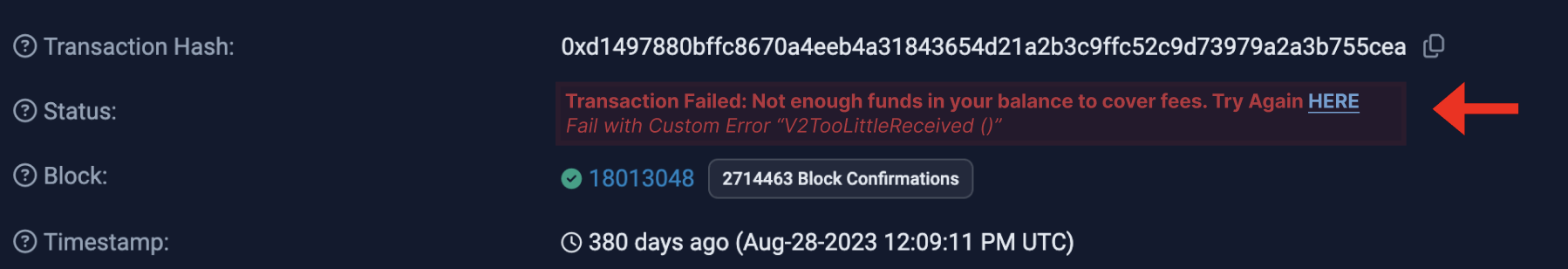
A solution would be to replace the current text with “Transaction Failed: Not enough funds in your balance to cover the fees. Try again Here” (still in red). Then under this text, include a subfield that has the status code in slightly smaller font. This allows novice level users to immediately decipher what went wrong and where to go to try their transaction again, while still giving the relevant technical information to more adept users.
Example Solution:
Conclusion
Relating to Norman’s three levels of design (Visceral, Reflective, and Behavioral), Etherscan has a lot to improve, namely with the visceral and behavioral levels:
- The visceral design starts off poorly with a cluttered, confusing, and hard to read homepage.
- The behavioral design lacks in the fact that the main function (exploring the blockchain via search) is not easy to find and once found, displays a complex visual hierarchy that adds extra cognitive effort on behalf of the user.
Implementing the mentioned changes would be a useful first step for Etherscan to improve its uability in these regards.