
Finch is a self-care pet app where users care for a virtual pet by completing daily self-care goals. It helps users improve their mental health and maintain a positive attitude through various self-care exercises. Quests include breathing, reflection, mindfulness, and more. The target audience includes individuals struggling with mental health and enhancing their self-care routines.
Personalization
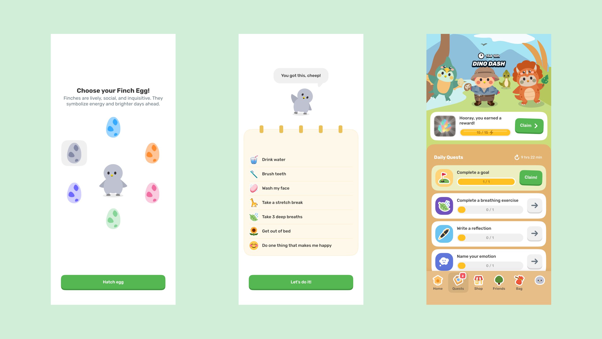
When users open the app, they are greeted by a bird and prompted to set up personalization. Finch utilizes skeuomorphic design to create an interface that mimics real-world interactions, helping users feel immersed in the experience of raising a virtual bird. The app features skeuomorphic icons for daily quests and the sidebar, making it easier for users to understand progress and complete tasks on their to-do lists. Don Norman emphasizes the importance of design consistency, and Finch follows this principle by using similar button elements throughout the app. Each task and instruction is accompanied by a skeuomorphic icon and text description, simplifying the process and enhancing efficiency.
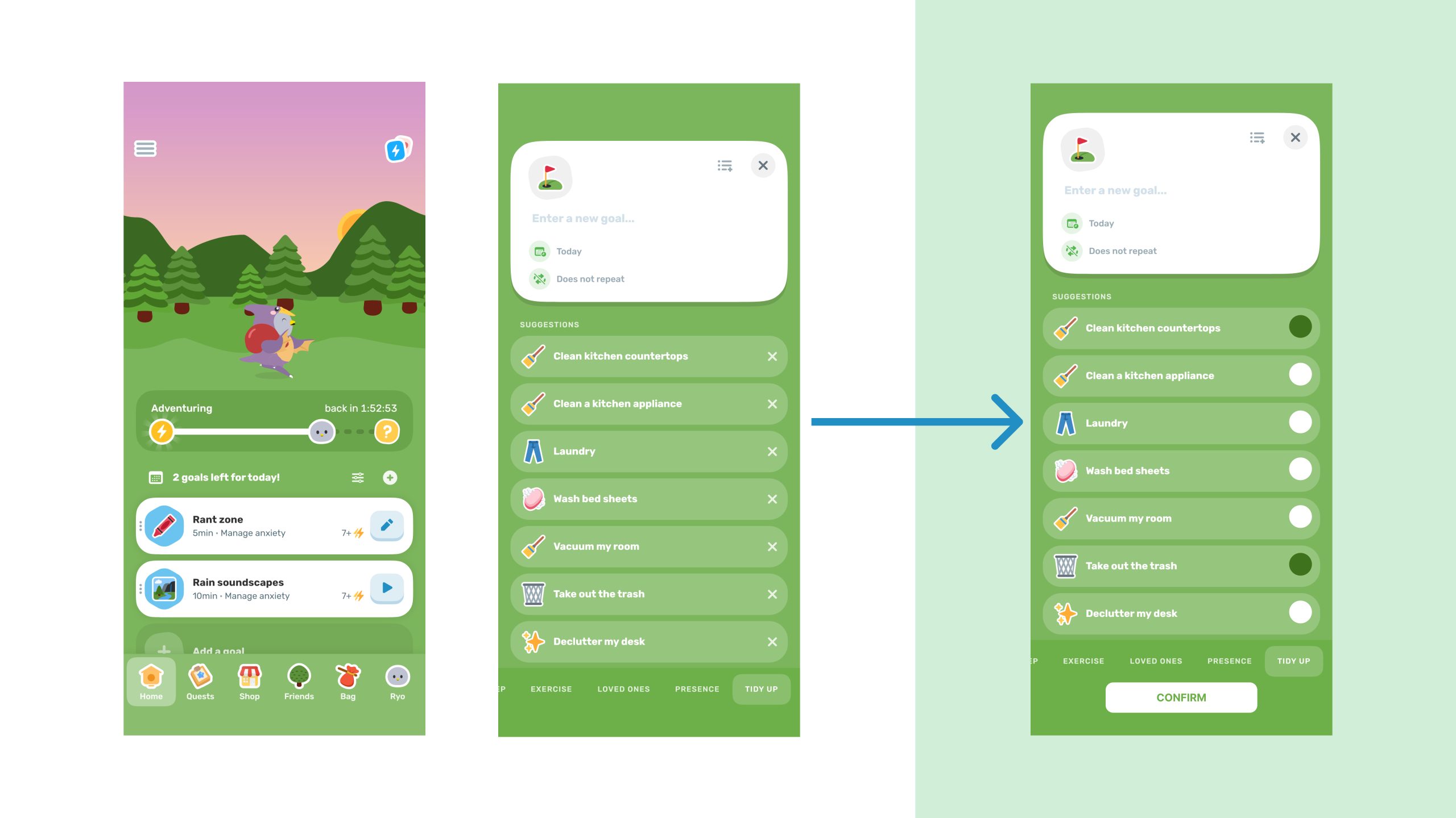
To-do List
When using the app for the first time, it gives the impression of overwhelming. The issue isn’t complex features, but rather complex design, which users often criticize. The issue applies to the to-do list. Users can‘t add multiple goals at once, but this doesn’t improve their efficiency. The purpose of a to-do list is to enhance efficiency, and the ‘add a goal’ feature contradicts this purpose. As Norman said, “Complexity is good; it is confusion that is bad.”
Exercises
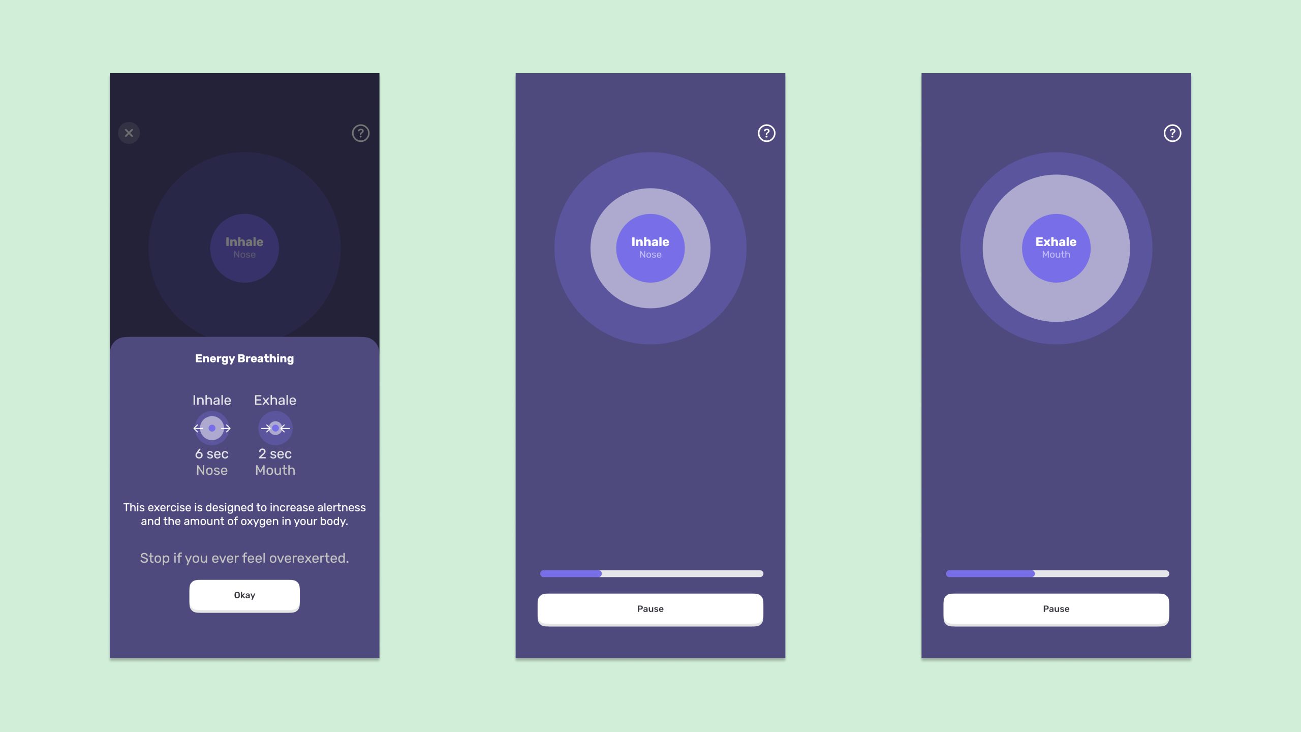
In addition to completing daily goals, users can earn extra rewards by completing additional exercises, allowing them to further care for their virtual pets. This offers more opportunities for positive experiences within the app. One focuses on breathing exercises. When users exercise breathing, it has instructions to guide users on how to exercise. Then, two circles appear on the screen. The inner circle moves according to the breathing instructions. As users inhale through their noses and exhale through their mouths, the app uses animated effects to guide them through the exercise, reminding them to follow the correct breathing pattern. This feature explains the concept of mapping and signifiers from Norman’s book, as the visual effect helps users understand and complete the exercise effectively.
Rewards
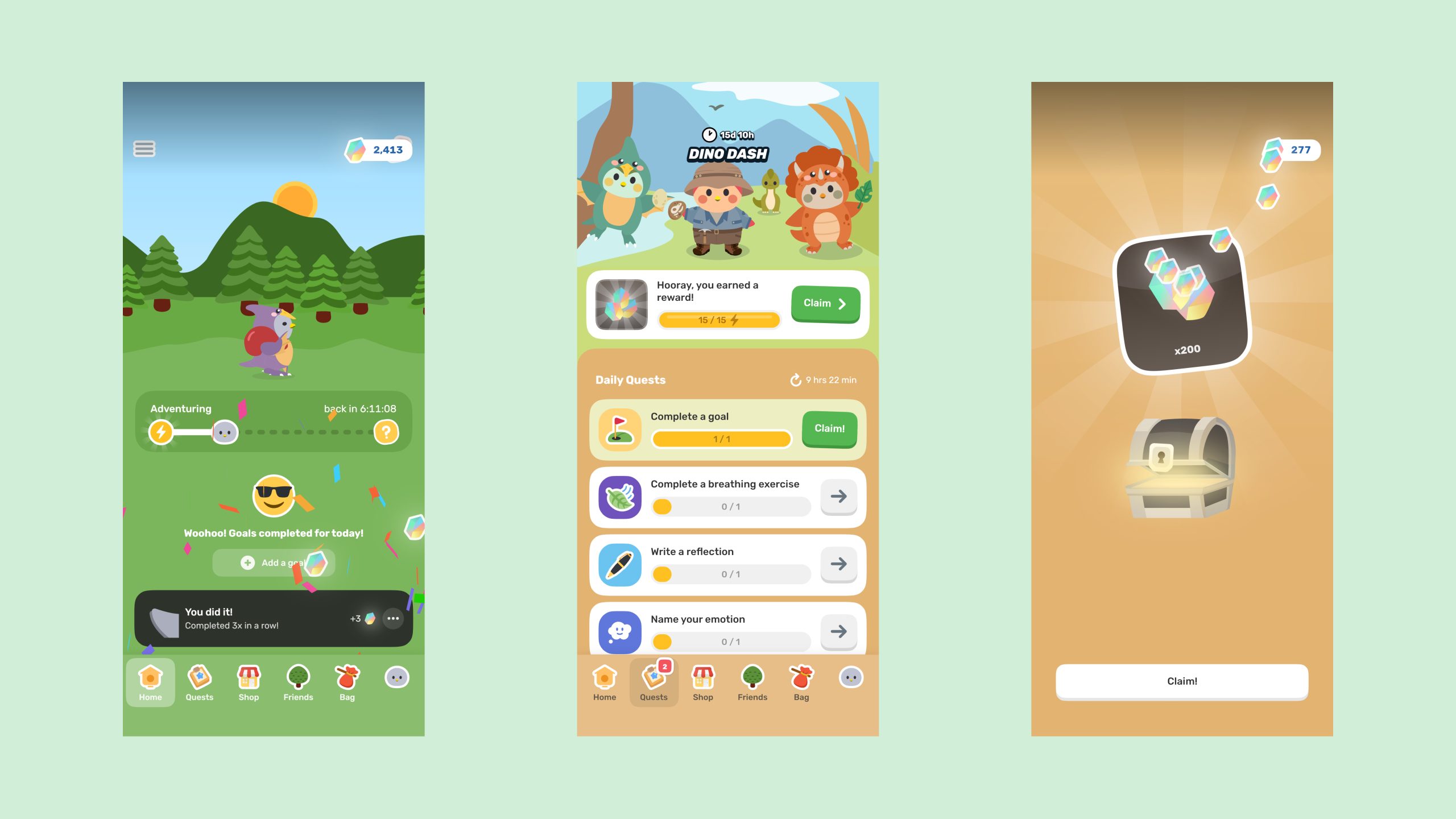
Each step is accompanied by animations that provide feedback. When users complete all their daily goals, they are rewarded with energy or rainbow stones. As Don Norman describes, feedback should be immediate and informative. In this app, animated feedback visually signals to users that they have completed their goals and achievements.
Conclusion
Finch is a multifunctional self-care app, offering a fresh approach to promoting mental health. It provides users with a positive experience and valuable feedback. While enhancing its features, it’s crucial to avoid making the app overly complex, as simplicity is important to addressing one of the most common user pain points in design psychology. Balancing functionality with simplicity is essential for an effective user experience. Design can indeed capture users’ attention, but the app had to solve users’ problems and provide an accessible experience fundamentally.