GasBuddy is a mobile app designed to help drivers find the cheapest fuel prices in their area. By using real-time data sourced from users and gas stations, it allows users to locate nearby gas stations, compare prices, and choose the most cost-effective option. Providing coverage across the U.S., Canada, and Australia, users can gain visibility on driving-related amenities within these local gas providers.
Finding Gas

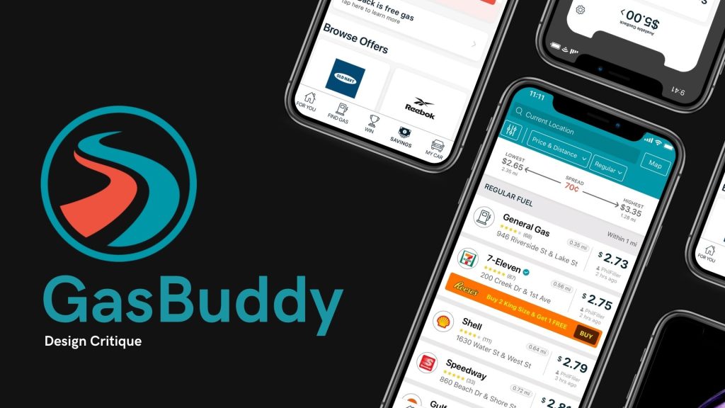
GasBuddy’s core functionality revolves around its map interface, which shows all nearby gas stations along with their current fuel prices. Much like other GPS-based apps, the map is intuitive, as it follows conventional design patterns similar to Google Maps and Apple Maps. This design employs real-world mapping signifiers, allowing users to easily connect the digital map to physical locations. Affordances are clear here—the map and station icons afford interaction, and users intuitively know they can tap on a gas station to view more details.
Icons representing gas stations and prices are intuitively placed on the map, allowing users to quickly compare prices and distances without needing further instructions. GasBuddy leverages the concept of signifiers by placing fuel price icons directly on the map, linking them to physical stations. These signifiers guide the user’s eye to the critical information—gas prices—and help them make quick decisions on where to refuel. The simplicity of the map layout ensures that users can immediately access the most relevant information, even if they are first-time users.
Key Features of GasBuddy

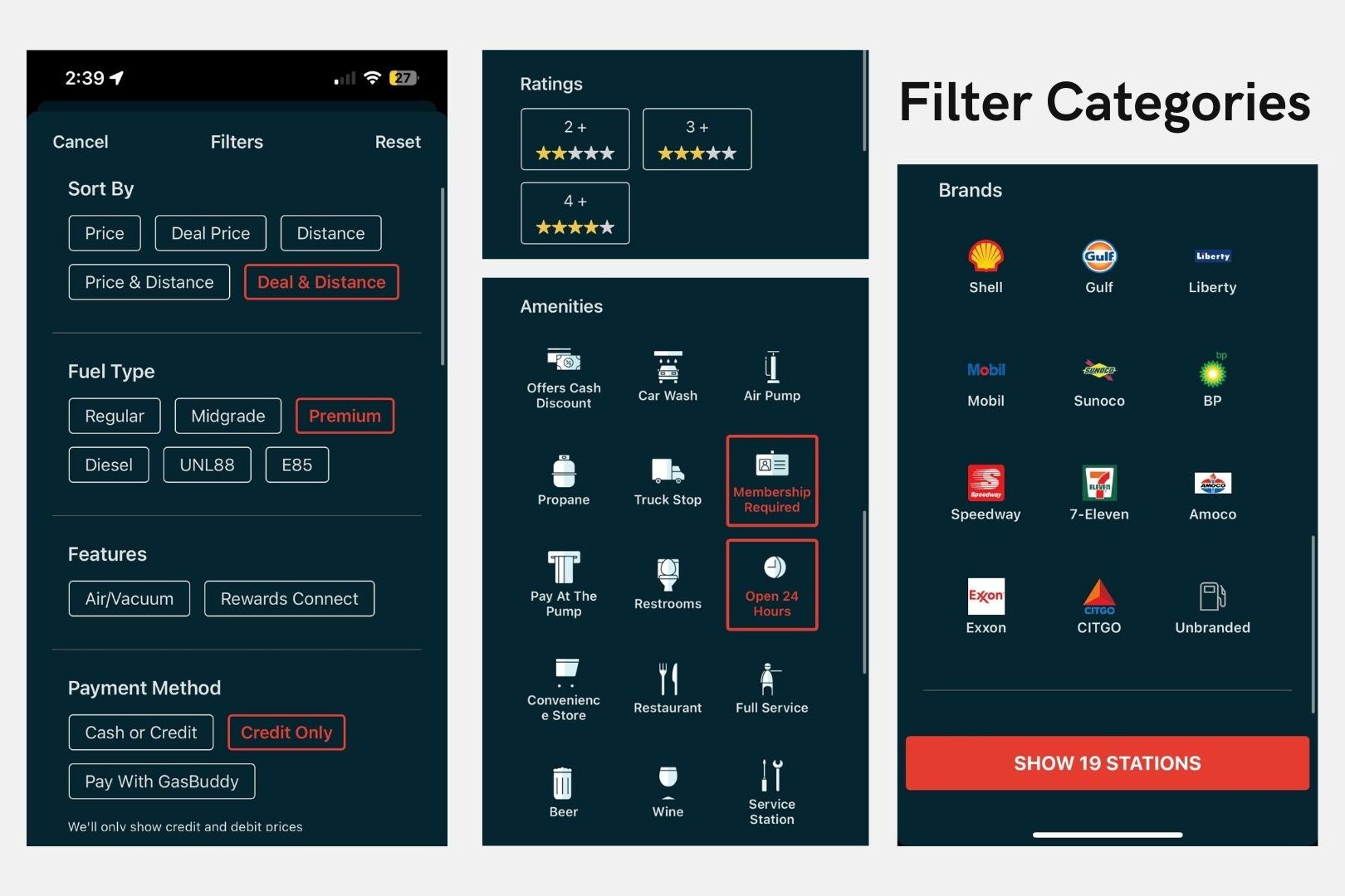
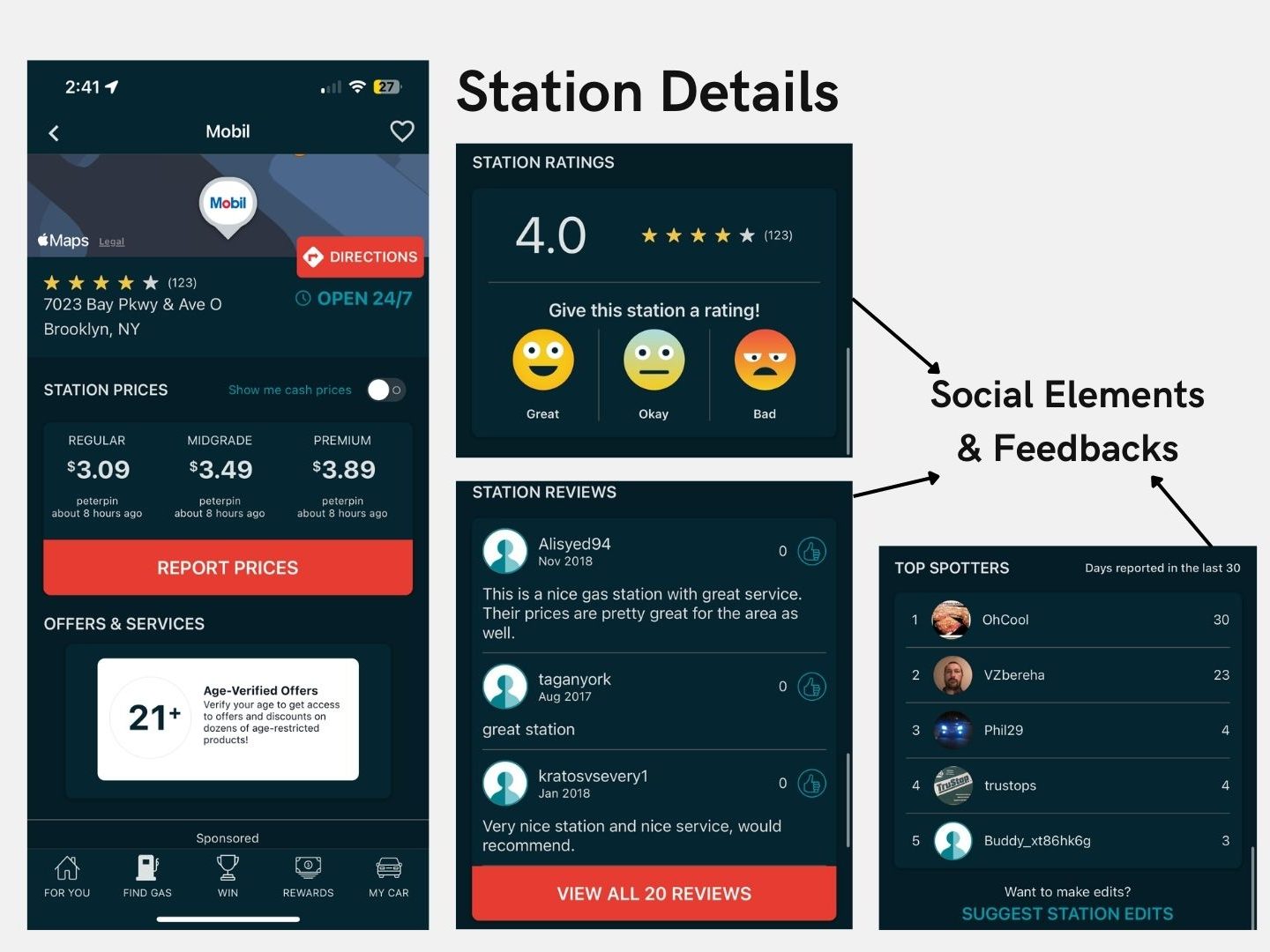
Once a station is selected, GasBuddy provides additional details such as fuel types, amenities, and user-submitted reviews. The app uses subtle signifiers to guide users through the process of selecting a station and applying filters, such as narrowing down by fuel type or amenities. For example, fuel prices are color-coded to indicate whether the price is lower or higher compared to other nearby stations, serving as a cognitive shortcut to simplify decision-making. Furthermore, these filters act as constraints that limit the users to their specific, desired fields- preventing irrelevant actions and ensuring accurate submissions. These design elements help users focus on achieving their goals (seeking the cheapest gas prices) efficiently without unnecessary complexity.
GasBuddy also encourages drivers to report gas prices, contributing to the platform’s crowd-sourced nature. The “Report Price” button is an excellent example of a signifier—it signals to users that they can contribute feedback to the app’s database. However, while the button is easily discoverable, the reporting process could benefit from stronger feedback.Norman emphasized the importance of feedback in design as it reassures users that their action has been successful. By adding more visual confirmations when submitting gas prices would make the experience more satisfying and validating, hence closing the loop for users.
From an affordance perspective, the reporting feature is straightforward—users instinctively understand they can interact with the “Report Price” button. However, GasBuddy could further improve affordance by offering clearer visual cues or a confirmation step after data is submitted, reinforcing the user’s action and ensuring the process is complete.
Design Feedback
While GasBuddy effectively communicates gas prices and station details, the app struggles to maintain an “aesthetic and minimalist design”, a key usability heuristic. The app suffers from visual clutter, primarily due to the presence of ads and excessive buttons on the screen. These extra elements create visual noise and errors, competing for users’ attention and ultimately detracting from the app’s primary function. The sheer volume of buttons, boxes, and advertisements overwhelms users, making the interface feel less intuitive and harder to use.

To improve, GasBuddy should reduce the number of elements on the screen—particularly ads and redundant buttons. By streamlining the interface, the app would better align with minimalist design principles and place the focus squarely on finding affordable gas. A cleaner, more focused design would allow users to navigate the app more efficiently, enhancing both ease of use and the overall user experience.
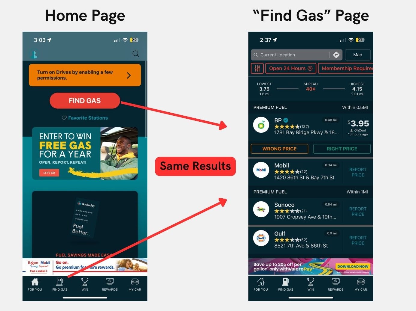
Despite the app’s core strength in helping users find gas stations, the home page is ineffective, violating the usability heuristics of efficiency and ease of use. Users open GasBuddy with a clear goal: to compare nearby gas prices. However, the home page displays a variety of information that is irrelevant to this primary purpose, making it tedious for users to navigate. Instead of directly showing nearby gas prices, the home page offers extraneous options and multiple paths, forcing users to take unnecessary steps to reach the “Find Gas” section.
This design violates Jakob Nielsen’s heuristic of “efficiency and ease of use” by introducing redundant navigation layers at the user’s first impression. Rather than reserving an entire separate tab for finding gas, the home page itself should prioritize this function. Users should be able to open the app and immediately see nearby stations and prices, eliminating the need to navigate through additional menus or tabs. Simplifying the home page and focusing on the primary task would drastically improve ease of use and overall task efficiency.
Conclusion
GasBuddy is a useful tool for finding affordable gas, but its home page design and visual clutter detract from the user experience. By violating usability heuristics like efficiency and aesthetic design, the app introduces unnecessary complexity for the user by prioritizing less relevant features like rewards and raffle opportunities. Simplifying the home page and reducing visual distractions would enhance task efficiency and ease of use, ultimately providing users with a more seamless experience that aligns with the app’s core purpose—finding the best gas prices.
Sources:
Norman, D. (2013). The Design of Everyday Things: Revised and Expanded Edition. Basic Books.
