Introduction
Goodreads is a household name among avid readers, boasting over 150 million members and a database of more than 3.5 billion books. Launched in 2006, Goodreads is a social cataloging platform where users can track their reading progress, discover new books, and interact with a community through reviews and ratings.
The platform was acquired by Amazon in 2013 for $150 million with the promise to keep the platform’s original ethos intact—a promise they’ve honored so thoroughly that Goodreads has remained a nostalgic (read: outdated) staple in the book world that truly would benefit from moving forward.
Goals
Goodreads serves a diverse range of users, including casual readers, avid book collectors, and literary critics. These users seek a user-friendly experience for tracking their reading, discovering new books, and engaging with fellow readers.
The app aims to:
1. Track and manage users’ books.
2. Offer personalized recommendations.
3. Facilitate social interactions and discussions.
4. Promote reading challenges and book-related activities.

The Basics : Where Everyone Starts.
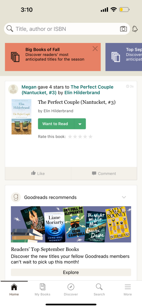
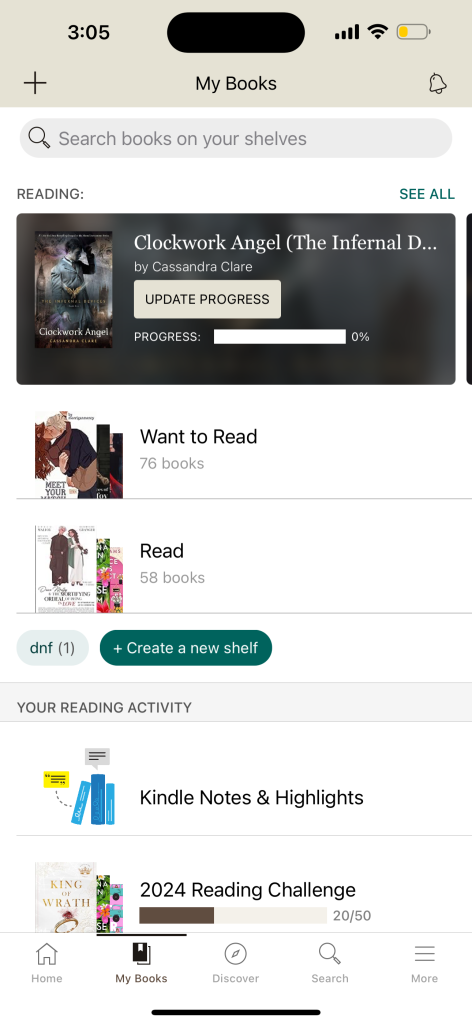
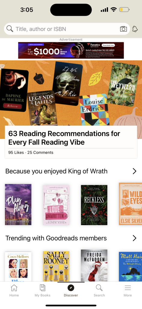
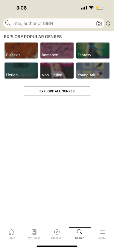
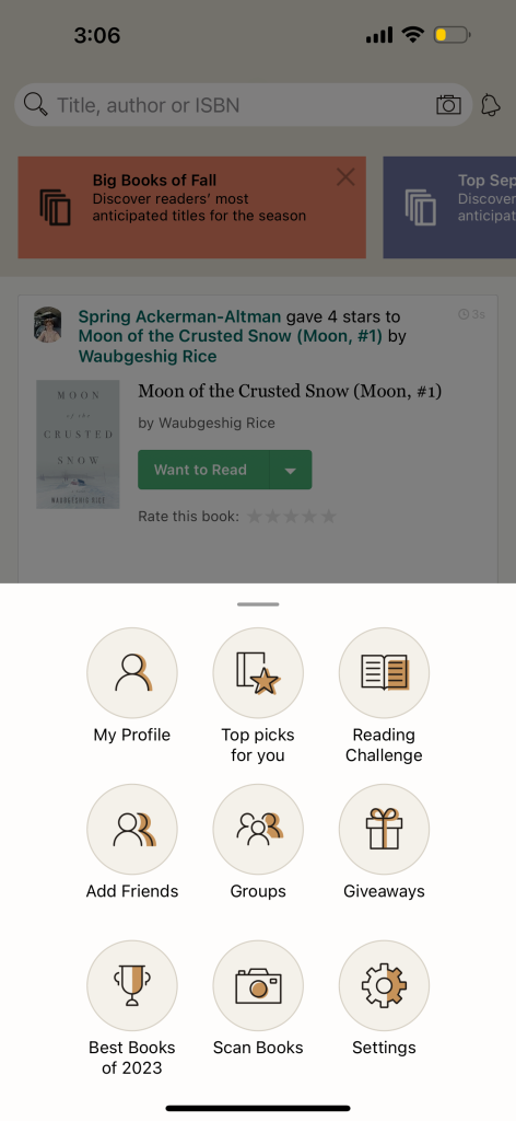
Upon signing up, users select their favorite genres and rate some books. They are then directed to the Home Page, where they’re presented with a few tabs of redirection on top and reviews for books from other users in the body of the page. From there, users can navigate to My Books for tracking, Discover to go find books from different categories and list made my the app, Search for finding specific books, and More for additional features and settings.
The Pitfalls: Where it falls short.
Problem 1:
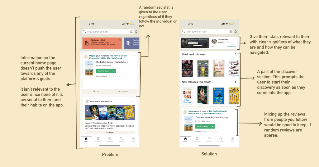
While Goodreads offers a range of features, the Home page fails to engage users effectively. According to Norman’s principles of discoverability and feedback, a well-designed interface should encourage user action, but the Home page presents impersonal, irrelevant information. Despite the app’s goal of personalizing the reading experience, there’s no prompt to explore books based on genres selected during sign-up, leaving the page underutilized. This lack of clear guidance results in users abandoning the Home page, making it disconnected from their reading journey.
Solution:
Integrating a progress tracker on the Home page would align with Norman’s feedback principle by providing users with immediate information about their reading journey. This feature offers clear, actionable feedback on their current status. Including personalized book recommendations based on previously read books adheres to Norman’s mapping principle. It connects user actions (previous reads) with relevant outcomes (suggested new books), making navigation more intuitive. Displaying reviews from users they follow aligns with the discoverability principle. It highlights relevant content that users are likely to find valuable, enhancing their engagement with the app.
Problem 2:
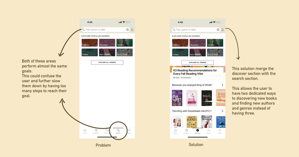
The presence of both a search bar and a search tab in the Goodreads app creates redundancy and potential confusion for users. Both lead to the same search results, making one of them unnecessary. This redundancy violates Norman’s principles of visibility and consistency. Additionally, the Discover section replicates the search tab’s function by guiding users through a similar exploration process, further compounding the confusion. This redundancy dilutes the effectiveness of both the search features and the Discover section.
SOLUTION:
Remove the search tab and retain the search bar on top, which is a universal function and more intuitive for users. Merge the current search and Discover sections into one Discover section. Since both prompt users to perform similar tasks, consolidating them will streamline the user experience. The updated Discover section can include tabs for different categories of genres, leading users through all the content previously found in the Discover section, thus minimizing steps and enhancing goal achievement. This solution would help promote consistency and reduce the amount of steps the user has to take to find books.
Problem 3:
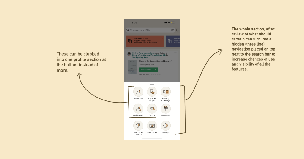
The More section of the Goodreads app houses some of the most engaging community features but is tucked away in the corner with minimal prompts or visibility. This design creates ambiguity and leaves important features underutilized. This issue violates Norman’s principles of visibility. The current placement of the More section in a less prominent area of the app reduces the visibility of these community features, making them harder for users to discover. It also overall causes frustration when a user might not find what they’re looking for just because it’s hidden in a more secluded area.
Solution:
The solution for this would be to move some of the key features out of the more section and repetition them in different part of the app according to relevance. Book recommendations can go to the discover section. the reading challenge is already present in my books and potentially the home page as proposed. The rest of the options under More would function better if they were to be turned into a navigation tab near the search bar at the top.
This solution would not only increase visibility but also allow for better navigation and intuitive use of the app while highlighting the goals of the platform.
The (Potential) Rise: How Goodreads could do better.
The Goodreads iOS app reveals several design flaws when assessed using Norman’s principles. Improvements in affordances, functionality, and visual cues are essential to aligning the app with modern design standards and significantly enhancing the user experience. The app’s current issues, such as redundant features and hidden community aspects, highlight the need for a more iterative design approach that incorporates user feedback.
While Goodreads remains a staple in the book community due to its extensive features and engagement, it could greatly benefit from updated visual elements and better integration of iOS functionalities, such as haptics. By addressing these design flaws and implementing user-centered changes, the app could unlock its full potential and offer an even more compelling and user-friendly experience.
As an avid user, I am hopeful for future updates that will modernize the app without compromising its foundational strengths.
