Introduction
Goodreads is a place where book lovers can find new books, talk to other bookworms, and keep track of what they’re reading. It’s like having a digital bookshelf where you can store all your books. You can connect with friends, share book recommendations, and get personalized suggestions for new books. There’s also a big community of bookworms where you can join book clubs, do reading challenges, and chat about your favorite books. Even though it’s a great tool, there are a few things about Goodreads that could be better to make it even easier to use. However, despite its utility, Goodreads has several design shortcomings that hinder the overall user experience.
By applying Don Norman’s principles from The Design of Everyday Things, we can better understand the issues with Goodreads’ interface and how they might be resolved to create a more user-friendly experience.
What did I do?
I spent some time poking around Goodreads and noticed a few(lot) things that were kind of cluttered. The homepage is a bit overwhelming with too much going, and all over the place. It felt like was playing a game of “Where’s Waldo?” to find what I need. I looked into what opinions others have regarding the same and they were facing the same problem! I then organized and wrote down problem that I was facing every time I interacted with the product.
Process
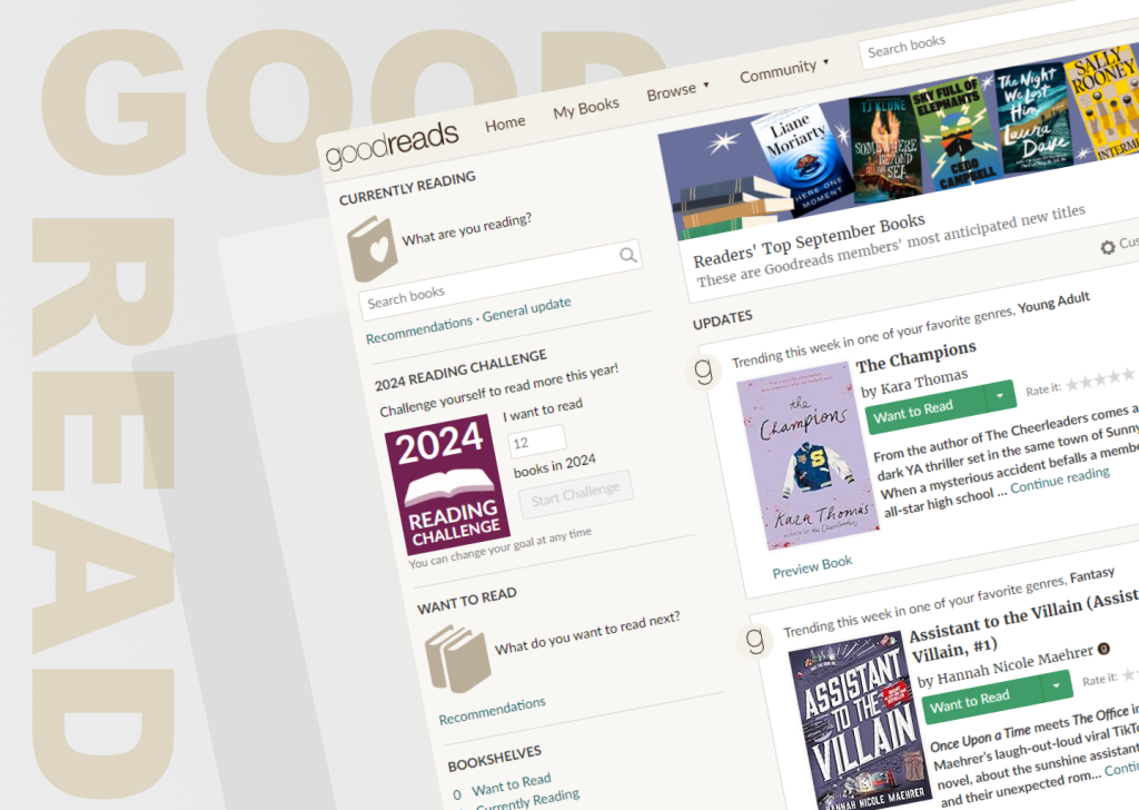
Home Page
The current Goodreads homepage (left image) presents a cluttered and overwhelming interface. The numerous elements, such as recommended books, updates, and community features, compete for attention, making it difficult for users to quickly identify and access the desired information. This lack of clarity and focus can lead to confusion and frustration. Additionally, the affordances of certain elements are not immediately clear, making it challenging for users to understand what actions are possible. This can result in hesitation and mistakes.
The redesigned Goodreads homepage (right image) addresses these issues by adopting a more streamlined and focused approach. The interface is less cluttered, with a clear distinction between different sections and a prioritization of core functionalities. This improved visibility and hierarchy make it easier for users to navigate the site and find the information they need.
Furthermore, the redesigned homepage enhances affordances by using visual cues and signifiers to indicate interactive elements. This makes it more intuitive for users to understand what actions can be performed and how to interact with different elements.
Key improvements:
- Clearer navigation: The redesigned homepage features a more prominent search bar and navigation menu, making it easier for users to find what they need.
- Focused content: The homepage focuses on the most important features, such as recommended books and user activity, reducing clutter and improving clarity.
- Improved affordances: Interactive elements are more visually distinct and easier to identify, reducing confusion and mistakes.
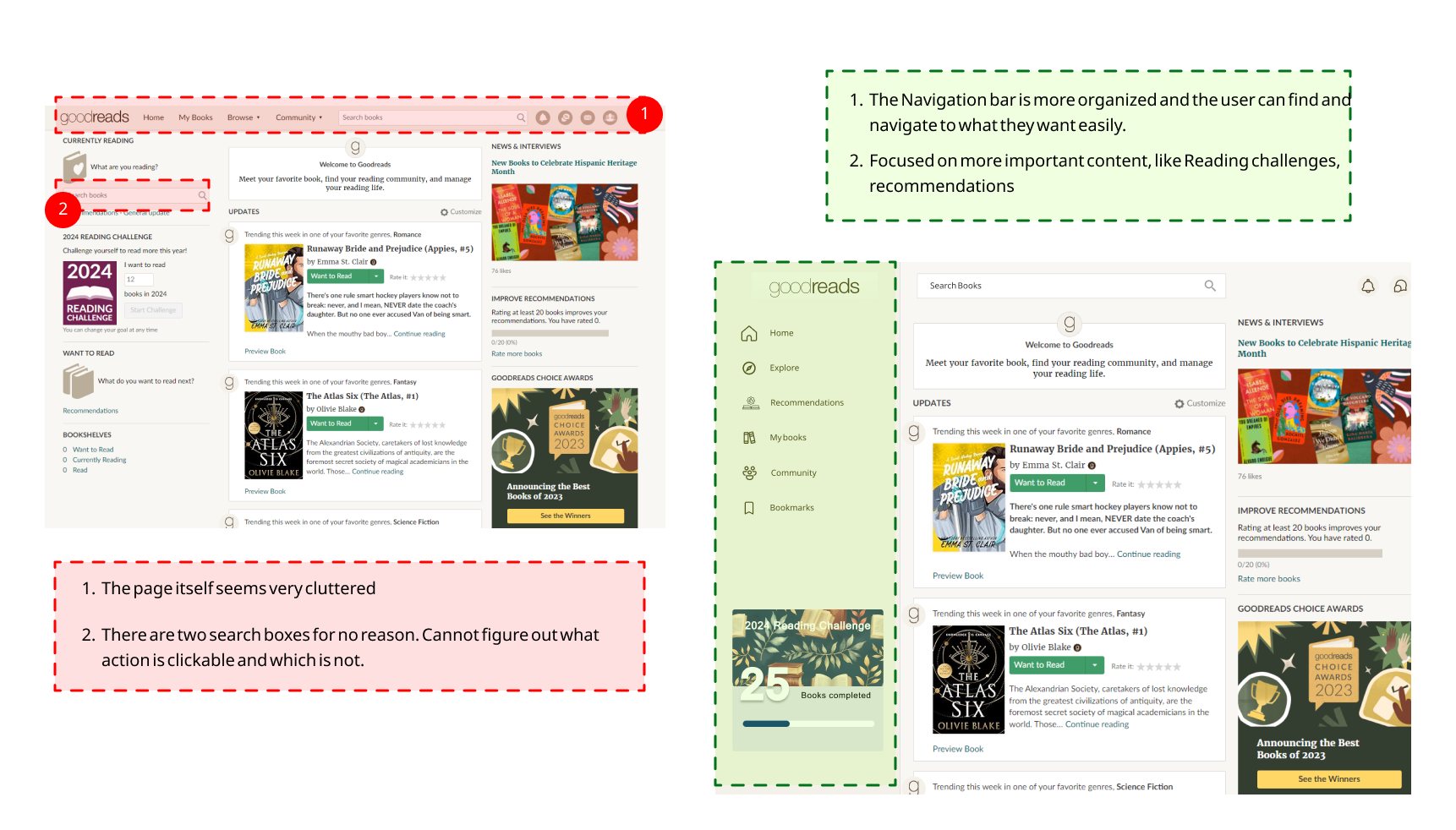
The Book Details Page
The book details page presents a cluttered and overwhelming interface with numerous elements competing for attention. This can lead to confusion and frustration for users, as they may struggle to identify and access the desired information. Additionally, the affordances of certain elements are not immediately clear, making it challenging to understand what actions are possible. Users may become overwhelmed and frustrated, leading to a decreased user experience. The elements on the book details page are not clearly differentiated, making it difficult to determine the most important information.
This can lead to disorientation and confusion for users.
- Clear Grouping & Clickable Genres: The genre tags are neatly grouped in a contained, visible area, making the page cleaner and easier to scan. Each genre is distinctly clickable, providing better discoverability and ensuring users can explore other books in the same category without guessing.
- Consolidated Action Buttons: All major book-related actions (like adding to the reading list or buying) are positioned together. This improves visibility and mapping, allowing users to make decisions more easily without hunting for buttons across the page.
By reorganizing the layout, the design becomes more intuitive, reduces cognitive load, and enhances the overall user experience.
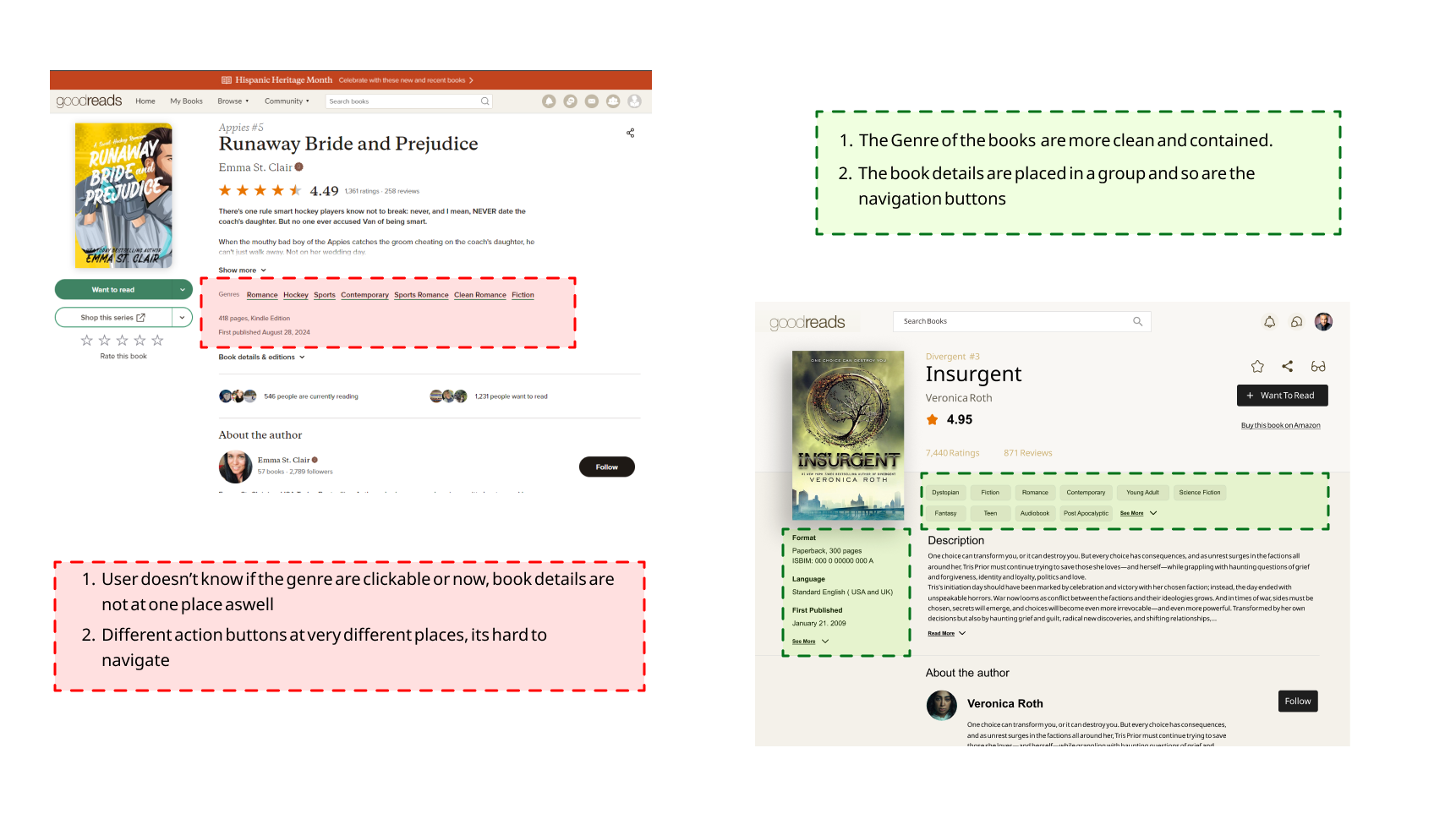
The “My Books” Page
The page is packed with text-heavy rows, and information is densely arranged in a spreadsheet-like format. This overwhelms users, especially when scanning for specific books. It violates the principle of visibility, where important details should stand out without clutter. Many of the action buttons are presented as small, text-based links, which fail to provide clear affordances. Users might miss key actions or be uncertain if their clicks register, which contradicts feedback principles—interfaces should offer immediate confirmation of actions. Categories such as “Read,” “Currently Reading,” and “Want to Read” are buried in a list. This forces users to manually scroll and sift through books, instead of easily navigating between reading statuses. This violates mapping—actions aren’t logically grouped, leading to confusion and inefficiency.
Improved Visibility and Layout: Books are visually grouped into distinct sections like “Read,” “Currently Reading,” and “Want to Read,” making it easier to scan and manage categories. This reduces cognitive load and adheres to the principle of visibility, ensuring that essential information is easily accessible without overwhelming the user.
Enhanced Affordances and Feedback: Each book is paired with intuitive buttons such as “Read” or “Rate Now” using larger, distinct elements. This gives users clear clues about what actions are available and provides immediate feedback after interactions, enhancing both affordance and feedback mechanisms.
Streamlined Navigation: The sidebar with clear, logical categories (e.g., “My Books,” “Explore,” “Recommendations”) helps users move between tasks more easily. This satisfies mapping by organizing actions in a manner that matches user expectations, reducing friction and making it easier to manage books at a glance.
Conclusion
With these improvements, Goodreads becomes more than just a platform for tracking books. It becomes an extension of the reading experience—smooth, enjoyable, and effortless. By applying Norman’s principles of visibility, mapping, feedback, and affordance, we’ve created a world where the platform feels as engaging as the stories it helps you discover.