Guidebook is an platform that lets you create guides for events and places. It is commonly used by conferences, forums and universities to share schedules and maps that attendees can follow to get to their events on time. For this critique, I will be taking the example of a new student at Pratt Institute who may use the app to find events at the Fall 2024 Orientation and assess it through the concepts from The Design of Everyday Things and How Artefacts Afford.
Guide Home Page
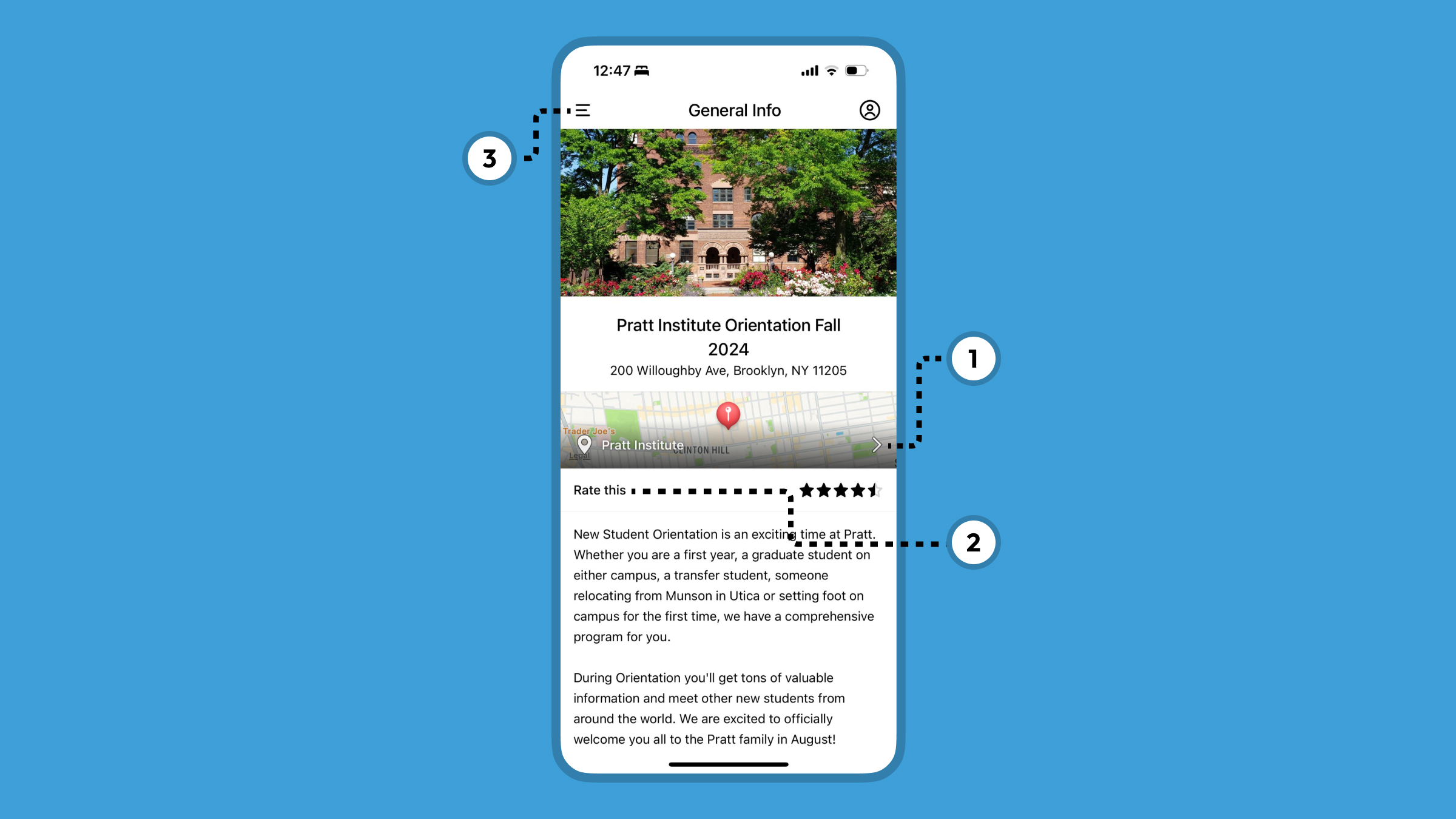
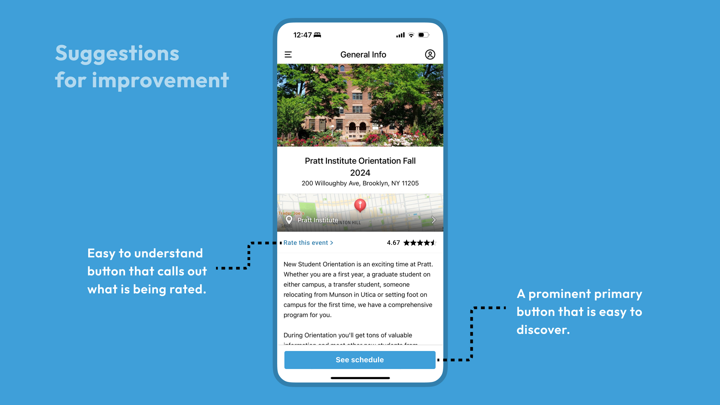
When a student downloads the “Pratt Institute Orientation Fall 2024” guide, they land on this page. The address of the campus is shown along with a link to the location on the map (1) which is a good affordance as it encourages them to navigate to the campus more easily. This is followed by the option to “Rate this” (2). The language used is not a clear signifier of what is being asked to rate here (the event, the location on the map, or the guide). The app also uses the same color for clickable buttons as for regular text, which makes the interactive nature difficult to understand. Furthermore, the star rating on the right may require the student to consciously think to understand that this is the average rating received.
The student would wish to view the schedule. The lack of a clear signifier for this creates a Gulf of Execution on this page as the next action is ambiguous. They may eventually find that all schedules are present in the hamburger menu on the top left (3). A user may not click on that button intuitively because a common conceptual model is that hamburger menus on the top left are menus for the entire app. Having a button at the bottom to view schedules would help bridge this gulf smoothly.
Guide Search
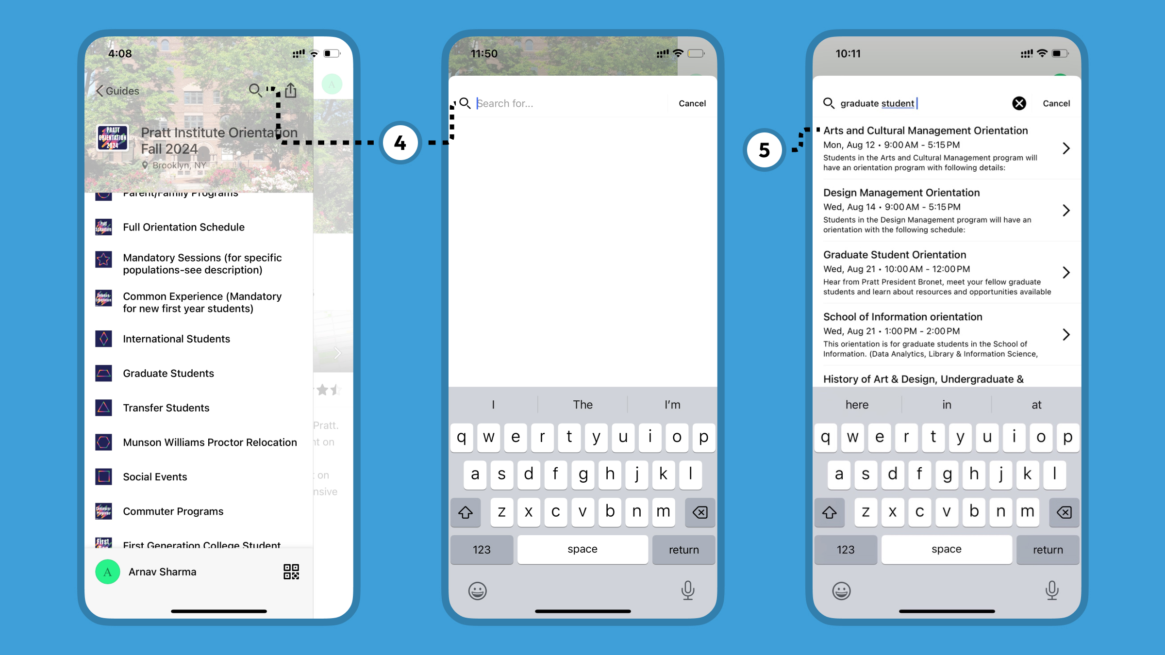
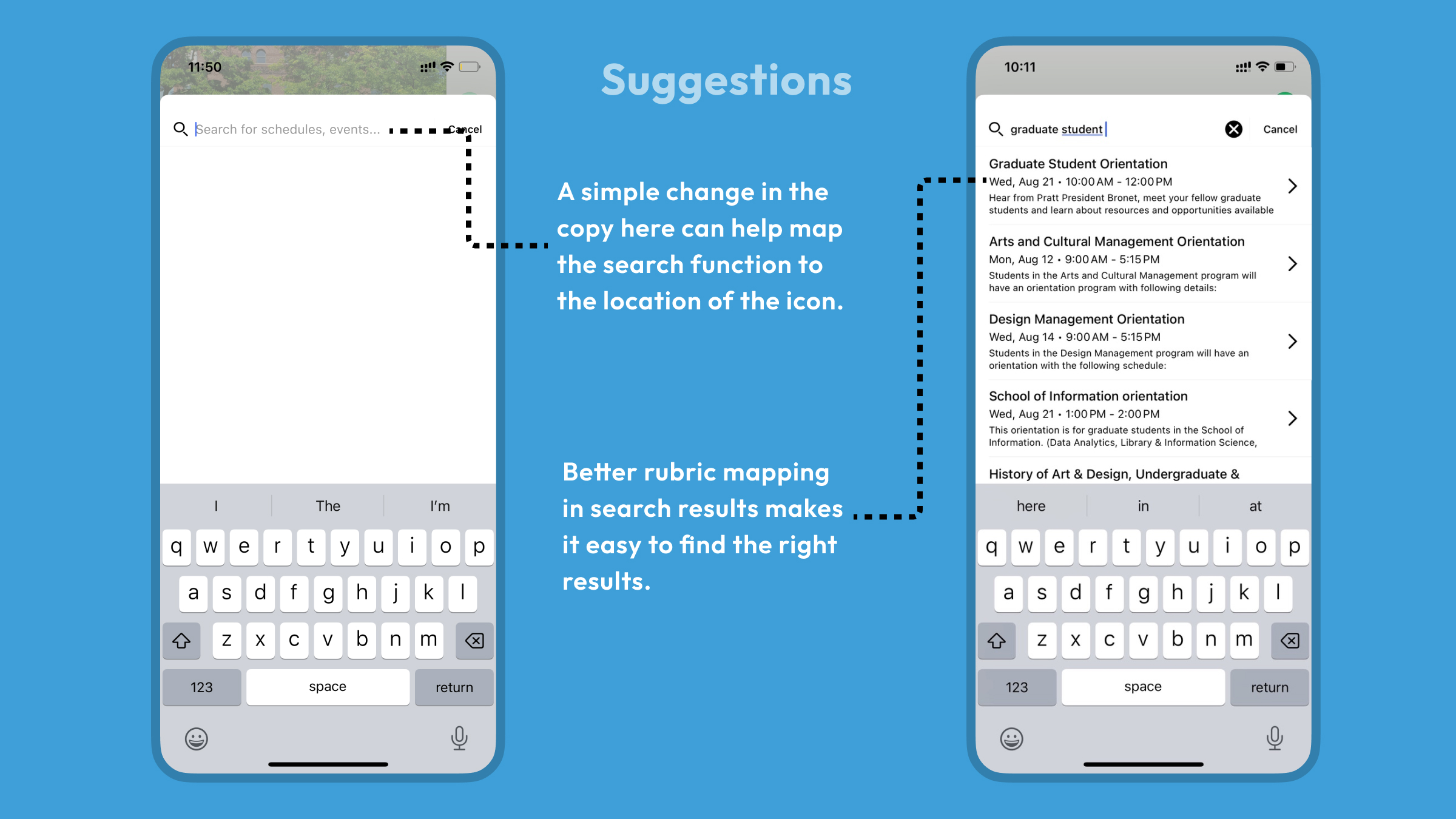
Upon clicking on the menu, the student must find the schedule(s) relevant to them. There is a search option (4), but this button is not mapped properly as it only allows searching through all the events and not the categories on this page. Additionally, when you search for an event, the results may not directly match the input (5). This could again be attributed to poor mapping of the search rubrics to the input. A suggestion to improve the search experience would be to have a prioritization list for how the results are mapped to the input, i.e. the name of the event should be prioritized over text in the event description.
Schedule Page
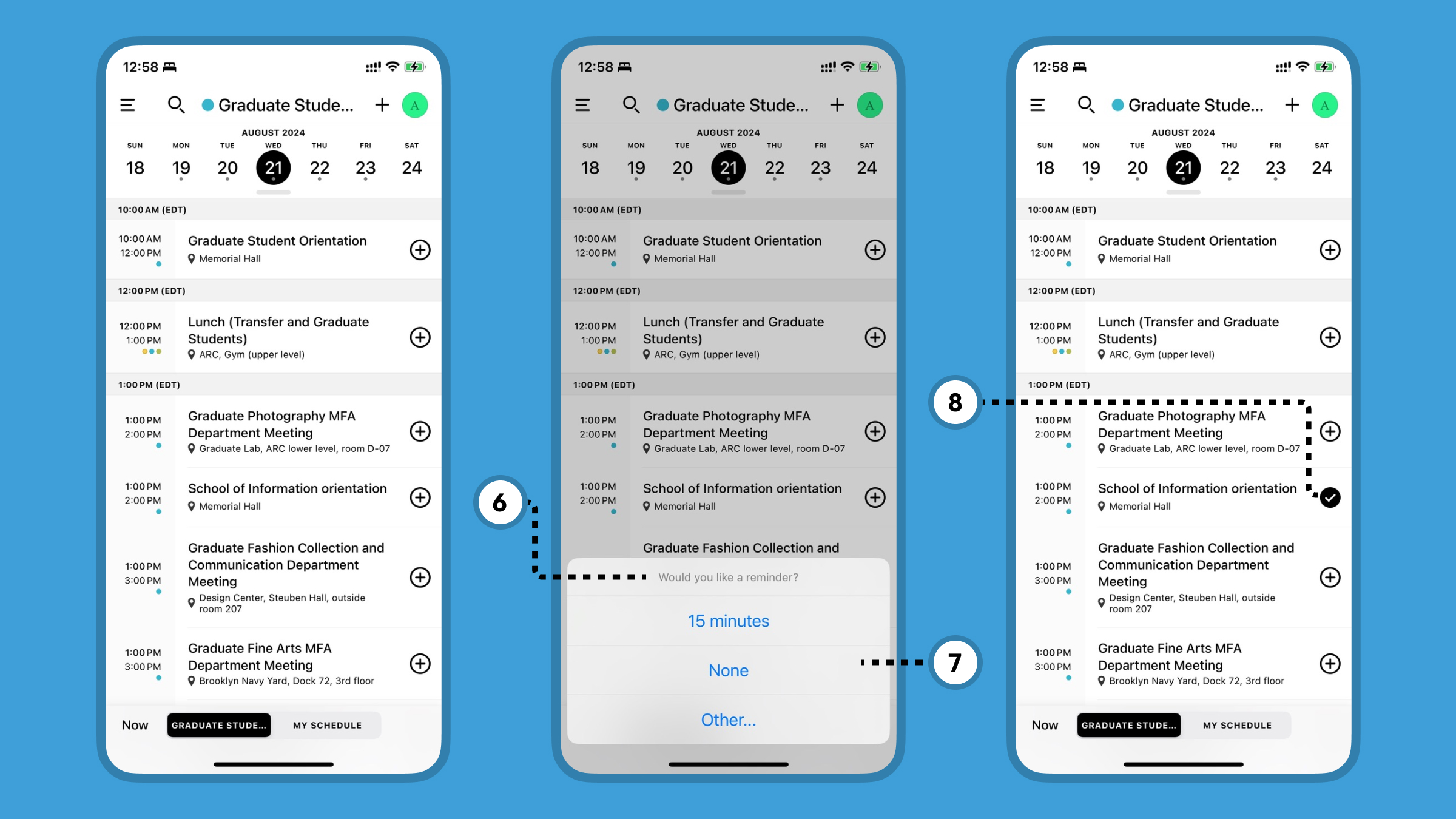
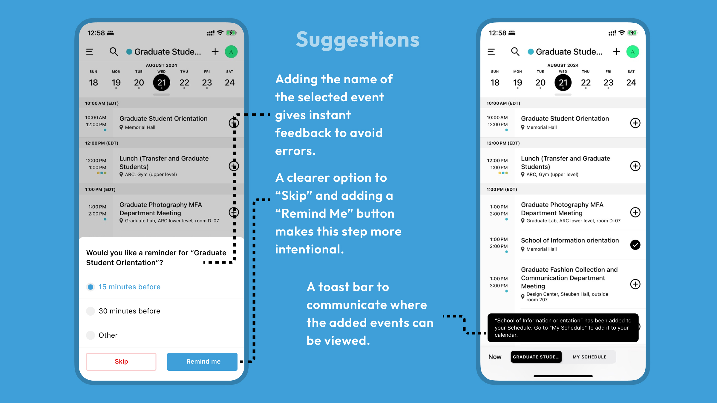
On the schedule page, date-wise schedules can be viewed based on the selected category. The app allows adding events to “My schedule” by clicking on the + icon next to them. However, when clicking the icon, the lack of proper feedback about which event was selected may cause action-based slips, if the user selects the wrong event (6). A small tweak here would be to add the event’s name in the header of the pop-up. Furthermore, the current design pattern puts all options at equal importance (7), which makes the reminder feel more like a demand instead of a request. Adding a clearer “Skip” button would help with this. Additionally, adding a button to confirm the selection would add positive friction to keep the user locked in so they can review the selected event and make the desired decision.
Confirmation of an added event is another example of improper feedback. While the check icon (8) tells the event has been added, there is still a gulf of evaluation in the impact on the overall system image. Some messaging that informs the user to view and add these events to the calendar may be useful.
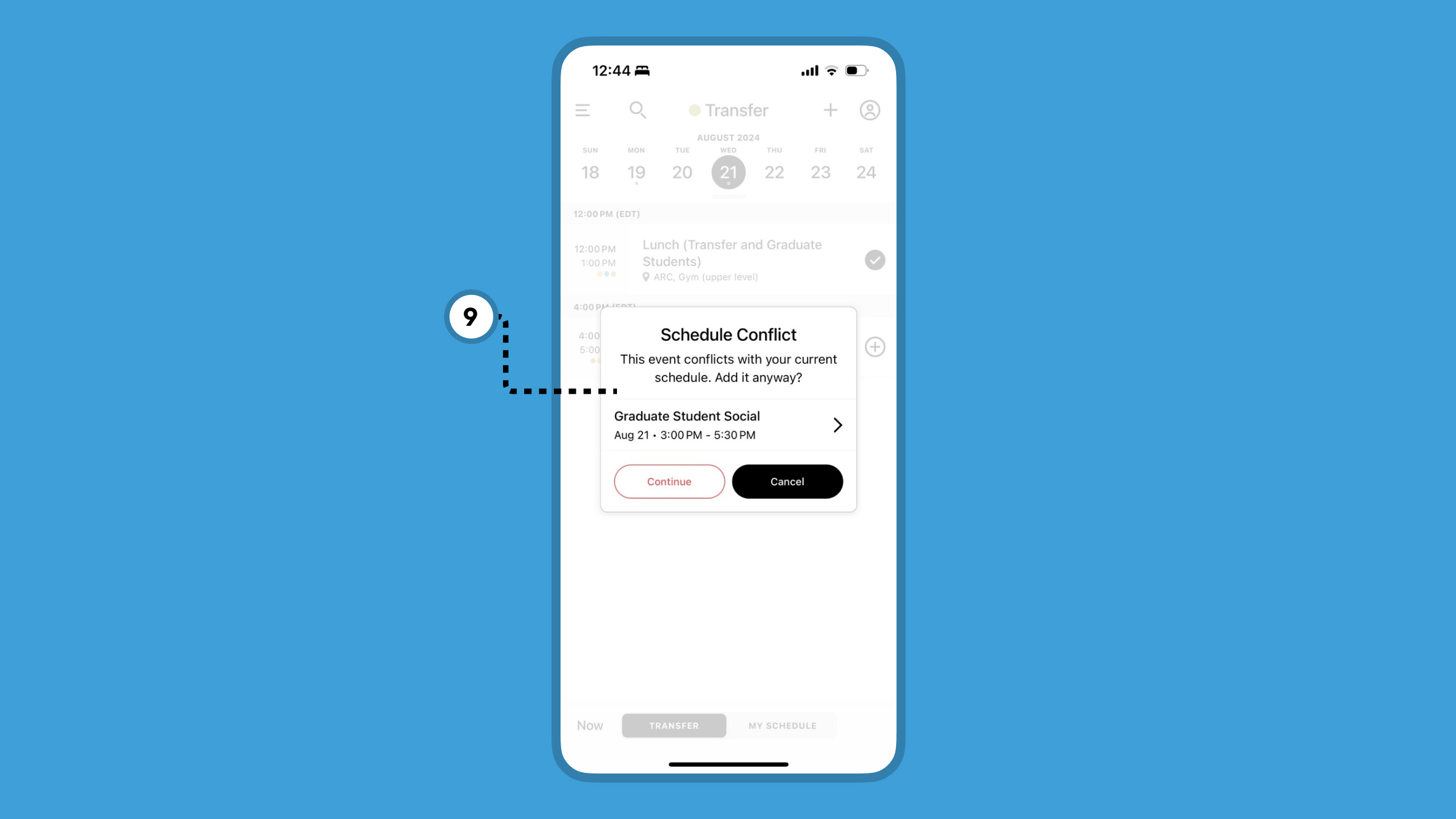
Another beneficial affordance of the app is that it discourages the user from adding conflicting events (9). It is designed in such a way as to constrain the user from making a memory-lapse mistake, as they may not be able to attend two events simultaneously. It is good that it is a discouragement rather than a refusal as the student may choose to leave the first event early to get to the second one.
Event Page
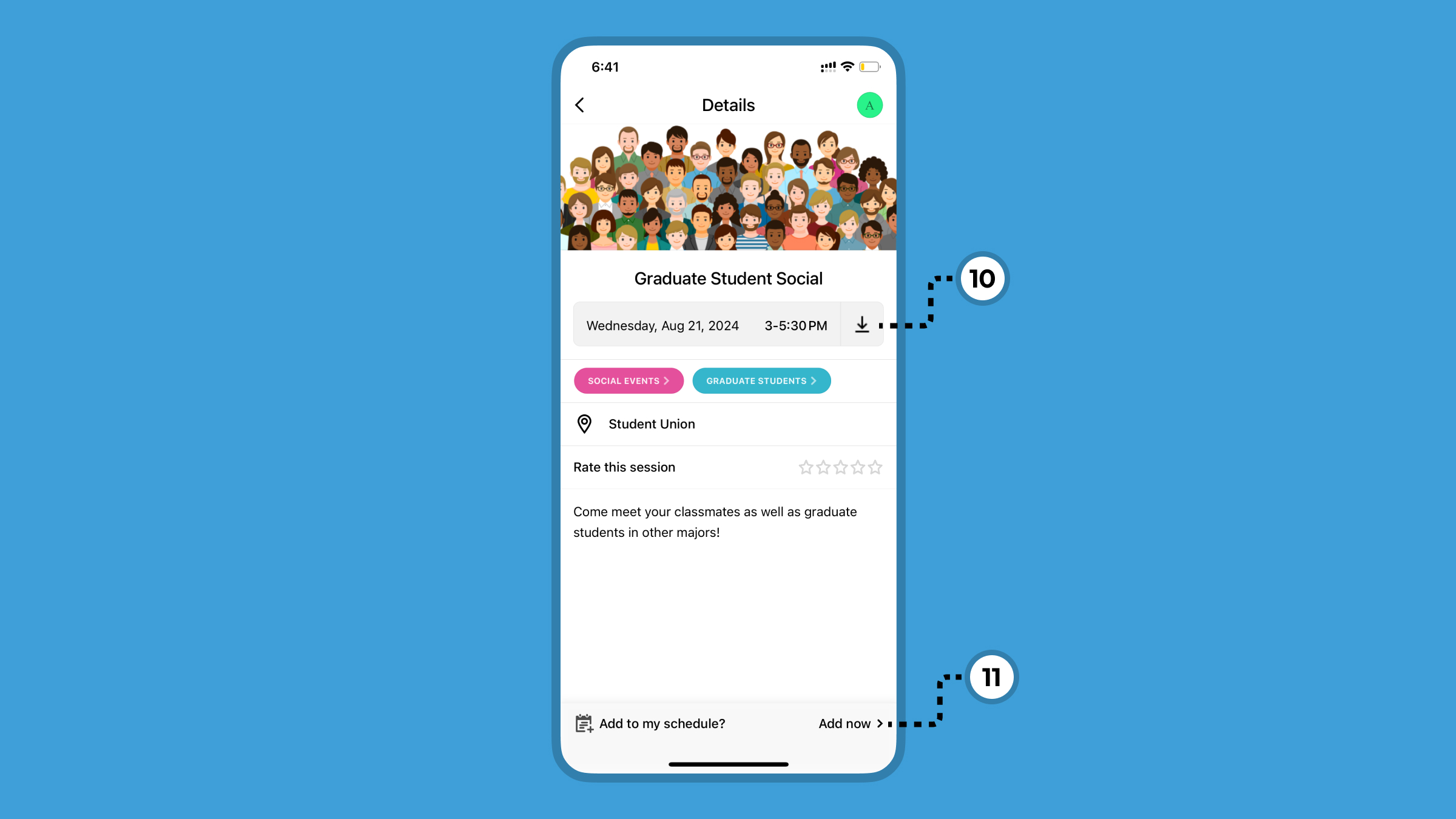
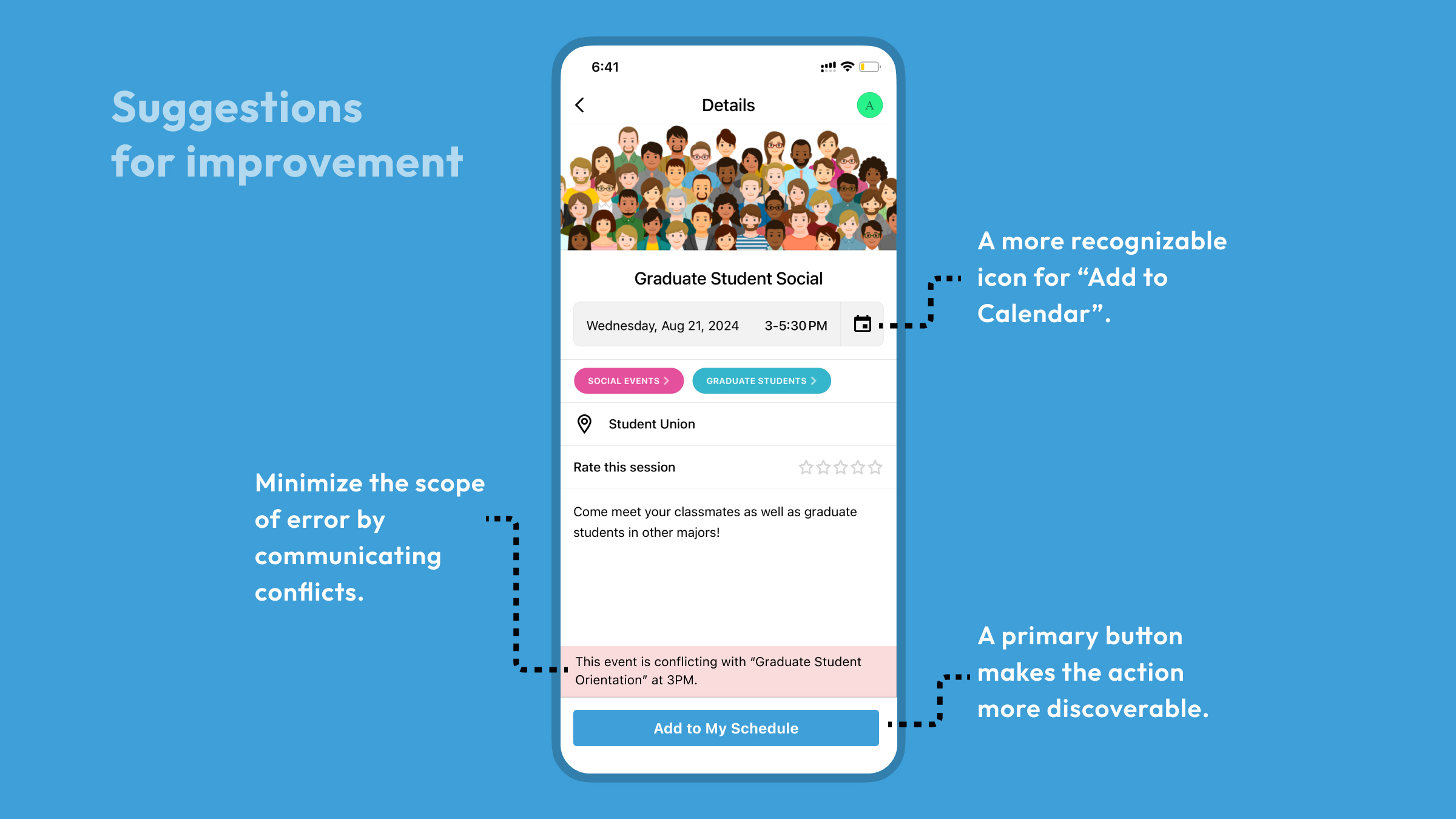
When a user clicks on an event they are taken to this events page. The student is allowed to add this event to their calendar (10). However, due to the usage of a “download” icon, an unusual signifier, this affordance does not register with the user’s behavioral level of processing. The lack of visual prominence on the “Add Now” button makes it difficult to discover (11). Moreover, this is a great opportunity to minimize the risk of error by informing the user about any potential conflicts in their schedule.
Conclusion
For the example use case, the Guidebook app has many good affordances that would help a student find the necessary events. However, many of these are not designed to make discovery and understanding of actions easier. The suggestions provided may help in solving some of the issues uncovered.