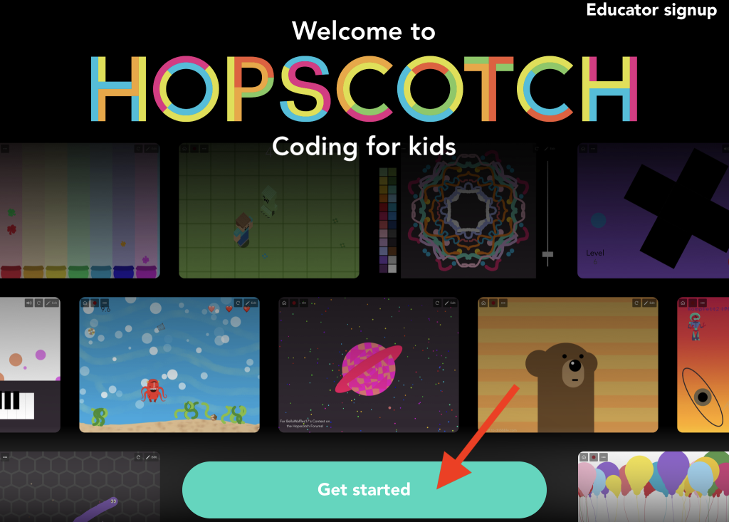
Hopscotch is a mobile coding app designed to teach children aged 10-16 to code by creating games, stories, and art. The primary users are kids, parents, and teachers, though the app is more directly designed for children and adults rather than educators. The browser-based version, ideally used by teachers, offers a variety of tutorials and lesson plans, but the app itself is focused on individual learning and creativity.
User Experience Overview
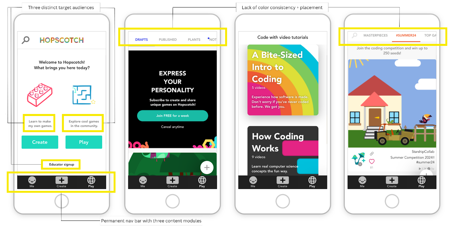
A typical child user, aged 10-16, would approach the app with goals like learning to code, creating a game, and socializing with other young coders. After a parent downloads the app and creates an account, the child is taken to Hopscotch’s dashboard, which functions as both a user profile and homepage. The app is divided into three sections: Me, Learn, and Explore—each tailored to different user goals.
Adults may use Hopscotch to understand coding themselves or to provide a resource for their child. Teachers might use Hopscotch for live demonstrations, though the lack of in-app lesson plans within the app limits its classroom use.
Affordances and Signifiers
Hopscotch uses affordances and signifiers throughout its interface. For example, a bold green “Create new design” button on the Me section’s Drafts tab contrasts sharply with the white background, clearly signaling the primary action. The tabs change from gray to blue with underlining to signify which section is active. However, there are inconsistencies in the overall design palette. In the Explore section, category tabs change to every color of the rainbow without a clear pattern, while Me tabs follow a clean gray-to-blue scheme. This inconsistency disrupts the user experience and could be improved by standardizing color schemes across the app. Additionally, the icon in the upper left corner could lead to avatar customization instead of a user profile, which contradicts a typical app’s user expectations. This mismatch could be fixed by renaming the icon or adding clearer signifiers, such as a “Change Avatar” label.
Feedback and Usability Challenges
Norman’s principle of feedback is crucial for guiding users through interactions, yet Hopscotch surprisingly lacks adequate feedback during the coding process. When users make mistakes, there is no immediate message explaining what went wrong. This gap can frustrate users, especially younger ones who may struggle to understand and fix errors on their own.
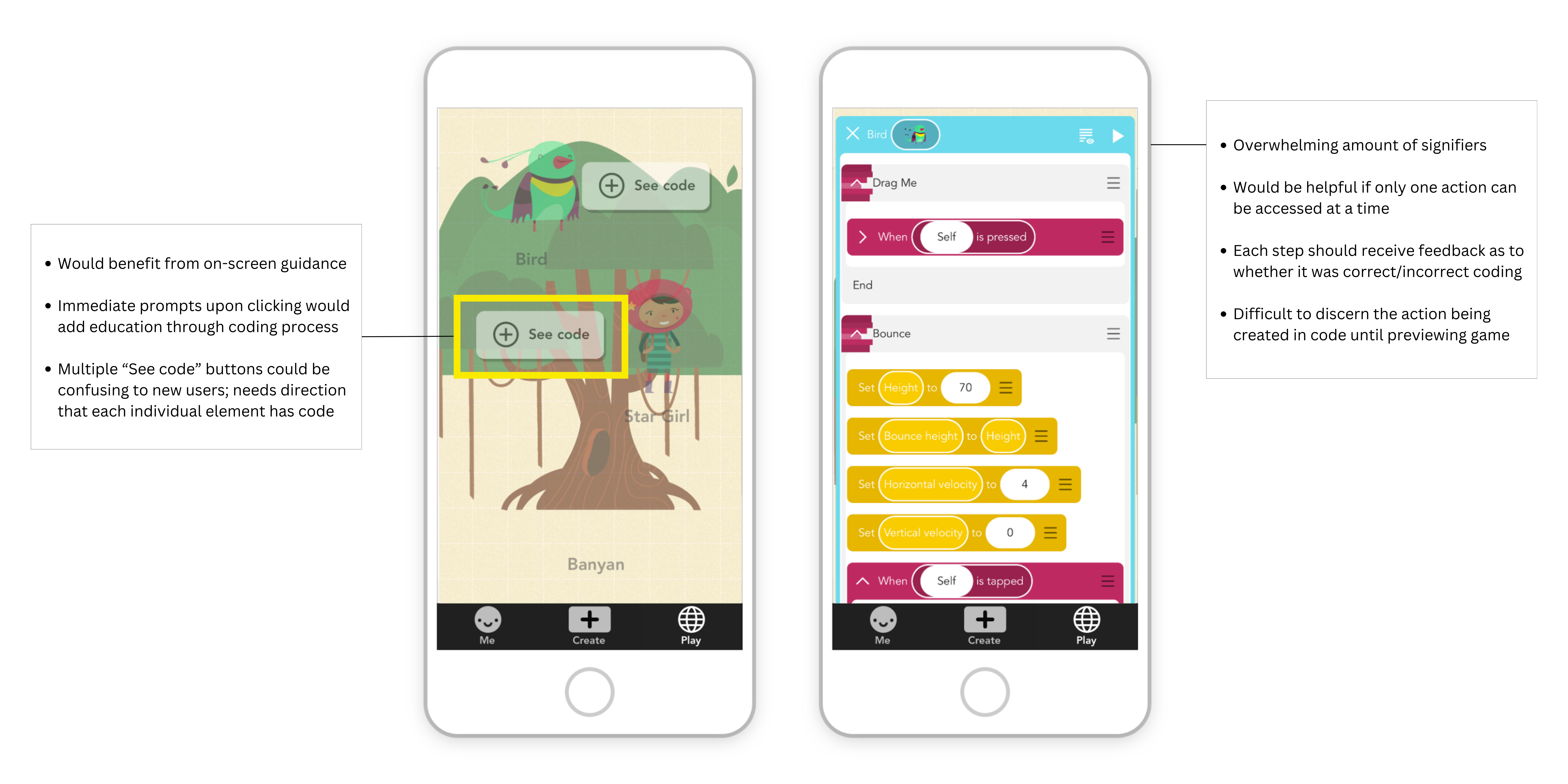
The app could benefit from integrating real-time feedback during game creation. For example, pop-ups explaining errors or offering suggestions would reinforce learning and help users troubleshoot their code more effectively. This would also align with Norman’s concept of a “conceptual model,” helping users better understand how coding functions as they interact with the system.
Human-Centered Design
Hopscotch excels in terms of its human-centered design. Copy language is simple and clear, making it accessible to users of a broad range of ages and developmental stages. The app is optimized primarily for iOS, limiting accessibility for non-Apple users who are restricted to the browser version. Its aesthetic invites engagement through bright, cheery colors and playful illustrations, and the interface encourages exploration without intimidating users.
Where it lacks, however, is the Explore section’s navigation bar, which could confuse a user due to the sheer number of tab options provided. Content provided on the “Excellent” and “Rising” tabs appear redundant, and the “Following” tab content likely overlaps with “Favorites” located within the Me section. As alternatives, streamlining the amount of options or incorporating a hamburger menu in Explore would make this section feel less overwhelming, reducing cognitive overload for young users.
Recommendations for Improvement
- Standardize interface elements: Consistent color schemes for tabs and more intuitive iconography would enhance user understanding.
- Improve feedback mechanisms: Real-time feedback during coding would help users learn from mistakes and better understand the coding process.
- Simplify navigation: Reducing redundant tabs and clarifying signifiers (e.g., the “Me” icon) would streamline the user experience, particularly for children.
While Hopscotch is a promising tool for teaching kids to code, it faces several usability challenges. Addressing these issues, particularly around feedback and style consistency, would help align the app with Norman’s principles of good design, making it an even more intuitive and effective learning experience.