Instacart is a grocery delivery and pick-up app that connects users with local stores and restaurants. Instacart connects users with personal shoppers to pick up items and deliver them straight to the user’s home, giving constant feedback and updates of the shopping process.
Selecting a store:
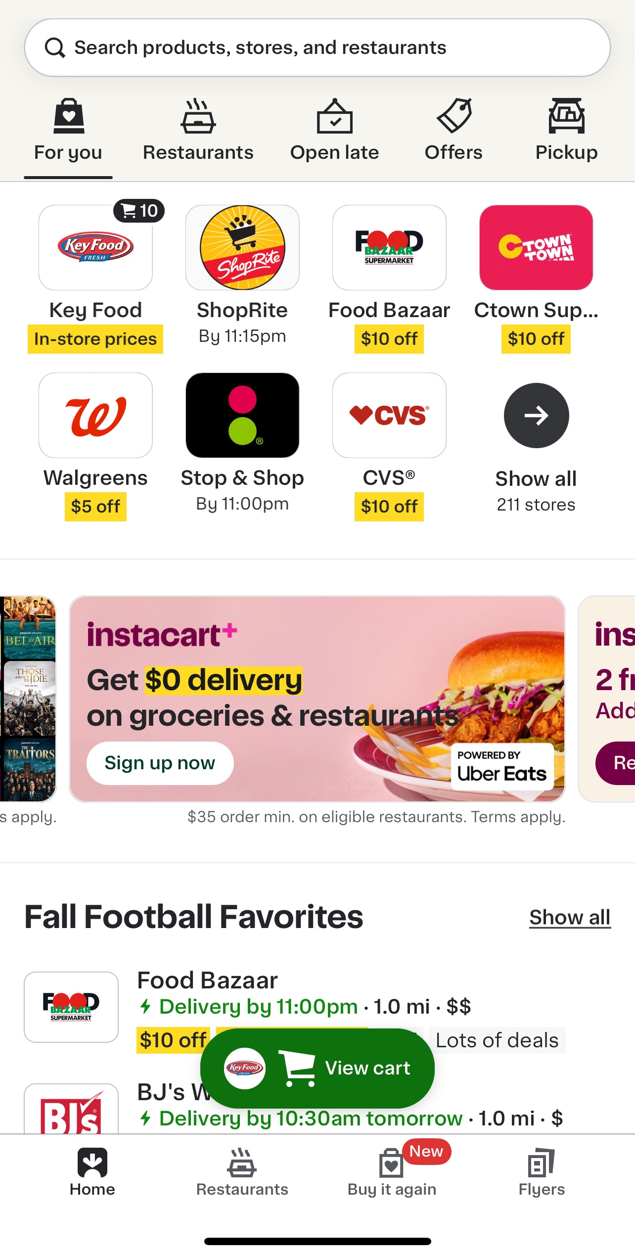
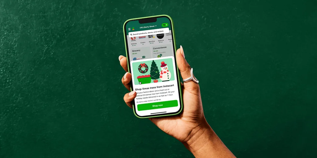
Upon opening the app, the user is greeted by a homepage that displays a sorted list of stores based on different criteria. The layout emphasizes the top seven most popular stores in the area, followed by arbitrary sections below. However, the wide banners between the top stores and the rest of the lists dominate the screen, interrupting the flow of the layout and creating a poor visual hierarchy, violating the principle of aesthetic and minimalist design.
The excessive use of the wide banners in the homepage causes information overload, distracting users from their primary task of exploring and selecting a store. Users are forced to continuously scroll down the page for more stores and content, reducing the efficiency of use. One alternative solution is to remove the wide banner ads that interrupt the flow of the page and replace them with small banner ads under the top navigation bar. The user will still be aware of the ad but it will not disrupt their flow.
However, the app leverages visibility of system status by providing real-time feedback with the user’s shopping status. If a user has items in a cart from a specific store, the app provides live feedback by attaching a cart icon to the store’s card with a numerical representation of how many items are in the cart for that store. The persistent reminder of the “view cart” button at the bottom of the homepage screen ensures the user can easily see which store’s shopping cart is in progress. The feature enhances user control and freedom as it allows the users to seamlessly resume their shopping journey without relying on memory.
Ordering from a store:
When users select a store from the homepage, they are taken to a “store-specific” page. If a store does not have pick-up available, the top left “Delivery or Pick-Up” button will appear gray. Instacart is successfully enforcing error prevention to ensure users cannot order Pick-Up when a store does not have that service available. By graying out the Pick-Up option, the app avoids future user confusion and frustration. The location and format of the Delivery/Pick-Up button also coincides with other mobile ordering app conventions (Uber-eats, doordash, etc.), creating a consistent and standard experience for users familiar with mobile ordering. This familiarity increases learnability and reduces cognitive load on users by relying on established patterns from similar platforms.
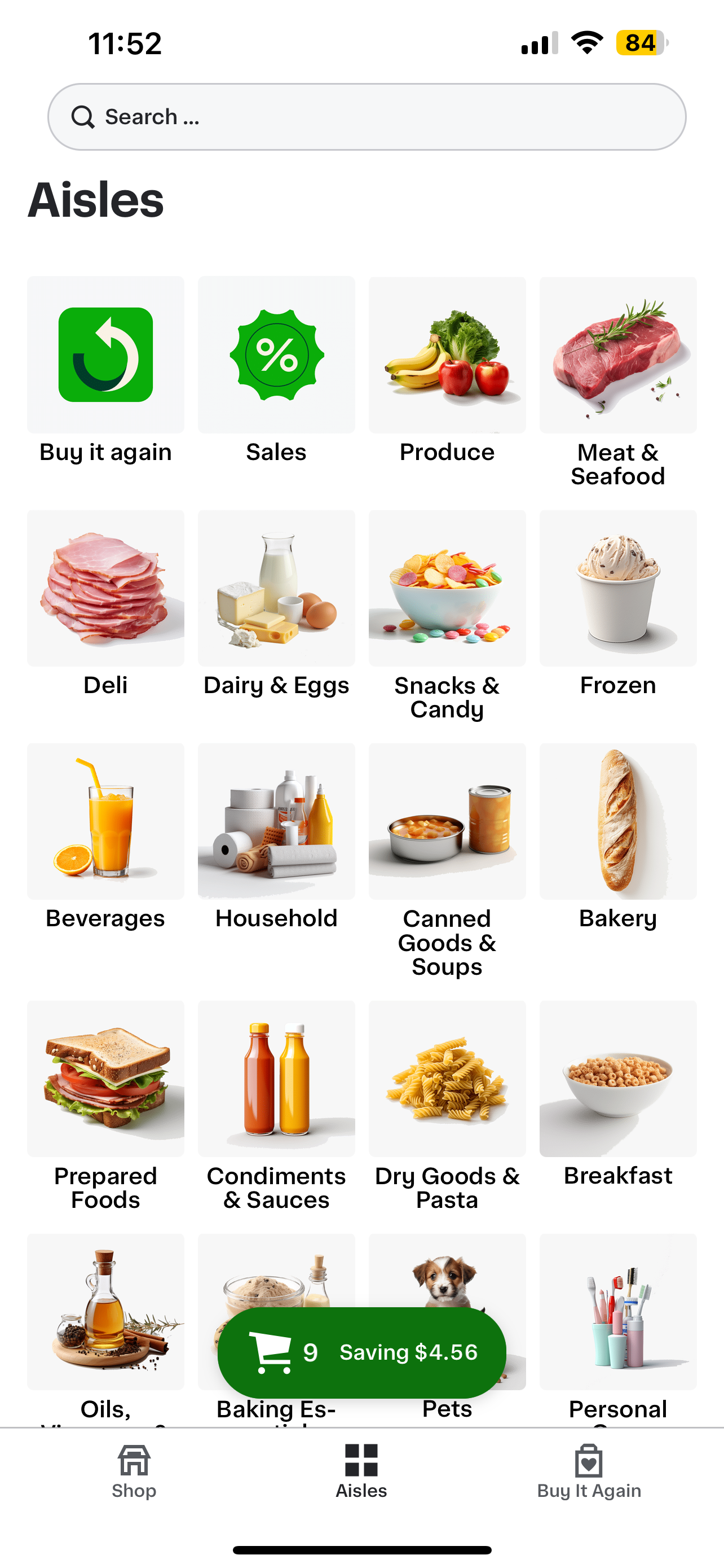
The store page reinforces a match between the real-world and the system model by using real-world language. The “aisles” page in the bottom navigation ensures the users connect their categories with real-world grocery categories (meat section, frozen foods, etc.) This further increases a user’s efficiency of use due to the ease of navigation. The aisles page allows users to explore products in a similar manner they are accustomed to in real-life.
Following shopping updates:
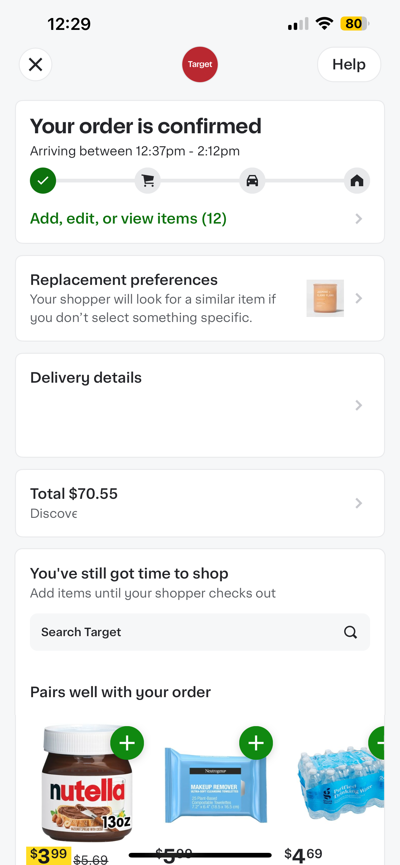
After a user places an order, real-time updates are provided. The order status gives real-time updates by providing both visual and written feedback for the shoppers status, detailing each stage of the process––when the shopper is actively selecting items, checking out, or en route to the user. This feedback displays a visibility of system status, keeping users informed at every step and giving them a clear understanding of the last possible moment they can modify their order. The page also contains a “add, edit, or view items (x)” function. This bestows control and freedom to the user, allowing them to adjust their current orders or select a replacement product. The button’s color difference provides affordance and discoverability, showcasing to the user that this text is interactive. This design choice ensures the user has an action they can take, reducing cognitive friction and also allowing a chance for users to rectify any mistakes made during the ordering process.
Alternative Solution Wireframe:
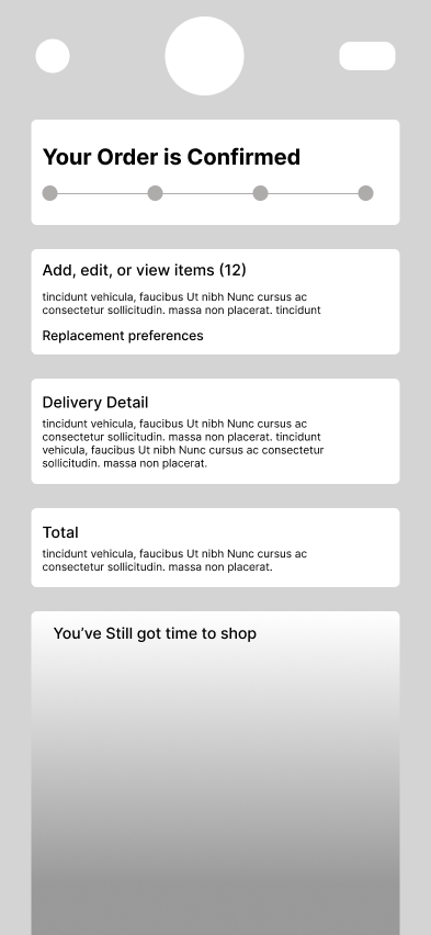
However, the page also contains redundant elements. The “Replacement Preferences” is linked to the “add, edit, or view items (x)” function, creating an unnecessary duplication of tasks. Users who only want to establish replacements can use the “Replacement Preferences”, but if they wish to go back to their items and edit/add others, they will need to enter another page through “add, edit, or view items (x)” function. This complex interaction increases a cognitive load and decreases learnability as it requires users to toy with the app more to establish its functionality. To simplify the process and increase ease of use, an alternative approach would be to combine the two functions into their own section, reducing repeated actions and allowing the user more control and freedom when editing orders.