Introduction
LibraryThing is a free book and movie cataloging website and app made specifically for personal and independent libraries. The application is praised for its simplicity, not using any library software to work and only requiring a username and password to begin. LibraryThing uses thousands of database systems like Library of Congress, Amazon, and public libraries.
1. Inability to Search Except by Book Title or Author
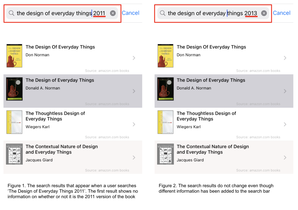
Users can easily add books to their catalog in two ways through the ‘Add to Catalog’ button on the Home page. They are either able to utilize the app’s search bar, which is located at the top of the screen and contains a small magnifying glass and text inside that reads ‘ Search for books to add’. Additionally, when a user clicks on the search bar, the app pulls up their keyboard. The signifiers and affordances of the search bar greatly increase discoverability and quickly show users what their first step should be in adding materials to their catalog. Another way to search is by clicking the barcode icon located on the right side of the search bar, which opens the user’s camera.
The issue arises once users find the book that they want to add to their catalog. Despite using thousands of library databases to build their own, LibraryThing does not contain every book and definitely doesn’t contain every edition or publication of a book. Searching for a specific book beyond just the title and author is impossible, as there’s no way for a user to input extra information like publication date, edition, etc. Even if a user tries to search with additional criteria in the search bar, search results do not change.
Solution
LibraryThing can fix this issue by adding a way for users to search using additional criteria. The app could implement a filter button, allowing users to input extra data like publisher information, publication date, and language. This CTA button would be most helpful if located next to the search bar and identifiable using the same icon as used with most library databases.
2. Option to Edit Metadata When Adding Books to Catalog
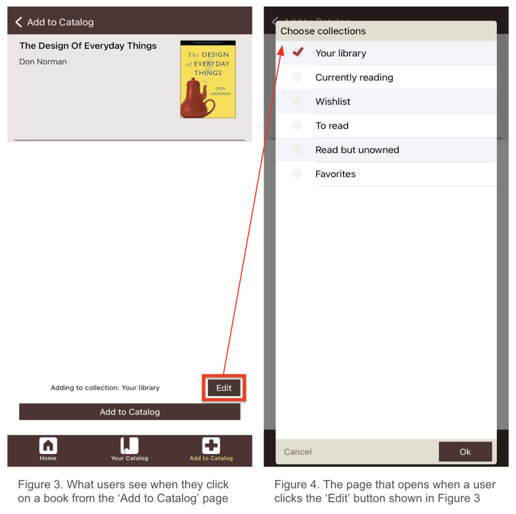
It isn’t until a book is added to a user’s catalog that they can see an item’s metadata. This not only makes searching for books difficult but makes adding a user’s exact book tedious. To edit metadata, users must go to the Your Catalog page, click on the book cover, and click ‘Edit Book’. This adds many extra steps to a problem that should be addressed when the book is first being added. Users should be able to edit a resource’s metadata as they are adding it to their catalog so the process is simplified.
When adding an item to their catalog from the Add to Catalog page, users are only presented with two buttons: ‘Add to Catalog’ and ‘Edit’. Users may think that the edit button will allow them to change the metadata of the book they’re adding, but clicking on it brings users to a new page that only allows them to change which collection their newly added book will be added to. Using signifiers like a basic ‘Edit’ button is especially confusing for users because a very similar button serves different functions depending on which page the user is accessing a book. Poor consistency throughout the app and bad signifiers means the user won’t know the effect of a CTA button, even if it seems straightforward.
Solution
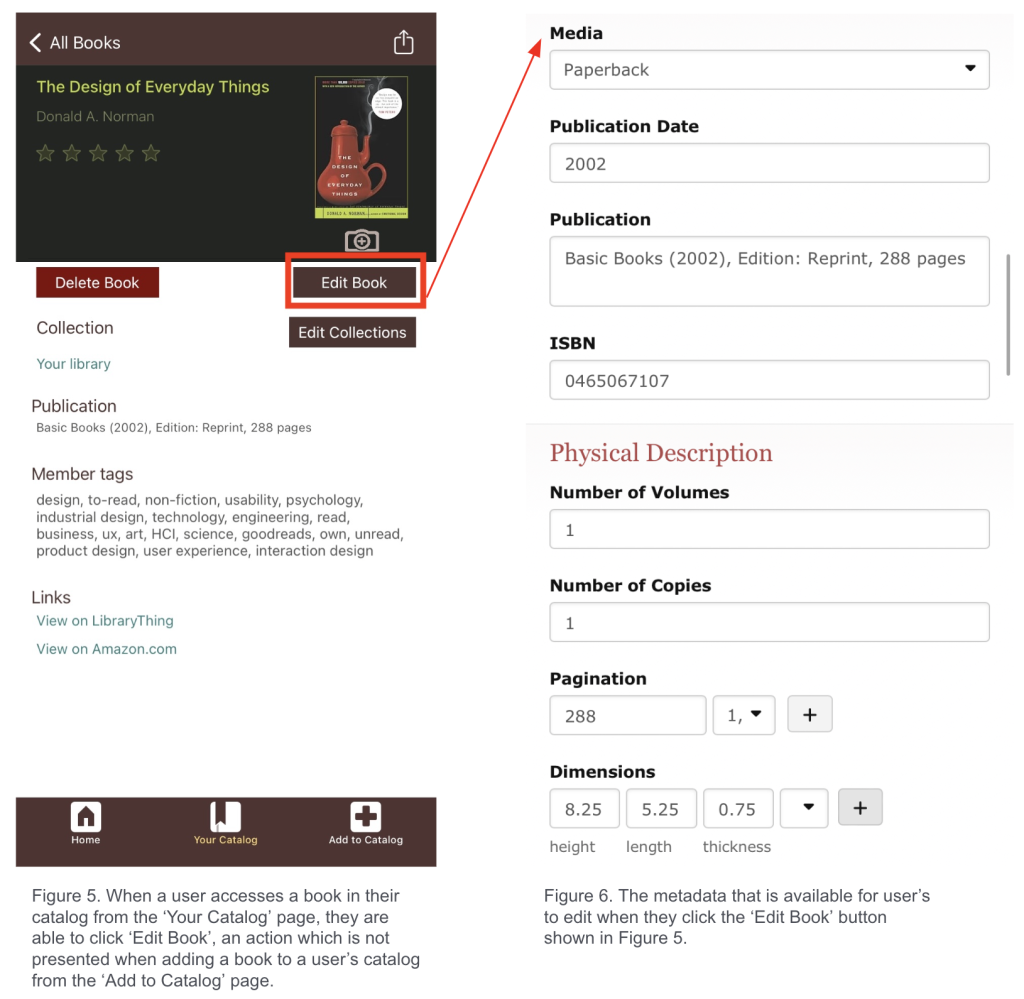
The easiest solution would be to allow users to click into a book from the Add to Catalog page to edit the metadata manually so that the book they’re recording in their digital catalog on LibraryThing exactly matches the physical book they own in real life. This would save multiple steps and save the user time. The process can look and function exactly as it does now, but the feature should be available when adding a book to a user’s catalog, not just after.
3. Inability to Add or Remove Collections
Each user profile comes with seven set collections that cannot be edited or deleted. Because LibraryThing advertises itself as a tool for independent and personal libraries, users may think collections can be personalized, which creates a disparity between the purpose of the app and how it functions and points to an issue with the app’s conceptual model.
Solution
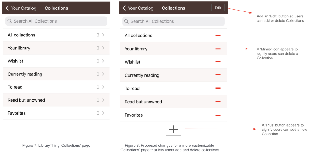
Solution: Add an ‘Edit’ button on the Collections page to allow users to add or delete collections. Once clicked, each collection could have a minus sign icon or some sort of signifier that lets the user know they can delete it. Additionally, adding a permanent plus sign button to the bottom of the page lets users know they can add custom collections.
Conclusion
LibraryThing is appealing because of its interface simplicity and use of clear signifiers and affordances. However, the inability to quickly or easily customize one’s catalog results in an overall small Gulf of Evaluation but large Gulf of Execution. The main benefit of the app is that it refrains from using or integrating complicated library systems or software, greatly reducing the learning curve for users.
