LiChess provides players with a refreshing free, ad-free, and open source online chess playing experience in a world full of capitalists commercializing everything. I have no doubt that every chess player adores it. Is the app providing the best experience possible, though? Let’s explore.
Before we go any further, I must confess, I’m not really into chess. That may seem like a odd start for someone who is going to critique a chess app, but I chose to see my lack of experience as an advantage. It allowed me to assess how well the app caters to beginners who aren’t familiar with chess competitors, jargon or industry specifics.
I will be approaching this app critique as someone who is a complete beginner to the online chess world. I will be referring to concepts from Design Of Everyday Things and How Artifacts Afford.
Gaining context
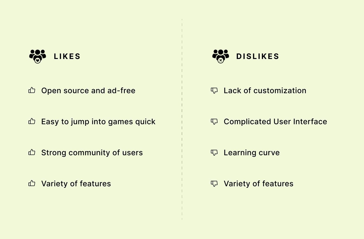
After exploring the entire interface and trying out several games (with 7 losses and just 1 win ;-;), I decided to dive into learning everything I could about the app and its community. I wanted to learn about their likes, dislikes, pain-points and what they would like LiChess to be. I went through reddit posts, LiChess, Chess.com forums, Play-store and app-store reviews. This helped me understand which user groups are enthusiastic about the app and which ones have difficulties.
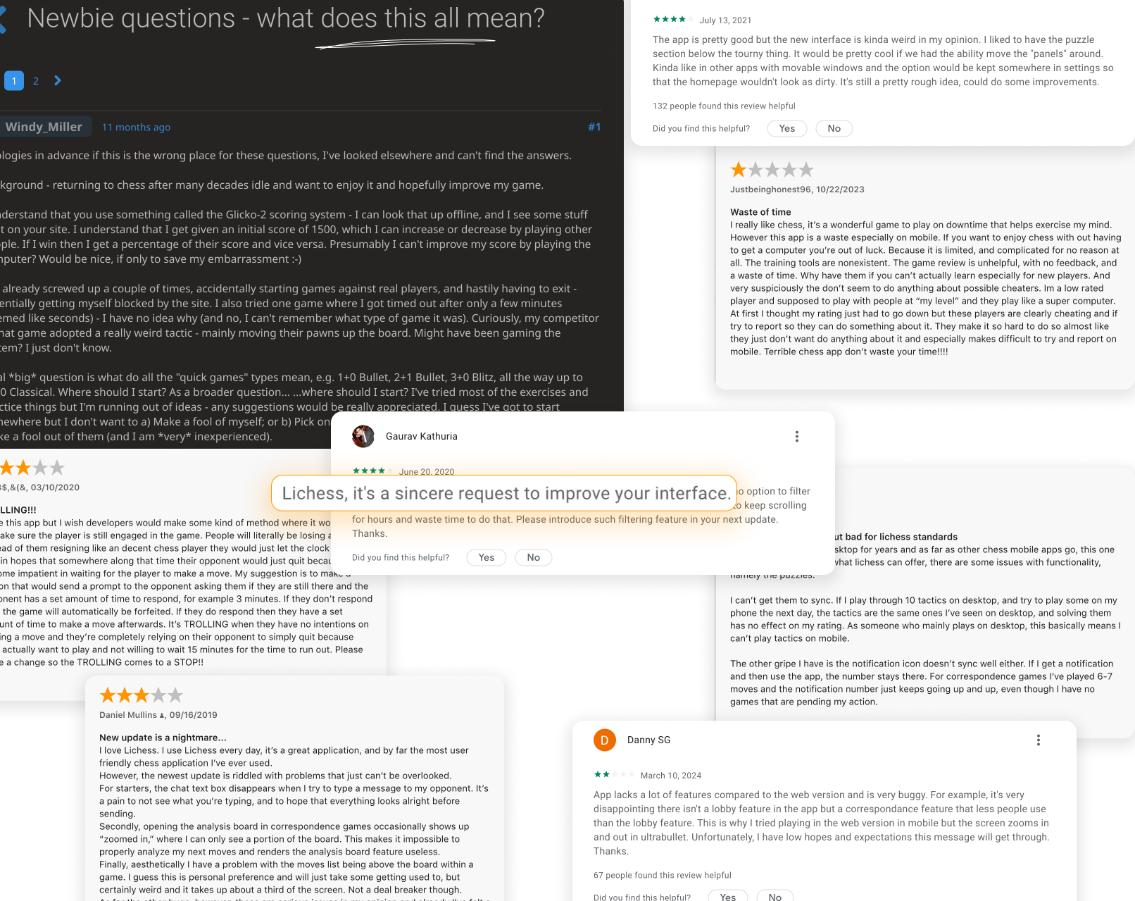
The majority of the app’s fans were serious online chess players who also consumed chess-related content and were avid online chess players. Those who knew chess but hadn’t kept up with twitch feeds, online chess interfaces, and other related stuff were the ones who struggled.
Now that I had a solid understanding of the app and it’s community, I was ready to begin my critique.
Analyzing flows
Now, using the context, we can analyze user-flows and make more accurate assumptions of what users would usually do as their tasks.
Upon first opening the app, the splash screen is shown and lasts for 2 seconds, the myriad of options and numbers going up and down after that clearly signifies the app is ready to be used and awaiting user’s action.
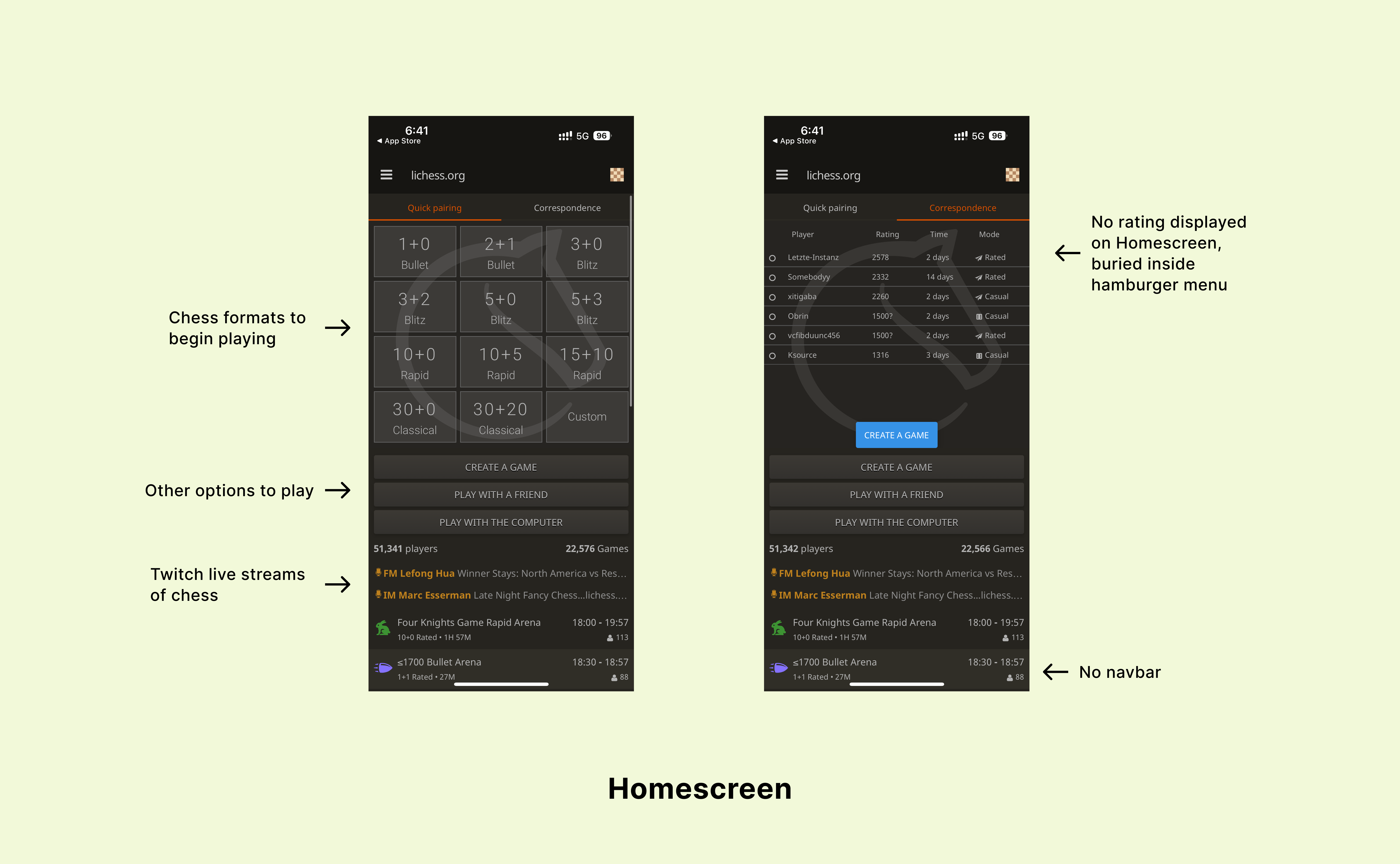
With twelve various ways to launch a game, it’s obvious that the home-screen’s primary encouraged action is to immerse the user in a game. However, a frequent problem is accidentally pressing one of these buttons while playing a game that lowers your rating—a factor that online chess players take great pride in. The existing pop-up box allows you to cancel and provides decent enough feedback when you join the game, but it doesn’t stay there for very long, and the cancel button isn’t a strong enough signifier in those panicked moments because it lacks colors or frames. The mapping of the play buttons to actually entering the game should be done in a smoother fashion without slips and mistakes, my proposed solution below adds a level of constraint that serves as healthy friction for the user.
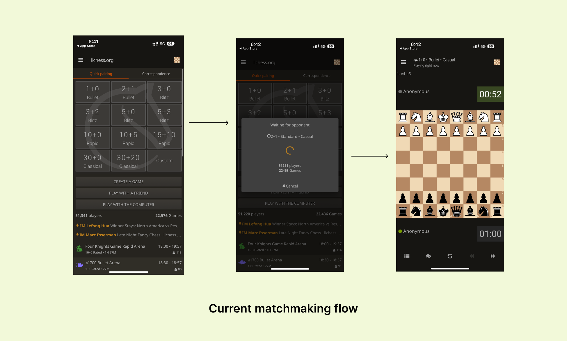
The buttons on the home screen currently provide a poor conceptual model of how the selected game mode operates; when I first opened the app, it wasn’t immediately clear what 1+0 meant. A great place to start when explaining the game’s rules to the user is the bottomsheet. Additionally, there is room for improvement in the home screen’s organization to enhance the discoverability of the numerous options for playing, watching live, and learning chess.
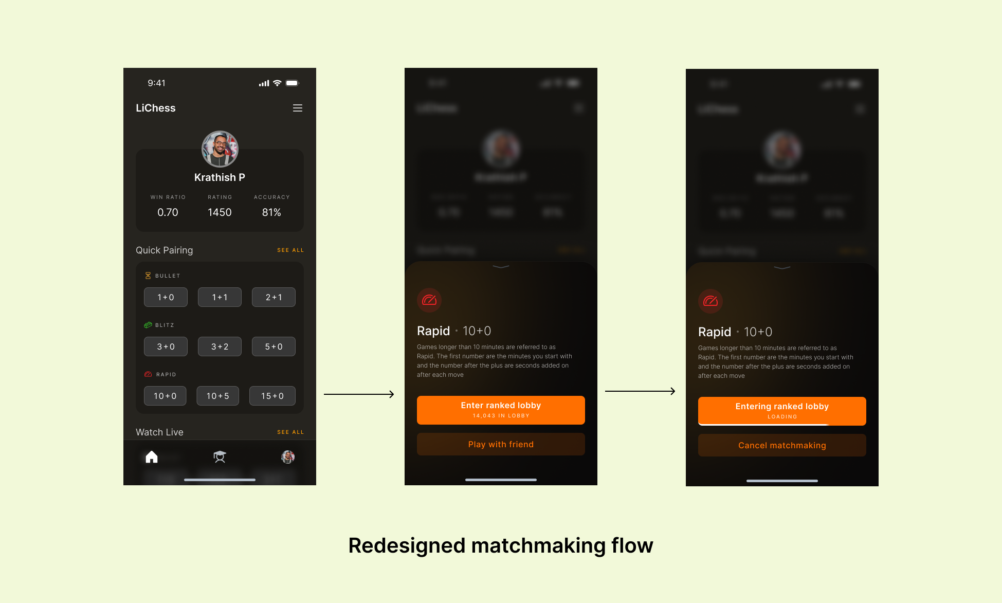
The solution offers a screen to review and learn what the game rules are and the strong colors and prominent frame are great signifiers to let the user they are entering the game and can cancel matchmaking. Matchmaking is also at the very least a 3 second process to let users cancel incase they don’t want to play. Organization on the homescreen increases discoverability and in turn reduces gulf of evaluation.
The chess rating determines your level in the game and who you match up against. Previously the rating was buried inside the hamburger screen. The solution brings out the rating to the main screen, which in turn serves as an encouraging affordance to the user to play more and increase their rating. The addition of a nav-bar helps filter out the different sections present in the app to broad sections of home/play, learn and profile.
Conclusion
To summarize, This design critique explored and implemented following opportunities for improvement:
- Increasing discoverability and reducing gulf of evaluation
- Building a stronger conceptual model
- Better and clear affordances
- Healthy constraint to allow for slips and mistakes
- Better mapping for matchmaking flow