Introduction
Mathison Insights is a consultancy that focuses on software engineering and data science contracts. The website’s main focus is to showcase what services are offered, the details of the LLC to do business, and an easy way for companies to contact the team for contract inquiries. Some additional information available is an “about us” page that introduces the team members, tells the user about the company’s core values, and gives a little background into the name of the consultancy.
Understanding the Target User
The target users for this webpage would be government organizations or software engineering managers within a company who are looking for specialists to tackle projects they are working on through a contract. There are a few codes and identifiers necessary to complete the paperwork necessary for contract work, so visibility of this information is important.
User Experience Problems
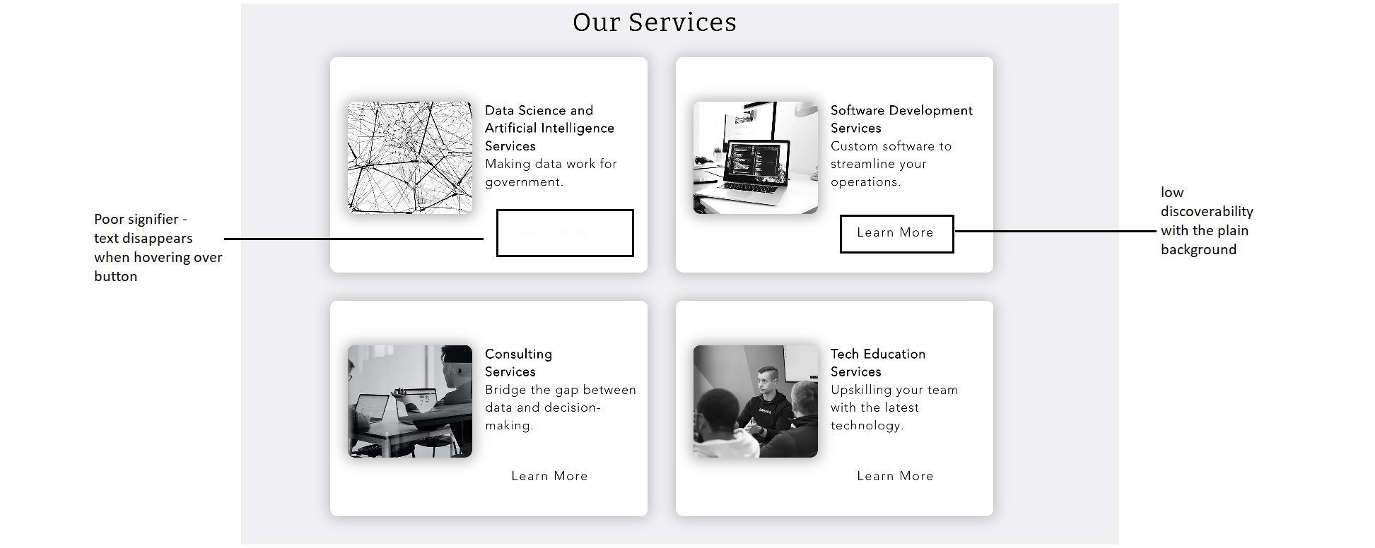
- The “Learn More” button
On the homepage of the site, four text boxes give a brief description of the different services available and have a link to “learn more” that takes you to a page with more detail. As you can see in Figure 1, the discoverability of the button was low since the background of the button was clear. In addition to this, there was a poor signifier when hovering over the button, because this caused the text to turn white, essentially making the text disappear
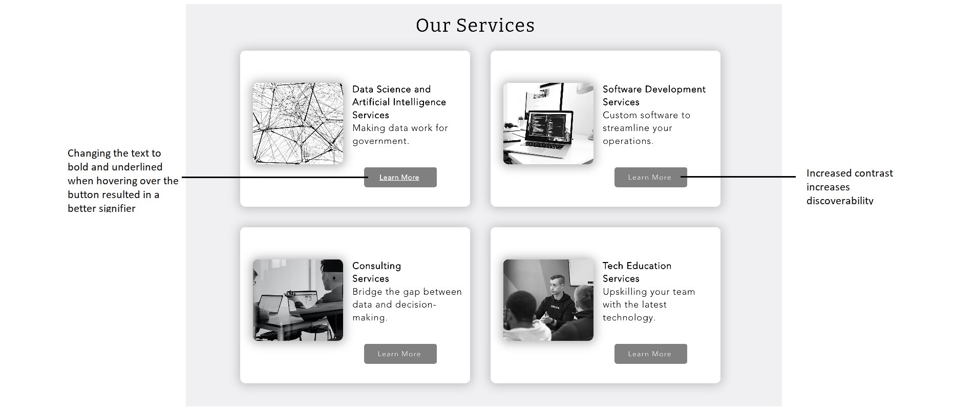
Solution: To increase discoverability, we added some contrast from the rest of the text in the box to the button by changing the background to grey. This also helps bridge the Gulf of Execution. To create a better signifier, we changed the text to turn bold and underlined when hovering over the button as you can see in Figure 2 below.
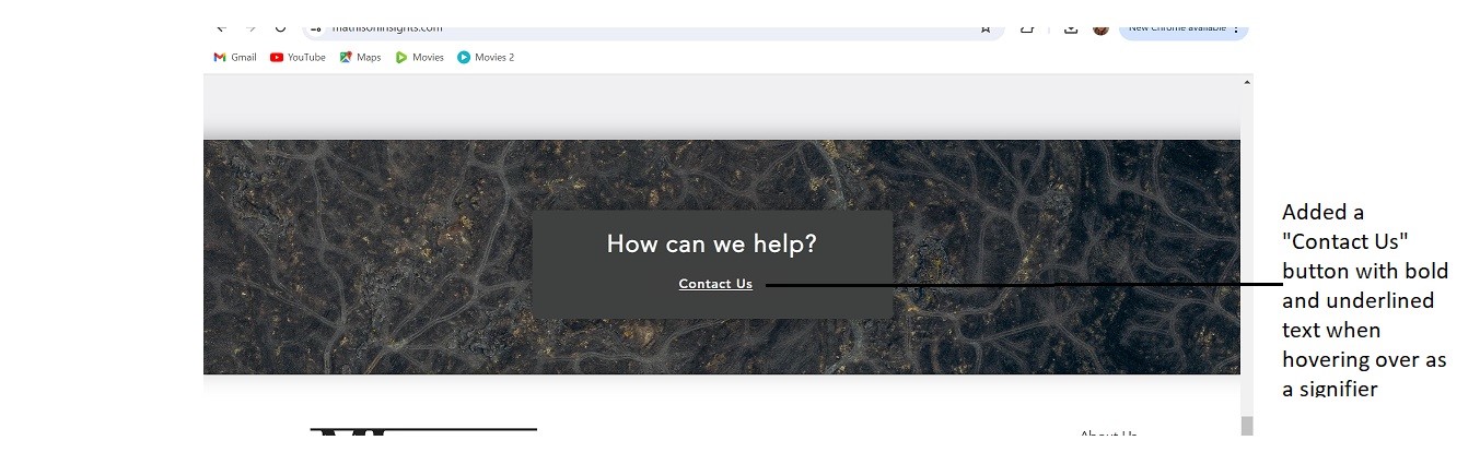
2. “Contact Us” link on Home Page
Originally, there was nowhere on the homepage for the user to contact the consultancy. The main goal of the website is for the target user – government organizations or software engineering managers – to reach out to the consultancy for contract work. Not having any method to do so within the home screen created poor affordance.
Solution: To fix this issue, we created a “contact us” button on the homepage. We made sure that this button has good signifiers by turning the text bold and underlined when hovering over it.
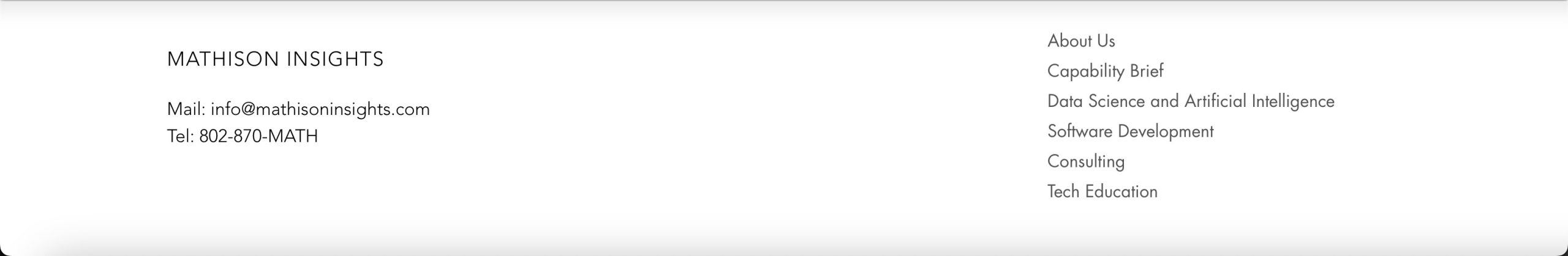
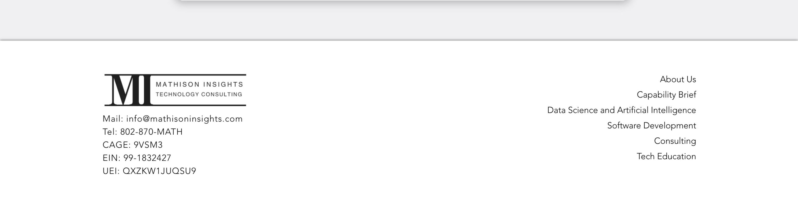
3. Footer
The footer is a key piece on a website where users can find information. If you can’t find what you’re looking for elsewhere, it typically functions as a backup option – it is a cultural convention. It was important for us to make sure the key components of requirement for a contract to be feasible were all available on the homepage.
Solution: The final pieces that were missing were the CAGE, EIN, and UEI codes, so we added those in to the footer, increasing visibility of this information. We also added the logo into the footer to streamline branding, and kept all the essential links on the right hand side.
Conclusion
While the main goal of Mathison Insights is pretty straightforward – acquiring contracts – there are still many factors that play a role in making sure the user experience when navigating the site is clear and concise. During this critique session, we focused on the main home page and made sure the affordance, discoverability, signifiers and visibility were all strong. By using Norman’s principles and making these tweaks, the information that is available will make it easier for the user to navigate the site to learn about the services and acquire all the necessary information to work with the consultancy.