Introducion
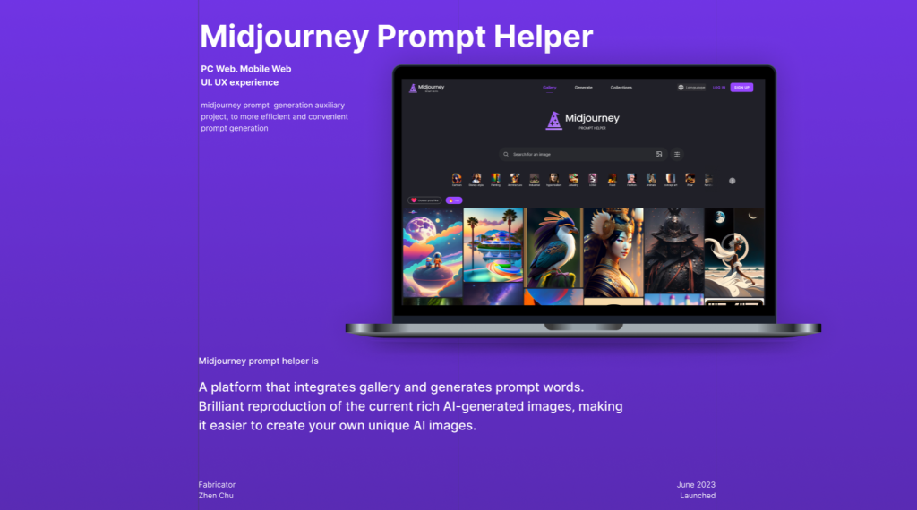
Midjourney prompt helper is a platform that integrates gallery and generates prompt words. Brilliant reproduction of the current rich AI-generated images, making it easier to create your own unique AI images. As a design student, I often use AI-generated image tools like Midjourney in my daily design work. They are very useful and interesting, but they are not easy to use. Therefore, I wonder if it is possible to design a tool that can make it easier to create AI pictures, so as to help more people experience the joy of AI creation and be skilled in using AI tools. This article will evaluate and analyze the Midjourney prompt helper product based on some of the usability factors mentioned in Don Norman’s book Designing Everyday Things, and how I addressed these issues to improve the user experience.
The process
After designing a version of the product, I organized several users to conduct usability tests on the product. I asked them to complete a particular task and observed their behavior. By observing the problems they encountered and their feedback, I found that there were some aspects of my product that were not easy for users to use.
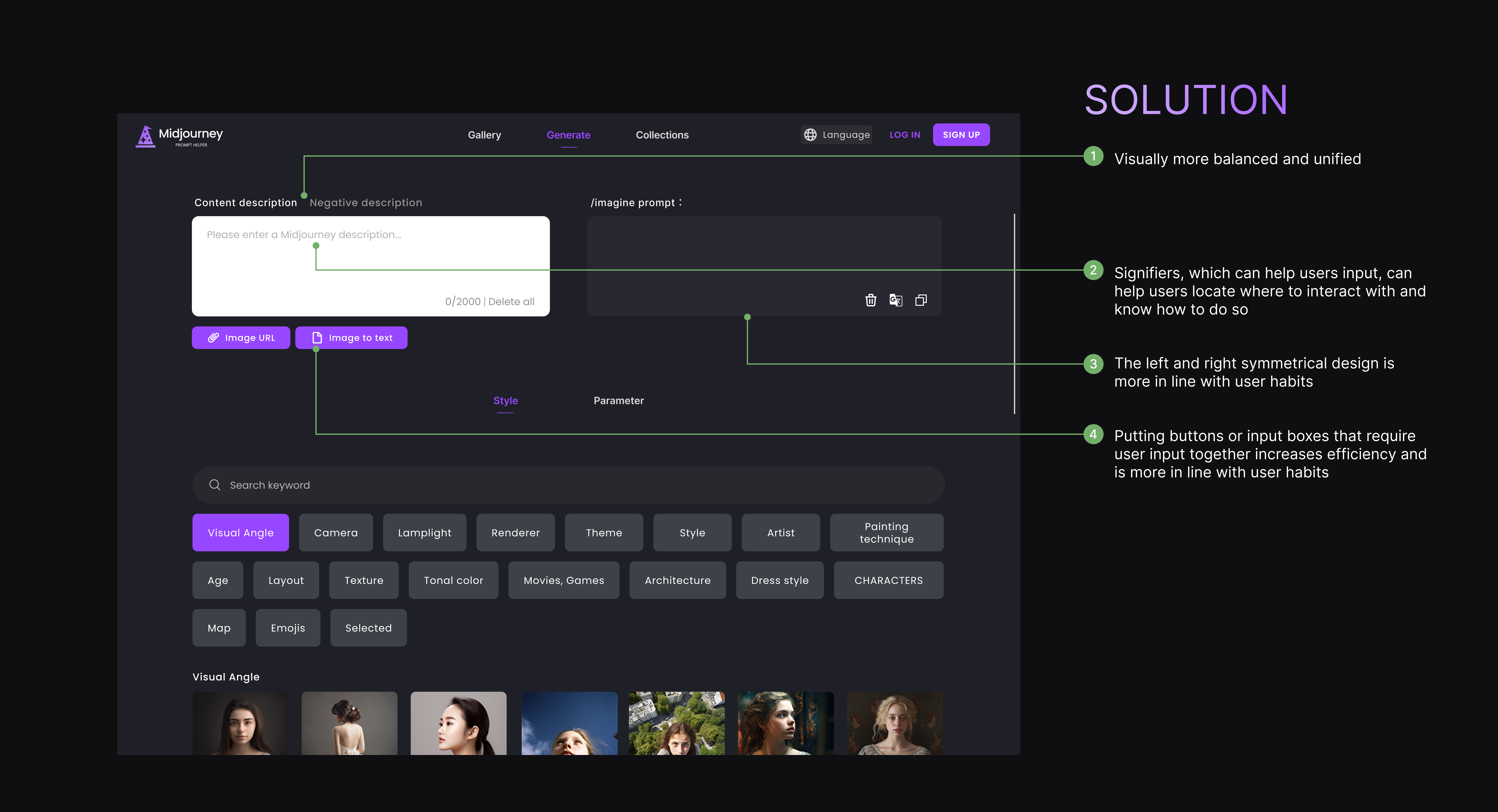
The purpose of this section is to allow users to write and modify prompt in the same place. Feel free to add and modify what your prompt needs, and be sure to generate content that the AI model can accurately recognize, The content description is to determine the elements and content needed to be included in the generated picture, while the negative description is to reduce or avoid certain elements and content in the generated picture.
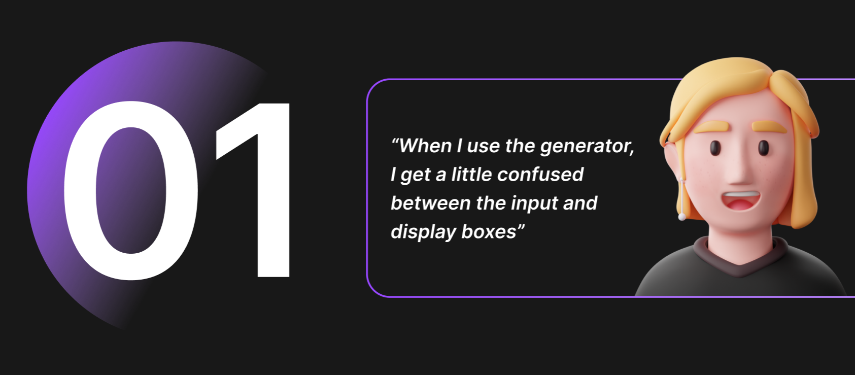
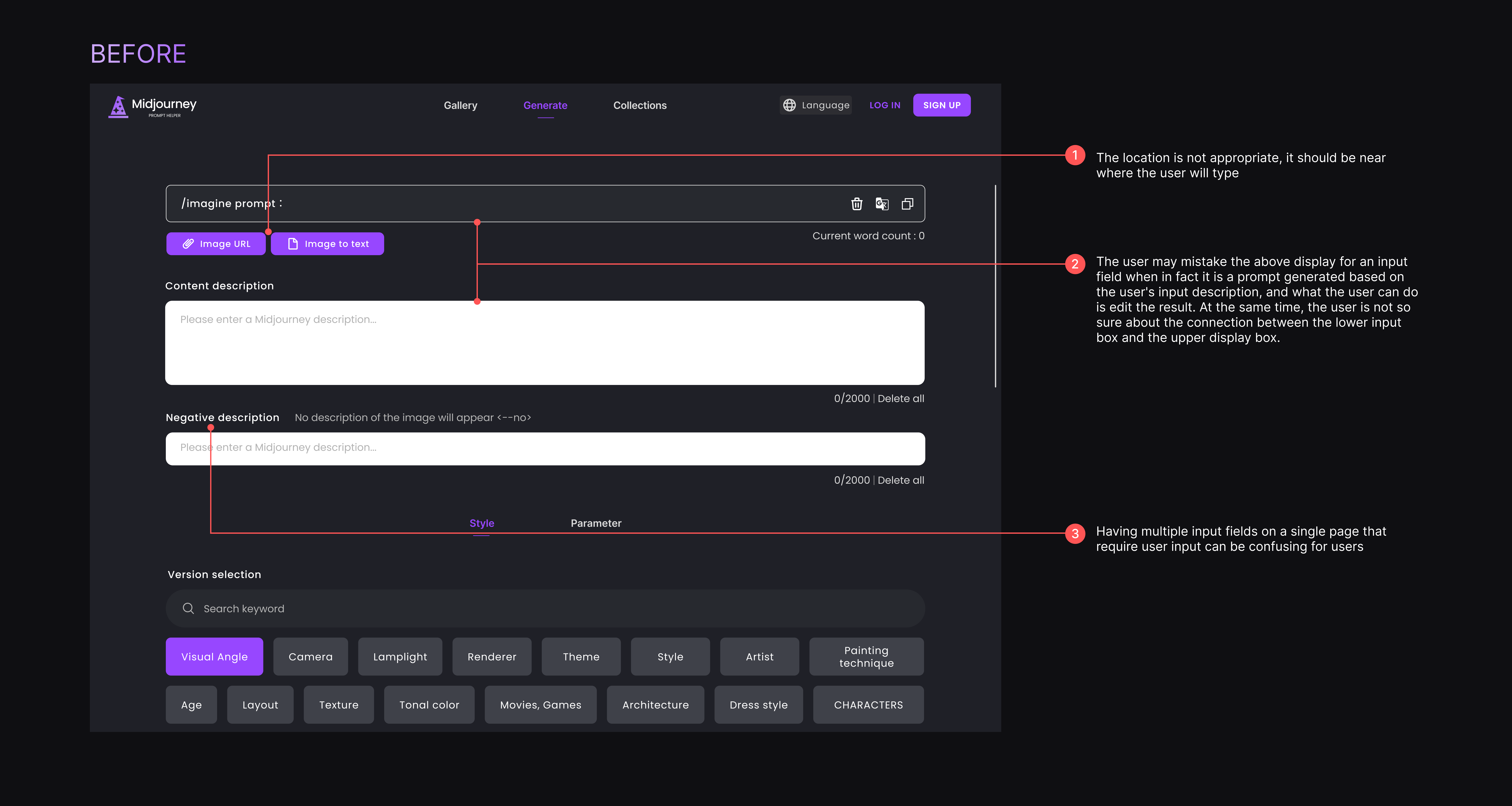
In the original design, the input field and clickable button positions were not grouped together, which was confusing for the user because the information was not clearly grouped. I wanted the user to enter the desired description as soon as they entered the page, but they were misled by the prompt at the top, thinking it was an input field. The user is worried about the presence of two input boxes at the same time, and in most cases, most users do not use the Negative description below.
SOLUTION
Grouping buttons and input fields into one section makes it easier for users to enter information so that they can distinguish between areas that need to be entered and results that can be edited. The input box and the display box are placed symmetrically on the left and right sides, so that the user can see the part that can be input in the first time, and the feedback on the right side will be more direct when the user enters the content. Folding Negative description into a clickable text button preserves functionality and optimizes the layout of the page.
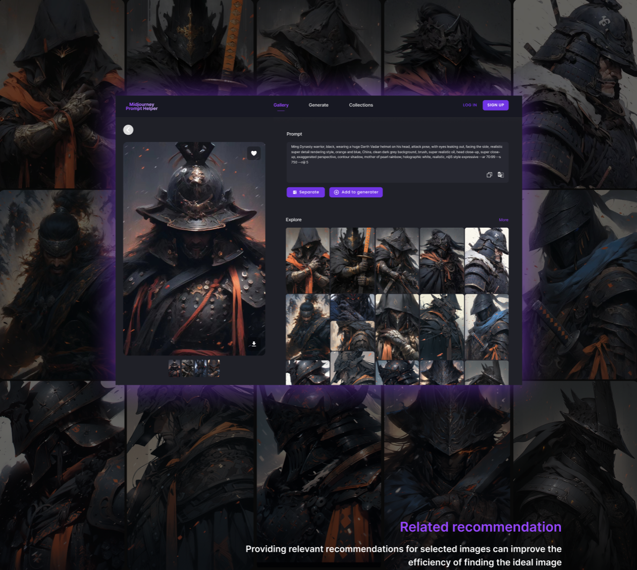
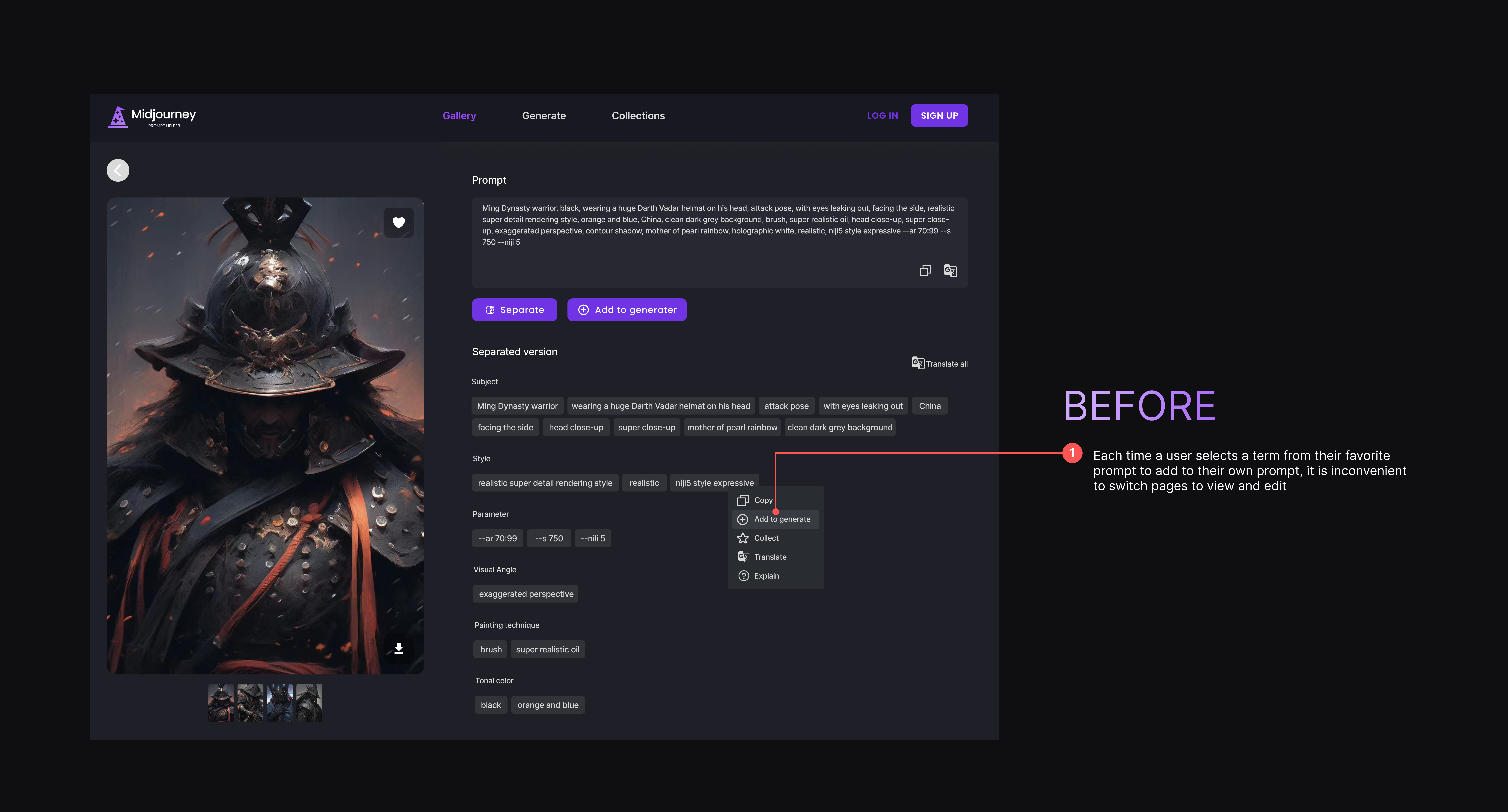
This page is used when the user finds a favorite AI-generated image in the gallery and wants to extract the term from it. In the original design, after adding a term, the user needs to go to the Generate page to see the term and edit it
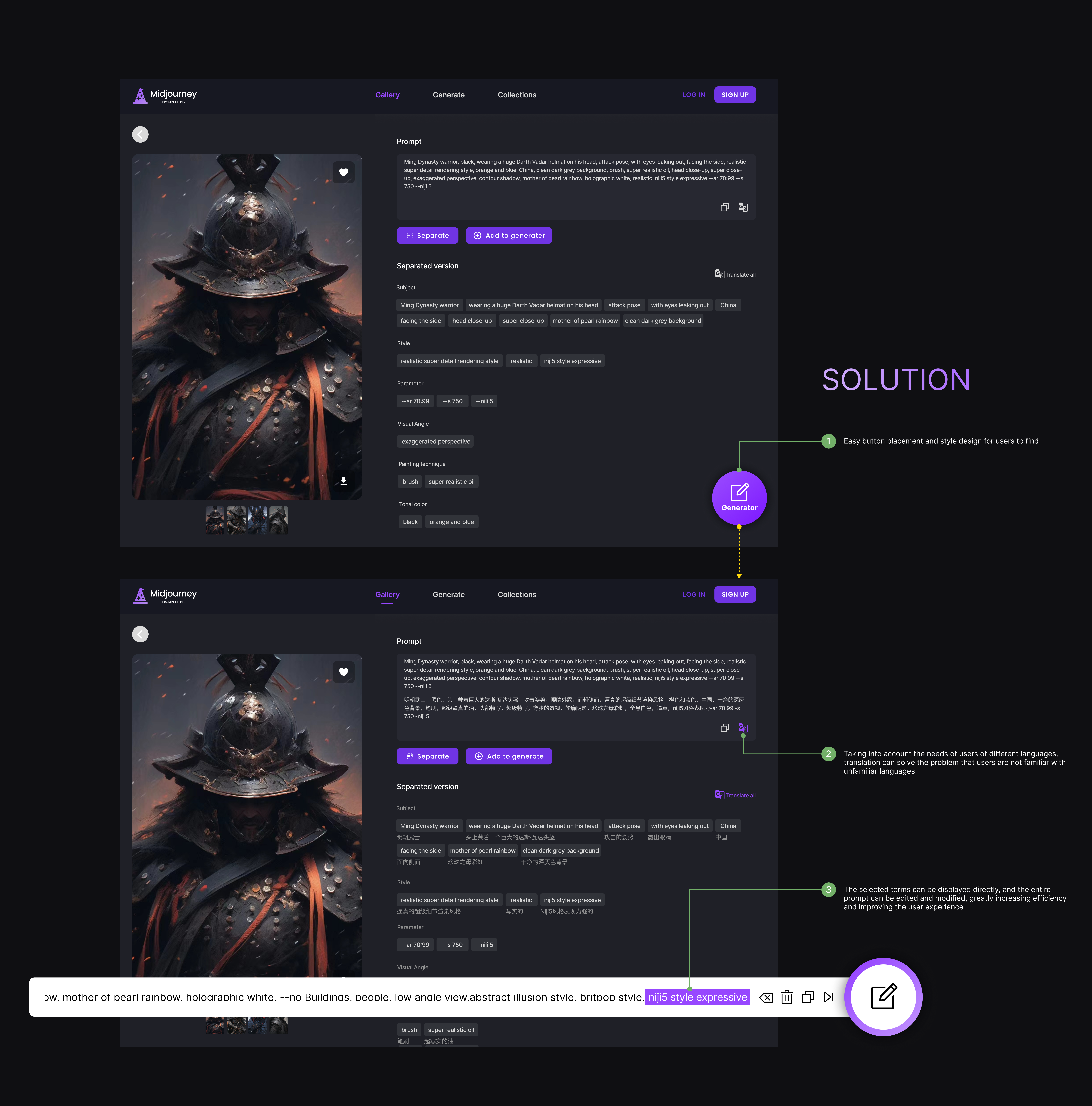
SOLUTION
Obviously, this approach does not make The user feel convenient, and also violates the user-centered Design principle mentioned by Norman in The Design of Everday Things. It does not consider the ultimate goal of the user after completing the operation, which leads to the user feeling lost and at a loss. My solution is to design a floating button in the same page, so that the user can easily find and know its purpose, and then click it to bring up an editable floating window that allows the user to see the newly added term, and edit this prompt without switching pages. Because it really affects efficiency and leads to a bad experience.
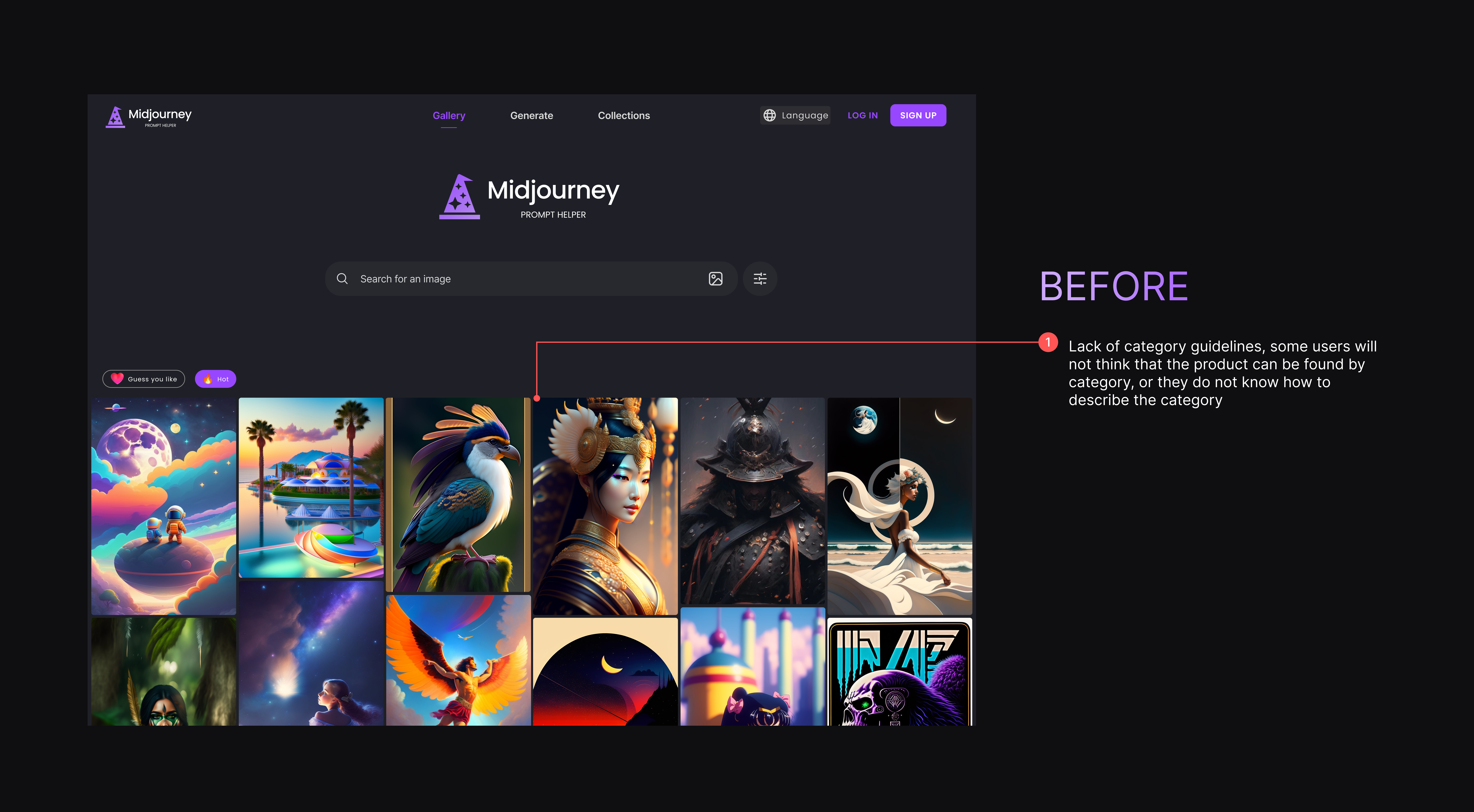
On the home page, the original design had a search box and a section showing recommended images, which I thought would allow users to quickly browse their favorite images or search for the images they wanted. However, in the process of user testing, I found that there was a Lack of category guidelines, some users will not think that the product can be found by category, or they do not know how to describe the category
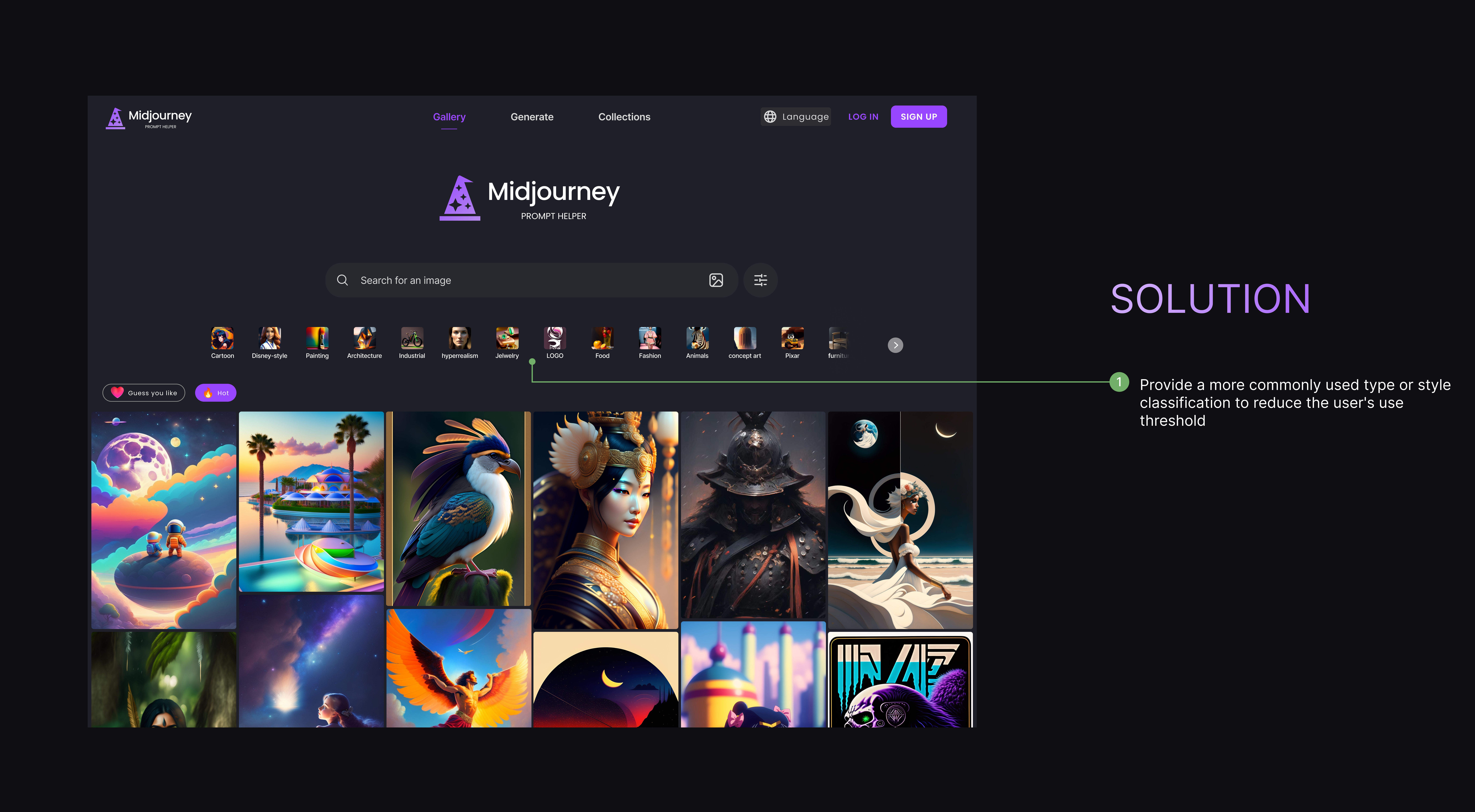
SOLUTION
My solution was to create a categorised list on the home page that would give users better guidance and inspiration when they were looking for certain types of images. This not only allows users to better use the functions of the product, but also speeds up the user’s understanding of the functions of the product
