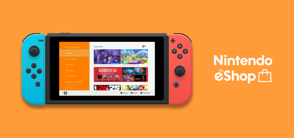
The Nintendo Switch is a video game console developed by Nintendo that allows users to dock the device for home-console play or to be played as a handheld device. Users can buy and download games for their Nintendo Switch through the in-device application, “Nintendo eShop”. The eShop acts as a storefront that helps users browse, search, and purchase various Nintendo Switch games directly to their device.
7 Years Since Launch, Is it Time for a Switch-Up?
I will be evaluating and critiquing the design of the Nintendo eShop’s digital interface, now 7 years since its initial release in 2017. For this evaluation, I attempted to purchase two games from the eShop. One found by using the search function, and the other found by browsing. All design evaluations were done following Don Norman’s design and usability principles as defined in his book, “The Design of Everyday Things” (2013).
Of the many features and pages that caught my eye, the 3 Major Design Attributes that stood out to me during the user journey and thus will be covering are as follows:
- Reduce friction to search and browse games
- Minimize user errors on Product Details page
- Help users find and access their Wish List
1. Reduce friction to search and browse games
Upon entering the Nintendo eShop application, users land on the “Featured” page and are offered a main navigation bar. The bar shows multiple pages that suggest many different ways for users to start their browse. It is helpful to show users various categories of featured games like new releases and popular sellers, but can feel overwhelming for first-time searchers.
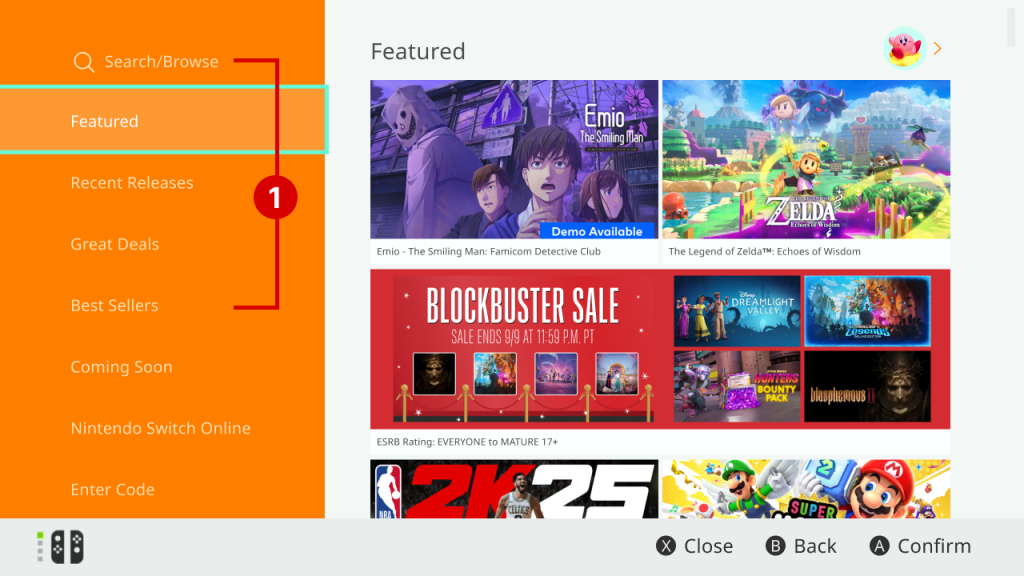
Problem 1.1: Navigation bar has too many overlapping signifiers that compete for user’s attention
- Users faced with multiple signifiers for multiple, yet similar, browsing options: “Recent Releases”, “Best Sellers”, “Great Deals”, and “Search/Browse”
- Overwhelmed by many similar choices, users face a Gulf of Execution, trying to figure out which one is the right place to start browsing
- Signifiers can help bridge that gulf, but having too many overlapping signifiers can ultimately confuse the user
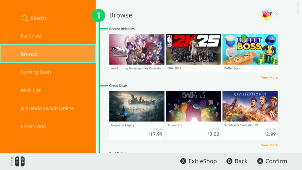
Solution 1.1: Consolidate the various browse-similar pages into one page
- Under one page titled “Browse”, users can look through the different categories previously kept under the main navigation bar.
- Main navigation bar now has one signifier that clearly indicates to the user where they should go if they want to browse through available games.
- “Search/Browse” page has also been edited to “Search” to avoid description-similarity slips due to both signifiers having the word “Browse”
Problem 1.1
Solution 1.1
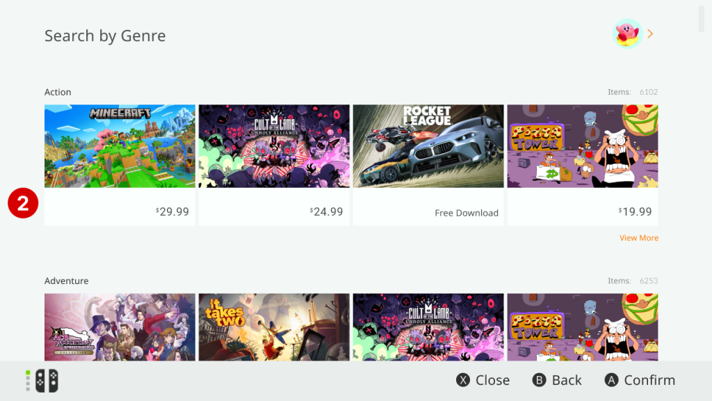
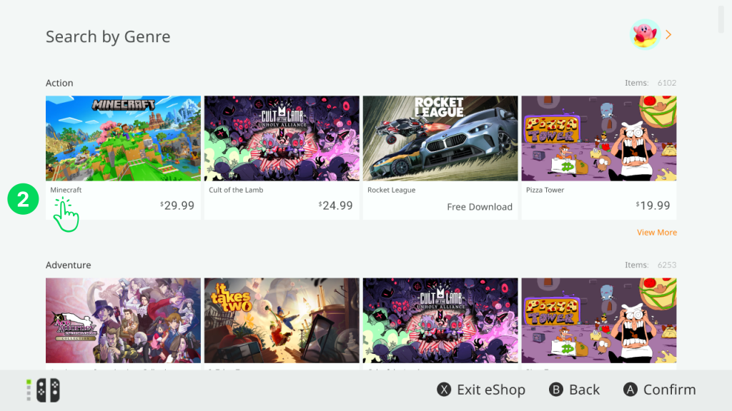
Problem 1.2: Missing text for game titles
- When the user is browsing games, there is no text stating the title of the games being shown.
- User is forced to rely on identifying the available games by their corresponding photo, whose text is also often illegible.
- Not including the game titles makes viewing what games are available less discoverable to users, especially if they are browsing for new, unfamiliar games.
Solution 1.2: Add game titles in text to every game listing
- Adding text stating each game’s title informs users about what game they are currently looking at
- With price text, creates a digital affordance that indicates user is looking at a purchasable product that can be bought (by further tapping in)
- Also acts as a signifier that tells user to tap on game’s title to be taken to game’s detail and purchasing page
- Follows digital e-commerce design standards
Problem 1.2
Solution 1.2
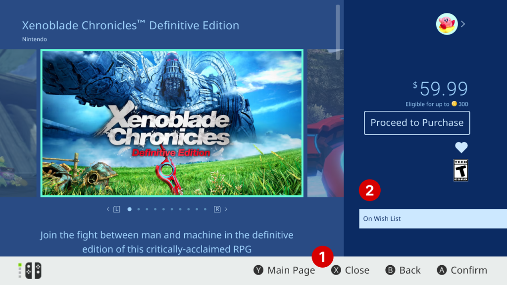
2. Minimize user errors on Product Details page
By tapping on a game, users are taken to another page that gives more details about the game. This page also allows users to start purchasing the game or to add the game to their “Wish List” by tapping on the heart icon.
Problem 2.1: Ambiguous wording of signifiers create unclear affordances
- User is presented with two affordances with similarly ambiguous signifiers in the form of the text labels: “Close” and “Back”
- If user wants to return to the previous page, they will wonder what’s the difference and are prone to description-similarity slips, as I was.
- I chose “Close” thinking it would close the product details page and take me back to the eShop’s home page, but I was surprised it tried to close the eShop application entirely instead.
Solution 2.1: Make signifiers distinctly different from each other
- By changing word choice or adding words for context, we can clarify what each affordance’s exact action is and reduce room for errors.
- Change 1: “Close” → “Exit eShop”
- Change 2: “Main Page” → “eShop Home”
- Note: “eShop Home” was used to not confuse with “Home” which refers to the Nintendo Switch console home page
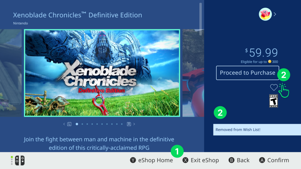
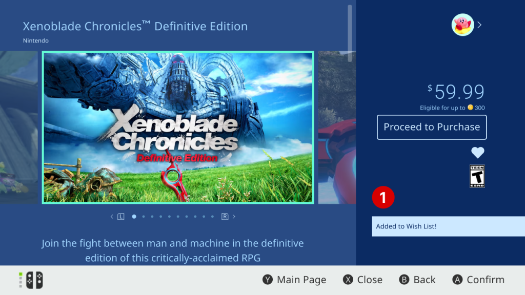
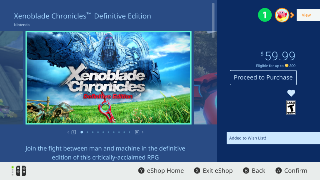
Problem 2.2: Poor feedback when interacting with heart “Wish List” button
- Correctly fires feedback message “Added to Wish List!” to let user know they successfully added a game to their “Wish List”
- If user tapped the heart icon by mistake, user cannot undo their action or remove the game from the Wish List
- If try tapping again, user is given delayed and uninformative feedback in the form of a single message that says “On Wish List”
- The feedback didn’t respond until my fourth tap, so I was left in a Gulf of Evaluation wondering if I had missed the button. By the time I received the feedback, I ended up wrongly interpreting that I had accidentally removed and re-added the game to my Wish List. Because of this poor feedback, users won’t recognize that removal is not a possible action.
Solution 2.2: Improve feedback & make an ‘undo’ for unwanted actions
- Make it possible for users to undo adding a game to their Wish List by tapping the heart icon again
- Add corresponding feedback message for successful removal stating “Removed from Wish List!”
- Not providing an ‘undo’ for users to quickly correct unwanted actions violates other usability Heuristics
- Violates Heuristic #3: “User Control and Freedom” from Jakob Nielsen’s “10 Usability Heuristics for User Interface Design”
- Reduce delay of feedback response time to immediately bridge users’ Gulf of Evaluation
Problems 2.1 & 2.2
Solutions 2.1 & 2.2
3. Help users find and access their Wish List
The Nintendo eShop does not have a shopping cart feature or page despite being a digital storefront. Therefore, users may elect to use the “Wish List” page as a makeshift shopping cart instead, where they can add multiple games to a list for purchase or to save for future purchases.
Problem 3.1: No signifier about where to access Wish List
- When user adds a game to the Wish List, the user is given good feedback that their action was successful.
- However, the user is given no signifier that indicates where to access their Wish List page.
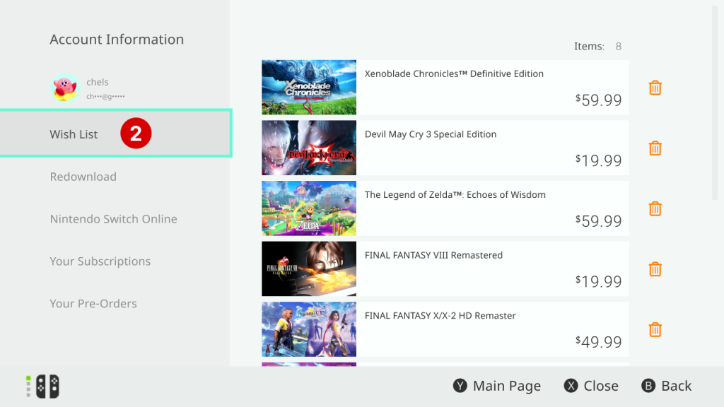
- After searching through multiple pages, I eventually found the Wish List page by tapping on the user profile icon and selecting “Wish List” from the navigation inside the “Account Information” page.
Solution 3.1: Create signifiers to clearly indicate Wish List page’s location
- Feedback “Added to Wish List” should offer prompt “View” for user to tap and be directly taken to their Wish List page
- Needs a signifier that draws user’s attention to tap on their profile icon to open their Account Information page
- Idea 1 (shown in image): Additional feedback highlighting profile icon when user successfully adds game to their Wish List
- Idea 2: After adding to Wish List, small motion animation of file getting put or saved into profile icon
- These are suggested solutions for if Wish List page were to remain inside the Account Information page; however an even better overall solution exists as detailed below in Solution 3.2.
Problem 3.1
Solution 3.1
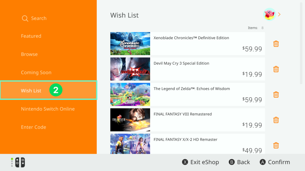
Problem 3.2: Wish List page is not easily discoverable
- Even if user returns to eShop’s home page, there is still no clear signifier about where to access “Wish List” upon opening the app.
- Not making the Wish List page available from the home navigation puts the burden on users to memorize how to access it from a different inner navigation
- Forcing users to store and recall this procedure in their long-term memory (LTM) can lead to memory-lapse errors and frustration when time has passed between visits to the eShop
- “I forgot from last time, where was the Wish List again?”
Solution 3.2: Add Wish List page to main navigation bar on eShop home page
- Adding the Wish List page to the home navigation bar on the eShop home page creates a more visible signifier
- Enhances the Wish List page’s overall discoverability since users will immediately see the navigation bar when opening the eShop for the first time
- Especially important for a page users will frequent as part of the main user flow of purchasing games
Problem 3.2
Solution 3.2
Conclusion
Using the Nintendo eShop application, I was able to successfully view and (mock) purchase 2 games. Although the eShop does successfully guide users through the primary user flow of searching and purchasing Nintendo Switch games, there is still much room to improve in its designs. By adding clearer signifiers and feedback to improve the discoverability of its major attributes, the Nintendo eShop will be able to enhance users’ overall experience and satisfaction with purchasing games from their storefront.
Author’s Note: Because the Nintendo Switch doesn’t support taking screen captures inside the Nintendo eShop application, all design mockups were recreated using Figma with as much accuracy as humanly possible.