Notability is a note-taking iPad app. It has a simple interface with smooth interactions. The app allows users to log in and start writing down their thoughts (either using the Apple pencil or typing manually). There is also an option to customize the notebook cover (like choosing a style for the book cover). This is to mimic the aesthetics and functionality of a real notebook as closely as possible.
It combines writing, drawing, typing, and audio recording into a single interface. It also supports syncing across devices via iCloud, Google Drive, or Dropbox, ensuring easy access to notes from multiple platforms. Students, professionals, and educators widely use it for tasks like taking lecture notes, annotating PDFs, and organizing information.
One fine day, I found myself instinctively tapping on a physical notebook because I made a mistake and was hoping to undo. The gestures from notability, procreate etc. have created such a natural association in my head that I found the mental model strongly etched in my real life (especially for an idea that is relatively new).
Landing page
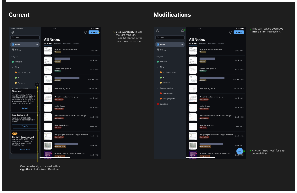
The discoverability of the “New” call to action is, I believe, intentionally well-placed. As a returning user, I was shown the home page with multiple previous notes I had left behind. I was getting bombarded with the notifications on the bottom left which was disorienting at first. Below are recommendations to improve the experience upon landing on this page.
Gallery tab
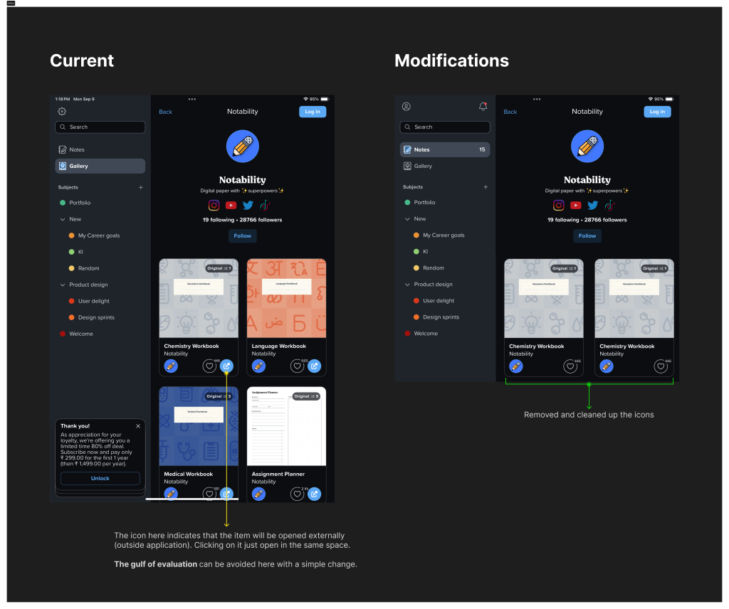
Gallery offers a ton of templates and themes for people to use. All of them come with pre-designed lines and notebook styles. Although the UI is clean and crisp, the icon mapping for the “external link” is confusing because clicking on the card opens the template in the same application.
Note taking experience
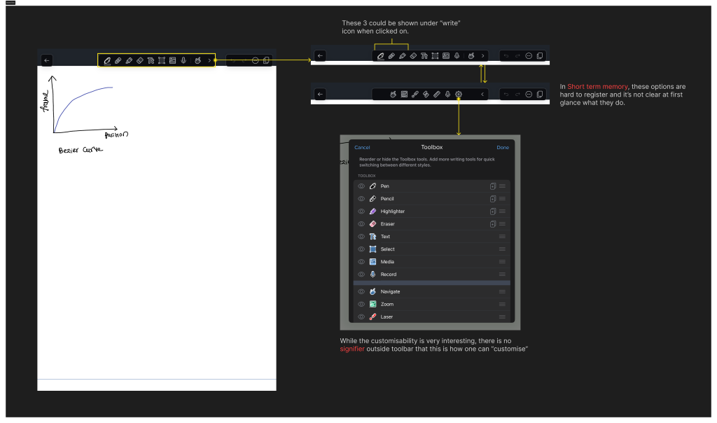
The creation of a new note is extremely seamless in notability. The pencil-touch response is accurate for people who prefer to handwrite. As a returning user, I found it difficult to recollect what the toolbar options meant. The ability to edit the toolbar is not easily discoverable (I stumbled upon it during research without having discovered it sooner).
Below is the note-taking product flow followed by ways to improve it.
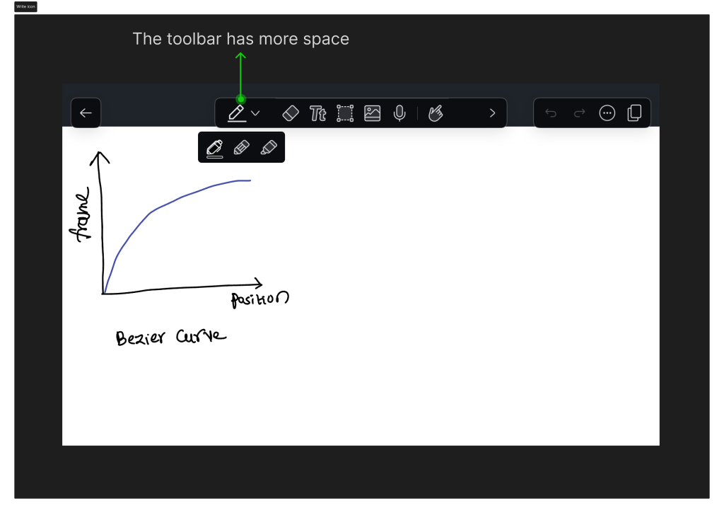
The modified toolbar includes a main icon with nested “write” options.
When clicking on the “three dotted” icon, a small overlay opens with multiple share options and note-settings. At this point, there are two exact icons with different functionality (as mentioned below).
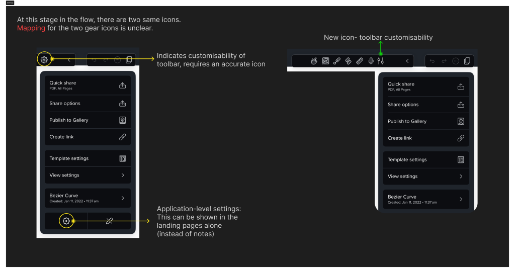
The customizability icon is modified to better indicate that the icons in the toolbar can be edited. The “settings” from within the notes menu are not of absolute importance as users might not take application-level action inside individual notes.
Profile/settings
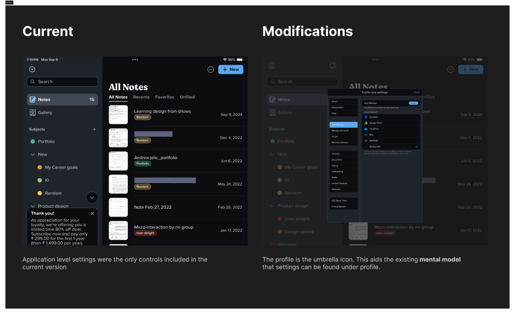
I am utilizing the existing mental model for where users look for settings. It is usually found nested under a bigger umbrella option like “Profile”. Following this also helps group information in one place.
Conclusion
Notability is praised for its intuitive interface, rich feature set, and flexibility in combining different types of input (text, audio, images) into one seamless experience, making it ideal for digital note-taking and organization. Given its dominance in the market, these usability improvements can enhance the product even further.

