I depend quite heavily on the NJ Transit app to commute within New Jersey and to the city. As a frequent user of the app, I’ve encountered many frustrations that I thought would be great to dissect for this assignment, using Norman’s design principles.
1. Discoverability
Discoverability is a principle that ensures users can easily find the available actions within an interface. The NJ Transit app lacks in this aspect due to poorly organized labeling, presentation, and menu hierarchy.
Upon opening the app, users are presented with an array of menus and tabs without a clear hierarchy, which make finding essential features difficult.
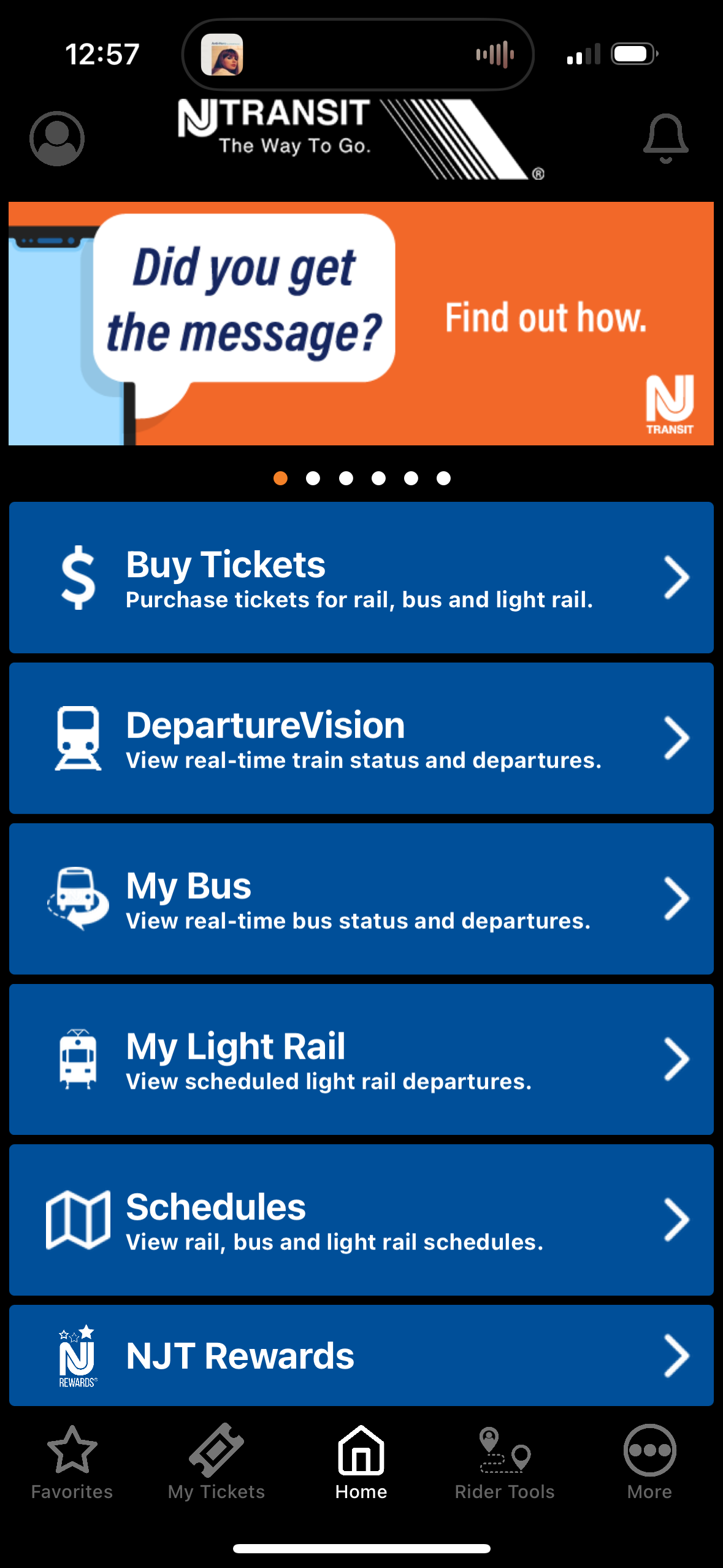
While the label names seem straight forward enough at first glance, the heirarchy is unclear and poorly organized, hindering the user from navigating effectively to complete simple tasks
A further look into the features reveal that the menu obscures basic tasks like ticket purchasing and schedule viewing, making the experience difficult to navigate for first-time users, especially those unfamiliar with the transit system.
The NJ Transit app’s features like “Departure Vision,” “My Bus,” and “My Light Rail” fail to effectively distinguish themselves as unique tools for each transportation mode. For example, the title “Departure Vision” provides no clear indication that this feature is specifically for trains or that it offers real-time train status information. This lack of clarity confuses users who might not immediately understand the purpose of the feature.
Similarly, “My Bus” follows a naming convention that suggests it functions like “My Light Rail,” yet the two features operate differently. While “My Bus” displays real-time status, “My Light Rail” does not, despite having a similar name. This inconsistency in labeling and functionality across the app leads to a disjointed user experience, making it difficult for users to quickly grasp the purpose and benefits of each feature. Clearer labeling and a more consistent approach to naming and feature functionality would greatly enhance usability and overall discoverability.
2. Conceptual Model
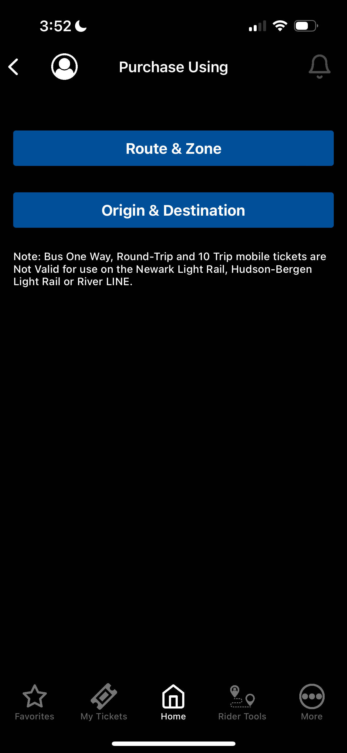
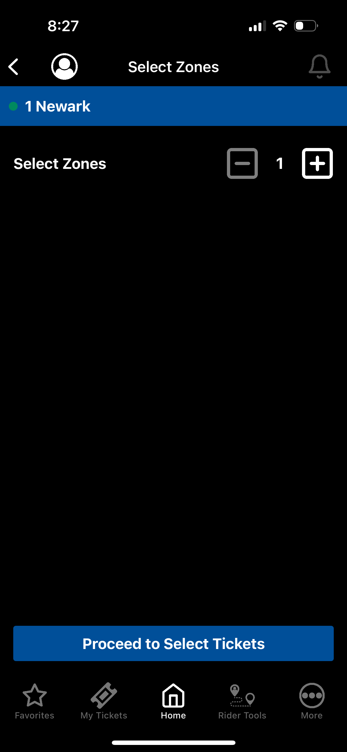
Buying a bus ticket requires navigating through confusing choices such as “Route & Zone” or “Origin & Destination,” which are unclear to new users. There is no information or descriptions indicating what “zone” means, or how it will affect the pricing.
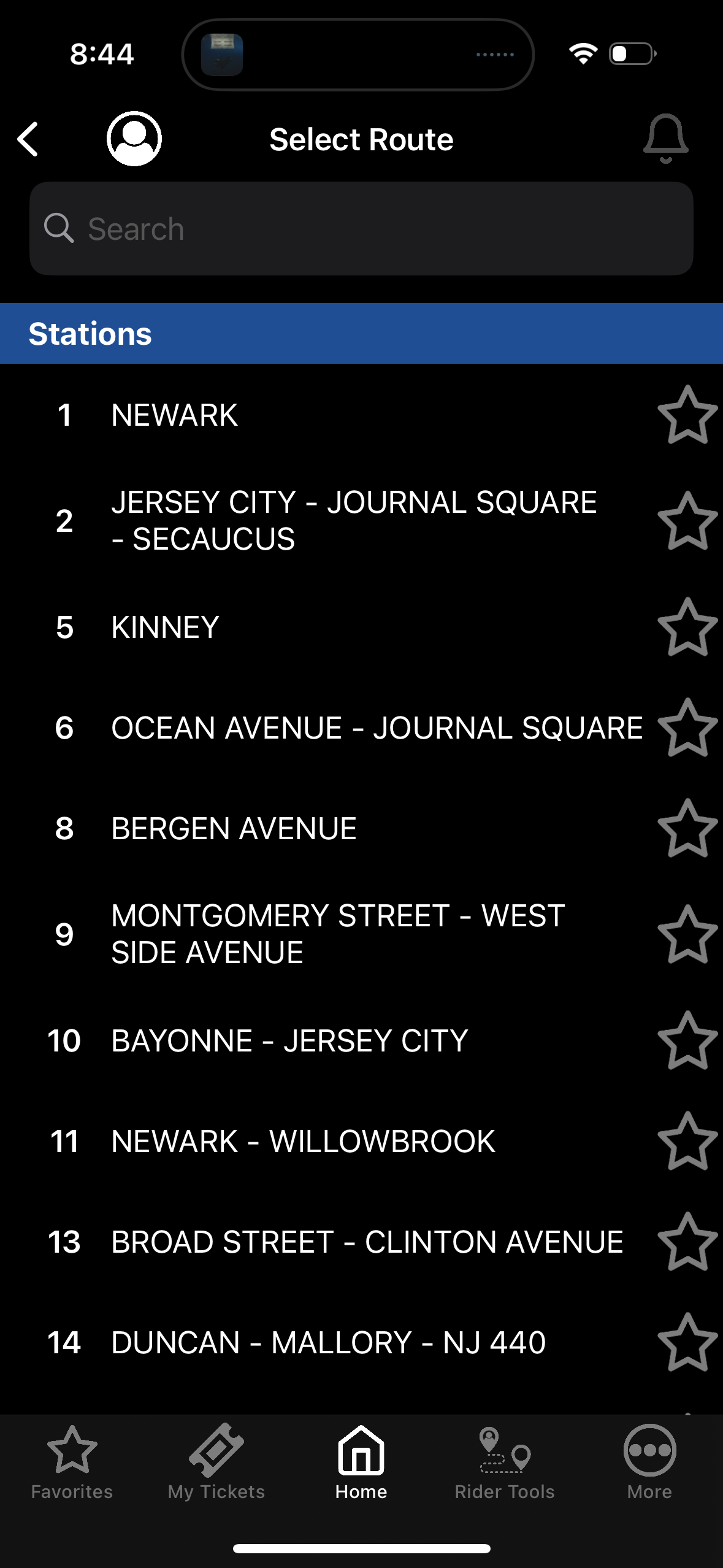
While the current design of the NJ Transit app caters to the mental models of experienced commuters who are already familiar with stop names and locations, it creates challenges for travelers and newcomers who may struggle to navigate the interface. Presenting all available stops in a list format can be overwhelming for those unfamiliar with the transit system.
The lack of a “map” or “search location” function further complicates the experience by preventing users from visualizing their journey or confirming that they are at the correct stops. This omission forces users to rely on external map apps, such as Google Maps, to find their way—leading to potential errors, confusion, and frustration as they manually transfer information between apps. Enhancing the app with integrated mapping and search functionality would greatly improve the overall usability and reduce the cognitive load on new users, creating a more seamless and reliable experience.
The trip planner also falls short, offering convoluted route suggestions that are often impractical, like taking a train to a bus to another train. These design choices force users into a trial-and-error approach, making the app feel more like a guessing game than a tool designed to help commuters.
2. Feedback
Feedback is crucial in helping users understand what’s happening after they take an action, but the NJ Transit app frequently fails to provide clear and consistent feedback. For example, trying to access bus schedules only to find that the stops near my house aren’t listed. When interacting with the app’s real-time tracker, users are often met with vague or misleading messages, such as “No stop times are available for this stop at this time,” which can appear whether the bus is on its way or simply missing from the app’s data feed.
This inconsistent feedback leaves users uncertain about the status of their actions, creating unnecessary stress, especially when time-sensitive decisions are involved. Even something as simple as scanning a ticket can become a frustrating task. I’ve encountered varying results depending on the reader’s mood that day, further eroding user confidence in the app.
4. Consistency and Standards
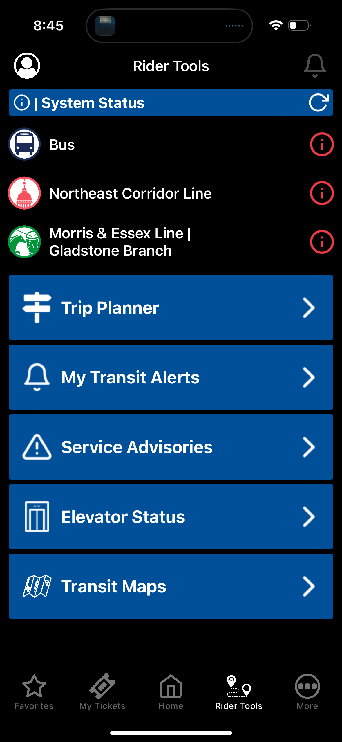
Consistency and adherence to familiar design standards help reduce user confusion and streamline interactions. The NJ Transit app, however, has so many inconsistencies that make navigating the app feel chaotic. The user flow when using the app for buses is very different than using it for trains, which is confusing. This discrepancy forces users to adapt to different interfaces and processes within the same app, increasing the cognitive load.
I often find myself needing to use external apps like Google maps to confirm information that should be available within this app. This further highlights the app’s failure to maintain a cohesive, user-friendly experience. Key information, such as gate details etc, is also missing, forcing commuters to rely on external sources throughout the entire process. These inconsistencies not only make the app frustrating but also undermine its reliability as a primary transit tool.
Conclusion
The NJ Transit app includes many useful features but could improve usability, especially for those not as versed with the transit system. Simplifying the menu layout, clarifying feature names, adding map and search options, and offering clearer feedback would make the app easier to navigate. These changes would provide a smoother and more reliable experience for all users.