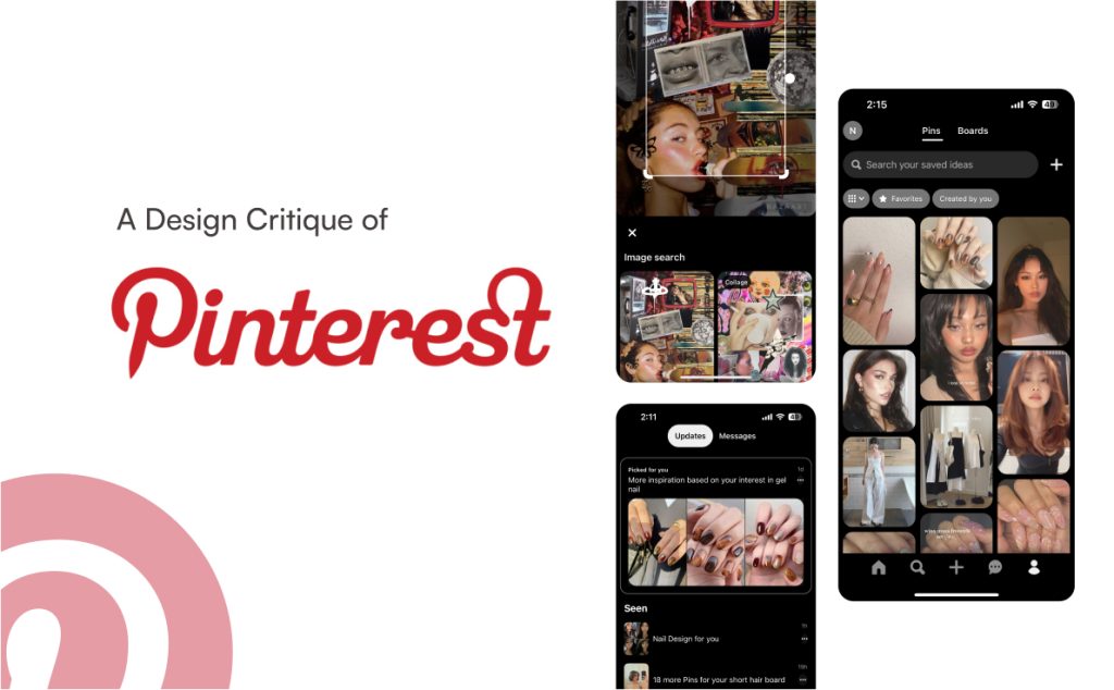
Pinterest is a visual discovery app that enables users to browse, save, and share images and ideas. Each “pin” represents an image or idea that can be organized into boards. Users can search for specific content, create their own boards, and interact with other pins through likes, comments, and repins. Pinterest’s mission is to help people discover things they love and inspire them to incorporate these discoveries into their daily lives.
Introduction
As a designer, I use Pinterest daily for both personal and professional inspiration. In this article, I’ll examine the Pinterest app, focusing on its flows and features—highlighting both strengths and areas for improvement. I’ll also apply concepts from Don Norman’s The Design of Everyday Things and Jenny Davis’s How Artifacts Afford to enhance and clarify my analysis.
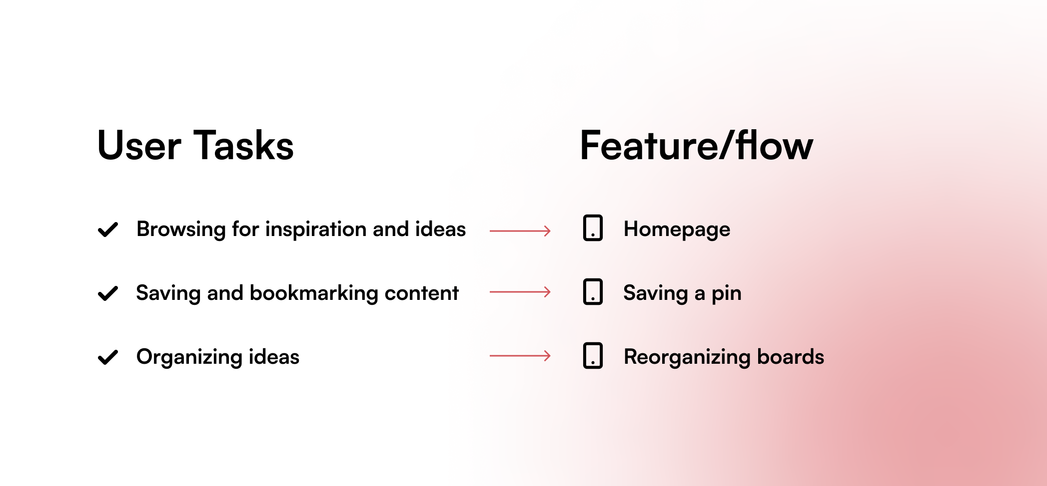
To dive into analysis, I want to go over these three main user tasks for the Pinterest app. Following these user tasks will help me closely critique the users’ needs and frustrations. The figure below shows how I would translate the user tasks into a feature or flow in Pinterest. I will then analyze each of the features or flows listed below.
Homepage has intuitive scrolling but suffers from chaos
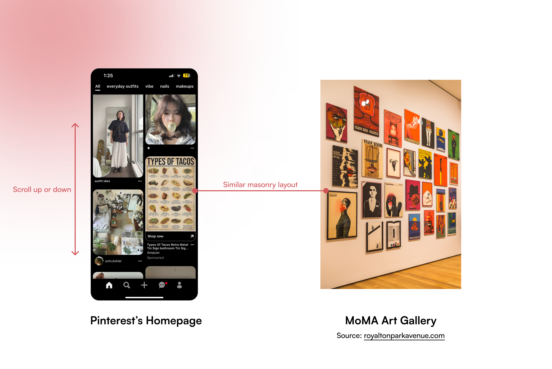
Pinterest provides a pretty well-done homepage. Immediately, the users are introduced to a “gallery” of images and media that are organized in a masonry layout. This layout is known to be aesthetic, and in Pinterest’s case, reminds users of browsing an actual gallery. Thus, referring to Norman’s definition of affordance and Davis’ that of encouragement in affordance, Pinterest affords or encourages browsing by simulating the vibe and feel of an art gallery. Additionally, the only actions users can take are scrolling up and down and tapping on a pin. Thus, the constraints that Pinterest provides signify users to understand and create the conceptual model of browsing with ease.
Homepage Frustration: Cluttered Interface
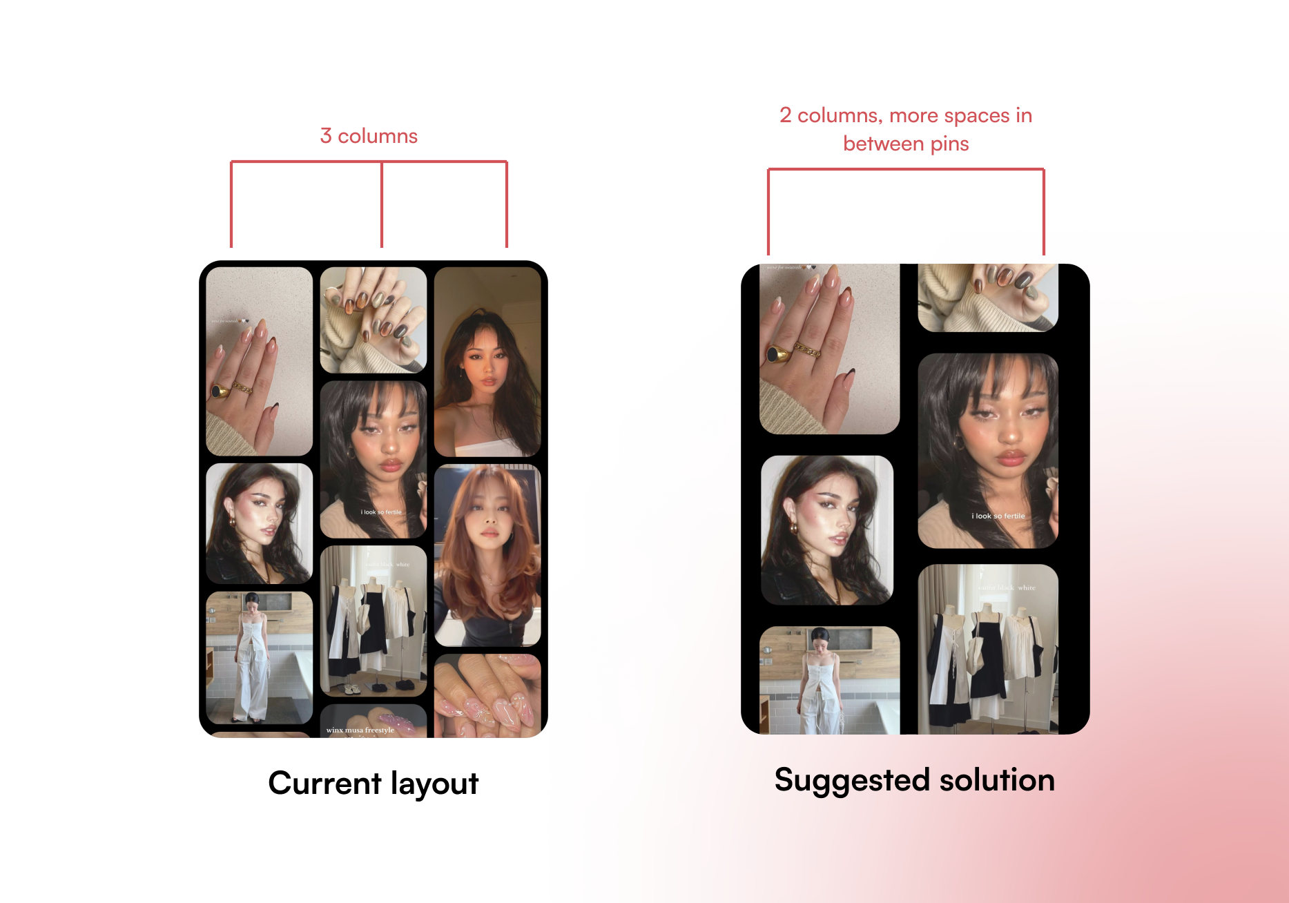
However, Pinterest can offer a less clustered homepage for a better scrolling experience. The pins almost touch each other, and the contents are of different categories. One possible solution is to change Pinterest’s 3-column layout into 2-column, creating more spaces between each column and each pin.
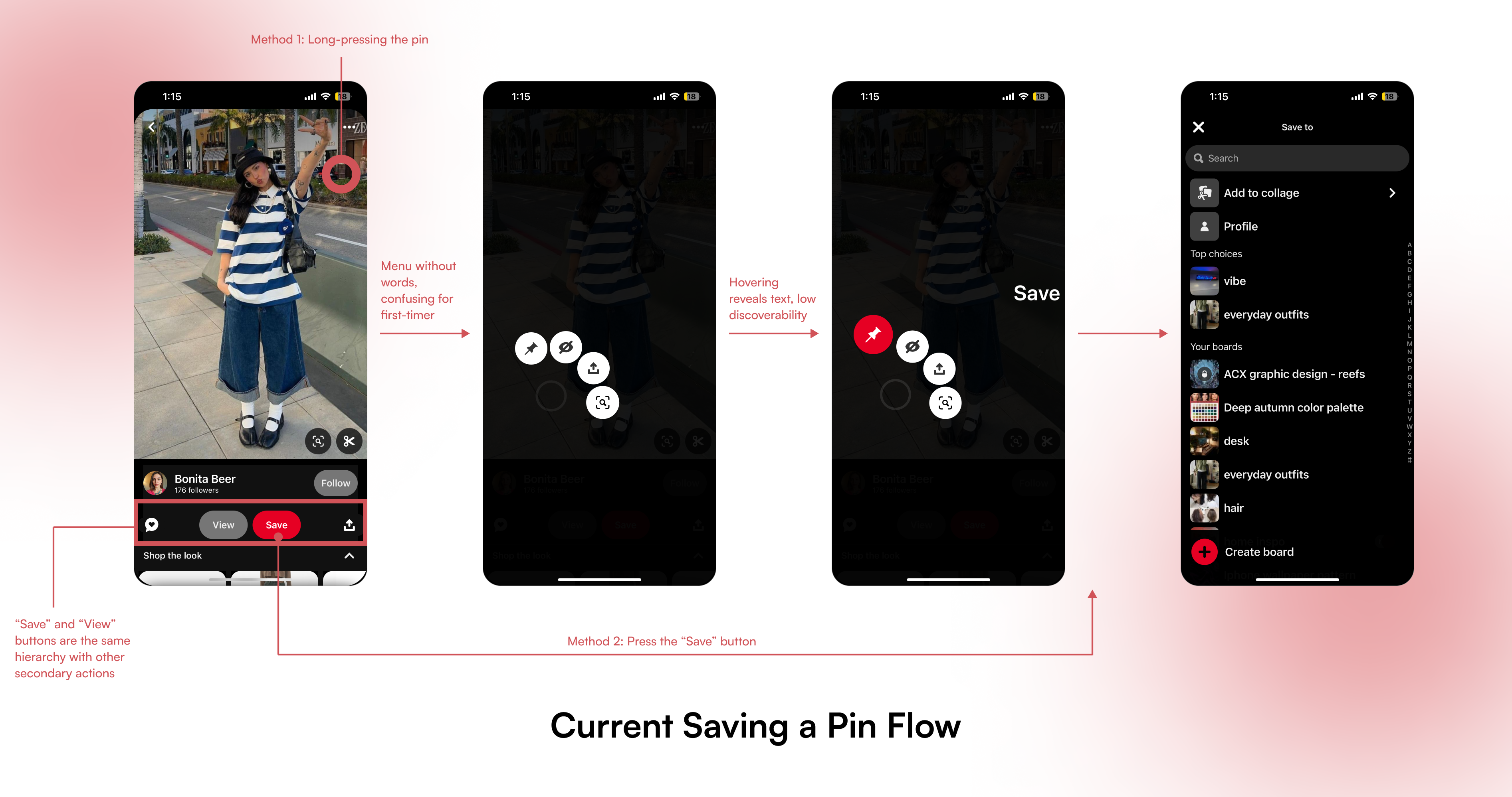
Saving a Pin Flow – Poor Discoverability
Pinterest calls each image or visual a “pin”, so most of its actions are written around pinning or repinning. However, a first-time user of Pinterest will have a hard time finding how to save a pin. There are two ways users can save a pin: by long-pressing the pin to open the menu (method 1), or by pressing the “Save” button (method 2).
- With method 1, since there are no signifiers noticing users that they can long-press the pin, it causes a hindrance in the users’ gulf of execution to assess the current system state and take action.
- For method 2, Pinterest puts the “Save” button next to the sharing and favoriting functions which are not as important, thus diluting users’ attention out of the main “Save” button. Pinterest, in this case, distracts the users and discourages them from pressing “Save”.
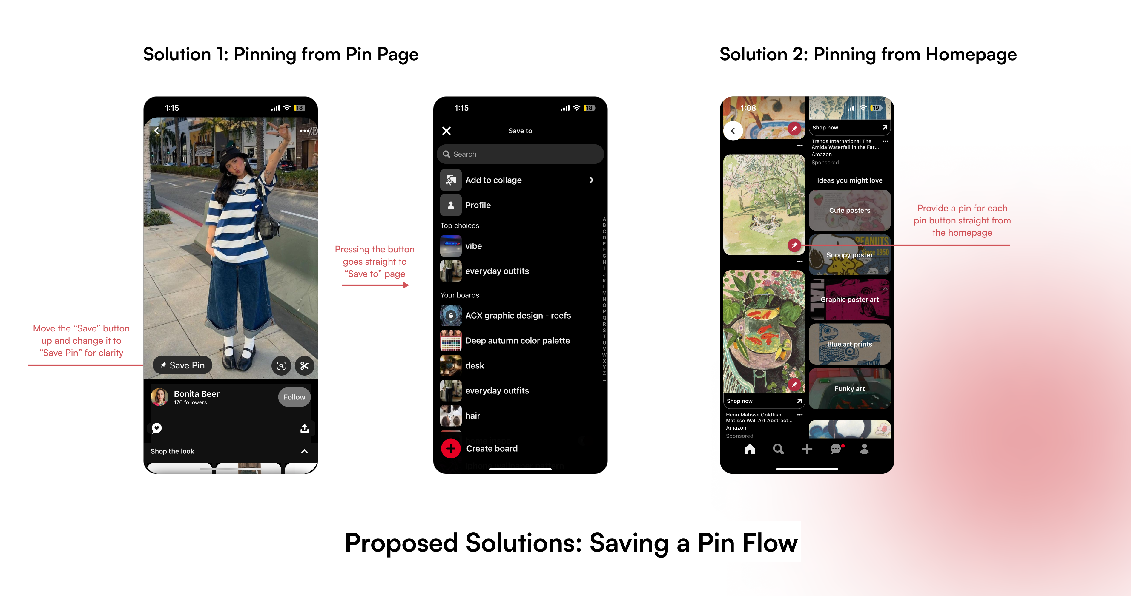
I propose two alternative methods that are intuitive and easier to discover. The first solution would be to move the “Save” button up and include it within the pin. Users can discover the button easily and it will only take 2 steps to add the pin. Similarly, my second solution includes displaying a pin button for each pin on the Homepage, allowing users to pin without having to enter the Pin Page.
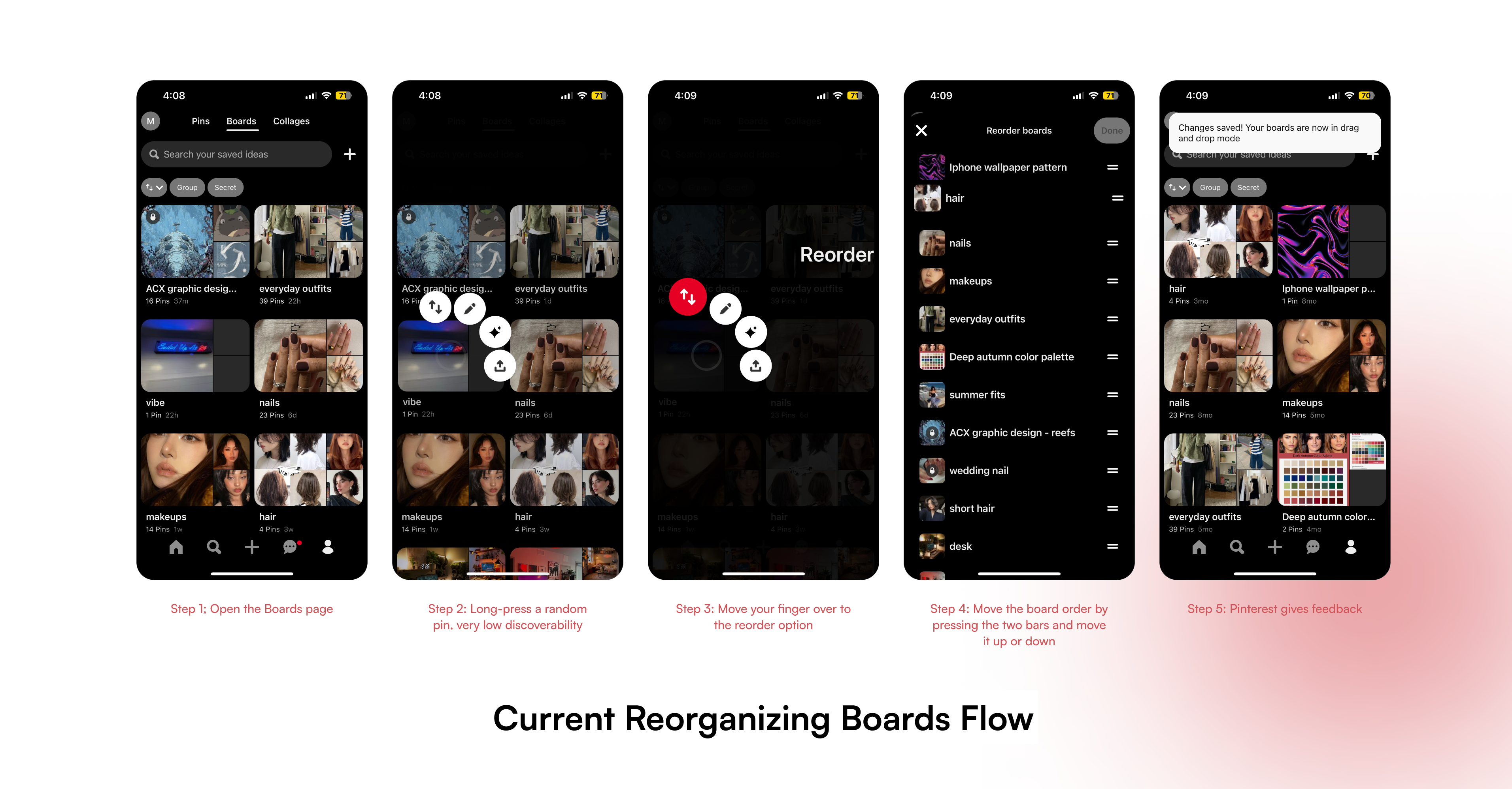
Reorganizing boards takes too many steps
Finally, the reorganizing board flow involves 5 steps that are not discoverable. Users have to press and hold a random board to access the menu which consists of only icons. There is little feedback for the users to know that they can reorder boards in this menu, prompting the users to lose interest in general. The bridge between the gulf of execution and the gulf of evaluation is broken in this stage.
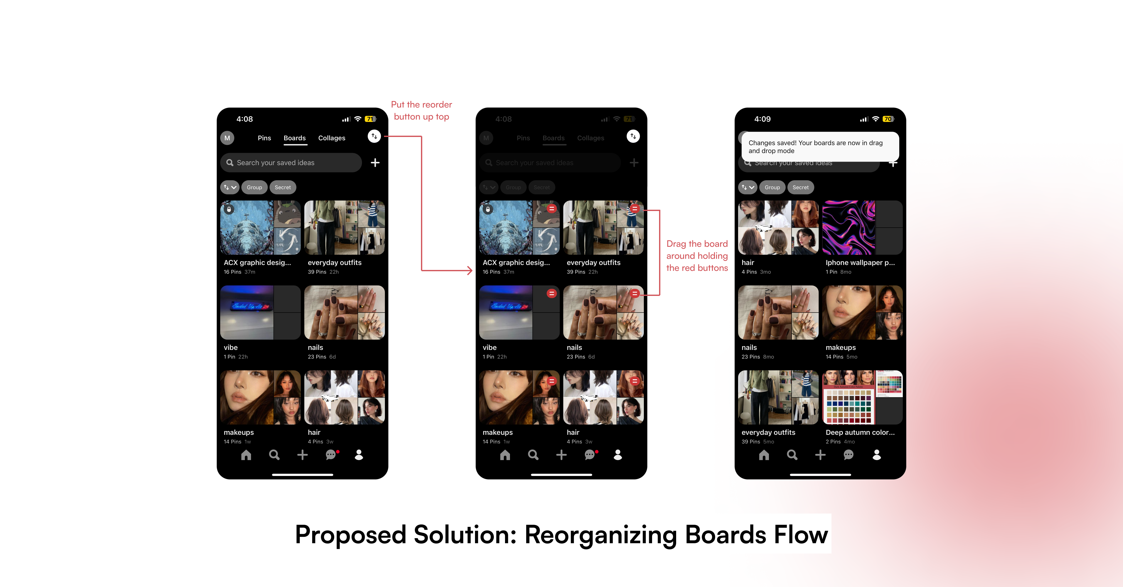
To address this problem, I propose putting the reorder board button in the top right corner. Once entering the reordering mode, users can then drag the boards around (similar to the iPhone’s way of reordering apps) and once they are released, the boards are in the correct order.
Conclusion
Despite all the aforementioned problems, I still believe Pinterest is a great application with a unique value proposition. The experience of getting inspired, collecting ideas and organizing personal touches on Pinterest remains fun and satisfying. Addressing these issues will help strengthen the app as a competitor and improve its user experience immensely.