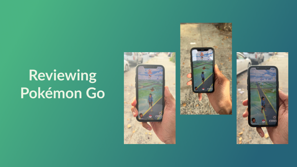
Pokémon Go is a location-based Augmented Reality (AR) game that involves players catching, training, and battling Pokémon; it was developed by Niantic and launched in 2016. It utilizes your smartphone’s GPS and camera to overlay Pokémon into the real world, encouraging you to walk, and to explore your surroundings.
Introduction
I have not watched the anime, I couldn’t name most of the 800+ Pokémon in the game, and my childhood was not spent playing the Pokémon games on Gameboy. However, even I was swept by in the “Pokemania” when Pokémon Go launched in 2016. In Chapter 7 of the “Design of Everyday Things” Don Norman talks about the distinction between Incremental innovation and radical innovation, Radical innovations introduce entirely new concepts or technologies that can create new markets or disrupt existing ones. Pokémon Go is an example of radical innovation. The game was unlike anything mobile gamers had experienced before, it was one of the first commercially successful Augmented reality games. It had many innovative concepts centred around exploration and community engagement. The game has one core goal — to make players feel like they’re Pokémon trainers. The social impact of this game can be a case study in itself. When I was given this app to critique, I was surprised to find that it is still available on the app store. It’s been 8 years since I last played, allowing me to review it with fresh eyes, Although the game has added more features since then, the player base has significantly decreased, and you don’t encounter other players as often, which can impact the overall experience.
How Pokémon Go promotes walking and exploring
As explained in Chapter 4 “Mechanisms of Affordance” of “How Artifacts Afford”, Artifacts can make requests or demands of users, influencing their actions by suggesting or requiring certain behaviors. The app demands physical movement from users to explore different locations and capture Pokémon, which is a unique affordance that distinguishes it from other mobile games.
Pokémon Go has several innovative ways to encourage walking and exploration
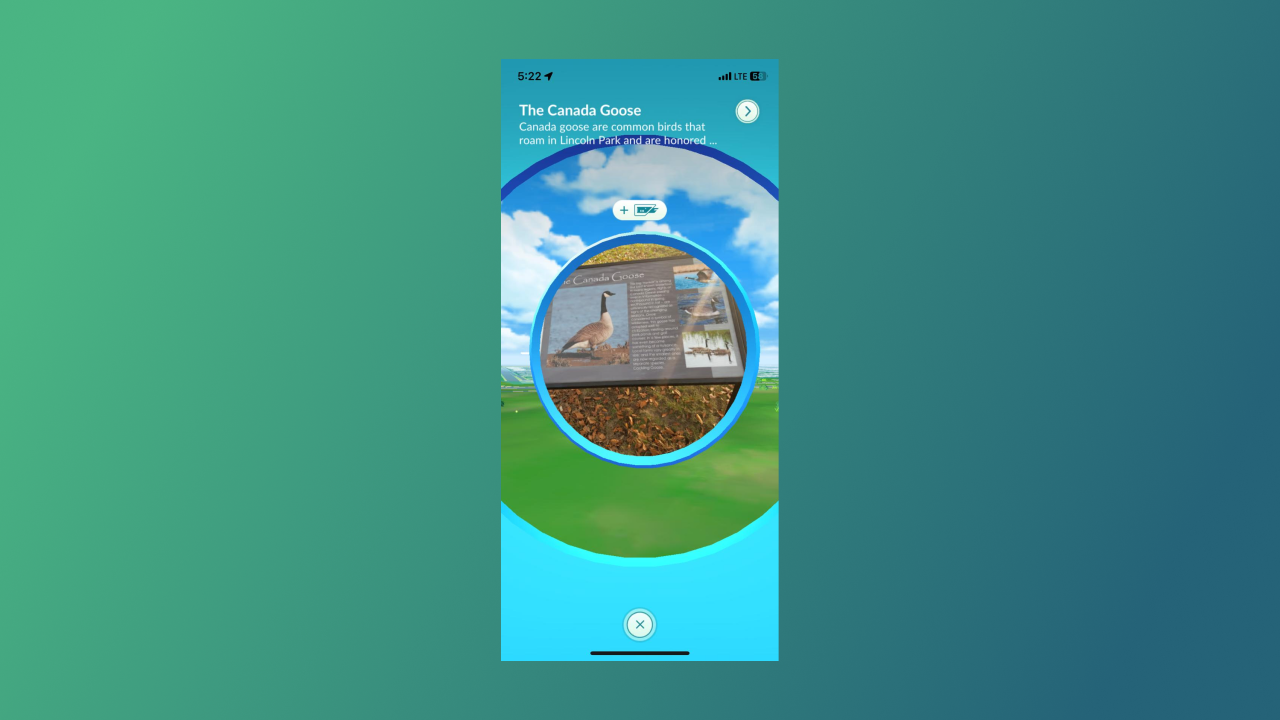
PokéStops
PokéStops are points of interest in your area and are often added by local players, These are real-world locations, such as historic landmarks, public art, or unique buildings, lures can be added at PokéStops to attract Pokémon, spinning the photo disc at the PokéStops replenishes your inventory, adding Lures to PokéStops can attract more Pokémon to the area. Different Lures attract different types of Pokémon
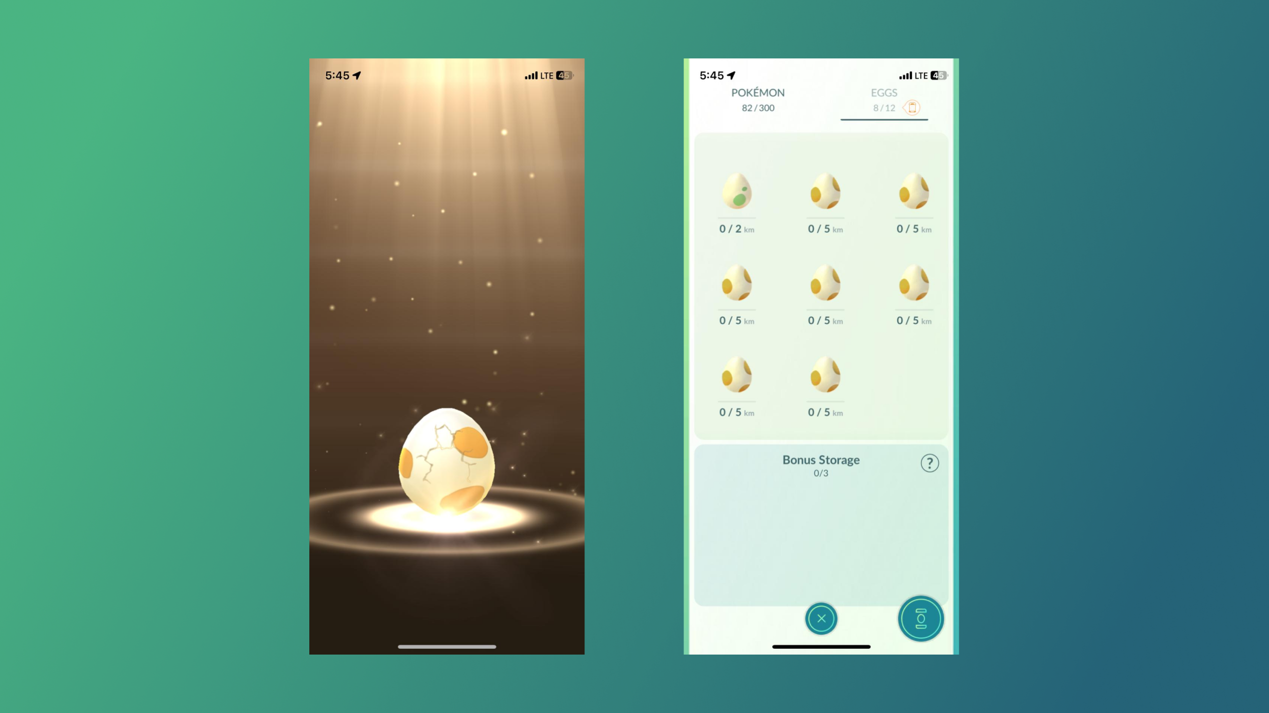
Hatching Eggs
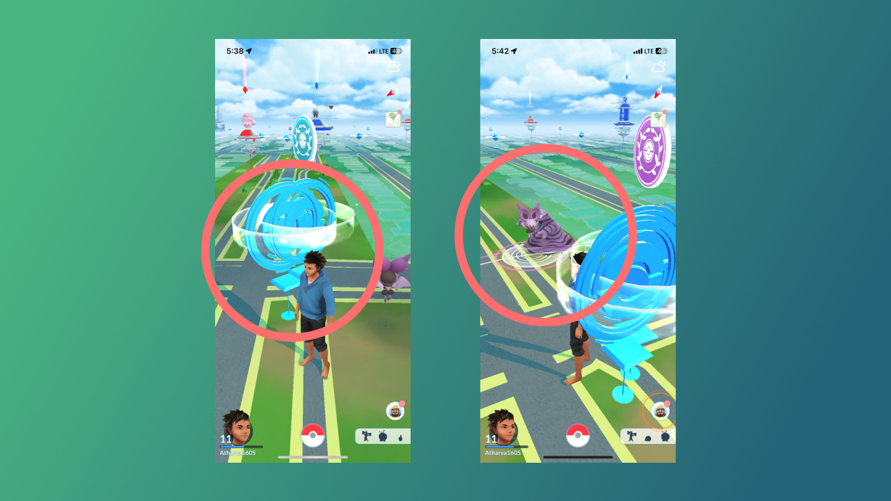
While I was walking, the screen suddenly flashed, and I saw a Pokémon hatch from an egg. Apparently, you get these eggs at PokéStops and you can hatch them to get new Pokémon. To hatch them you have to walk a certain distance—the more you walk, the faster they hatch. This is another innovative way in which Pokémon Go promotes walking
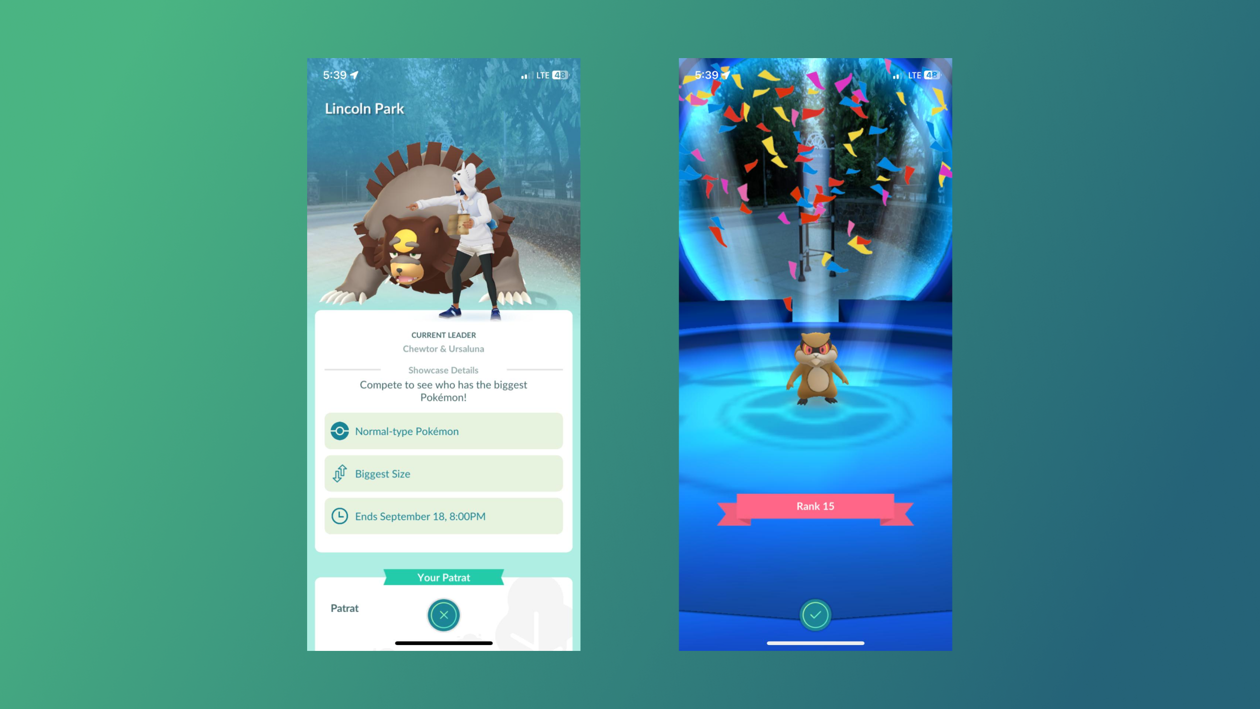
Pokémon Showcase
Pokémon Showcase is sort of a competition. Here players can display their Pokémon and have them ranked based on specific judging criteria. The showcase I went to ranked Pokémon based on their size. This is a good way of not only encouraging exploration but also enhancing community engagement. Pokémon Go encourages social interaction by facilitating group activities like this.
How Artifacts Afford” highlights how design features embedded into the game’s mechanics enable specific behaviors—such as walking and exploring
Gamification
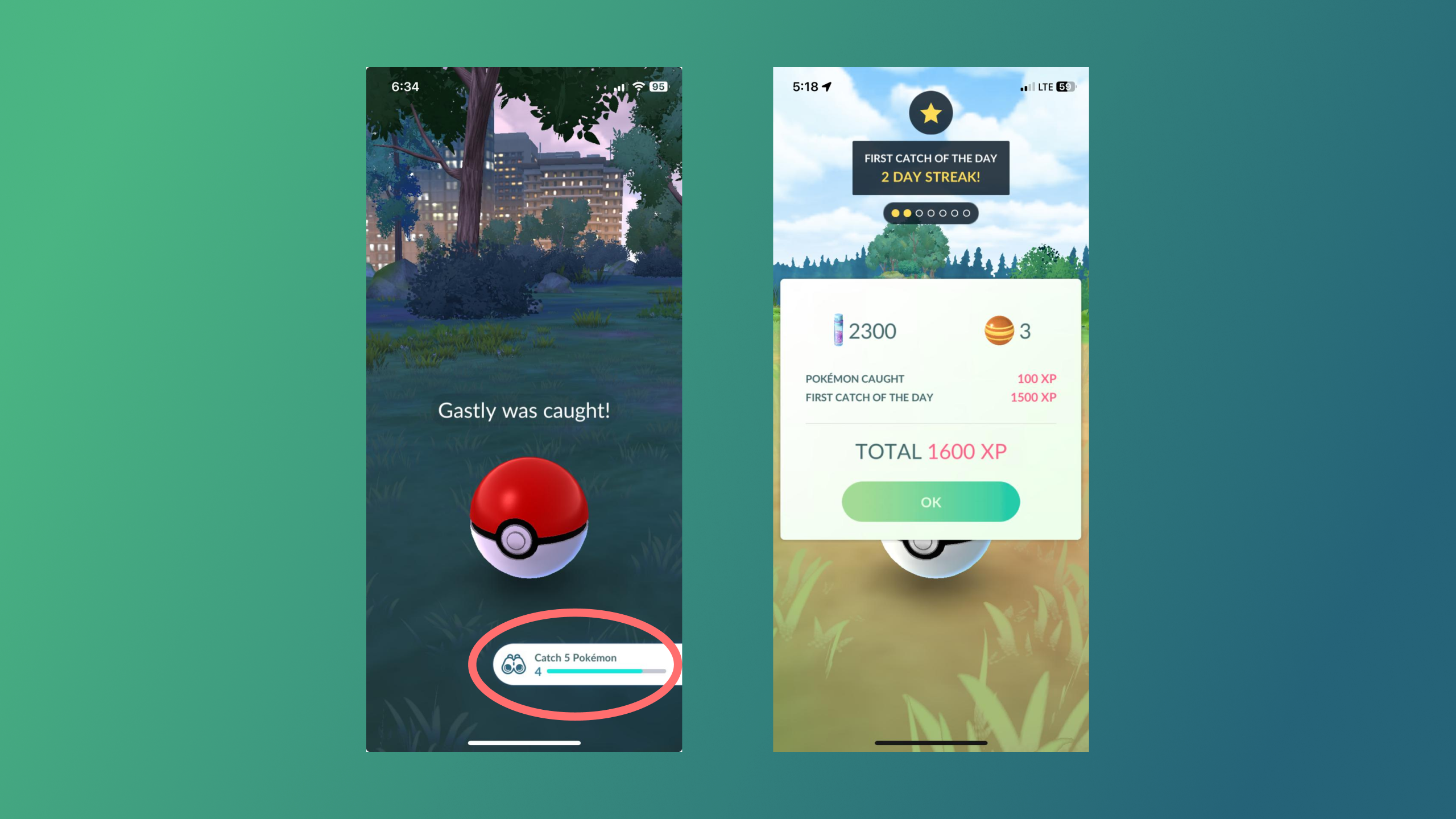
Pokémon Go uses the concepts of gamification to maintain user engagement. The Daily Streak feature incentivizes you to keep to the app every day. Each day a player logs in and completes a task, such as catching a Pokémon or spinning a PokéStop, their streak increases, leading to increasingly valuable rewards. Every time you catch a Pokémon, the game shows how many more Pokémon you need to catch to receive experience points. (XP). This visual indicator serves as a clear signifier, helping players understand their progress towards levelling up.
The use of Visuals and Haptics
As Norman explains, Emotions play a significant role in influencing the user experience. The use of nice animations, appealing visuals and haptic feedback creates a visceral, and exhilarating response when you capture a Pokémon or when you fail. This sensory engagement can be addictive, encouraging you to continue catching more Pokémon.
Another good use of haptic feedback is as a non-visual signifier to inform players when a Pokémon spawns nearby so that you are not constantly looking at your screen while you’re walking.
Cognitive Walkthrough
I decided to conduct a cognitive walkthrough with 3 of my friends, none of whom have ever played Pokémon Go or are fans of the franchise.
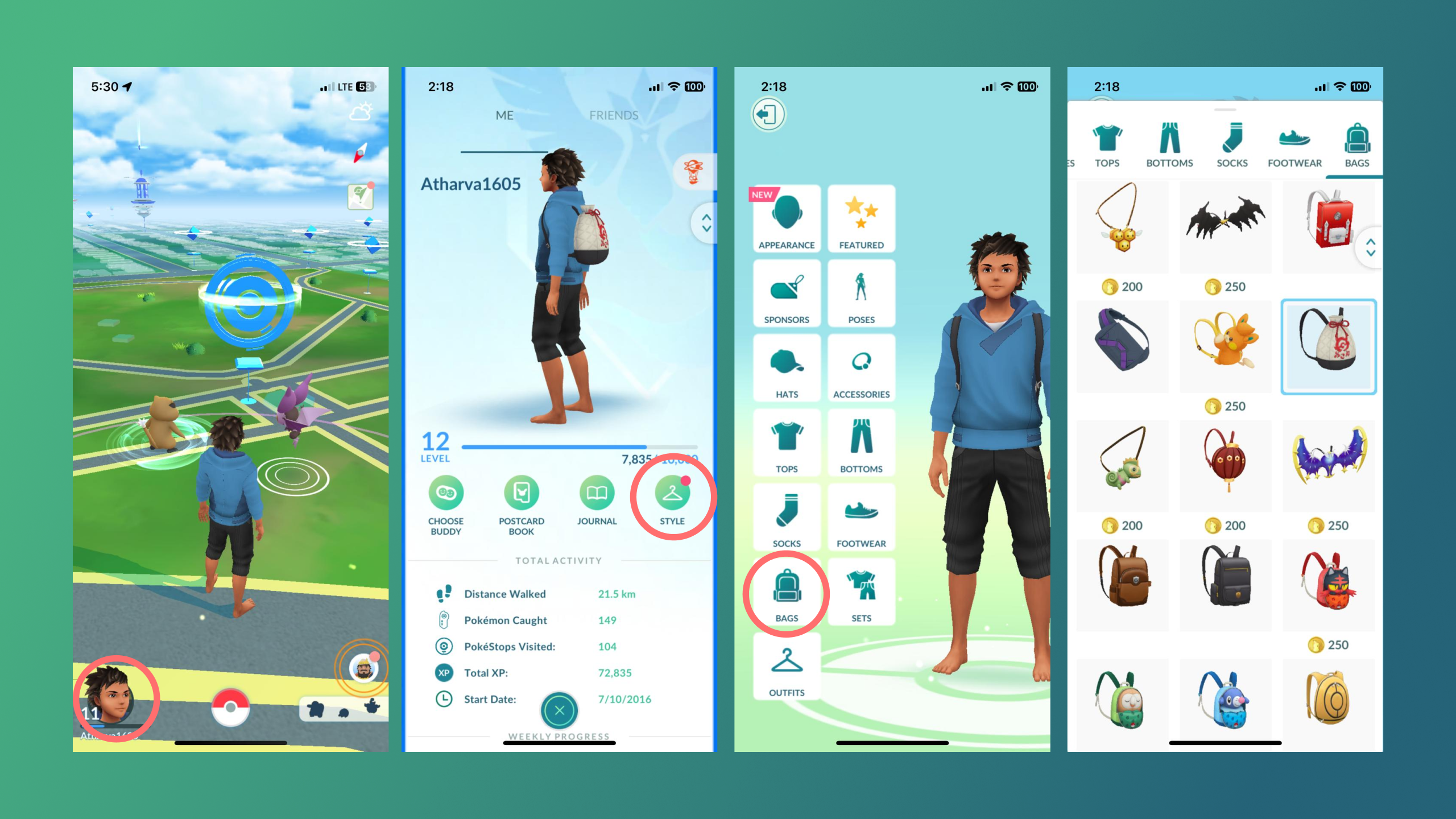
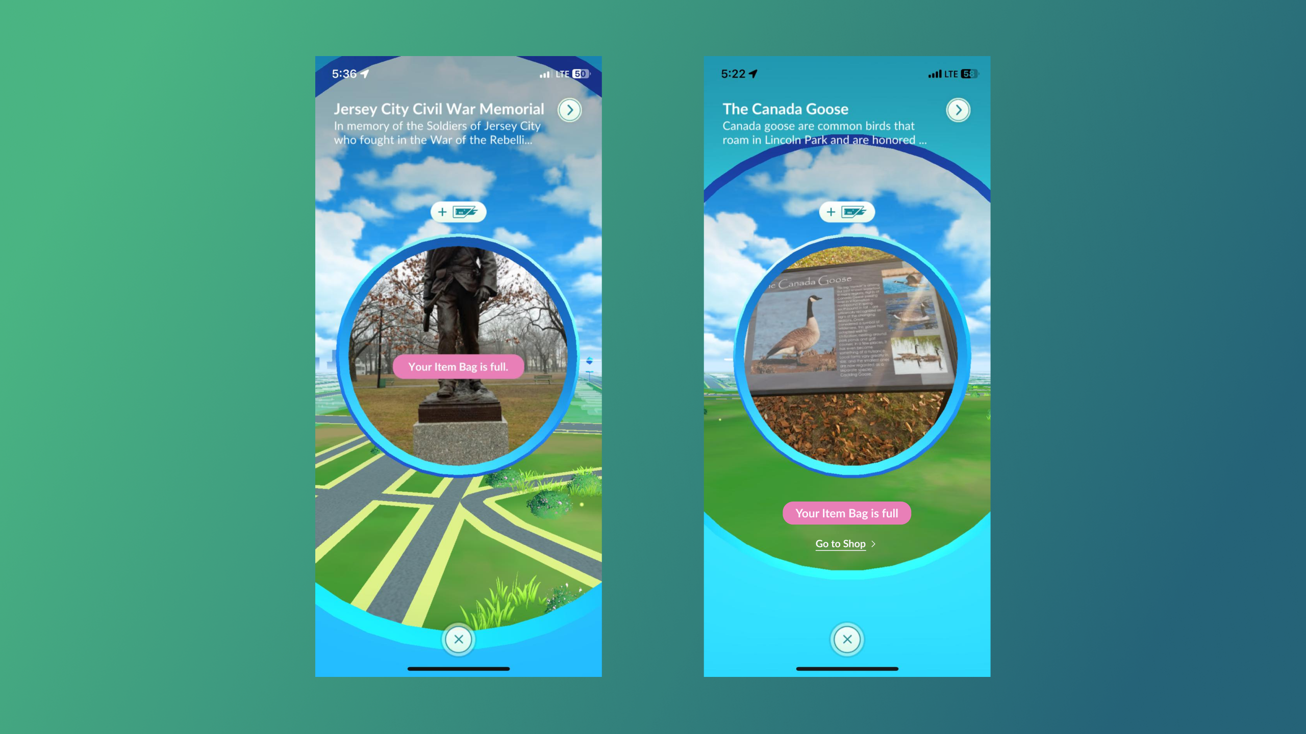
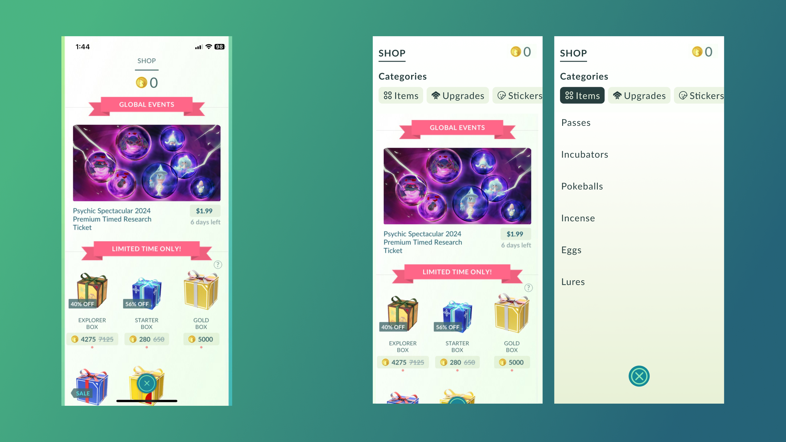
User Goal 1: Upgrading your Items Bag
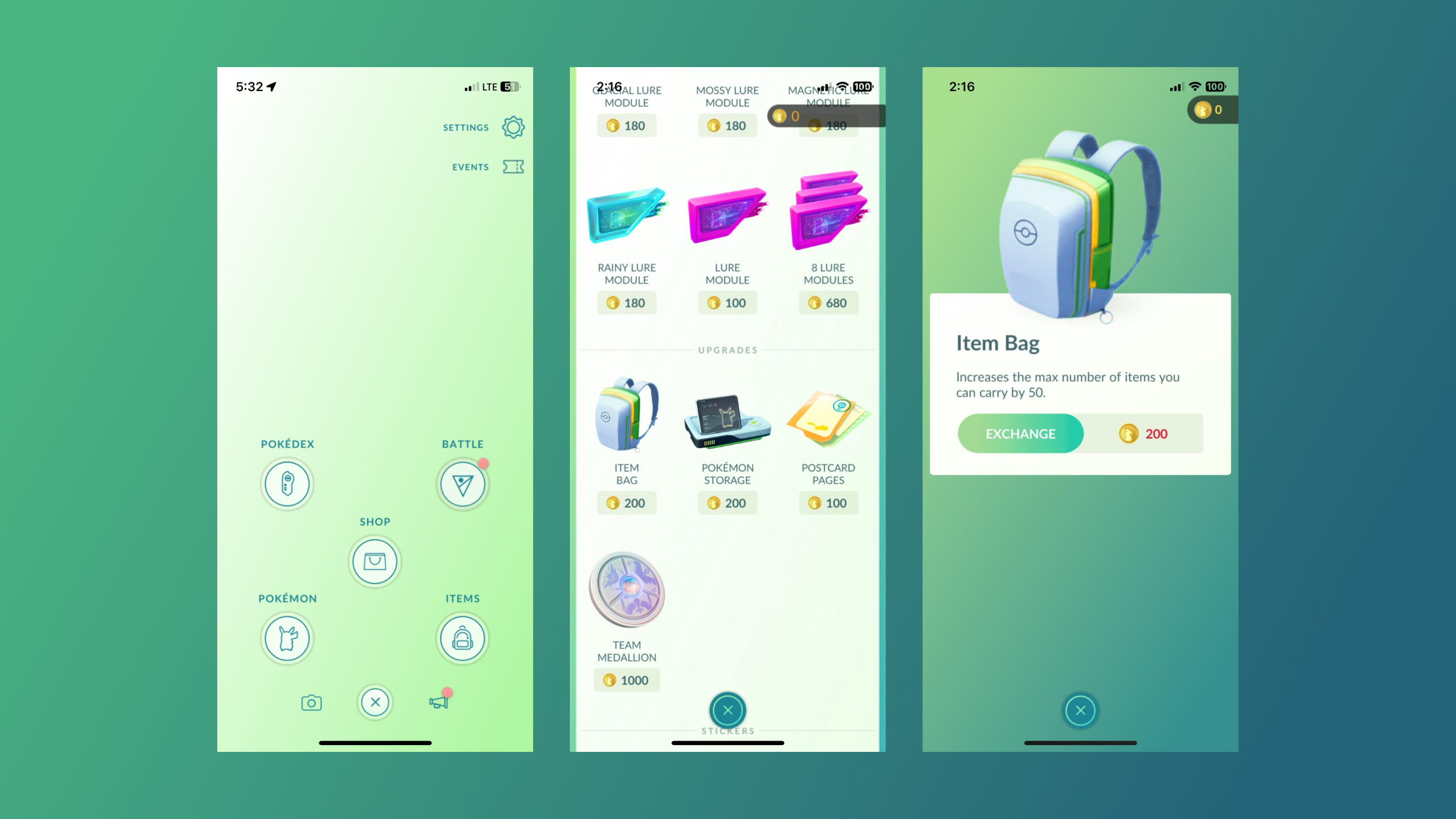
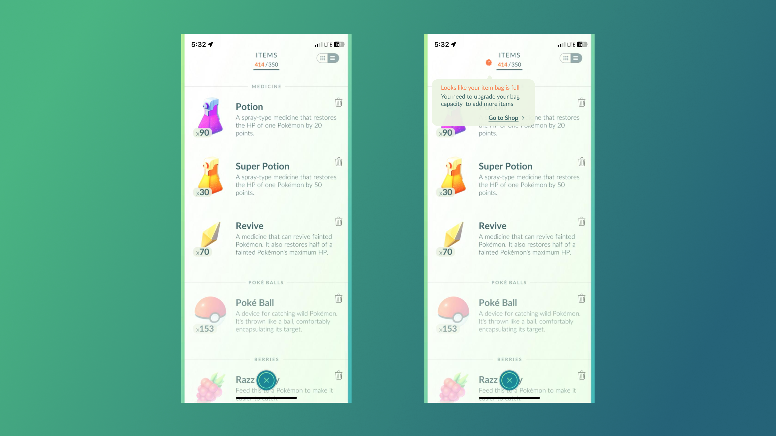
While I was playing Pokémon Go, I approached a PokéStops , When I spun the photo disc at the PokéStops , I received a message stating that my item bag was full. I was unfamiliar with the concept of the item bag or how to upgrade it. I decided to make “Upgrade your item bag” one of the user goals in my cognitive walkthrough, All my friends struggled with this one, One friend tried tapping on the bag on my player character. All of them went to the player profile on the bottom left, then to styles and bag, However purchasing bags there only changes the appearance of your bag without increasing capacity, This wasted my Pokécoins on a useless purchase. I think there should be information telling the players what they are purchasing. After eventually locating the correct menu i.e. the Pokéball in the center, two friends mistakenly clicked “Items” instead of “Shop” which was the correct option due to the items menu having a backpack as a logo. All of my friends eventually made it to the “shop” menu but they closed it before even scrolling down, The item bag is at the very bottom of the page, they simply gave up halfway.
Some possible solutions to this problem can be redirecting the users directly to the shop from pages where they are informed of low bag capacity, this can be done with tooltips. This aligns with Norman’s principle of providing clear signifiers, Also, categorizing items within the shop would help users find items more efficiently (discoverability) and help them understand what the shop has to offer.
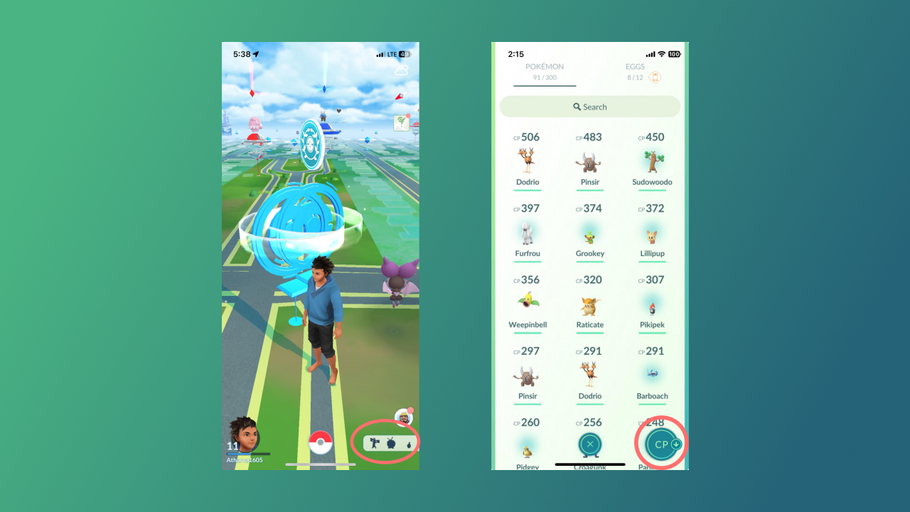
User Goal 2: finding the most powerful Pokémon and powering it up
The second user goal for the walkthrough was “finding the most powerful Pokémon from my collection and powering it up”. During the cognitive walkthrough, all of my friends initially pressed the “Nearby Pokémon” menu in the bottom right corner, eventually figuring out that they needed to go to the center menu, One friend got confused between the “Pokémon” and “Pokédex” menu items. Adding descriptions to the menu could help, as similar confusion arose when another friend thought “Items” was where you upgraded your bag due to the logo in the previous user goal. However, this is not a major issue because experienced users eventually learn their way around the app. After selecting the correct option “Pokémon” from the menu, all of them scrolled through the list to find the most powerful one, but none used the filter option to sort by CP (Combat Points), maybe it was not visible enough. One friend didn’t even know what CP meant. Once the right Pokémon was found, powering it up was simple and straightforward
Other Issues
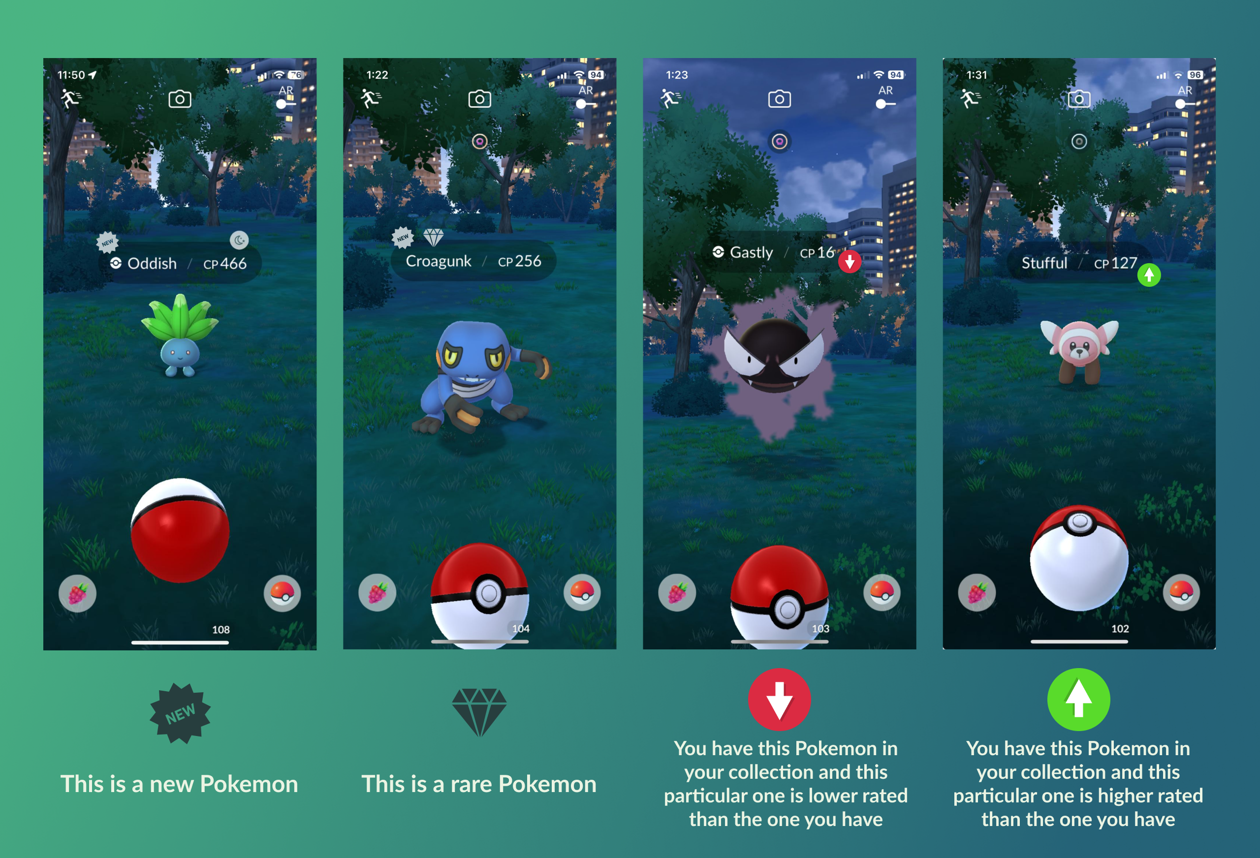
Not enough Information while catching Pokémon
Pokémon Go does not provide clear indicators to inform players whether a particular Pokémon is already part of their collection or if it is new. Also, If the Pokemon is already owned there is no way to compare the ratings of a newly encountered Pokémon with the one that you already have. This was a problem because I did not know if I should use my limited Pokéballs on a Pokémon I was unsure if I already owned. I did not know if a Pokémon is worth the effort to catch. By incorporating visual indicators, such as icons next to the Pokémon’s name, players could quickly assess whether it is worth attempting to catch. This redesign aligns with Norman’s principles of visibility and feedback, ensuring that users have the necessary information at hand to make informed decisions.
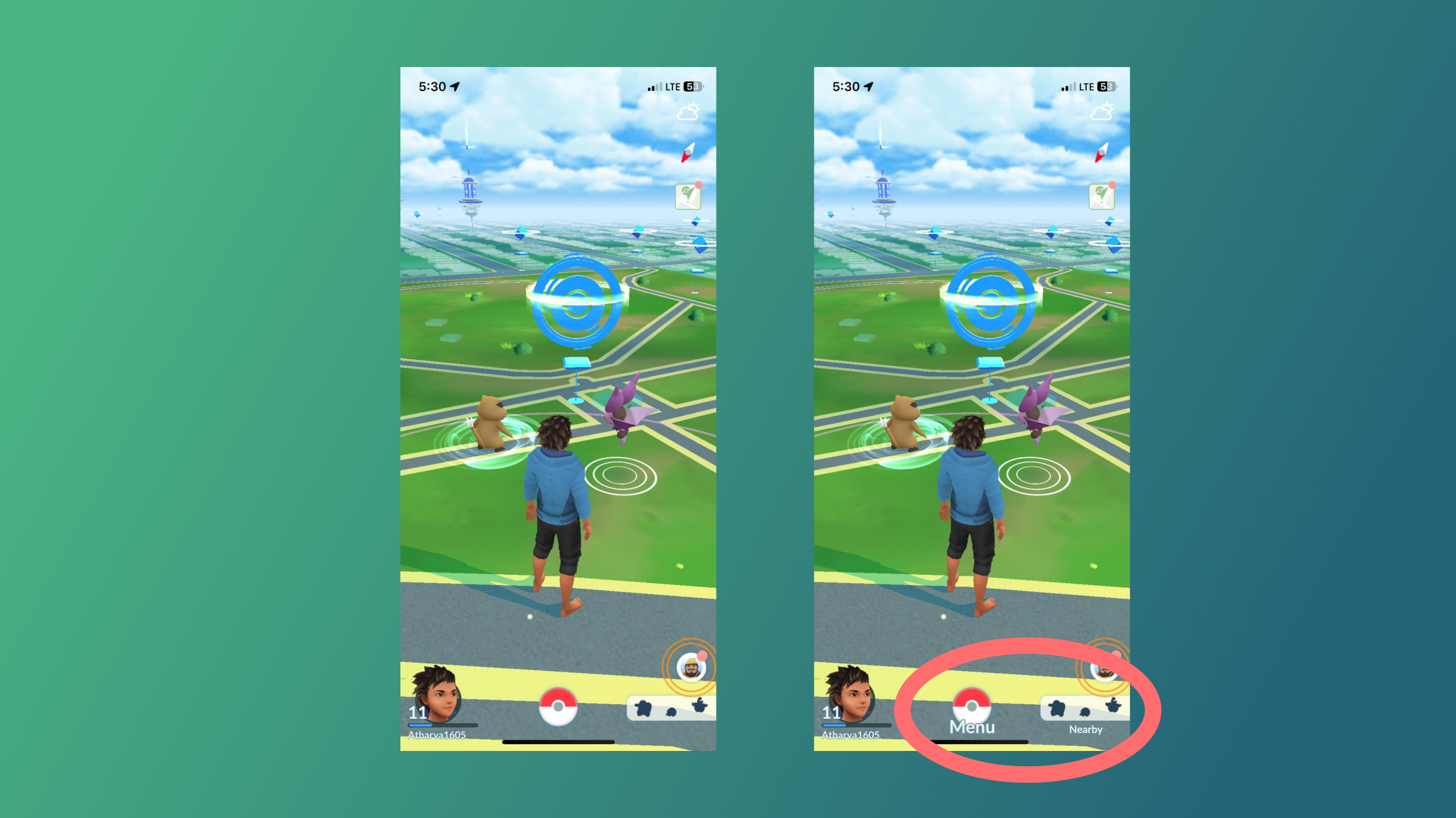
Icons without Labels
During the cognitive walkthrough, a common issue encountered by my friends was not understanding what each icon meant. Most of the icons in the game do not have descriptive labels and are very small and therefore difficult to make out their meaning. A particular point of confusion was the “Nearby Pokémon” feature in the bottom right corner of the screen, which two of my friends mistakenly thought was the menu for viewing their existing Pokémon collection. The central Pokéball menu also created a lot of confusion because it looks like a button you would press to start a game or battle. Incorporating titles or labels beneath these menu items could significantly enhance discoverability, aligning with Norman’s principles of clear signifiers.
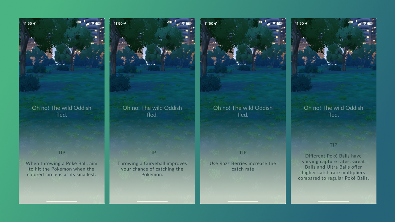
No guidance on how to improve
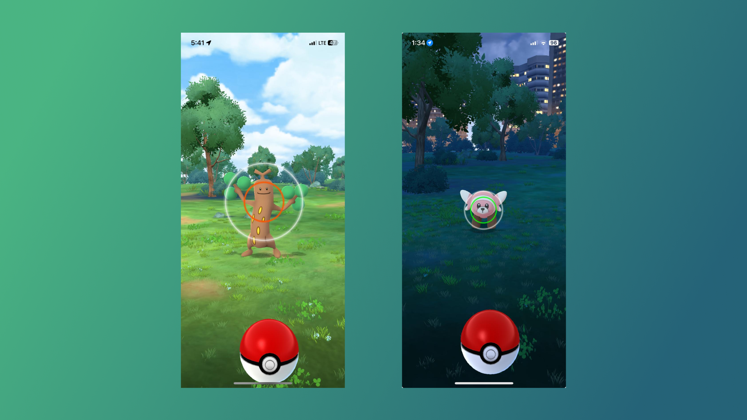
After breezing past the first few Pokémon, likely due to the app matching my experience level to keep me engaged, Pokémon started escaping from my Pokéballs, I did not understand what I was doing wrong, The game gave me no guidance or feedback on how to improve. It did not tell me what I was doing wrong, A solution can be—after multiple failed attempts, incorporating tips—such as throwing curveballs, using berries, and utilizing better Pokéballs will help users understand how to improve their catch rate. I later learned that the color of the circle around a Pokémon indicates its difficulty level: green means easy, while orange and red mean more difficult to capture. Though it is a signifier I did not catch it the first time.
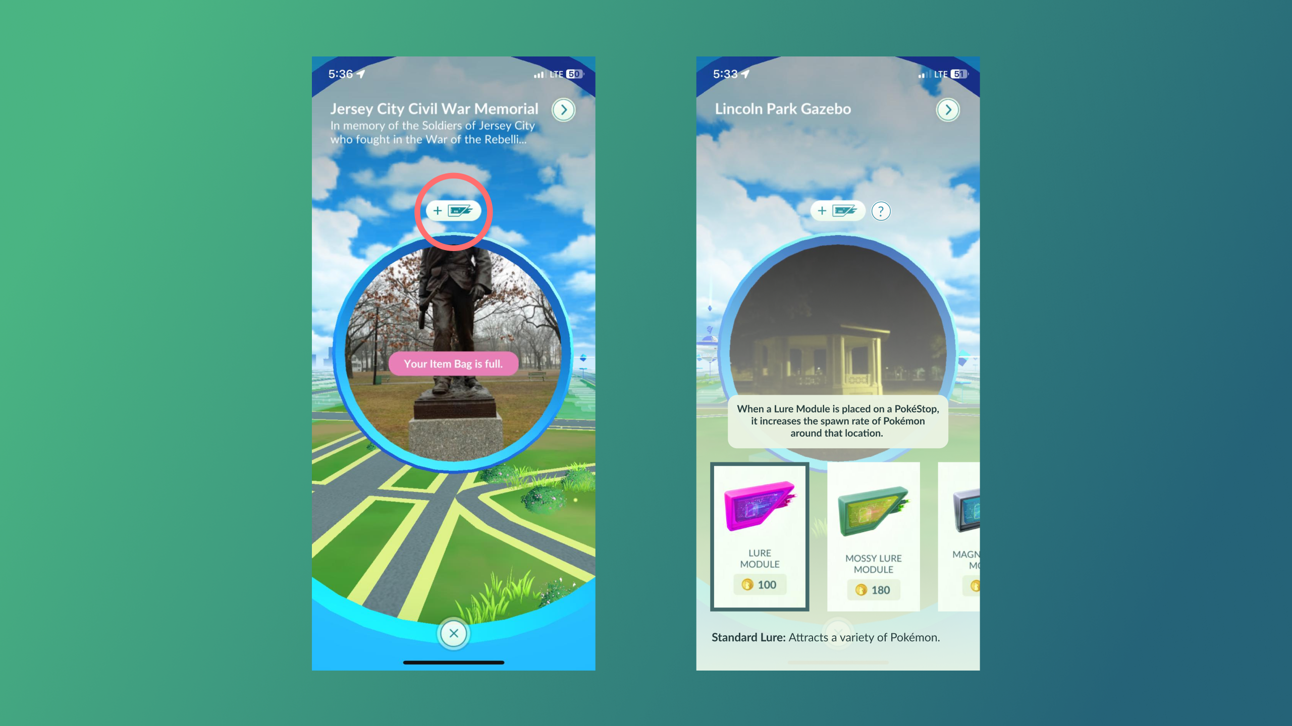
Non Descript Icons
There is an icon in PokéStop that is not very descriptive and almost escaped my attention the first few times I encountered it. I did not understand its purpose initially, but after Googling I realized it is an option to add lures to the stop, Adding lures attracts Pokémon to the area. Different lures attract different Pokémon. I decided to add a tooltip here to explain this feature, also adding the option for the players to go through the different lures, learn about their functionality and a link to buy them from that screen itself will help improve the adoption of this feature. Adding tooltips to explain lure features at PokéStops enhances visibility, discoverability, and user engagement, aligning with Don Norman’s principles of intuitive design
Small Touch Targets
Sometimes two Pokémon or PokéStops spawn right next to each other, In such cases the touch targets are too close, making it difficult to select the correct target accurately. Introducing multi-touch gestures, such as long taps or double taps, can serve as additional affordances, making it clearer how users can select between overlapping elements. However, this is not a big issue as most of the times the Pokémon spawn with enough distance between them.
Conclusion
Pokémon Go remains was a groundbreaking app in the augmented reality (AR) gaming space, Despite being eight years old, its innovative concepts continue to stand the test of time. The app contains numerous features, resulting in a convoluted system of nested menus. To improve user experience, these menus should include clear labels and descriptors. For those unfamiliar with the Pokémon franchise, the app can be overwhelming, so providing guidance and tips is essential.