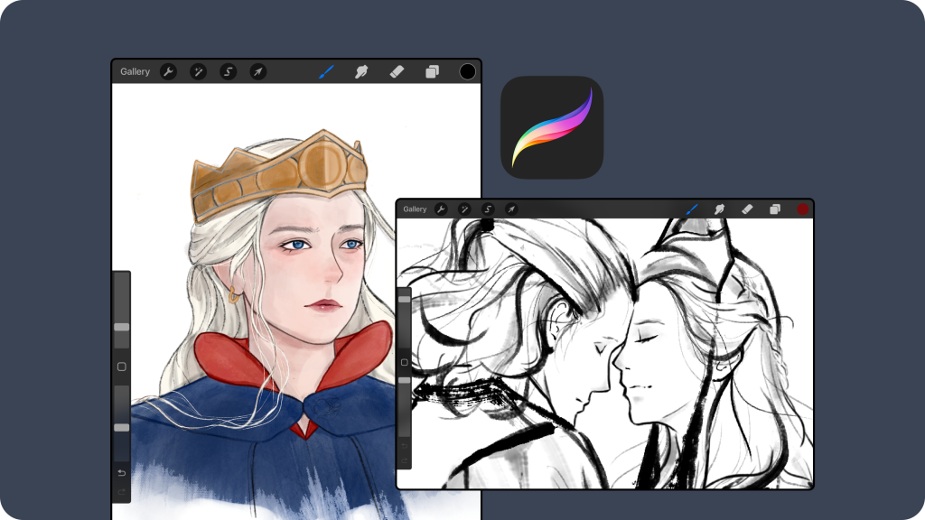
Procreate is a powerful digital illustration app designed for iPad, widely used by artists, illustrators, and designers for creating professional-grade artwork. With customizable brushes, blending modes, Apple Pencil support, and a clean interface, it has become a go-to tool for digital art.
Procreate’s UI stands out for its simplicity and aesthetic appeal. It doesn’t overwhelm users, avoids screen clutter, and gives the feeling of working on a real canvas. However, this “clean” and “minimalist” interface design can present a steeper learning curve for newer users, especially those unfamiliar with Procreate’s layout.
As an experienced artist and long-time Procreate user, I find the app enjoyable and intuitive. However, my critique focuses on the user experience for newer Procreate users, including seasoned artists unfamiliar with the app and novice artists testing it for the first time.
Problem 1:
Poor Signifier – Misleading Color Drop Tool
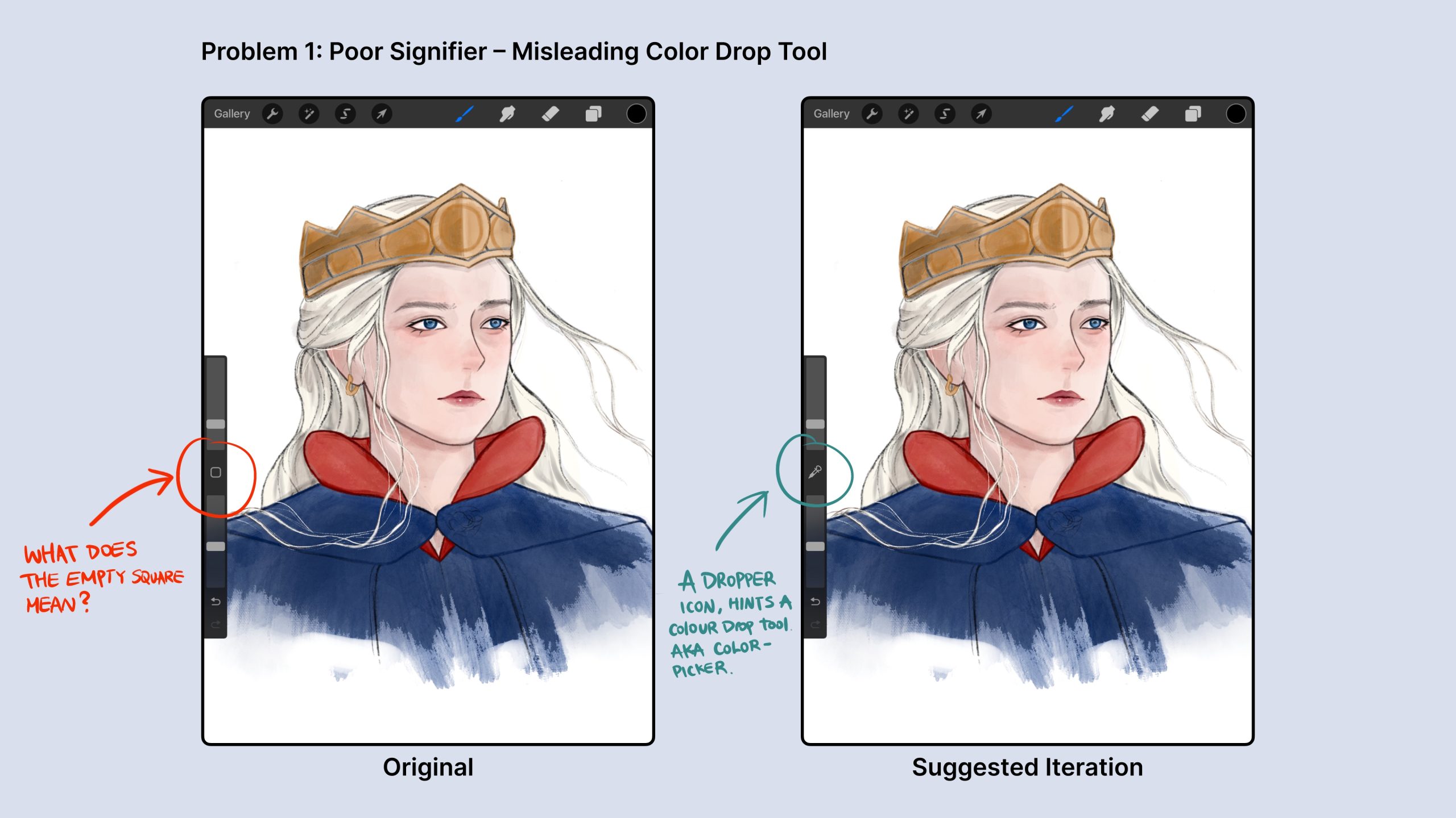
At first glance at the side menu, a new Procreate user might be confused about the function of the empty grey square. The mental model for an empty square in many interfaces often represents a checkbox waiting to be checked. In this case, however, the square is actually a color-drop tool, a staple feature in most digital art programs. Procreate’s signifier for this function does not clearly convey its affordance, making it difficult for users—new to the app but familiar with other design software—to recognize the color drop feature.
Suggested Improvement:
To improve clarity, I recommend replacing the empty gray square with a dropper icon that visually communicates the tool’s function. A dropper icon can be a better conceptual model that provides artists a simplified explanation of how color-drop works: by dropping it on certain areas of the canvas to extract the same color. This is a concept familiar to most digital artists, and the icon would greatly enhance discoverability.
“The power of a good conceptual model lies in its ability to provide meaning to things.”(96) – Don Norman
Problem 2:
Adjustment Bars Have Poor Signifiers, Leading to Ineffective Mapping
New users may encounter the Gulf of Execution when interacting with the two identical slider bars on the side of the Procreate interface. It’s unclear at first glance what these bars control and what the polar directions represent.
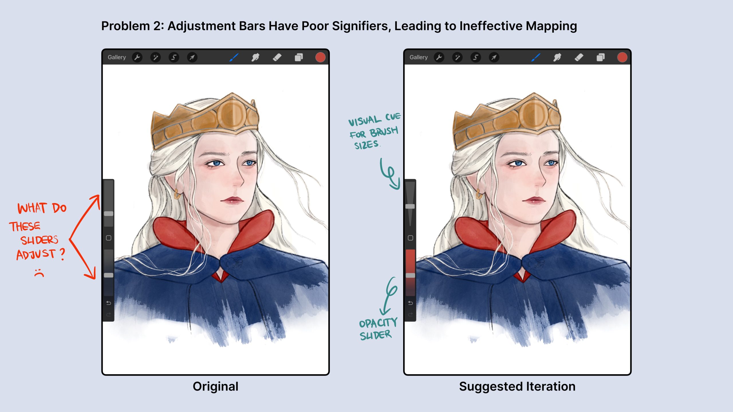
The two sliders are meant to adjust the brush size and opacity, but this isn’t immediately apparent. On the current interface, users have to tap and hold on either bar to trigger a hover box that displays “size x%” or “opacity x%,” depending on which bar they are interacting with. The lack of mapping and distinct visual cues creates confusion, making it difficult to tell which bar controls what and in which direction users should slide.
Suggested Improvement:
For the brush size slider:
- I recommend redesigning the slider bar to be an isosceles triangle, where the narrower angle indicates a smaller brush size. This design would provide more intuitive mapping, as users can easily infer that a smaller angle represents a smaller brush and a wider angle represents a larger one.
For the opacity slider:
- The current bar can be kept, but I suggest adding a gradient that transitions from fully opaque to fully transparent along the bar. This visual cue would indicate that sliding toward the transparent side reduces opacity. This enhancement would improve the mapping by visually communicating the function of the slider.
Problem 3:
Can Not Manually Center Canvas – Lack of Constraints and Feedback During Rotation
While it’s great that users can smoothly rotate the canvas in any direction to suit their drawing needs, Procreate lacks a feature to ensure that the canvas is precisely centered. It’s challenging to manually rotate the canvas to exact angles like 90, 180, 270, or 360 degrees. Users often end up slightly off-angle without constraints or feedback, such as 91 or 89.7 degrees. This lack of precision can be frustrating, as Procreate does not provide visual or haptic feedback when specific rotational angles are reached.
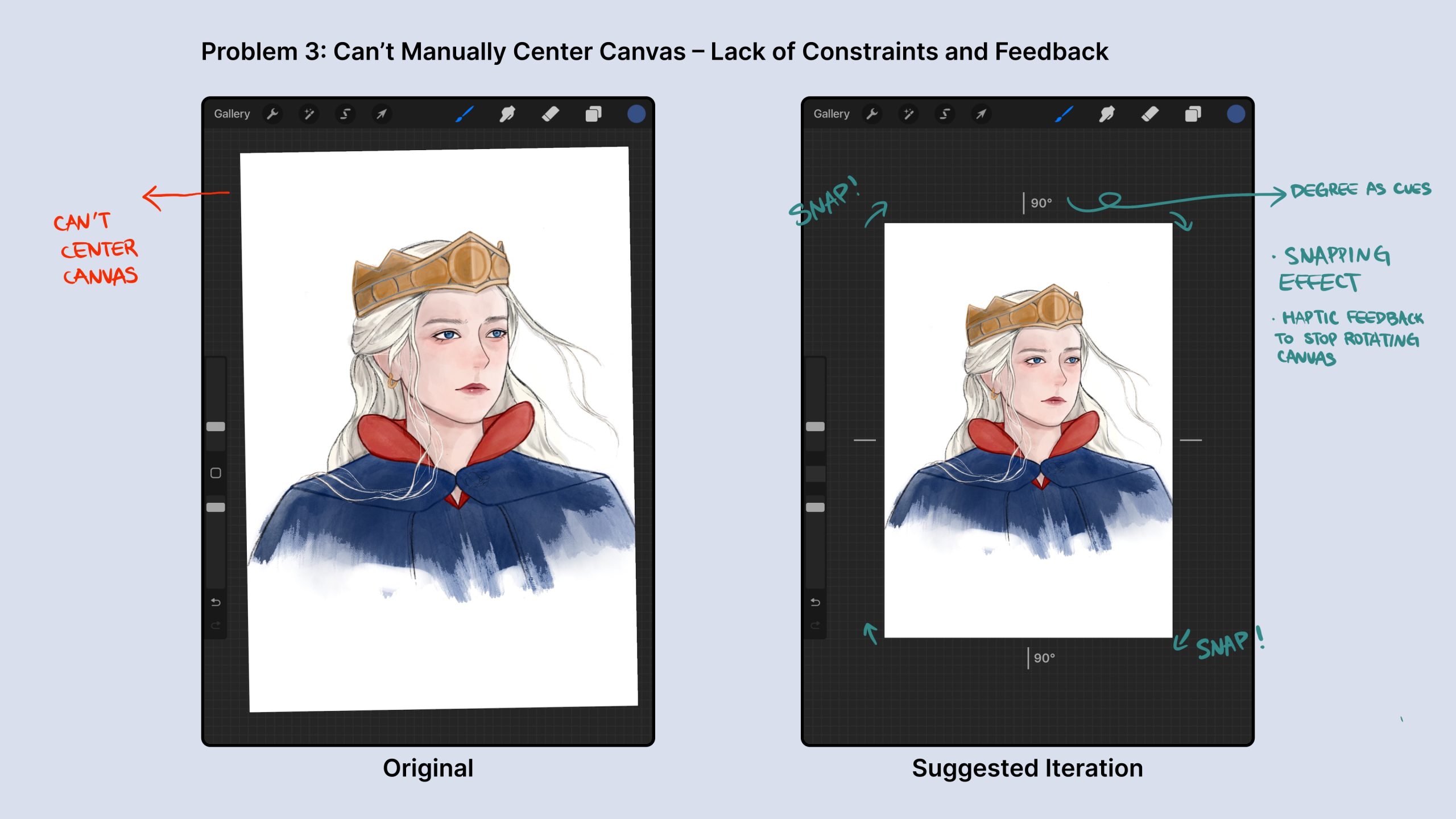
Suggested Improvement:
Since human hands aren’t perfectly precise, I recommend:
- adding haptic feedback and snapping effect as a subtle physical constraint when rotating the canvas.
For instance, a small vibration could be triggered whenever the canvas reaches key rotational points like 90, 180, 270, and 360 degrees. This feedback would signal to users that the canvas is centered, acting as a cue to stop adjusting the rotation.
A snapping effect can be added to the canvas will automatically lock into place when it reaches certain angles, as some users might not feel the small vibration. These added features would make it easier for users to achieve precise angles without relying on guesswork.
Procreate’s Trade-off: Knowledge in the Head
From my observation, Procreate appears to have made a deliberate trade-off between knowledge in the world and knowledge in the head, opting for the latter.
Procreate is a perfect example of an app prioritizing the knowledge-in-the-head approach: it demands a longer learning period and presents a steeper learning curve upon first use. (105) Artists need to learn, store, and recall how to navigate and utilize the app through their memory.
As a result, Procreate’s interface is clean and aesthetically pleasing, with simple icons and tools that become more intuitive with frequent use. It is a highly efficient app once the users are well-learned.
However, if implementing the suggestions I’ve discussed is not feasible, I propose that Procreate consider incorporating an interactive tutorial flow. This could provide hover instructions or tooltips that are readily accessible whenever users wish to recall specific functions. This way, it would benefit both new and experienced users, aiding them to learn and remember functionalities, and enhancing their overall artistic experience.
